
Tips for Creating Accessible eLearning Resources
As more learning platforms move online – both government and private – the importance of keeping these systems open to all becomes even more pressing.
As more learning platforms move online – both government and private – the importance of keeping these systems open to all becomes even more pressing.
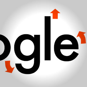
While designers seem to like it, Google's new logo has been compared to Comic Sans in some quarters. Why are we seeing such a wide discrepancy in opinion?
In 2015 it's no longer enough for interface elements to instantly switch between two static states. Petras has 7 tips for making your interactions sing!
Consistency and system can be just as important as inspiration in good design. Daniel shows you how to generate a useful style with Sketch App.
The Facebook Friends icon was telling a story from another era – until designer Caitlin Winner stepped in.
Designers are hunters, always tracking the perfect assets to tell their story. Adobe Stock brings the hunt into your Creative Cloud app.
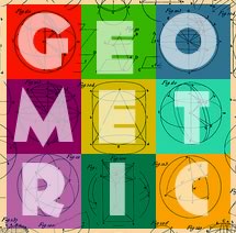
Including such famous fonts as Futura and Museo Sans, geometric fonts represent one of the most useful and versatile subcategories of sans-serif typefaces.
Kelsey has compiled a collection of fun typography games sure to test your typographical skills and improve your knowledge. Have some fun and learn.
Often it's the flaws in a technology – the brush strokes, the audio hiss – that we celebrate most. Khoi Vin celebrates the halftone in his latest design.
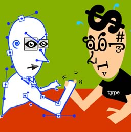
Fonts have been a convenient place to store our vector icons – but is it the *right* place? Massimo asks if it's time to move to SVG.
We can track clicks and cursors but that doesn't tell us the whole story of what our users are actually interested in. Charles walks us through eyetracking.
A lot of us muddle our way through Photoshop to get a result. Ivaylo has a checklist to get you set up the 'right' way.
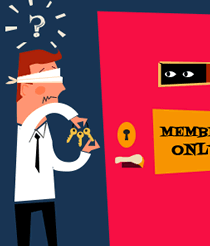
Conventional wisdom says that the frustration of masked passwords is worth it to keep us safe from hoods and hustlers. But does it actually help?
Like hand-holds on a climbing wall, paragraphs give us an obvious path to traverse a wall of text - except when we they get lost on a small screen.
Today Laura Elizabeth delivers a 'typographic tour du force' that will lift you from middling to master in 12 minutes. Read and see.
Make things easier. Make things faster. That's what Simone is offering with these six online tools. And they're all free!
We all love Dribbble, but lots of designers overlook the power of the Behance network. Dan looks at some of the neat tricks this quiet achiever can deliver.
Read Boom! The Sound of a Perfect Idea Landing and learn with SitePoint. Our web development and design tutorials, courses, and books will teach you HTML, CSS, JavaScript, PHP, Python, and more.
Powerpoint and Keynote are powerful, but also a deadend for your data. Chris shows-off the growing power and flexibility of open source presentation tools.
Often we talk about 'fluid' layouts. Cards give us the small units that allow us to 'pour' our page components into differently sized and shaped layouts.
Perfection is achieved, not when there is nothing more to add, but when there is nothing left to take away. In mobile design, was a truer word ever spoken?
New technologies have a way of shaking up the status quo and there's usually someone not happy about it.
'Codesign tools' is the name being given to a new generation of visual web design tools. Are they a genuine option? Richa makes her call.
Forms are often the make-or-break point for conversions on our web applications. Kerry pulls together a checklist of good UX design for passwords & forms.
Vectors are a great option for icons but the decision between icon fonts and SVG is a hard one. Now Seren Davies has raised some new issues with icon fonts.
Everyone loves a hero. Gabrielle brings a fresh literary point of view to the classic hero section.
While vector icons have grabbed the spotlight, pixel-based icons make up most of the icons we see each day. Ada looks at the options for pixel icon editors.
Cognitive dissonance is that feeling you get when a picture frame is 3 degrees off square. Learn to use it without getting used by it.
Adobe Comp CC is an app focused on creating quick prototyping on your iPad. James tests the concept of fleshing out ideas without leaving your armchair.
What does web design have to do with natural selection and Darwin? Andrew May has some wide ranging ideas in this interesting 'think piece'.