
Key Takeaways
- The Hero Section, also known as the Hero Header or Hero Image, is a prominent element at the top of a webpage design, aiming to engage users and guide them through the site. It serves as a visual stimulant and a focal point, often telling a story or conveying a message.
- The concept of the Hero Section can be traced back to the literary and psychological attributes of a hero, with its journey of purpose and its role as a key player in the world they inhabit. This concept can be applied in web design to create a compelling and engaging Hero Section.
- In designing a Hero Section, it’s crucial to make it visually distinct, serve a purpose, and guide the user towards a specific destination. It should also incorporate bold typography, help move the site’s “story” along, and create a logical flow in design.
- A well-thought-out Hero Section can tell a nuanced, linear story even with a single image. It’s an opportunity to make a strong first impression, increase user engagement, reduce bounce rates, and improve conversion rates.
As defined by the Oxford Dictionary: Hero /ˈhirō/ (noun)
:A person, typically a man, who is admired or idealized for courage, outstanding achievements, or noble qualities
:The chief male character in a book, play, or movie, who is typically identified with good qualities, and with whom the reader is expected to sympathize
:(In mythology and folklore) a person of superhuman qualities and often semi-divine origin, in particular one of those whose exploits and dealings with the gods were the subject of ancient Greek myths and legends.
These are all definitions to a word derived from the Ancient Greek word ἥρως which means heroes. A word that has a rich history dating back to a time where Gods clashed with mythological beasts and championed heroes to fell nasty foes on a path of destruction.
But what does the etymology and history of such a word have to do with web design? In short, if you know how to make mortar you can build something a lot more effective than a straw hut.
What is the Hero Section?
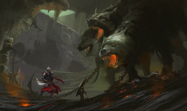
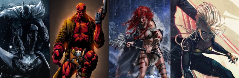
Sad truth time: the hero section has nothing to do with your favorite comic and movie heroes. That means no Batman, Hellboy, Ironman, Doctor Strange or any other caped crusader.
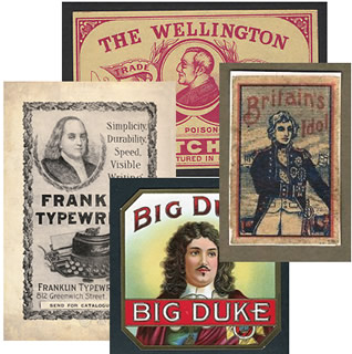
The “Hero Section” – also commonly referred to as the “Hero Header” and “Hero Image” – is a design trend that isn’t all that new. Soap companies of the 1800’s competed vigorously to develop the most effect hero panels in their labels and newspaper adverts, featuring lithographs of cute kids, caring mothers and fluffy kittens.
Not a lot has changed there.
Also for the first time companies began to understand the benefits of drawing links between their products and contemporary heroes including Benjamin Franklin, Horatio Nelson, and the Duke of Wellington – not always with permission.
On the web the hero section is typically a prominent image, slider, text or similar element that has pride of place at the top of your homepage layout and possibly subsequent pages. It is front and center and in your face.
Don’t confuse Hero Sections with those large, trendy background images used in lieu of color or patterns. There is always a purpose and focus for these sections opposed to just serving to set a general look and tone.
The Hero Section is not only a visual stimulant but it is also a core tool that is used to not only give the design a focal point but to pull in the masses and get them hooked. The Hero Section is not only the ‘likable protagonist’ in your story, but also the summary in the book jacket that gets you to read on.
The Literary Hero
When I create music videos for artists (maybe you didn’t know I do that) I often find myself being left to my own devices without any concept but my own. I’ve found that looking for unconscious links between song meaning and images not only yields a better understanding of the project, but allows me to create visuals that leave the artists happy.
With web design and specifically with the Hero Section the concept works pretty much the same. Know the past – the hero’s backstory – and you can apply it to the present.
Joseph John Campbell introduced the concept of “monomyth” or “the heroes journey” back in 1947. The concept goes:
A hero ventures forth from the world of common day into a region of supernatural wonder: fabulous forces are there encountered and a decisive victory is won: the hero comes back from this mysterious adventure with the power to bestow boons on his fellow man.
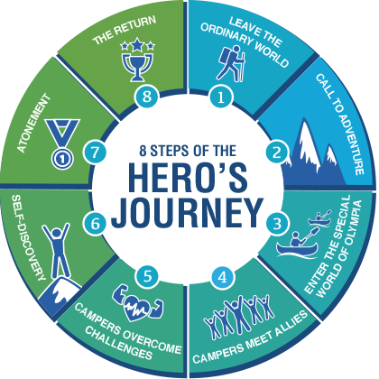
In the typical structure there are three acts – departure, initiation and return. Each act is broken up into phases which can be applied to the creation and structuring of your site’s Hero Section.
The key things to remember when using literary and psychological attributes of the hero to your sections are:
- The hero is idolized and is a chief player in the world they inhabit
- The hero’s journey is a journey of purpose, from start to finish
- The myth of the hero is consequently the beginning step to finding the true “self”
- The end product or individuation of the hero is as important as the rest of the story
Applying the Literary Hero to the Design

Now that we have that out of the way it is time to see how literary connections and history can help shape an effective Hero Section.
- The literary hero usually starts out as the “Average Joe” – Frodo from the Lord of the Rings for instance – but increasingly stands out from the crowd as the story progresses. Work this idea into your Hero Section by creating contrast within and and around it. Make your hero visually distinct.
- While the hero’s journey does typically follow a notable formula you should make a conscious effort to design your own “path”. Don’t feel pressured to use common layouts. Try something different.
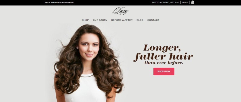
- In the hero’s journey no task is without cause. Your Hero Section should always serve a purpose. When designing make sure there is destination. That could be a problem solved, a fear allayed or even just ‘longer, fuller hair‘.

- Though not all literary stories come with big, powerful demi-gods as heroes, they do have heroes who become bold by the end. Translate this idea by using big, bold typography for your titles.
- Whether as a literary or psychological vehicle the hero helps lead the story. When picking images make sure they help move your “story” along.
- Like literature, see your design as a story. Each element is a chapter so give proper consideration to produce logical flow in design that not only tells your story but also tells the visitor where to go next.
Great Heroes Always Tell Stories

Since the majority of hero shots are static, it is even possible to tell a story using a single image?
You certainly can. Let’s take a look at how Be My Eyes uses their hero section to advance their story with a single image.
First let’s start with the concept of the site. Visually impaired users sometimes may not have any way of getting critical visual information for their world. This could be anything from signage to packaging to mail deliveries. The Be My Eyes app allows visually impaired users to instantly connect to sighted volunteers who can provide help via the camera. In a sense, these volunteers are true manifestations of the word ‘hero’.
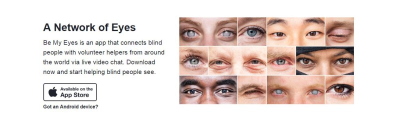
But while anyone can become a hero, the site’s Hero Section cleverly uses a static image to successfully tell a story which takes it beyond a simple high quality image of the product.
The “Average Joe”, the image of the guy is cast as the visually-challenged user while the iPhone case displaying bright, vivid eyes, plays the role of the hero. You don’t see the actual product but the story is clear. There is no heavy handedness, no cryptic message, just a simple “this is what you are looking at. This is our story”.
With the use of the high contrast of the image coupled with the bold typography you can see logic and progression. The Hero Section works even better if you are accustomed to reading left to right – admittedly a cultural thing – as this not only highlights the hero’s journey but also points to that very important light at the end of the tunnel.
The key point here is that it’s possible to tell a linear, nuanced story if you put enough thought into the hero shot composition.
If Be My Eyes can do it, why can’t you?
Conclusion
It may seem a stretch to most to apply something not design related to the development of a site but unconscious links can be just as valuable as conscious runs. If anything, you can say you at least tried a new method of development. Try it out, you never know what good may come out of it.
Have you ever used unconventional methods when it comes to designing hero sections? Let us know.
Frequently Asked Questions (FAQs) about Hero Sections
What is the importance of a hero section in a website?
The hero section is the first thing visitors see when they land on a website. It plays a crucial role in capturing the visitor’s attention and conveying the main message of the site. A well-designed hero section can increase user engagement, reduce bounce rates, and improve conversion rates. It’s an opportunity to make a strong first impression and guide visitors towards taking a desired action, such as signing up for a newsletter or making a purchase.
How can I make my hero section more engaging?
There are several ways to make your hero section more engaging. Firstly, use high-quality, relevant images or videos that resonate with your target audience. Secondly, craft a compelling headline that clearly communicates your value proposition. Thirdly, include a clear and concise call-to-action that guides visitors towards taking a desired action. Lastly, ensure your hero section is responsive and looks good on all devices.
What are some common mistakes to avoid when designing a hero section?
Some common mistakes to avoid when designing a hero section include using low-quality images, overloading the section with too much information, using vague headlines, and not including a clear call-to-action. It’s also important to avoid making the hero section too cluttered or complicated, as this can confuse visitors and deter them from exploring the rest of your website.
How can I optimize my hero section for mobile devices?
To optimize your hero section for mobile devices, ensure your images and text are responsive and scale properly on smaller screens. Use larger fonts and buttons to improve readability and usability. Also, consider the load time of your hero section on mobile devices and optimize your images and videos to ensure they load quickly.
Can I use a video in my hero section?
Yes, using a video in your hero section can be a great way to engage visitors and convey your message in a more dynamic and interactive way. However, it’s important to ensure the video is high-quality, relevant, and not too long. Also, consider the load time of the video and ensure it doesn’t slow down your website.
How can I test the effectiveness of my hero section?
You can test the effectiveness of your hero section by using tools like Google Analytics to track user engagement and conversion rates. You can also conduct A/B testing to compare different versions of your hero section and see which one performs better.
What should be the size of the hero section?
The size of the hero section can vary depending on the design of your website and the message you want to convey. However, it’s generally recommended to keep your hero section above the fold, meaning it should be visible without the visitor having to scroll down.
Should I include social proof in my hero section?
Including social proof in your hero section can be a great way to build trust and credibility with your visitors. This could be in the form of customer testimonials, reviews, or logos of well-known clients or partners.
How often should I update my hero section?
It’s a good practice to regularly update your hero section to keep it fresh and relevant. This could be when you have a new product or service to promote, a special offer or event, or when you want to test a new headline or call-to-action.
Can I have more than one call-to-action in my hero section?
While it’s possible to have more than one call-to-action in your hero section, it’s generally recommended to have a single, clear call-to-action to avoid confusing your visitors. If you have multiple actions you want visitors to take, consider using a primary and secondary call-to-action.