Google doesn’t change it’s brand often, but when it does, it’s hard to ignore it. From search pages, to app icons, to browser tabs, it is a brand that is stitched into the linings of our online lives. Yesterday the ‘Big G’ rolled out probably their biggest re-branding effort ever. Here it is.
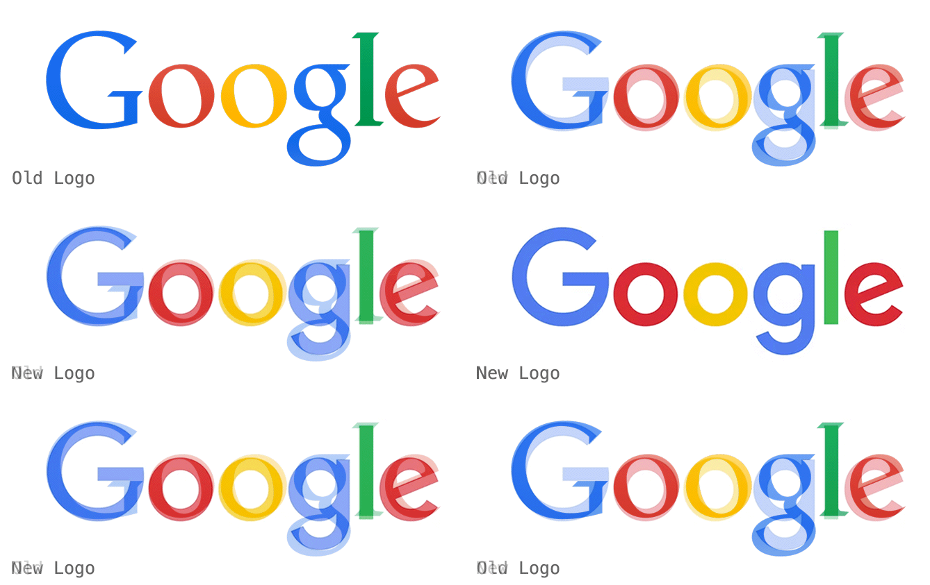
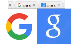 To me, the update to a sans-serif typeface seems to make more sense. Their former serif font — particularly that ‘reading-spectacles g’ — always had an older, bookish feel of romance novels and Bronte sisters. The new geometric sans-serif is much more of a happy engineer’s construction.
But What Does ‘The Internets’ Think?
Sifting through the press, Twitter and Facebook, there seemed to be two distinct streams of reaction:1). Designers by-and-large like it
Connie Birdsall, Creative Director, for Lippincott said “Google’s new logo is elegantly simple but still maintains the fun and playful quality of the original design.” “It’s really about much more than a logo and more about kind of a smart system” says Geoff Cook, founding partner at Base Design. SitePoint’s own Design & UX writer Laura Elizabeth tweeted: “Yay I LOVE @google’s new logo. Lovely stuff” Wired called it “.. simpler, younger, and friendlier”. But it’s not all ringing endorsements.2). Many non-designers are wringing their hands.
Professional grump, Jon Gruber groaned: “Their old logo was goofy. This new one is simply garbage. Just right for a company with no taste”. Public comments on the Official Google Blog include:- Went from a nice professional looking logo to a basic noring(sic) 1st grade font and you like it?
- Yeuch…. not an improvement at all
- Make that 2. The new favicon STINKS!. Hard to find on favorites bar
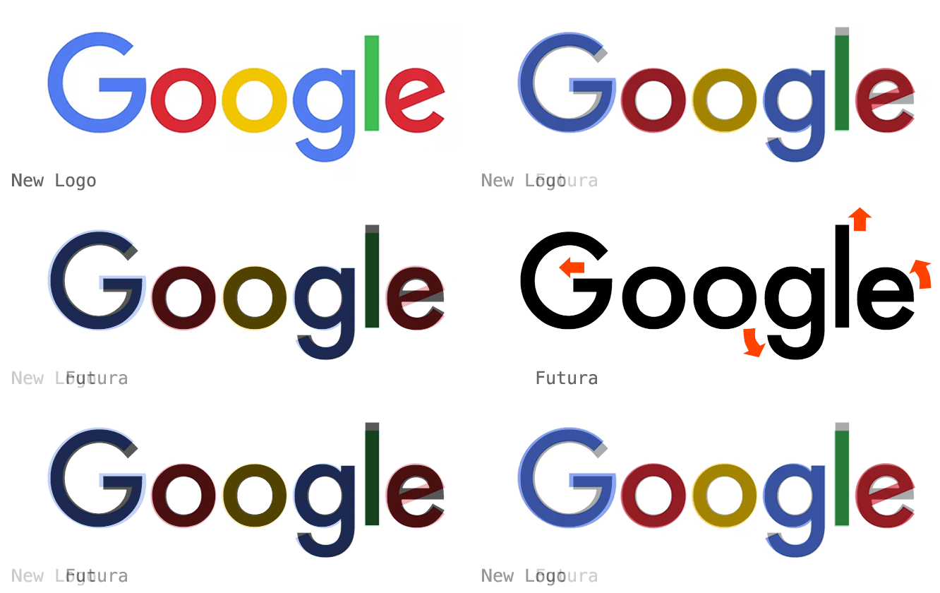
Just not your type?
It’s interesting that many complaints portray the update as more unprofessional and childish than the previous incarnation.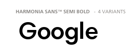
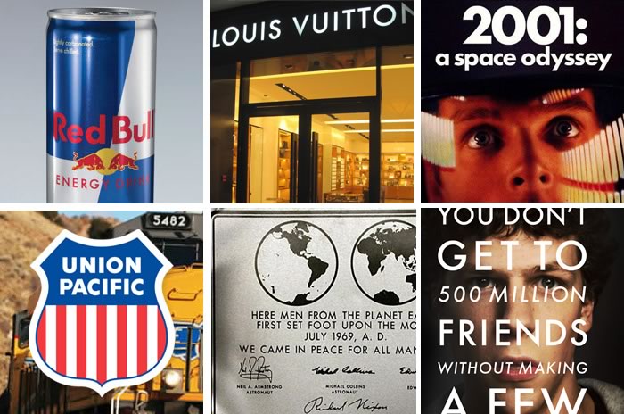
- 2001: A Space Odyssey titles
- The Social Network movie posters
- Red Bull cans
- Volkswagen ads
- Louis Vuitton branding
- The Apollo moon landing plaque
Frequently Asked Questions about Google’s New Logo and Comic Sans
Why does Google’s new logo look like Comic Sans?
Google’s new logo, introduced in 2015, was designed to be simple, uncluttered, and friendly, much like the Comic Sans font. The logo uses a custom, geometric sans-serif typeface called Product Sans. While it shares some similarities with Comic Sans, such as the rounded shapes and playful feel, it is not the same font. The resemblance might be due to the fact that both fonts were designed with readability and simplicity in mind.
What is the difference between Google’s new logo and Comic Sans?
While both fonts are sans-serif and have a friendly, informal feel, there are several key differences. Comic Sans was designed to mimic comic book lettering and has a more hand-drawn look, while Google’s logo uses a custom font, Product Sans, which is more geometric and uniform. The letterforms in Google’s logo are more balanced and consistent, while Comic Sans has more variation in its shapes and sizes.
Is Comic Sans available on Google Fonts?
No, Comic Sans is not available on Google Fonts. Comic Sans is a proprietary font owned by Microsoft, and it is not available for free use on other platforms. However, Google Fonts offers a wide variety of similar, playful sans-serif fonts that you can use instead, such as Comic Neue and Bangers.
Why do some Google Fonts look like Comic Sans on certain computers?
This could be due to a number of factors, including the browser or operating system settings, or issues with font rendering. If a specific font is not available on a user’s computer, the browser may substitute it with a default font, which could be Comic Sans in some cases.
Why was Comic Sans removed from Google Docs?
Google periodically updates its font library, and sometimes this involves removing certain fonts. However, as of now, Google has not officially stated why Comic Sans was removed from Google Docs. It’s worth noting that you can still add Comic Sans to your Google Docs by using the “More fonts” option and searching for it.
What are some alternatives to Comic Sans on Google Fonts?
If you’re looking for a font similar to Comic Sans, Google Fonts offers several options. Comic Neue is a more modern, refined version of Comic Sans, while Bangers has a comic book feel. Other playful, informal fonts include Patrick Hand, Indie Flower, and Just Me Again Down Here.
How can I add Comic Sans to my Google Docs?
While Comic Sans is not included in the default font list in Google Docs, you can add it by clicking on the font dropdown, selecting “More fonts”, and then searching for Comic Sans. Once you’ve added it, it will be available in your font list.
Can I use Google’s new logo font, Product Sans, in my documents?
Product Sans is a proprietary font used by Google for its logo and product names, and it is not publicly available for use. However, Google’s open-source font, Roboto, shares some similarities with Product Sans and is freely available on Google Fonts.
Why does Google use a font similar to Comic Sans for its logo?
Google’s logo was designed to be simple, friendly, and approachable, much like Comic Sans. The rounded shapes and clean lines of the logo’s font, Product Sans, give it a playful feel that aligns with Google’s brand identity.
Is Comic Sans a good font to use in my documents?
Comic Sans is a casual, informal font that was originally designed for comic book-style speech bubbles. While it can work well in certain contexts, such as children’s books or informal invitations, it may not be suitable for more professional or formal documents. It’s always best to consider the tone and purpose of your document when choosing a font.
 Alex Walker
Alex has been doing cruel and unusual things to CSS since 2001. He is the lead front-end design and dev for SitePoint and one-time SitePoint's Design and UX editor with over 150+ newsletter written. Co-author of The Principles of Beautiful Web Design. Now Alex is involved in the planning, development, production, and marketing of a huge range of printed and online products and references. He has designed over 60+ of SitePoint's book covers.
