
Key Takeaways
- Card design is a popular trend in web design due to its adaptability with responsive frameworks, its ability to organize content in a coherent and interactive manner, and its compatibility with mobile platforms.
- The use of cards in web design has a variety of benefits including providing an overview of a topic in a condensed space, saving space on websites while featuring a large amount of content, and engaging the reader through interactive elements such as likes, shares, and links.
- Cards are versatile and can be used in a variety of ways, including injecting order into content, encouraging economy of thought through bite-sized content, and facilitating easy sharing across social platforms. They also allow for all content to be equally weighted, leaving the reader to choose what they find most important.
From social networks to news websites, from online stores to common sites, cards are omnipresent on the web these days.
The rise of mobile technologies, bit by bit, led towards a new architecture of websites to the point that responsive design and adaptability are now a must. This contributed to the success of “cards” which are one of the top design trends in 2015.
However, we can be reasonably certain that cards are not just a passing design fad, but they will be the future of web development as they are provide one of the best ways to organize and display content in a coherent fashion.
So, in this article I’m going to explain you what “card design” is, and how it impacts on how you design.
Let’s go!
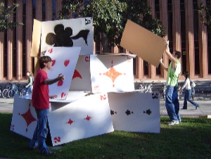
Card Design Through the Ages
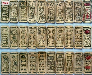
Although cards have now become very popular in web design, they have been an effective mean of visual communication for at least a thousand years. Firstly introduced as a game in 9th century Imperial China, cards later became useful in the business world.
Indeed, in the 17th century, “trade cards” made their first appearance in London to help people find business: they were an early example of the modern “business cards”.
Today, the card is the preferred shape for coupons issued by stores and supermarkets, which people collect to get special discounts.
And most of us have to look no farther than our own wallet to find more cards that we care to mention: we have credit cards, loyalty cards, store card and even the standard driving license has the standardized format of the card.
Anyway, there is a strong link between the traditional use of cards and the application they found in web design: as common material cards usually contain information on two different sides, so web cards redirect to further content.
What are Cards on the Web?
From a web point of view, we can define a “card” as a small rectangle associated to a singular thought. Cards are full of interactive elements such as text, links, buttons or images but they suggest just one main action: the one of “clicking” through the card to further discover the content.
Indeed the principal aim of cards is to provide an overview of a certain topic in a condensed space and, if the reader is interested, with just one click he can open the subject in another page.
This is a great advantage for websites such as Facebook or Twitter, which have adopted the card design pattern, as they can feature a large amount of content while saving precious space.
Therefore, the most important characteristic of cards is the idea of the interaction they have to convey. When designing, web developers should remember that cards do not only have to feature news but they also have to engage the reader. That’s why cards include buttons for likes, shares or links to read the full story.
Besides being useful, cards are a common design choice because they are compatible with responsive frameworks. The “broken-into-pieces” structure can create eye-catching user interfaces, but it is also perfect for mobile platform development too. Indeed, the design of a card has a very similar shape to the one of mobile phones screens.
Often we talk about ‘fluid’ layouts. Cards give us the small units that allow us to ‘pour’ our page components into differently sized and shaped screen layouts.
Why should we use cards?
Since cards give us built-in versatility, they can be used in different ways according to the required functions. So, let’s have a look at some of the reasons to use cards:
- They are a trend : although trends are, by their nature, transient things, using cards you can give your design an undeniable currency.
- They inject order : the use of cards forces a level of organisation to your content.
- They are ideal for responsive design: they can easily fit in websites and applications for mobile devices. The most important aspect is that, on smartphones, cards are easy to be stacked vertically to create a feed-like layout.
- They encourage economy of thought: because they are bitesize, cards can never contain a lot of content. At first, this may seem a drawback, but I think it is a good thing! In a card you should feature only a hint of the full content, and then encourage the reader who wants more to click through to find out.
- They are social: cards are perfectly suited to social media, not only because they are used by social networks, but because they make it possible for users to easily share content across social platforms and through emails.
- All content is more equally weighted: cards help to solve the issue of which article you might feature at top of the site. With cards, pieces of content of the equal importance can live on the same page without you having to rank them. It is the reader himself who is going to choose what is important and what he wants to read.
Who is Using Cards?
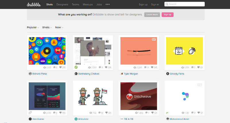
Dribbble
The layout of the website is based on cards which feature an image and little information about each design. What I like about the Dribbble design is that you can click on the card to discover more details but you can also stop the mouse pointer on the card to make a small description of the work appear.
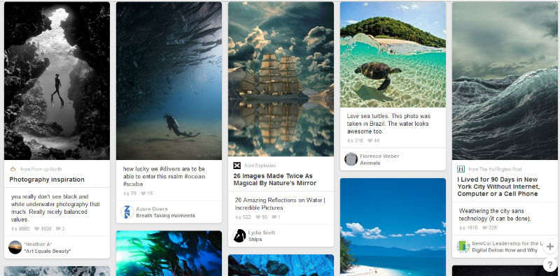
Speaking of card design, we could not avoid mentioning Pinterest. In fact, many people think credit Pinterest as the first to adopt the cards metaphor. Pinterest clearly demonstrates that “all content is important” because on Pinterest there are no cards which are more visually dominant than others.
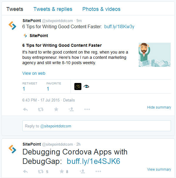
Twitter arose out of the 144 character limitations of SMS so was born with a ‘card ready’ layout. Last year the social network launched their own product called “Twitter Cards“, an application designed to help you ‘card-ize’ your own content as you post it into their system. They describe the application as a chance to:
“attach rich photos, videos and media experience to Tweets that drive traffic to your website”.
The result is that now the homepage of Twitter is full of cards associated to tweets. Clicking any one of them will enlarge the content and, sometimes, offer third party options.
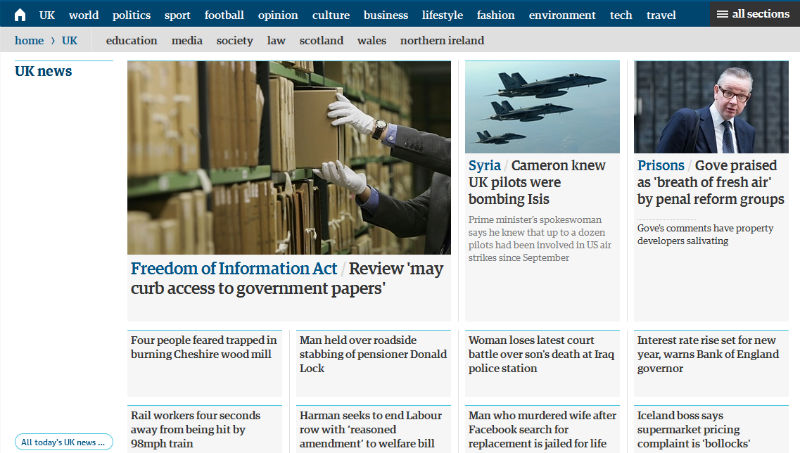
The Guardian
The famous British newspaper, applied the card layout to their website in order to “think of new ways to improve the discovery and promotion of content”.
They have been able to create a modular scheme composed by different cards: each one is associated to a title and if you click it you will be redirected to the full article. The website evokes an overall impression of elegance and clarity.
Conclusion
Cards provide an useful method to create attractive websites and they are also a highly flexible format to realize various layouts to give user a great experience.
The ever increasing importance of tablets and smartphones will contribute to keep cards on top of web design for long.
Meanwhile, will you use cards in your works?
Frequently Asked Questions about Using Cards in Web Design Layouts
What are the benefits of using cards in web design layouts?
Cards in web design layouts offer a clean, flexible, and responsive way to display content. They are highly versatile and can be used to present a variety of content types, including images, text, and links. Cards can also be easily rearranged to suit different screen sizes and resolutions, making them ideal for responsive design. They help in organizing information in a digestible manner, making it easier for users to interact with the content.
How can I effectively use cards in my web design?
To effectively use cards in your web design, consider the type of content you want to display. Cards are best suited for bite-sized content or when you want to highlight specific pieces of information. Ensure that each card serves a single purpose or idea for clarity. Also, maintain consistency in the design of your cards to create a cohesive look and feel.
What are some best practices for card design in web layouts?
Some best practices for card design include maintaining consistency, using clear and concise content, and ensuring that each card serves a single purpose. It’s also important to consider the visual hierarchy, which can be achieved by using different sizes, colors, and typography. Additionally, ensure that your cards are responsive and look good on all screen sizes.
Can I use cards for complex web design layouts?
Yes, cards can be used for complex web design layouts. They can help break down complex information into digestible chunks, making it easier for users to understand and interact with the content. However, it’s important to ensure that the cards are well-organized and don’t overwhelm the user.
How can I make my card design more engaging?
To make your card design more engaging, consider using high-quality images, compelling headlines, and clear calls to action. You can also experiment with interactive elements like hover effects or animations. However, ensure that these elements enhance the user experience and don’t distract from the content.
What are some common mistakes to avoid in card design?
Some common mistakes to avoid in card design include overcrowding the card with too much information, using inconsistent design elements, and not considering the responsiveness of the cards. It’s also important to avoid using too many different colors, which can make the design look cluttered and confusing.
How can I use cards to improve the user experience on my website?
Cards can improve the user experience on your website by making it easier for users to find and interact with content. They can help organize information in a clear and concise way, making it easier for users to understand and engage with the content. Additionally, cards can be used to highlight important information or calls to action, guiding users through the website.
Can I use cards in e-commerce web design?
Yes, cards are a popular choice in e-commerce web design. They can be used to display products in a clean and organized manner, making it easier for users to browse and shop. Cards can also be used to highlight product features, prices, and reviews, providing users with all the information they need to make a purchase.
How can I make my cards responsive?
To make your cards responsive, ensure that they adapt to different screen sizes and resolutions. This can be achieved by using flexible grid layouts and media queries. It’s also important to consider the size and legibility of text and images on smaller screens.
What tools can I use to create card designs for my website?
There are many tools available for creating card designs, including graphic design software like Adobe Photoshop and Illustrator, and web design tools like Sketch and Figma. There are also online platforms like Canva that offer pre-made card templates that you can customize to suit your needs.