
Key Takeaways
- Icon fonts and SVGs are both vector-based techniques for displaying icons on a website, but SVGs offer more styling options and are generally more accessible to screen readers.
- Icon fonts were once the best-practice solution for web icons, but SVGs have introduced useful innovations that may have changed the game. SVGs have built-in semantically-sensible elements, unlike icon fonts which often require additional ARIA attributes to be accessible.
- SVGs can be more difficult to implement than icon fonts and require more code, potentially increasing the size of web pages. However, SVGs do not require HTTP requests to load, unlike icon fonts, which can slow down a website.
- The choice between icon fonts and SVGs depends on the specific needs and constraints of the project, such as compatibility, accessibility, and user experience. SVGs are generally more performant and accessible, but icon fonts may be easier to implement and style.
We all know the feeling: just as you feel like you’ve finally achieved mastery of some great web technique… it’s time to switch to something new and better.
It has certainly happened to me many times, and it happened again recently with icons. After a long period where icon fonts seemed to be the natural, best-practice solution, SVG has introduced some useful innovations that may have changed the rules of the game.
Choosing any technique is a task that involves weighing up many topics. When we deal with icons we need to consider:
- Accessibility: are there some issues with text-only browsers or screen readers?
- Semantic meaning: an icon is a glyph used to represent something else (this the simplest definition of this concept I’ve found; it comes from the Semantic-UI framework docs), so, are we creating a useful relationship between signs and the things to which they refer?
- Browser compatibility: do we need to ensure a large browser compatibility?
- HTTP issues: does our icon system unnecessarily tax our server (HTTP requests) and contribute to longer page load times? Can icon files be cached?
- CSS styling & animation: can we arrange and animate our icons using CSS?
So, what is the best choice now? Can we still get by with icon fonts – or it is time to turn to SVG?
A Brief History
I realized that when we talk about icons, it’s easy to take for granted some topics which we have been dealing with in the past. They can help us to better frame the debate, but not everyone knows them. So, I’ve put together a very brief ‘history of icons techniques in web authoring’ to help clarify the debate. (If you feel you’re ok with the history part, jump ahead).
Back in the mid-90’s – a time when browsers had little to no CSS support – icons were managed with the classic <img> tag. This technique brought with it a lot of accessibility and semantic issues. Furthermore, pages that used lots of icons had to fire off a barrage of performance-crushing HTTP requests: one for each icon in the page.
What’s more, if you intended to introduce a :hover effect, you had to load these secondary images with JavaScript.
Happily, things got significantly better with CSS Sprites (or Image Sprites). This technique consists in arranging all icons in a single, unique file (typically GIF or PNG) to be loaded as a CSS background image. The needed portion of the image can be shown by adjusting the background-position property, as in the scheme below (I’ve also made a pen, if you want to see a running example):
![]()
This technique is still used by many huge sites like Youtube and Google and it solved a lot of problems:
- Only one image file is required, regardless of how many icons you have (including
:hovereffects), so HTTP requests can be significantly reduced. - Many accessibility (and semantic) issues are resolved, since background images and CSS pseudo elements are invisible to text browser or screen reader (while images are content).
I’ve prepared a little test that creates two lists: one with sprite icons and one using <img> tags. On the left side of the image below, you can see how the two lists are close to identical (except that the second one required much more code).
The right side is a screenshot of the same lists rendered with Lynx viewer (a web emulator of the text-only web browser Lynx) and it can give you some idea of how your web page may appear using assistive technologies (though A.T. output can vary widely).
You can see that the second list containing the images alt texts (green highlighted), which in this case are perfectly useless, since they confuse the content rather than adding meaning to it. True, we can avoid this by using empty alt attributes (as in the last two items), but we still have content elements (the images) being used as presentational attributes.
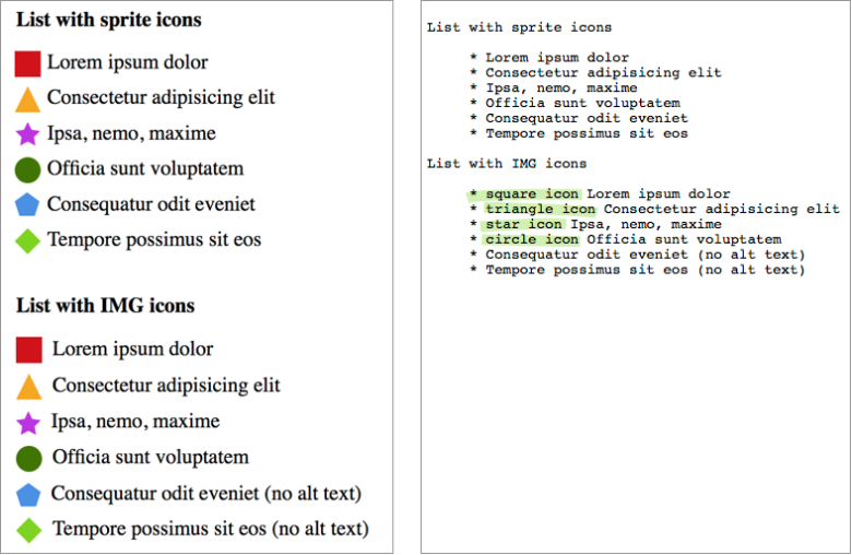
Of course, there are many cases which require meaningful icons, and the above CSS sprites example doesn’t represent the best solution. We’ll come back to this topic later.
Icon Fonts
Although they represented a big step forward, CSS sprites are still bitmap images. As such, if you need to represent the same glyph in different colors or resolutions, you need a different images for each version.
This problem was resolved by font icons: since fonts are vectors, they are resolution independent and can be easily colored through CSS.
The most common way to apply icon fonts to a page is through a pseudo element – just like we did with CSS sprites. Unfortunately this doesn’t resolve the issue of meaningful icons, since this technique still leaves them invisible to screen readers.
Let’s look at the example below (using Erik Flowers’s Weather Icons): ![]()
The first part of the screenshot represents a common icon implementation (using a pseudo element). In this case the icon is part of the content and has a very specific meaning. Unfortunately Lynx can’t see the icon, producing a nonsense sentence. You can see the result in the second part of the image.
Luckily there is an easy workaround for this issue: you can add a description inside the icon element (in this case an <i> tag). The description is wrapped inside a <span> that is styled to make its content invisible to browsers (it has usually a big text-indent value), but not to screen readers, that don’t take care about this tricks:
The icon
<i class="wi wi-umbrella">
    <span class="sr-only">"umbrella"</span>
</i>
means that it's raining
Now, a screenreader can make sense of this as a meaningful sentence: 
These topics are deeply addressed in some old articles on Filament Group blog, 24 Ways and CSS Tricks.
More on Accessibility
Although accessibility issues regarding icons are not yet solved, you can do more using WAI-ARIA techniques, paying attention to font sizing, color contrast and so on (if you are interested in these arguments, take a look at the Web Content Accessibility Guidelines from W3C).
But accessibility is not only an issue of screen readers. Even users of common browsers can be seriously impacted by our icon choices. Alex highlighted on SitePoint recently referencing a talk by Seren Davies. It demonstrates how icon fonts are not an evergreen solution, and that it may well be time to move on.
Browsers have wonderful systems for receiving, scaling, rendering and manipulating text. Ultimately co-opting that system to manage and render imagery can only undermine that powerful text function.
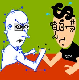
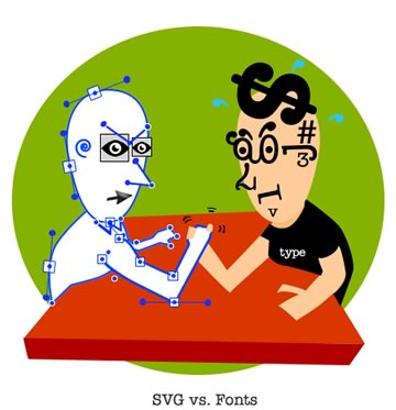
The Case for SVG
Finally, we come to SVG.
SVG further enhances what we have seen regarding icon fonts. Chris Coyer wrote an interesting article about Icon Fonts VS SVG features, so I’m going to be very concise about these topics:
- both are vector-based, so you don’t have to deal with resolution issues or multiple files
- both of them can be arranged and styled through CSS, but inline SVG allows you to control individual part of a single icon, giving you the option of multicolor icons (there are some multicolor solutions for icon fonts too, like Forecast Font or the one described in this Pixel Ambacht article. Nevertheless all them are much more complicated compared to SVG). Furthermore, with SVG you have access to glyphs strokes.
- the workarounds we need to improve icon font accessibility are not necessary with SVG files, since they have built-in semantically-sensible elements (i.e.
<title>and<desc>), not unlike the HTML page itself. - Inline SVG can’t be cached and reused like icon font, but you can cache external SVG files, as you can with any image file.
- Icon fonts browser support is complicated but very comprehensive (including IE6+), while SVG requires at least IE9+. Explorer doesn’t support external SVG files, but there is a polyfill for this.
SVG icons can be implemented in many ways (I have covered many techniques in my previous SVG icons article), all them can be useful, but I think that the better solution is represented by the SVG symbols technique.
SVG symbols give you the best control on your icons as you can easily change their color and, by using relative units, you can resize them according to the related text.
See the Pen SVG example by Massimo Cassandro (@massimo-cassandro) on CodePen.
At the moment only Firefox seems to let you edit symbol parts via CSS. Viewing the previous pen using FF, the third row should appears just like the last one, which uses inline SVG.
In the same way, text and screen reader support can’t be always granted (for example, the previous pen is not correctly rendered with Lynx Viewer).
If you want to see more example, take a look at my other pens about SVG, and if you want to go deeper with SVG and accessibility read Léonie Watson’s very interesting Tips for Creating Accessible SVG or Dudley Storey’s Making SVG Accessible article.
Conclusion
Let’s go back to the question we have started from: what is the best choice now between icon fonts and SVG?
As usual, the answer is: it depends. You must consider all the element of your project evaluating compatibility, accessibility, user experience etc. Personally, I’m increasing the use of SVG symbols in my projects, and avoiding icon fonts when it’s possible.
Thanks for reading.
Frequently Asked Questions on Icon Fonts vs SVG
What are the main differences between Icon Fonts and SVG?
Icon Fonts and SVG (Scalable Vector Graphics) are two different ways to display icons on a website. Icon Fonts are essentially fonts that contain symbols and glyphs instead of letters. They are vector-based and can be scaled without losing quality. SVGs, on the other hand, are an XML-based vector image format that can also be scaled without losing quality. The main differences between the two lie in their implementation, accessibility, and performance. SVGs are generally considered to be more accessible and performant, but they can be more difficult to implement than Icon Fonts.
Are SVGs more accessible than Icon Fonts?
Yes, SVGs are generally considered to be more accessible than Icon Fonts. This is because SVGs can be directly embedded into HTML, allowing screen readers to better understand the content. Icon Fonts, on the other hand, often require additional ARIA attributes to be accessible, and even then, they may not be as accessible as SVGs.
Can Icon Fonts and SVGs be styled with CSS?
Both Icon Fonts and SVGs can be styled with CSS. However, SVGs offer more styling options than Icon Fonts. With SVGs, you can style individual parts of an icon, apply gradients, and even animate them. Icon Fonts, on the other hand, can only be styled as a whole.
Are SVGs more performant than Icon Fonts?
SVGs are generally considered to be more performant than Icon Fonts. This is because SVGs are resolution-independent and do not require HTTP requests to load, unlike Icon Fonts. However, the performance difference between the two is often negligible and may not be noticeable in most cases.
Can I use both Icon Fonts and SVGs on the same website?
Yes, you can use both Icon Fonts and SVGs on the same website. However, it’s generally recommended to stick to one or the other for consistency and performance reasons.
Are SVGs supported by all browsers?
SVGs are supported by all modern browsers, including Chrome, Firefox, Safari, and Edge. However, older versions of Internet Explorer (IE8 and below) do not support SVGs.
How do I choose between Icon Fonts and SVGs?
The choice between Icon Fonts and SVGs largely depends on your specific needs and constraints. If you need simple icons that are easy to implement and style, Icon Fonts may be the better choice. However, if you need more complex icons with advanced styling and animation options, SVGs may be the better choice.
Can I convert Icon Fonts to SVGs?
Yes, there are tools available online that can convert Icon Fonts to SVGs. However, keep in mind that the conversion may not be perfect and some manual tweaking may be required.
Are there any disadvantages to using SVGs?
While SVGs offer many advantages, they also have a few disadvantages. For one, they can be more difficult to implement than Icon Fonts. They also require more code, which can increase the size of your web pages.
Are there any disadvantages to using Icon Fonts?
Icon Fonts also have a few disadvantages. They require HTTP requests to load, which can slow down your website. They also offer fewer styling options than SVGs and may not be as accessible.