

Key Takeaways
- Geometric fonts, based on simple geometric shapes like circles and squares, are highly versatile and useful in creating a range of moods and feelings in users. They are often used for headings in print and digital design due to their simplicity and minimalism.
- Six notable geometric fonts for designers include Attitude, Biko, Geomancy, Rometric, Building, and Moderne Sans. Each has its own unique characteristics and applications, from evoking popular culture of the early ’90s to referencing architectural styles.
- While geometric fonts are popular and trendy, they may not be suitable for all types of design. They work best in modern, minimalist projects and may not be the best choice for long-form text or traditional, formal designs.
Typography is one of the most dynamic and ever-changing areas of design and has a huge bearing on the overall UX of your work. Indeed, typography gives us the chance to evoke moods and feelings in the users just by selecting the appropriate fonts for the circumstance.
In both websites and mobile applications, sans-serif fonts are generally preferred for their lack of visual embellishments – serifs are thought to work better on paper than screen. This makes sans-serif a good fit for the flat design aesthetic while keeping the overall readability high.
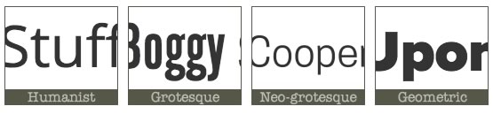
But there are more categories than just serif and sans-serif. Sans-serif fonts are divided into four categories: Humanist, Grotesque Neo-grotesque & Geometric
In this article we’re going to look at some designers who really know how to use geometric fonts well – and then we’ll pick out a handful of the finest geometric fonts for use in our own projects.
Let’s go!
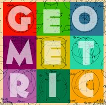
What Do We Mean By ‘Geometric Fonts’?
As the name suggests, these fonts are based on simple geometric shapes such as circles and squares. Geometric fonts are used mainly for headings of printed works, but can also suit web or mobile design projects.
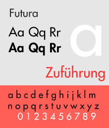
Experts trace the rise of geometric fonts to the Bauhaus, the German art school which operated from 1919 to 1933. It is no coincidence that ‘Futura‘, one of the most famous geometric fonts, was released in 1927 by Paul Renner, an artist strongly influenced by the Bauhaus movement.
One of the key principles of the Bauhaus was a strong focus on simplicity and function over superfluous decoration. Futura is a classy combination of cut-metal precision and understated elegance.
Geometric Fonts in the Wild
Let’s have a look at some examples of how geometric typefaces can be used with good results.
Jova
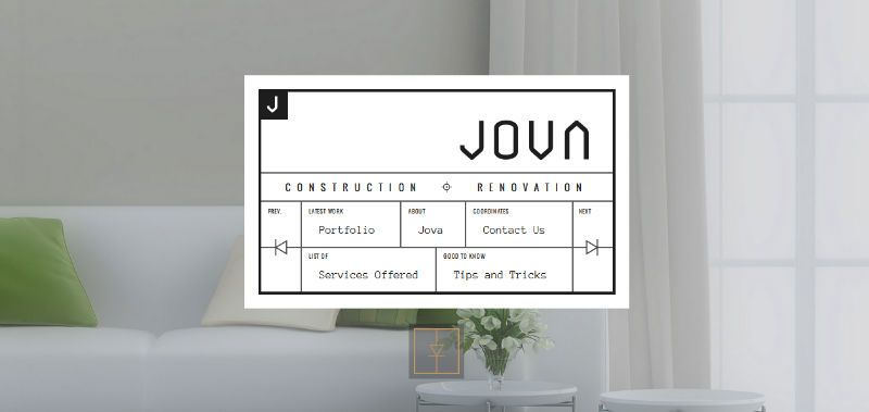
Jova is a construction enterprise which is specialized in renovations of houses and shops.
Their website features an unconventional navigation menu which is based on a grid-style layout and it creates a professional, simple and refined look which goes well with the brand image.
The designers decided to write the text with a geometric font: I think it is a good choice because the linearity of the subtle typeface reinforces the overall design.
Le Parc Records
My second example is “Le Parc Records”, a music label. Here, the website is able to evoke a dark, contemporary, powerful mood thanks to the combination of rich background images and distinctive font choice.
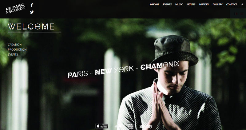
Indeed, while the photography is spectacular, the typeface works beautifully to help bind the visuals together. Although the font is a bit bizarre, it is definitely attractive. The font is a geometric one which has no decorative serifs at the tips of the letters, but instead employs small inserts in some letters such as “O” and “X”.
This shows that geometric fonts not only work well in a sharp, elegant and clean setting like Jova, but also in cooler and edgier situations like Le Parc.
Comedy Central
The last example is the U.S. television channel, “Comedy Central”. A few years ago, Comedy Central underwent a rebranding process which introduced a new logo and a new look.
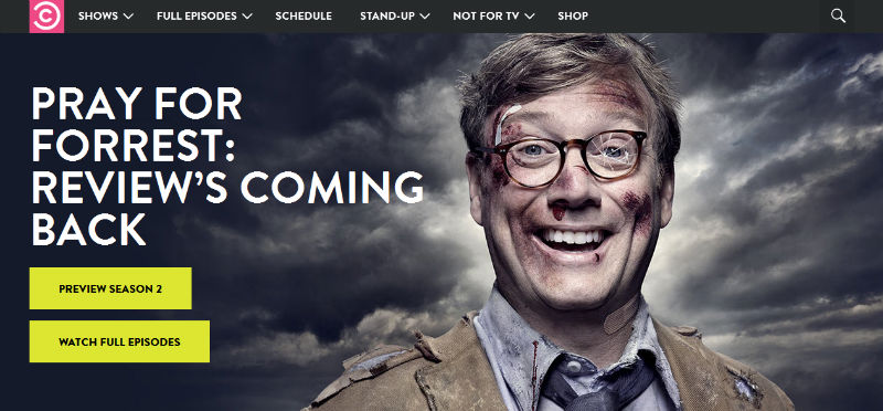
This project was carried out by “theLab”, a creative production agency, which decided to use the geometric font “Brandon Grotesque” to evidence the confidence and maturity of the company.
The font always appears in uppercase and it is used in the logo as well as in almost all the text which is present on the website. This evokes an idea of elegance and competence but at the same time, with the help of some images, it lets leak out the sense of humour which distinguishes Comedy Central.
Geometric Fonts For Your Library
Now that we have seen how geometric fonts can be used, it’s time to hunt down some of the best fonts you can download from the web.
Attitude
The designer of “Attitude”, Emil Kozole, says that the creation of the font was inspired by the Japanese and American popular culture of the early ‘90s. With this font, the designer certainly wanted to experiment with letters and shapes. The result is a typeface not unlike the one used in “Le Parc Records”.
The font has 7 different versions: “regular”, “inline”, “3d”, “sliced”, “soldier”, “drunk” and “wasted”. Each version, with the only exception of “inline”, has 2 different styles: “regular” and “alternate”. Since “Attitude” is minimal but also stylish, it can work well for posters, clothes design, magazines and cd covers and, of course, for headings of websites.
The font can be downloaded for free: Download link
Biko
Biko is a geometric sans-serif font created by Marco Ugolini for Monofonts. The name is a tribute to Steve Biko, a South African activist who fought against the Apartheid.
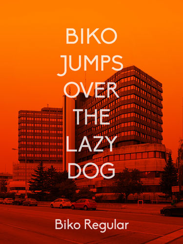
Biko has a friendly but strong character which makes the typeface good for websites, mobile apps, texts and logos. It is available in four different families: light, regular, bold and black.
If you need the font for personal use, you can download Biko for free at: Download link
Otherwise, if you need it for commercial purposes, you can buy a license at www.monofonts.com/products/biko. Prices vary according to the kind of license you look for and in case you are interested in a single family, you can contact the font creator.
Geomancy
Geomancy is a font developed by “One By Four Studio” and it clearly shows references to the geometric patterns inspired by the style of the French and American Art Deco. The font is designed to only contain uppercase letters, so we wouldn’t suggest using this for body text. I think that Geomancy is much better suited for titles and big posters.
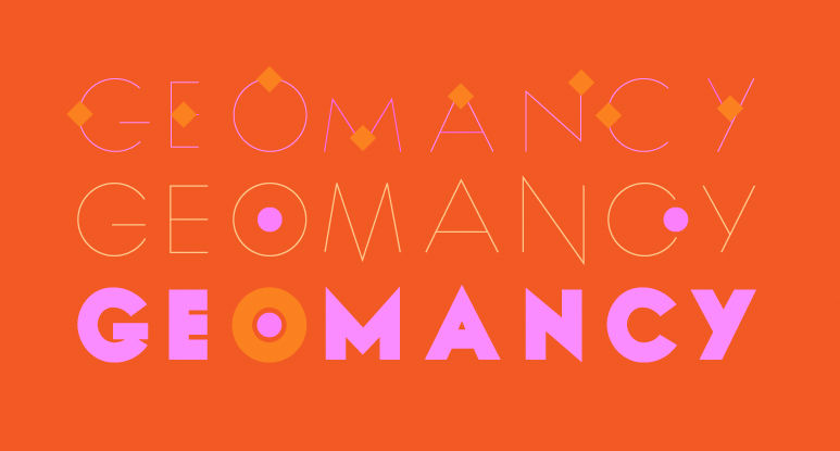
In the package you can find two different versions of the fonts: “Extra Bold” and the thinner “Hairline”. According to the effect you want to create, you can use these families separately or together.
The fonts can be downloaded for free here: Download link
Rometric
Rometric, by Thomas Richardson, heavily draws inspiration from the neo classic style of architecture, mixed with modern angles and geometric shapes. The most recurrent shapes are circles and triangles which are a common motif in neoclassicism.
The aim of the designer was to create a font which could explore and combine old and new trends within a single unique typeface.
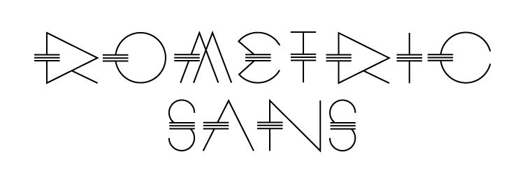
What I really like of this font are the three horizontal lines present on every letter: they add a modern appeal and they make this font unforgettable. It’s a strange but pleasing meeting point between techno and art deco.
Of course, the font should not be used in long text passage, but only in headings.
You can download Rometric for free at: Download link
Building
Building is a font designed by the Italian Leonardo Gubbioni. He tells us the font was created to “capture the attention of the viewer in a world where we are constantly assaulted by sensory stimuli”.
Building works especially well on page titles, packaging and clothes design.
The font is composed of uppercase letters. Download link
Moderne Sans
Moderne Sans is a clean sans-serif typeface designed by Marius Kempken. The font is inspired by the typography of the 1920s. Here more than ever, letters are based on geometric shapes: the “O” is a perfect circle while the “M” and “N” are created by combinations of triangles.
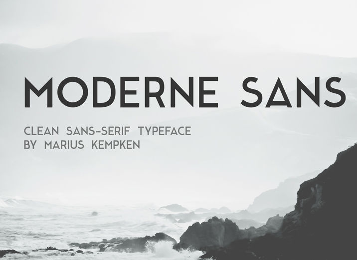
If you download the font, which is free, you will get the uppercase version as well as the lowercase one.
The font can be downloaded here: Download link
Over to you. Get Designing!
The fonts I listed are just a few of my personal favorites, but the web is full of geometric fonts and all sorts of free fonts which are waiting to be downloaded and used.
Sometimes simple shapes can make the most compelling and inspiring design statements.
Frequently Asked Questions about Geometric Fonts
What Makes a Font Geometric?
Geometric fonts are typefaces that are based on geometric shapes, primarily circles, squares, and triangles. They are characterized by their simplicity and minimalism, with each character often constructed from repeated geometric shapes. This gives them a modern, clean, and uncluttered look. They are often used in logo design, headlines, and any design work that requires a modern, clean aesthetic.
How Can I Identify a Geometric Font?
Geometric fonts are typically characterized by their use of simple geometric shapes. The letter ‘O’ is usually a perfect circle, and other letters are often constructed from shapes like squares and triangles. They also tend to have uniform stroke widths, meaning the thickness of the lines used to form the letters is consistent throughout.
Are Geometric Fonts Suitable for All Types of Design?
While geometric fonts can be versatile, they may not be suitable for all types of design. Their minimalist and modern aesthetic makes them ideal for logo design, branding, and digital design. However, they may not be the best choice for long-form text or traditional, formal designs.
What Are Some Popular Geometric Fonts?
Some popular geometric fonts include Futura, Avenir, and Proxima Nova. These fonts are known for their clean lines, simple shapes, and modern aesthetic. They are widely used in both print and digital design.
Can I Use Geometric Fonts for Free?
While some geometric fonts are available for free, others may require a license or purchase. It’s important to check the licensing terms of any font before using it in your designs.
How Can I Incorporate Geometric Fonts into My Design?
Geometric fonts can be incorporated into your design in various ways. They can be used for headlines, logos, or any other elements that you want to stand out. Because of their simplicity, they pair well with a variety of other fonts and can be used in a wide range of design styles.
Are Geometric Fonts Trendy?
Geometric fonts have been popular for several years and continue to be a trend in graphic design. Their clean, modern aesthetic appeals to many designers and they are often used in branding and logo design.
How Do I Choose the Right Geometric Font for My Project?
When choosing a geometric font, consider the message and tone you want to convey. Geometric fonts are modern and clean, so they work well for projects that require a minimalist, contemporary feel. Also, consider readability, especially if the font will be used for longer text.
Can I Create My Own Geometric Font?
Yes, with the right tools and knowledge, you can create your own geometric font. There are many software programs available that allow you to design and create your own fonts.
What Are the Alternatives to Geometric Fonts?
If geometric fonts don’t fit your design, there are many other font styles to consider. Serif fonts, for example, are more traditional and formal, while script fonts can add a touch of elegance or creativity. It’s all about finding the right font to match your design and message.