
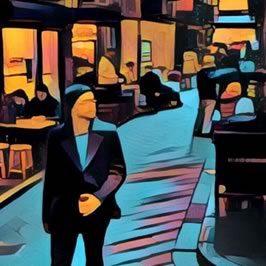
Web Layout 101: Making the Most of the Top Right Corner
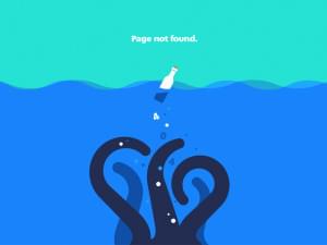
The top right of screen is a difficult area of the screen to design for. Michaela shows you how to select the best images for your layout.
The top right of screen is a difficult area of the screen to design for. Michaela shows you how to select the best images for your layout.
Watching an SVG image drawn onto screen is powerful effect. Ivaylo shows you how to create the 'Invisible Pen' Effect in SVG using Vivus.js
There's a lot of social buzz around 'Figma' , a new Browser-based UI Design tool. But is it a serious alternative? We look at Figma for Sketch Designers
Jan Losert has spent 4 years refining his refining his design product dashboard design – now he's ready to share his insights and secrets. Read on.
There are few things more disconcerting than getting legal notice from seemingly nowhere. But if you receive a cease and desist letter, Adam has your back.
Micro-interactions are subtle “moments” centered around accomplishing a single task. Daniel shows how they count for UI designers.
How can you create a single SVG graphic – maybe a logo or icon – that can be easily restyled and recolored in any setting or device? Massimo has a solution.
Jessica Enders looks at how even the giants of digital media can slip up in their web form UX.
We know that users are less patient and we need to reduce waiting times. But there are also tricks to help us 'bend time' in our favor.
Websites are so often boxes in boxes in boxes. Daniel has 5 different ways to break your habit of rectangular website designs.
Wireframing is a key component of modern frontend design but often overlooked in design and development courses. Saad can help.
UXD is process of building better, more pleasurable products for users. Psychology is the key to understanding their needs and wants.

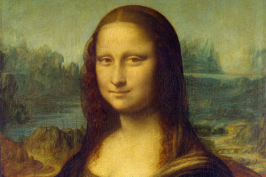
Research shows that looking at faces changes the way we think. Can you use this knowledge to trigger empathy in your users?
Today we've put together a list of 8 impressive and distinctive headline fonts designed to give your layouts an extra touch of star power. Enjoy.
'Push button' image filters have developed a bad reputation with design professionals. But perhaps a new image filter called Prisma can change their minds.

Saad explains how white space, a lack of content, can make a design more effective.

Designing for IoT – the Internet of Things – offers great opportunities, but also a new range of challenges. Charles Costa walks you though the big 4.

Google fonts revolutionized web fonts by bringing them to the world. They've just released the services' biggest overhauls since 2010. But is it better?
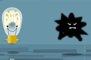
They are the product of comic books and newspaper 'funny pages' but Aja is here to tell why the speech bubble is set to rule our future UIs.
Pantone 448C – a dark olive-brown – is used on Australian cigarette packaging because it is visually unappealing. But context changes how we see color.

Store design isn't accidental. Hundred of years of experience teaches many UX lessons. Daniel explains how you can apply in the digital world.
Think you know Flickr? Did you know they store a vast reservoir of copyright free photos imagery from the world's great libraries, museums, & archives?

Read Conversational UIs, R2-D2 and Avoiding the Uncanny Valley and learn with SitePoint. Our web development and design tutorials, courses, and books will teach you HTML, CSS, JavaScript, PHP, Python, and more.
SVG is powerful, but finding a place to put your image is harder than it should be. Here's a scalable, reliable, free SVG image hosting method.
Some users come to us via the web – others via an app. How does the onboarding UX differ? Aja looks at how Mint and Expensify answer that question.
Codepen has become a vast repository of some of the best in front-end UI thinking. Sarah has put together a short list of handy snippets from Codepen.io
It doesn't matter how crisp your SVG text is if it's too small to be read. Responsive SVG lets you prioritize the important parts of you graphic.
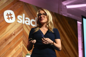
Designers are part of an ever-growing team in 2016 and collaboration is key. Theo looks at the best Slack apps for designers.
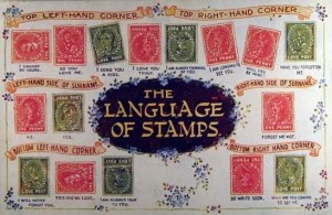
While today we LOL, smile :) and wink ;), a hundred years ago people were encoding their thoughts and feelings into the position of their postage stamps.
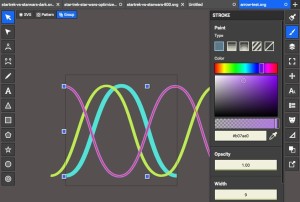
SVG patterns are a great low-bandwidth tool for designers but setting them up can be hard. Alex shows how Boxy SVG makes things much easier.