


Key Takeaways
- The rise of conversational user interfaces, such as the ‘Slackbot’ used by Slack, demonstrates the appeal of human-to-app interactions that mimic human-to-human chat formats. This approach can make the user experience feel more familiar and engaging.
- The use of ‘UX theater’, such as the ‘typing’ indicator in the Quartz news app, can enhance user engagement by creating anticipation and making the app feel more personable, despite users’ awareness of the artificiality of these features.
- The concept of the ‘Uncanny Valley’ in robotics and AI, which suggests that near-human but not perfectly human representations can be unsettling, is relevant to conversational UIs. As these interfaces become more complex, designers will need to avoid falling into this ‘valley’ to maintain user comfort and engagement.
What was the first ‘killer phone app‘? I’m talking about the first non-voice product that had droves of people buying mobile phones for the first time just to use it?
Was it Google Maps? Maybe the YouTube app? Bejewelled? Farmville? Facebook?
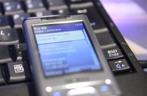
No – as important as they may have been, I think the original killer app has to be SMS (or texting). Sending little notes to each other doesn’t sound very innovative or exciting, but from the early 90’s onwards, SMS drove the cellphone market while providing an obscenely lucrative revenue stream to phone network providers.
People seemed to like SMS for three reasons.
- It was private.
- It was simple.
- It felt familiar.
We all probably passed notes in class and stuck them on the refrigerator door. SMS just let us pass them across the world.
Many of the first big online services for desktop computers used the same chatty approach – ICQ, Yahoo IM, AIM, and MSN Messenger. Even today Facebook Messenger, Whatsapp Twitter, and Slack have billions of users every day tapping out short text messages to each other.
What can we say? Humans really like this format.
Birth of the Conversational User Interface
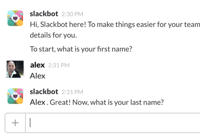
The last three years have seen the rise of a new kind of user interface. Slack were one of the first companies to realize that this ‘human-to-human‘ chat format might work just as well for human-to-app interactions.
Instead of using a standard account creation sign-up form, Slack used their ‘Slackbot’ like a welcoming hotel concierge.
And it made total sense. They want you to chat – why not start chatting from the first moments you use the app? The idea caught on and has been reproduced many times since.
Quartz: Chatty News App
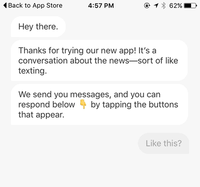
Quartz is a new news app (currently iOS only) that takes the idea of conversational UIs to a new level.
While Slack was a chat client just expanding where it chatted, Quartz jams news events into an SMS-like format. It’s a bit like having a friend SMSing you newspaper snippets to read on the train. You can ask your friend for more detail on the story or tell them to move on.
While I’m not totally convinced yet that Quartz is a winner, it is a brilliantly original way to think about presenting news. It’s loose and informal and easily the most clutter-free news UI I’ve ever seen. Each time you read a new message and make a yes/no decision – Quartz handles the rest.
Very interesting.
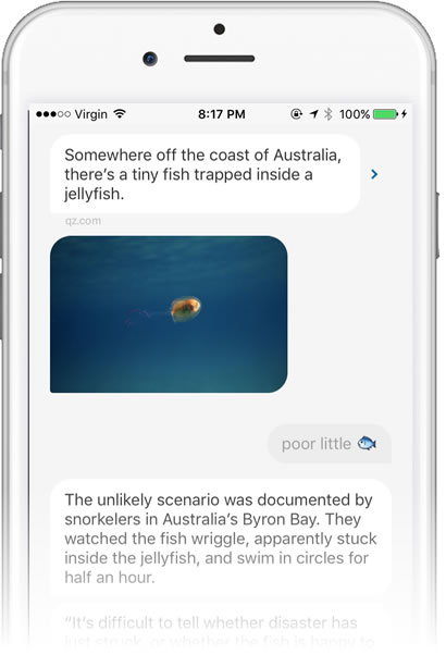
One eye-catching little UI touch is the ‘typing’ indicator that appears just before Quartz posts a new message to screen – three drumming dots inside a speech bubble (see the animation above).
We’re all familiar with this idea. In real world conversations, we can signal with body language that we’re about to speak. In chat apps from ICQ in 1996 to Slack today, we get a visual indicator that the other person is in the act of replying. It’s a useful protocol.
But this is an app speaking to us – not a friend or colleague.
Now let’s be frank: We all implicitly understand that this is all ‘UX theater’ put on for our benefit. Even my 10-yo daughter immediately picked it. There’s nobody banging away at a real keyboard. It’s pretend.
So, how do we feel about that?
I’m not sure about you, but I’ve been surprised by my own gut reaction.
My designer brain tells me I should be dismissive and snarky. “Bah! How DARE you slow down my experience with such feeble UI parlor tricks!” (yes, my ‘designer brain’ sounds like Professor Moriarty).
But my UX-self started grudgingly liking it – and I couldn’t understand why at first.
So, why don’t I hate this?
I now think there are two reasons why it works.
1). Part of it is anticipation. Like the arrival chime on an elevator, it’s slightly less jarring when we can prepare for the new content just before it arrives. The ‘reply drum’ (I’m coining that phrase) is onscreen for a second or less, so there’s very little time to get genuinely impatient. But we watch that spot.
2). As much as I know it’s a trick, I can’t help treating ‘Quartzbot’ more like a person than the glorified tweet-stream it is. That tiny detail at least partially overrides my rational understanding that this is just fancy code.
And that, in turn, changes the way I read each message. We’re all well-trained at reading our text messages carefully. An SMS is usually short, but often packed with subtext, undertones and hidden meaning. For instance, your partner replies to your text with ‘Fine.‘ or ‘ok..‘ you know things are very likely NOT either fine or OK. But ‘CU l8r ;)‘ is another matter.
Quartz manages to trick that part of our brain into reading the news. Will the magic last? I’ll be interested to see over the coming weeks.
30 Rock & The Uncanny Valley
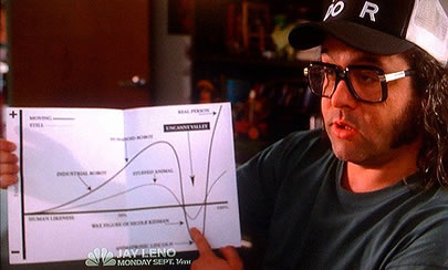
In a memorable episode of 30 Rock, Frank delivers a brilliant explanation of the robotics theory of the ‘Uncanny Valley’.
Frank: As artificial representations of humans become more and more realistic, they reach a point where they stop being endearing and become creepy.
Tracy: Tell it to me in Star Wars
Frank: A’right. We like R2-D2… And C3PO. (pointing low on chart)
Tracy: They’re nice.
Frank: And here we have a real person like Han Solo (pointing at top of chart)
Tracy: He acts like he doesn’t care… but he DOES!
Frank: But down here we have a CGI Stormtrooper… (pointing at bottom of valley) … or Tom Hanks in the Polar Express”
Tracy: I’m scared! Get me outta there!
Frank: That’s the problem. You’re in the valley now. It’s impossible to get out.
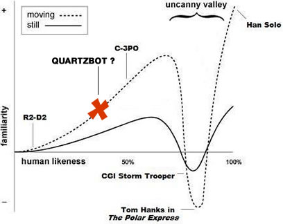
It makes sense that the concept of the uncanny valley applies to these conversational UIs too. Perhaps ‘Quartzbot’ (or whatever it’s called) is vaguely likable because it manages to land in that relatively simple, ‘un-creepy’ R2-D2 part of the graph.
But it will be interesting to see what happens when conversational UIs start getting more complex and edging into ‘the valley’.
Originally published in the SitePoint Design Newsletter.
Frequently Asked Questions (FAQs) about Conversational UIs, R2-D2, and Avoiding the Uncanny Valley
What is the concept of the Uncanny Valley in relation to conversational UIs?
The Uncanny Valley is a theory in the field of robotics and artificial intelligence. It suggests that humanoid objects which imperfectly resemble actual human beings provoke uncanny or strangely familiar feelings of eeriness and revulsion in observers. In the context of conversational UIs, this concept is applied to the design and development of chatbots and virtual assistants. If these digital entities are too human-like but not perfectly human, they can cause discomfort and unease among users, thereby affecting user experience and engagement.
How does R2-D2 avoid the Uncanny Valley?
R2-D2, the iconic droid from Star Wars, successfully avoids the Uncanny Valley by not trying to mimic human appearance or behavior. Instead, it communicates through a series of beeps and boops, and expresses emotions through its actions rather than facial expressions or speech. This makes R2-D2 endearing and relatable, without causing the discomfort associated with the Uncanny Valley.
What are some strategies to avoid the Uncanny Valley in conversational UIs?
There are several strategies to avoid the Uncanny Valley in conversational UIs. One is to design the UI to be clearly non-human, like R2-D2. Another is to focus on perfecting the human-like qualities of the UI, so it crosses the Uncanny Valley and becomes indistinguishable from a real human. It’s also important to ensure the UI’s responses are contextually appropriate and emotionally intelligent, to enhance user engagement and satisfaction.
How does the Uncanny Valley affect user engagement?
The Uncanny Valley can significantly impact user engagement. If a conversational UI falls into the Uncanny Valley, it can cause discomfort and unease among users, leading to reduced interaction and engagement. On the other hand, a UI that successfully avoids the Uncanny Valley can enhance user engagement by providing a more comfortable and enjoyable user experience.
What role does emotional intelligence play in avoiding the Uncanny Valley?
Emotional intelligence plays a crucial role in avoiding the Uncanny Valley. A conversational UI that can understand and respond to users’ emotions appropriately can enhance user engagement and satisfaction. It can also help the UI to appear more human-like, thereby crossing the Uncanny Valley. However, it’s important to ensure the UI’s emotional responses are not overly human-like or imperfect, as this can cause discomfort and fall into the Uncanny Valley.
How can we measure the success of a conversational UI?
The success of a conversational UI can be measured through various metrics, such as user engagement, user satisfaction, and task completion rate. User feedback and reviews can also provide valuable insights into the UI’s performance and effectiveness.
What are some examples of successful conversational UIs?
Some examples of successful conversational UIs include Apple’s Siri, Amazon’s Alexa, and Google Assistant. These virtual assistants have been designed to understand and respond to natural language commands, making them easy and intuitive to use. They also avoid the Uncanny Valley by not trying to mimic human appearance or behavior too closely.
What are the future trends in conversational UI design?
Future trends in conversational UI design include the use of AI and machine learning to enhance the UI’s understanding and response to natural language commands. There’s also a growing focus on emotional intelligence, to make the UI more empathetic and responsive to users’ emotions. Additionally, there’s a trend towards more personalized and contextually appropriate responses, to enhance user engagement and satisfaction.
How does cultural context affect the design of conversational UIs?
Cultural context can significantly impact the design of conversational UIs. Different cultures have different norms and expectations when it comes to communication, which need to be taken into account when designing a conversational UI. For example, the use of formal or informal language, the level of directness, and the use of humor can all vary between cultures.
What are the ethical considerations in designing conversational UIs?
There are several ethical considerations in designing conversational UIs. These include respecting user privacy and confidentiality, ensuring the UI does not discriminate or show bias, and being transparent about the use of AI and machine learning. It’s also important to consider the potential impact of the Uncanny Valley, and to design the UI in a way that respects and enhances the user experience.