

Key Takeaways
- The world’s most visually offensive color, as determined by a study of 1,000 smokers, is Pantone 448C, also known as ‘opaque couché’. This color was associated with negative concepts such as “dirty”, “death”, and “tar”.
- While colors aren’t inherently ‘bad’, our reactions to them can be influenced by both genetic factors and learned associations. For instance, although Pantone 448C is seen as visually unappealing in the context of cigarette packaging, it has been used successfully in other design contexts, including fashion and logo design.
- The use of color in marketing and branding can significantly impact consumer reactions. Understanding the cultural and personal associations with certain colors can help businesses effectively communicate their brand values and attract their target audience. For example, in Australian cigarette packaging, red and gold have historically been used to signal vigor, strength, wealth, and prestige.
As a designer, have you ever been asked to make something that people hate? Something designed to literally drive people away from a product?

I suspect not.
That’s precisely the strange task that market research and UX research firm, GfK was set in 2012. In Australia, smoking is discouraged to point that legislation dictates that the all cigarette packaging be deeply unattractive. This includes horrendous images of smoking-related illnesses and forthright messaging.
Not that’s it’s 100% effective. I have male smoker friends who specifically ask for the ‘Smoking can harm your pregnancy’ boxes because the message doesn’t apply to them (I’m serious).
Meet Opaque Couché
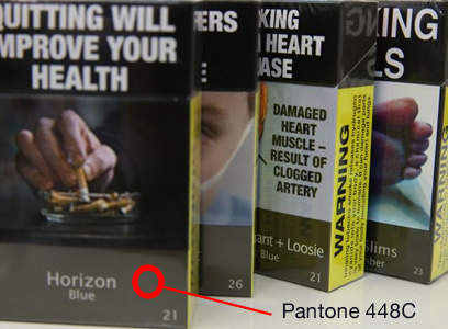
GfK was commissioned to study 1,000 smokers to determine the world’s most visually offensive color.
This is it – Pantone 448C, also known by the more poetic name of ‘opaque couché’. I’d call it a brown, leaning slightly into olive-green. GfK reported that smokers associated the color with “dirty”, “death”, and “tar”.
Can colors really be born bad?
Obviously, colors aren’t tangible – they’re just how our brains render light wobbling at a particular speed. What you see as red might not be what I see.
But we do have built-in reactions to them – some genetic, some are learned. Most people associate blue with calmness, yet a nation of Italians associate blue with excitement and pride and drama.
Using Pantone 448C as the basis to create a montage of Flickr photos certainly produces a gloomy, sickly collection. There aren’t many images with that color profile that fall under light-hearted or happy.

But, on the other hand, many designers have used the color (or one very close to it) with great success in the past.
Fashion megacorp Gucci currently offer a 2,440 coat they like to call ‘thick army-green wool’. I’m afraid that is opaque couché, my friends. Lots of logo designers (Cog Design below) have used the color the bring an earthy, anti-establishment cool.

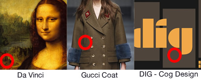
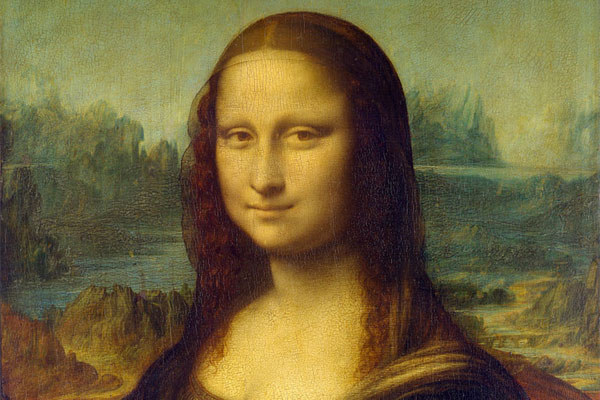
Da Vinci himself even used a palette of browny-green ‘couché-related’ colors throughout the background of the Mona Lisa. This seems to back up the idea that context and history has a lot to do with how we see a color.
The Problem with Metallic Colors
The funny thing is, historically, the two most common colors in Australian cigarette packaging have been:
- Red: signalling vigour and strength (i.e. Malboro and Winfield)
- Gold: signalling wealth and prestige (i.e. Malboro Gold and Benson & Hedges)
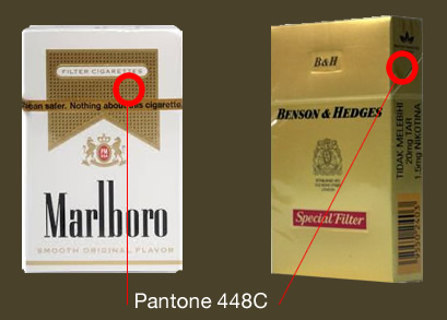
Even the internal wrapper was often a gold-backed foil.
When you use any metallic card in packaging, the color naturally changes depending on where the light source is positioned – with gold you may see any color from a light lemon yellow in the highlights to a dark, deep chocolate in the shadows.
And – yes, you guessed it – a color that reads as something very, very close to Pantone 448C.
Now, I see these the new cigarette boxes quite often, and to me, visually they still read as a metallic gold – just not quite catching the light. I know that’s not the case, but with the shiny plastic wrappers, my brain just can’t shake that idea.
Perhaps – given the specific history of cigarette packaging – a ‘puke green’ or ‘rotting pink’ might have been a better choice than a brown with ‘aspirations of being gold’.
And maybe the surveyed smokers knew exactly what they were doing when they answered those survey questions?
How do you feel about Pantone 448C?
Me – I don’t hate the color.
In fact, I’ll be looking for design opportunities to slot it in.
Originally published in the SitePoint Design Newsletter.
Frequently Asked Questions (FAQs) about Colors and Their Perception
How does color perception vary among different individuals?
Color perception can vary greatly among individuals due to several factors. These include the physical condition of the eyes, the presence of any color vision deficiencies, and even cultural and personal associations with certain colors. For instance, some people may associate the color red with danger or love, while others may associate it with prosperity or luck. These associations can influence how we perceive and react to different colors.
Are there any universal meanings associated with colors?
While color perception can be subjective, there are some universal associations that many cultures share. For example, blue is often associated with calmness and stability, while red is frequently linked to passion and intensity. However, these associations can still vary depending on the context and individual interpretation.
How does color psychology impact marketing and branding?
Color psychology plays a significant role in marketing and branding. Different colors can evoke different emotions and reactions from consumers. For instance, green is often used in branding to signify growth, health, and eco-friendliness, while black can signify luxury and sophistication. Understanding these associations can help businesses choose the right colors for their branding to effectively communicate their brand values and attract their target audience.
Can colors have negative connotations?
Yes, colors can have negative connotations depending on their context and cultural interpretation. For example, in some cultures, white is associated with purity and innocence, while in others, it can symbolize death and mourning. Similarly, while red can signify love and passion, it can also be associated with danger and anger.
How does color affect our daily lives?
Color has a profound impact on our daily lives. It can influence our mood, behavior, and decision-making process. For instance, the color of a room can affect how relaxed or stimulated we feel. Similarly, the color of a product or its packaging can influence our purchasing decisions.
What is the role of color in art and design?
In art and design, color is a powerful tool for conveying emotions, setting the mood, and creating visual interest. Artists and designers carefully choose and combine colors to create a certain look or feel, and to communicate their message effectively.
How does color vision deficiency affect color perception?
Color vision deficiency, also known as color blindness, affects how individuals perceive and distinguish between different colors. The most common type is red-green color blindness, where individuals have difficulty distinguishing between red and green. This can affect various aspects of life, from simple tasks like choosing ripe fruits to more complex tasks like interpreting traffic lights.
Can colors influence our physical and mental health?
Research suggests that colors can indeed influence our physical and mental health. For instance, exposure to blue light can affect our sleep patterns, while being surrounded by greenery and nature can reduce stress and improve mental well-being. However, more research is needed to fully understand the extent of these effects.
How does the use of color vary in different cultures?
The use and interpretation of color can vary greatly among different cultures. For example, in Western cultures, black is often associated with mourning, while in some Eastern cultures, white is the color of mourning. Understanding these cultural differences in color interpretation is important, especially in fields like marketing and communication.
Can our perception of color change over time?
Yes, our perception of color can change over time due to several factors. These include aging, changes in our physical health, and even shifts in our cultural and personal associations with certain colors. For instance, as we age, our eyes may become less sensitive to certain colors, altering how we perceive them.

