


Key Takeaways
- White space, also known as ‘visual silence’, is a critical design element that helps focus a user’s attention and improves the functionality of a design. It comes in two types: Active (added for emphasis and structure) and Passive (space between words or around a logo).
- White space also has two sizes: Micro (smaller areas between letters, words or adjacent graphical elements) and Macro (larger volumes of space between columns or paragraphs). Adjusting these can drastically change the overall tone of a design.
- Despite its name, white space can be any color or even a texture that represents negative or empty space in a design. It is used effectively in Call To Actions (CTAs) and to evoke emotional responses, among other things.
- Designers should resist the urge to fill every space in their design with elements. Empty space is not wasted space. Companies like Volkswagen and Apple have used white space effectively in their designs to create focus and improve user experience.
Rowan Atkinson: Welcome to Hell
Before we start, take a look at a minute or so of the video above.
What did you notice? Most likely, Rowan Atkinson’s incredible wit, but did you notice the way he makes use of silence to make people laugh? That’s called comic timing and it’s one of the most important skills a successful comedian can possess.
Try to imagine Rowan’s performance without those pauses in-between. It’s not so funny now because the silence is key to what makes each joke work. This is silence with an important purpose.
The same situation exists in music – though it might be in the form of a lull before a loud crescendo rather than complete silence.
In the example above, notice how the beat ‘drops’ at 0.45 seconds and again at 1.29? The quietness builds the drama for what is coming up next. I’ve selected a dance track but I could have chosen Beethoven’s 5th just as easily.
So, in both examples above we can see that ‘quietness’ is a critical factor when you want to focus someone’s attention. And that is precisely what ‘white space’ is all about.
In terms of web design, white space usually refers to the areas with no text or imagery. We can think of it as ‘visual silence’. In order for our design to function properly, we need to use white space in good rhythm with our used space
Though Google hasn’t always been known for their pure design skill, they’ve certainly always been a great advocate for white space, as their famous homepage attests. Launched at a time when competitors like Yahoo! were tightly packing their pages with weather, news and email, Google’s low-clutter interface let their users focus on the main task at hand – searching the web – without drawing their attention to places they’re not interested in.
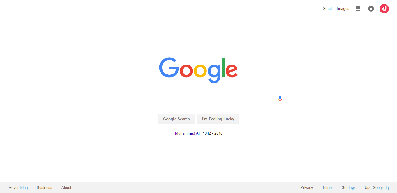
It’s hard to fully appreciate how radical that design decision was nearly 20 years later, but we know where it took them.
White Space Comes in Two Types
Active White Space: This is the space in between elements in the design which is often added for emphasis and structure. This type is asymmetrical and makes the design look more dynamic and active.
Passive White Space: This is the space between words on a line or the space surrounding a logo or some other graphical element.
Take a look at 500px’s homepage to see how active and passive white space is used.
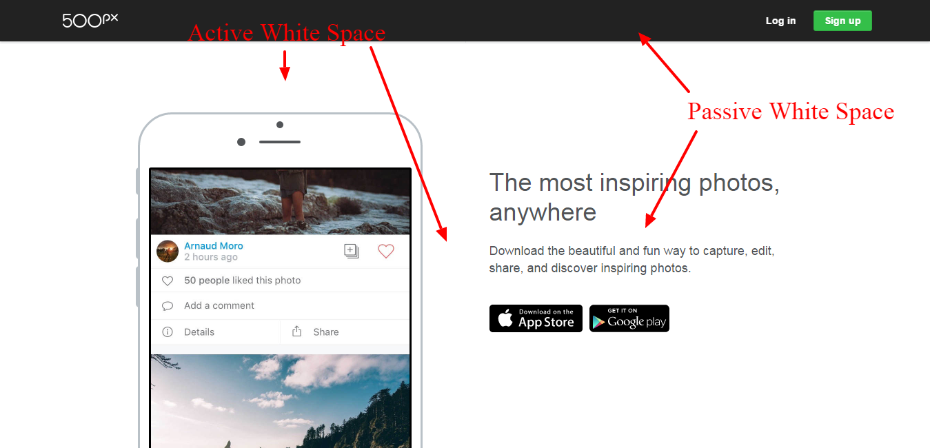
When dealing with white space, we’re mostly concerned with the active white space, but we still need to pay close attention to the passive white spaces and how it works with our general design.
White Space Comes in Two Sizes:
Micro White Space: is the term that is given to the smaller area of white space, between letters and words and between graphical elements adjacent to one another. Adjusting the micro white space in a design most often adjusts the overall tone of a design without changing its ‘heart’ – similar to dialing down the BPM in a dance song. It’s the same song but sleepier.
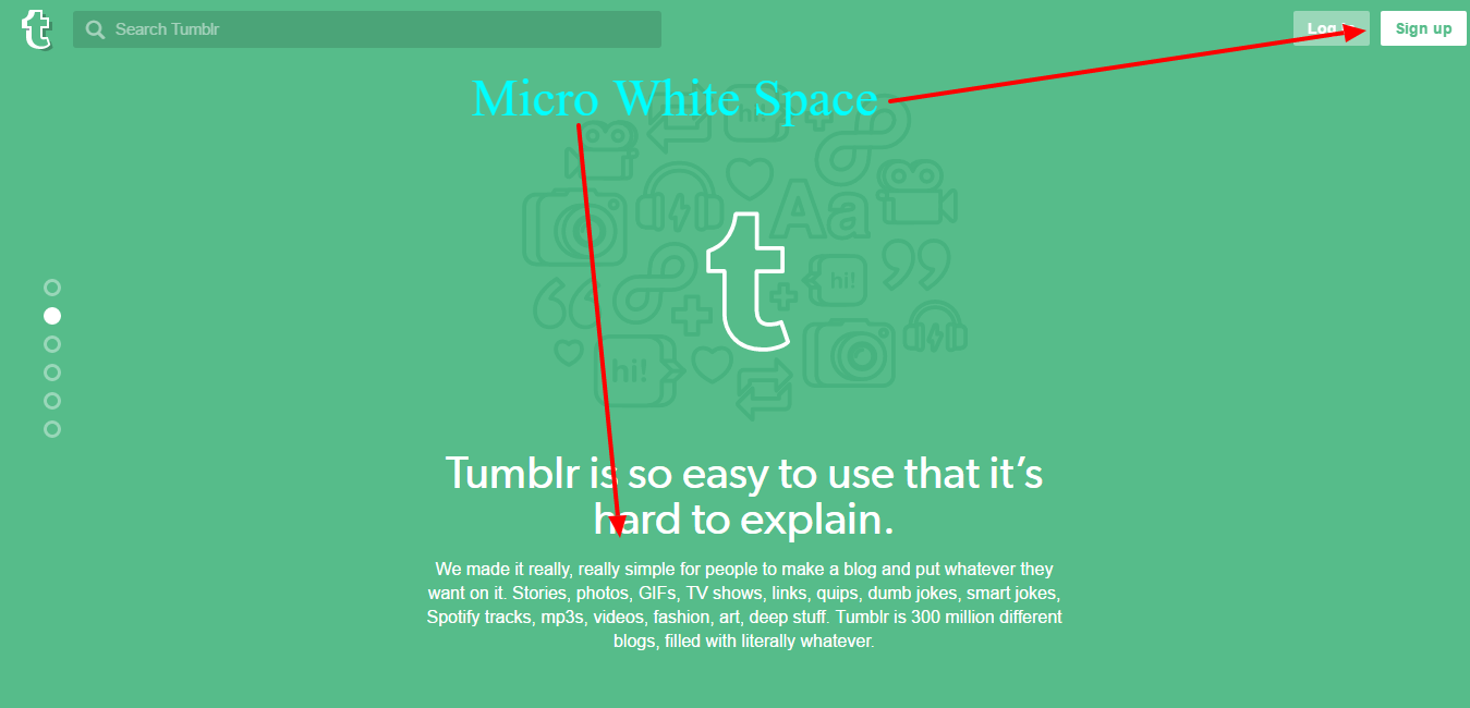
As outlined in the image above, you can see the space between the ‘Log In‘ and ‘Sign up‘ buttons and the micro white space between the heading and the paragraph.
Macro White Space: is the term given to the larger volumes of white space, such as the space between columns or paragraphs. Optimizing your ‘macro white space’ often changes your design drastically, with the potential to improve your user’s flow and rhythm throughout the web page.
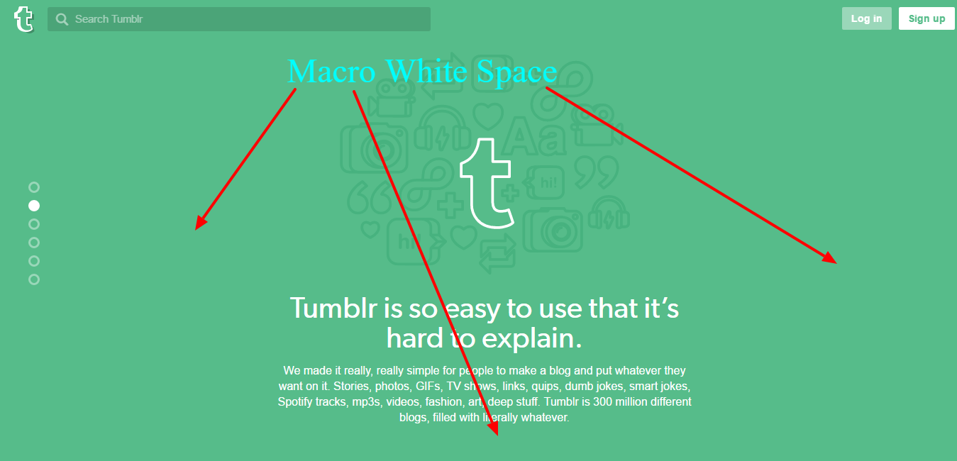
The sides and the empty footer clearly represents the ‘macro white space’ in the Tumblr design.
Is White Space Really White?
While the term ‘white space’ seems to suggest a lack of color or tone, this can be a little misleading. White space can actually be any color that represents negative or empty space in your design – yellow, blue, green or even a texture or photograph (as the Todoist example below shows).
Though it doesn’t matter what color you choose, keep in mind colors and texture are often more interesting to look at than stark white. The principles still apply even if you choose a different color or texture.
Where And How To Use White Space:
Using White Space for CTA’s (Call To Actions)
Always assume that the user doesn’t know where to go next, and design your white spaces accordingly. The idea itself is simple, if nothing is near a button in a page it means that button should be clicked next.
On the other hand, if the page is crammed with elements near that button the user would not even see the button due to the clutter.
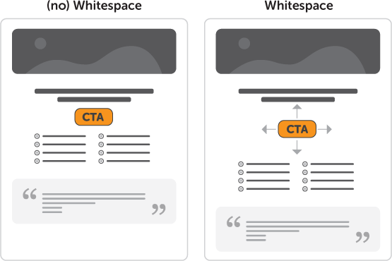
As you can see above, the second CTA is more prone to interaction than the first since it’s not covered by elements all around.
Using White Space for Emotional Response
There are many ways to evoke emotion in design including typography, color, and imagery. While all of these are useful for imposing additional drama, arguably white space that can add the most drama and emotion to a page for the lowest design cost – Some might call it ‘bang-for-buck’.

As you can see, Todoist uses white space around the main headline, which in turn lets the background image shine and thus convey some positive emotions. They’re using an image of a happy guy instead of the Application itself which is also a big plus.
Fight the urge to fill in the blanks
As designers – and humans in general – we have a natural tendency to want to fill in spaces we find with ‘stuff’. If we buy a bigger closet – or garage or house for that matter – it rarely takes us long to fill this new space.
This habit often insinuates itself into our designs as well. Whenever we see an empty area in our design we start to think “What can I add there?“. This mindset can be a problem for designers.
So, rather than filling in your design with elements, try placing a single CTA button in the middle of the page and create a ‘safe zone’ (empty space) around it. Always keep in mind that empty space is not wasted space.
Who Uses White Space Really Well?
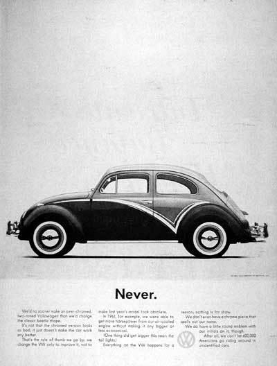
Throughout their history, Volkswagen has been a master of white space in their magazine ads. From the beginning, their simple yet dynamic layouts stood out like a beacon at a time when magazine ads were predominantly busy and static.
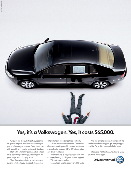
You can clearly see the macro space above and under the car, which makes the car itself the center of the focus for the reader. The asymmetrical shape of the white space keeps our eye traveling around the car, down the text and back up, never stopping.
What happens if we’re a little bit cheeky and reconfigure this VW ad to cut out this extra white space?

All the main components seem to remain, but the ad doesn’t function anywhere near as effectively now
- The car seems less impressive
- Our eye doesn’t flow as freely
- The story of the fainting man is harder to tease out
We broke it. It’s safe to say, don’t take this piece to your design interview at Volkswagen.
As you can see below, from the 1960’s through to today, Volkswagen has continued to use white space to great effect.

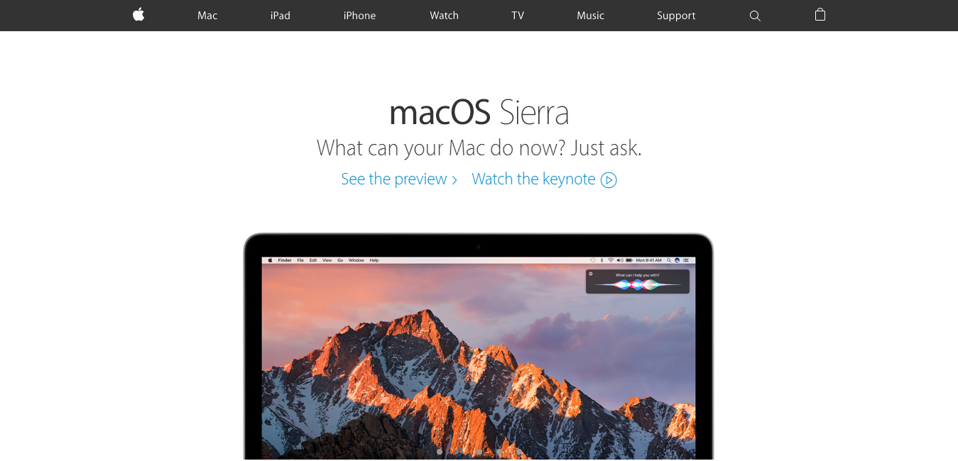
Though a relative newcomer compared to Volkswagen, Apple has also been a leading advocate for white space design – from their website to their hardware to their famous Apple store interior design and architecture.

Conclusion
So, we learned that white space is not white, and it’s the part in our designs where nothing is happening. This is an essential principle of design that any designer shouldn’t overlook, as it decides whether a page is usable or not and whether a specific element is getting the needed attention.
We learned that white space has two distinct types (Active vs Passive), and two different sizes (Micro vs Macro). We saw examples of how the white space equivalent is used in comedy (Comic Timing) and how it makes people laugh more, and also examples in music.
Lastly, I would add that as a designer you should keep in mind that less is more, and work accordingly. White space either makes your design or breaks it.
I hope these ideas help with your next design.
Frequently Asked Questions about White Space in Design
What is the psychological impact of white space in design?
White space, also known as negative space, plays a significant role in design psychology. It helps to create a balance, improve readability, and highlight important elements in a design. By providing a visual breathing room for the eyes, it can make your design feel open, fresh, and modern. It also helps to create a certain mood or tone, such as sophistication, elegance, or minimalism. Moreover, white space can guide the viewer’s attention and make the information more digestible and easier to understand.
How can I effectively use white space in web design?
White space is a crucial element in web design. It can be used to separate different sections, improve readability, and create a focal point. To use it effectively, consider the following tips: Use it around text and images to prevent clutter and improve readability. Use it to separate different sections and elements. Use it to highlight important elements such as call-to-action buttons or key messages. Remember, white space doesn’t necessarily have to be white. It can be any color, texture, pattern, or even an image.
What are the common mistakes when using white space in design?
Some common mistakes when using white space include not using enough of it, using it inconsistently, and not considering it in mobile design. Not using enough white space can make your design feel cluttered and overwhelming. Inconsistent use of white space can make your design look unprofessional and confusing. Not considering white space in mobile design can lead to a poor user experience, as mobile screens are smaller and require more careful use of space.
How does white space affect user experience?
White space significantly impacts user experience. It helps to create a clean, uncluttered design that is easy to navigate and understand. It can also improve readability and comprehension by separating different elements and making the text easier to read. Moreover, it can guide the user’s attention and help them focus on the most important elements. A well-designed white space can make the user experience more enjoyable and efficient.
Can white space be considered a waste of space?
No, white space is not a waste of space. It is a crucial element in design that helps to improve readability, create balance, and highlight important elements. While it may seem like it’s not serving a purpose because it’s empty, it’s actually doing a lot of work. It’s providing breathing room for the eyes, guiding the viewer’s attention, and helping to create a certain mood or tone. So, far from being a waste, white space is a powerful tool in design.
How does white space contribute to minimalistic design?
White space is a key element in minimalistic design. It helps to create a clean, simple, and uncluttered look that is characteristic of minimalism. By removing unnecessary elements and leaving only the essentials, white space allows the important elements to stand out. It also contributes to the sense of simplicity and elegance that is often associated with minimalistic design.
What is the difference between active and passive white space?
Active white space is used intentionally to guide the viewer’s attention and improve the layout and structure. It’s often used to highlight important elements or separate different sections. Passive white space, on the other hand, is the empty space that naturally occurs, such as the space between lines of text or the space around graphics. Both types of white space are important and contribute to the overall design.
How does white space impact brand perception?
White space can significantly impact brand perception. It can make your design look professional, sophisticated, and high-quality. It can also convey a sense of elegance, luxury, or minimalism, depending on how it’s used. By improving readability and user experience, white space can also enhance the overall perception of your brand.
Can white space be colored?
Yes, white space can be any color, texture, pattern, or even an image. Despite its name, it doesn’t necessarily have to be white. The term “white space” simply refers to the empty space in a design, regardless of its color or appearance.
How can I measure the effectiveness of white space in my design?
The effectiveness of white space can be measured in several ways. You can use user feedback, user testing, and analytics to see how users interact with your design. You can also look at metrics like engagement, conversion rates, and bounce rates. If your design is easy to understand, enjoyable to use, and successful in achieving its goals, then your use of white space is likely effective.

