


According to a study by Missouri University of Science and Technology, over 94 percent of users’ first impression of a website are design-related. Research also shows that a whopping 88 percent of people do not return to websites due to usability issues.
If you think all it takes to design a website is having good technical and aesthetics skills, think again. While aesthetics is important (this is 2016!), it isn’t the only thing that makes a website – in fact, it isn’t even the most important. Usability matters a great deal, and designing a website with the following rules of psychology in mind will always result in a more powerful website.
Key Takeaways
- Context is crucial in UX design. Don’t break established UX patterns just to be innovative. Users expect certain elements to be in certain places or orders due to repeated exposure to these things.
- Strategic use of images in web design can direct users’ attention. An image of a person that focuses on the copy on a page directs people to focus on the copy, and an arrow on a landing page that points to a signup form tells people to pay attention to that signup form.
- Drastic redesigns can lead to backlash due to users’ resistance to change. Instead, make redesigns gradual and subtle, and actively gather feedback in the process.
- Font size and simplicity can affect readers’ moods. Larger, simpler fonts improve the mood of readers and make instructions appear easier to carry out. Different font sizes can also be used to make certain text elements stand out.
Rule #1: Context is Everything in UX

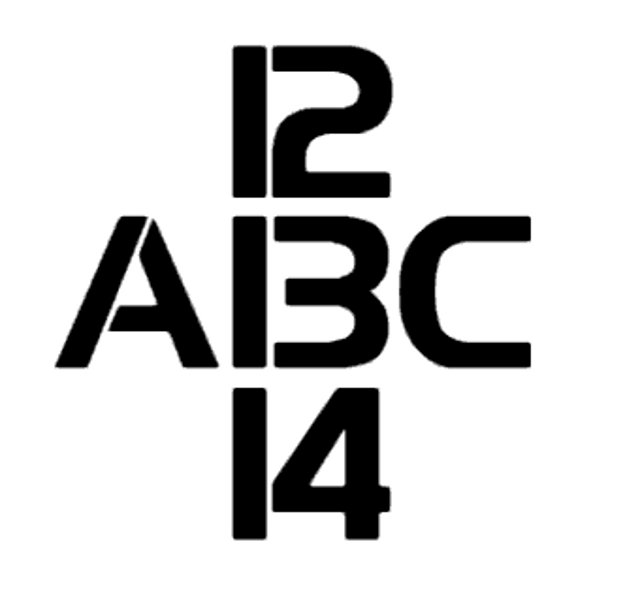
What do you see above? A number or a letter? 13 or B?
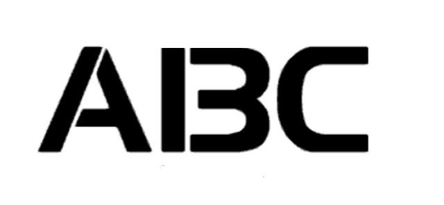
Take a careful look at the above image. What do you see? A B C, right? Okay, take a look at the below image:
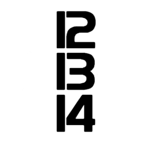
You’re probably seeing 12, 13, 14, right?
Below is the original image where the above two images were extracted from:
In the first example, you’re either going to see 13 or B depending on your previous experiences or preconceived notions. In the second example, you’re highly unlikely to see A 13 C because the A preceding the controversial B and the C succeeding it have influenced your perception of it. In other words, you’re most definitely certain that it is B, not 13.
In the third example, however, you’re highly unlikely to see 12 B 14 because 12 and 14 have influenced your perception of things – if 12 comes first and 14 comes last, of course, the controversial “thing” in the middle must be 13 and not B, right?
While the above example is a bit more direct, here’s a more subtle one:

Are you seeing two faces or a vase in the above image?
Chance are you’ll see two faces if your most recent experience is with humans, and you’re more likely to see a vase if you just spent a lot of time with vases.
The examples used in this section explain the perceptual set theory.
In psychology, perceptual set theory is our tendency to perceive information in a certain way based on expectations and information we may already have. Perceptual set is usually influenced by culture, background or other information/situations we were previously exposed to.
The good thing about perceptual set is that it can be influenced; with the second image shown in this section, if you were shown just 12 and 14, you automatically assume that the controversial “number” is 13. If you were shown A and B, you automatically assume that the controversial “letter” is B. If you were shown the controversial number/letter alone, though, you’ll see a number or letter depending on your experience and existing preconceptions.
So, how does this apply to your website design?
The UX Principle: Don’t Break Established UX Patterns Just to be Fresh or Cool or Fun
It’s common for creative people to want to innovate and change things dramatically from what is common in your niche. But that innovation can kill conversions from your web design. When people visit a website, they expect certain elements to be in certain places or orders.
For instance, when you design a form that asks for their name and email, they expect the name to be asked first and email later. These are preconceived ideas in their mind due to repeated exposure to these things, and it is important not to tamper with these notions (or certainly not without a very good reason).
When you do decide to innovate, be sure to include clues and guides that make it easy for people to know exactly what the new elements represent – this is UX101.
Rule #2: Image Positioning Can Have Split User Attention
No web design is complete without visuals, but – whether you’re using stock photos or real images – using images in web design isn’t as simple as most people think.
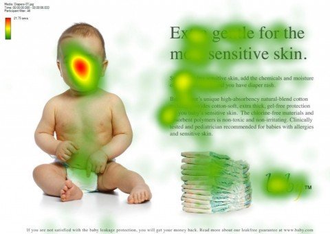
Take a look at the below example:
Then take a look at this one:
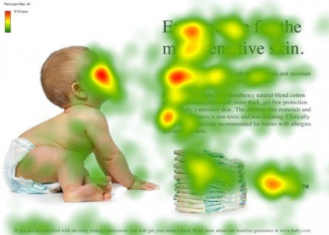
Both images include the same copy and advertise the same product. The only thing that changed is the positioning of the image of the baby; in the original example, the baby was made to look forward. As a result, more people focused on the baby’s gaze. In the second example, however, the baby was made to look sideways; in return, a significant number of people directed their gaze sideways – exactly where the baby’s gaze was directed.
Here are two more examples that validate the same principle:
The below image shows the lady in the picture directing her gaze at you:
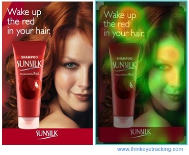
The below image shows the lady in the picture directing her gaze at the product:

How does this apply to your website design?
The UX Principle: Make Sure Your Use of Images is Strategic
The wrong image use can distract people from the message you’re trying to get them to notice – significantly reducing your conversions in the process.
When using images in your web design, it is important to realize the power of positioning; an image of a person that focuses on the copy on a page directs people to focus on the copy. An arrow on a landing page that points to a signup form tells people to pay attention to that signup form. Instead of simply using images, make sure the images you use direct people to focus exactly on what you want them to focus on.
Rule #3: Avoid Drastic Redesigns – Use a Gradual and Subtle Approach
Why is it that the biggest, most successful websites very rarely do major redesigns? And why is it that whenever major websites do a redesign there is almost always a massive blacklash?
This is explained by Weber’s Law of Just Noticeable Difference. Weber’s law states that “the size of just noticeable difference is a constant proportion of the original stimulus value,” where just noticeable difference is “the minimum amount by which stimulus intensity must be changed in order to produce a noticeable variation in sensory experience.”
More simply put, Weber’s law states that you won’t always notice a difference to things at the slightest change; for example, if you’re lifting an object that weighs 10kg, you won’t easily notice a difference if you add an extra 0.1kg of weight. If, however, you add an extra 1kg, the difference will be easily apparent. In this instance, the extra weight added (1kg) to make the person lifting the object notice a difference is called the difference threshold.
This same principle can be used for effective web design; when Facebook, Twitter, Google or some other major websites make a massive redesign, there is usually backlash.
It’s been psychologically proven that we don’t like change – especially drastic ones. A study published in 2010 found that we tend of have a strong preference for things that have been around for long; the study found that students preferred an old course requirement that has been in place for long even when a new course requirement could mean less course work for them. The study also found that the longer something has been in place, the better. Our strong resistance to change can be linked to evolution and our survival instincts; we’ve evolved to find safety in consistency, so we resist anything else.
How does this apply to your website design?
The UX Principle: Make Redesigns Gradual and Subtle.
Like Google, Facebook and other major websites have found out (some, the hard way!), change is better when it is subtle and gradual.
Don’t introduce a complete website redesign too soon; gradually change various elements, actively gathering feedback in the process. If you want to introduce a redesign that is too drastic, split test it to a small portion of your users first. Watch their reaction, and let that influence how you roll out the design to your general users.
Rule #4: Use Fonts to Lighten Readers’ Moods
What, if anything, does psychology say about font size? Is smaller or bigger font better?
A 2012 study found that font size matters and that larger fonts elicit stronger emotional connections in the reader. Interestingly, experts advise not going with a font size lesser than 16px for content.
That said, research hasn’t found any difference in reading comprehension between font sizes, but legible and simple fonts (and aren’t bigger fonts more legible?) have been found to make instructions appear easier to carry out and also improve the mood of people reading them.
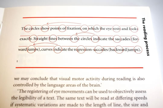
It is also important to understand the concept of a “Scan Path,” which explains the natural way our brain reads and process information: When we read content, on the web or elsewhere, our eyes follow a natural pattern called a “Scan Path.” In essence, our eyes read content in tiny jumps – during which everything is blurred – and then pauses so that our brain can take a snapshot of the letters we’re reading, arrange them into words and interpret the meanings. All these happens in a split second, so it is impossible to notice. These jumps are called saccades while the pauses are called fixations, and both make up a Scan Path.
It is important to understand this natural process of reading content to understand how to effectively design for readers. Scan Paths follow a Z-shaped pattern, and we’re mostly not fully “conscious” until there’s a “pattern interrupt.” In short, if you want readers to pay more attention to certain text elements in your web design, it mustn’t be in the same font size as everything else.
How does this apply to your website design?
The UX Principle: When Using Fonts, Simple and Large is Always Better
Here are a few tips for better font usage in your design:
- Use simple fonts; anything too fancy and you make things overcomplicated.
- Use larger fonts; not only do they make it easier to read your content, but they also improve the mood of the readers.
- Introduce a bigger/different font to make important elements stand out; font consistency throughout the page, especially for key elements in your design that you want people to notice, can kill conversions.
Frequently Asked Questions on UX Design and Psychology
What is the role of psychology in UX design?
Psychology plays a crucial role in UX design as it helps designers understand how users think, behave, and feel. This understanding is essential in creating user-friendly interfaces that meet the needs and expectations of the users. By applying psychological principles, designers can predict how users will interact with a product, making it easier to design intuitive and efficient interfaces.
How can I apply the psychology of colors in UX design?
Colors can significantly influence our emotions and decisions. In UX design, you can use colors to guide users’ attention, convey information, and evoke specific emotions. For instance, red is often associated with urgency or danger, while green signifies success or progress. However, it’s important to consider cultural differences as colors can have different meanings in different cultures.
What is the Von Restorff effect and how can it be used in UX design?
The Von Restorff effect, also known as the “isolation effect,” states that items that stand out are more likely to be remembered. In UX design, you can use this effect to highlight important elements on your page, such as call-to-action buttons or critical information, by making them visually distinct from other elements.
How can the psychology of shapes influence UX design?
Shapes can also convey meanings and evoke emotions. For example, circles are often associated with harmony and completeness, while squares suggest stability and balance. By understanding these associations, you can use shapes strategically in your design to communicate your message effectively.
What is cognitive load and how can it impact UX design?
Cognitive load refers to the amount of mental effort required to process information. If a user interface is too complex or cluttered, it can increase cognitive load, leading to confusion and frustration. To minimize cognitive load, aim for simplicity and clarity in your design. Use clear labels, consistent layouts, and avoid unnecessary elements.
How can I use the psychology of choice in UX design?
The psychology of choice suggests that while users appreciate having options, too many choices can lead to decision paralysis. In UX design, it’s important to provide users with meaningful choices but avoid overwhelming them. For instance, you can limit the number of options in a menu or use progressive disclosure to reveal information gradually.
What is the Fitts’s Law and how can it be applied in UX design?
Fitts’s Law states that the time required to move to a target depends on the distance and size of the target. In UX design, this means that important elements should be large and close to where the user’s attention is likely to be, making them easy to click or tap.
How can the psychology of perception influence UX design?
Perception is how we interpret sensory information. In UX design, understanding perception can help you create interfaces that align with how users naturally process information. For example, users tend to perceive elements that are close together as related, which you can use to group related items.
What is the psychology of habit and how can it impact UX design?
Habits are automatic behaviors that we perform without conscious thought. In UX design, you can leverage habits by creating consistent and predictable interfaces. This allows users to use the product more efficiently as they don’t have to think about each action.
How can I use the psychology of motivation in UX design?
Motivation drives behavior. In UX design, you can use rewards, feedback, and challenges to motivate users to engage with your product. For instance, you can provide positive feedback when a task is completed or use gamification elements to make the experience more enjoyable.

