

Key Takeaways
- Distinctive headline fonts can significantly enhance the visual character of a site and draw readers into the content; eight impressive fonts are Goku, Dual, GrouchoCaps, Pier, Lombok, Simplifica, Butler, and Audrey.
- Each font has its unique feel and application; for instance, Goku is perfect for high-end sites, Dual can be used virtually anywhere, GrouchoCaps suits entertaining sites, Pier fits any site’s niche, Lombok is ideal for fashion sites, Simplifica works for most sites, Butler is great for formal sites, and Audrey is best for fashion and beauty niches.
- When choosing a distinctive font for a headline, consider the tone and mood you want to convey, the readability of the font, and the medium it will be used on; while using multiple fonts in one headline is possible, it’s generally recommended to stick to two to avoid clutter.
Every great story needs an equally effective headline – after all, the most brilliantly written text has zero value if no readers are drawn into reading it.
While a well-stocked font library is a must for any serious designer, sourcing legible, attractive, headline fonts presents its own challenges. On text-heavy content sites – for instance, The New Yorker or A List Apart – the headline typography sets much of the visual character of the site. So, today I’ve put together a list of 8 impressive fonts designed to give your headlines an extra touch of star power. Enjoy.
Goku
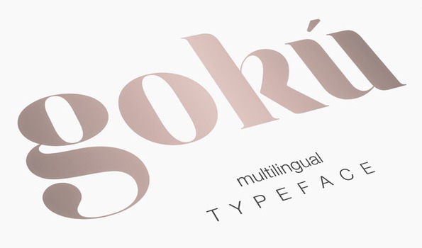
Admit it, Goku is a gorgeous typeface that channels a sophisticated energy with a blend of the artsy for an elegant look that will stop traffic. It’s no surprise that this multilingual set was originally designed for a Watches of Switzerland event.
- Price: $11
- Download
Where to Use: Goku while can be used anywhere it is a font that is best suited for sites that are more high end. Think luxury fashion brands and online editorial magazines.
Where to Use: Robinson is a great font to use for your typical sites. From portfolio to athletic shops and creative agencies it has enough edginess for your more graphically inclined sites.
Dual
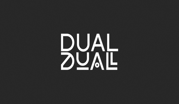
Funky fonts are a thing but getting a fully usable and legible font that still has the ability to surprise is difficult. Thankfully, Dual exists for those who want a touch of the experimental without sacrificing readability. Dual’s ‘parent font’ has a sensible, business-class, geometric feel – but throw is 10 more stylistic sets, the possibilities are almost endless.
- Price: Free to $116
- Download
Where to Use: Thanks to Dual’s two fonts in one style it can be used virtually anywhere. Set 5 is perfect for news and article based sites while the more avante-garde set can easily find a home in more laissez-faire based designs.
GrouchoCaps
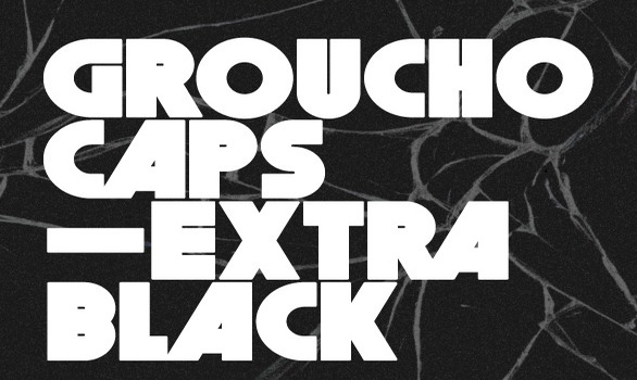
When I want a bold font I really want it bold and Groucho delivers with its all-caps TrueType style. Big, fat words like this are perfect canvases for bold colors and with Groucho’s commanding look there’s no need to worry that someone didn’t catch your headline.
- Price: $9
Where to Use: Groucho’s big look is perfect for those not so serious sites. Think bright colored home and landing pages and sites that simply exist to entertain and possibly get you to buy a few fizzy drinks.
Pier
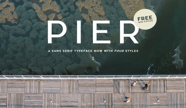
Bigger is not always better even if you are trying to create a catchy headline. Pier is that compromise between a bold or skinny typeface for a final result that hit the sweet spot for a lot of projects. The modern look makes this an everyday type font but it is far from a pass over if used correctly.
- Price: Free to $100
- Download
Where to Use: Pier is like the girl next door, you probably want to take her everywhere and you should. With four styles available Pier is one of those too good to be true but still perfect fonts that can be used no matter your site’s niche.
Lombok
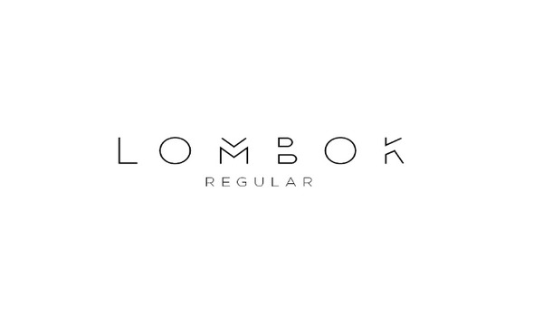
Fancy fonts are and will forever be “a thing” but the Lombok typeface shows you that you can still keep a formal look about your font while experimenting. A minimal line weight and sharp geometric play makes Lombok standout without being garish.
- Price: Free for personal use. (Contact Alexandre Pietra for commercial pricing.)
- Download
Where to Use: Lombok is a typeface that will work perfectly for festival type sites and those in the realm of fashion from boutiques to online fashion zines.
Simplifica
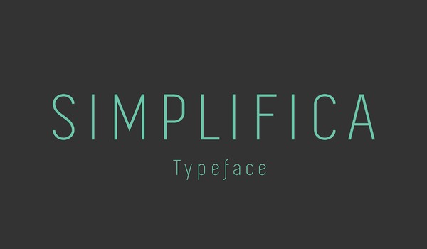
Every now and again – mostly now – I want a classy, geometric font that is a little lighter in the weight department. Simplifica is exactly that. An easy-on-the-eye, legible sans-serif, Simplifica’s high caps height commands attention without needing to be bold and in your face.
- Price: Free
- Download
Where to Use: Simplifica is another one of those typefaces that can be used on most occasions on any site without compromising the site’s message. From news to creative agencies, Simplifica can hold its own.
Butler
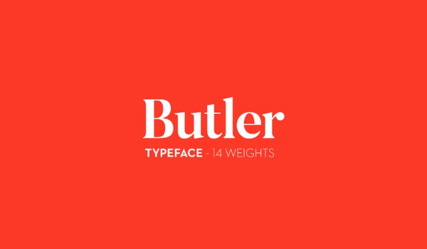
Admittedly, I’ve never been a huge fan of serif fonts – probably a hang-over from having to use Times New Roman as a child to write essays – but I absolutely love Butler. If you’re looking for a modern take on a serif that boasts clean curves, carries enough weight to be taken seriously, but is still refined, then Butler is the font for you.
- Price: Free
- Download
Where to Use: Butler makes a great humanist addition to the more formal or high-end sites. Think health insurance, family law or tertiary studies.
Audrey
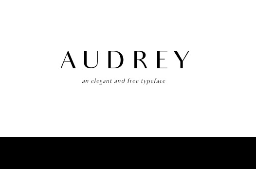
When talking about typefaces, the word ‘elegant’ often brings to mind script fonts but Audrey is elegant in its own right. Taking on curvy geometric and severe straight lines for a masterpiece of contrast appeal, Audrey reminds me of a perfume ad.
- Price: Free
- Download
Where to Use: Audrey’s elegant charm is best reserved to the fashion, health and beauty niches but I’m certain you could get away with using it somewhere like a fancy four-star restaurant.
Do you have a favorite set from the list above? Have your own favorite typeface you like to use for headlines? Feel free to share them with us.
Frequently Asked Questions about Distinctive Headline Fonts
What makes a font distinctive?
A distinctive font is one that stands out due to its unique design elements. These elements can include the shape of the letters, the spacing between them, the thickness of the strokes, and other stylistic features. Distinctive fonts are often used in headlines to grab the reader’s attention and make the content more engaging. They can also help to convey a particular mood or tone, and can be a powerful tool in branding and marketing.
How do I choose the right distinctive font for my headline?
Choosing the right distinctive font for your headline depends on several factors. First, consider the tone and mood you want to convey. Different fonts can evoke different emotions – for example, a bold, heavy font might convey seriousness, while a light, script font might convey elegance or whimsy. Second, consider readability. The font should be easy to read at a glance, especially if it’s being used in a headline. Finally, consider the medium. Some fonts may look great on a computer screen but not as good in print, or vice versa.
Can I use multiple distinctive fonts in one headline?
While it’s possible to use multiple distinctive fonts in one headline, it’s generally not recommended. Using too many different fonts can make the headline look cluttered and confusing, and can detract from the message you’re trying to convey. If you want to use multiple fonts, a good rule of thumb is to stick to two – one for the main headline and one for the subheadline or tagline.
Are there any free distinctive fonts available?
Yes, there are many free distinctive fonts available online. Websites like 1001freefonts.com and fontspace.com offer a wide range of free fonts in various styles. However, it’s important to check the licensing terms before using a free font, as some may have restrictions on commercial use.
What are some examples of distinctive headline fonts?
Some examples of distinctive headline fonts include Futura, Helvetica, Garamond, and Times New Roman. These fonts are known for their unique design elements and are widely used in various types of media.
How can I install a new font on my computer?
Installing a new font on your computer is usually a straightforward process. After downloading the font file, simply open it and click the “Install” button. The font should then be available in any program that uses system fonts.
Can I use distinctive fonts in my logo?
Yes, distinctive fonts can be a great choice for a logo. They can help to make your logo stand out and be memorable, and can convey the personality of your brand.
Are there any trends in headline fonts?
Trends in headline fonts can change over time, influenced by factors such as changes in design aesthetics, technological advancements, and cultural shifts. Some current trends include the use of bold, heavy fonts; minimalist, sans-serif fonts; and retro-inspired fonts.
Can I create my own distinctive font?
Yes, with the right software and skills, you can create your own distinctive font. This can be a complex process, however, and may require knowledge of typography and graphic design.
How can I learn more about typography and font design?
There are many resources available for learning about typography and font design. Online courses, books, and tutorials can all provide valuable information. Websites like myfonts.com and typetype.org also offer a wealth of information and inspiration.

