How to Set CSS Margins and Padding, and Cool Layout Tricks
We cover the use of CSS margins vs padding, the box model, bleeding and collapsing margins, and concludes with some cool layout tricks.
We cover the use of CSS margins vs padding, the box model, bleeding and collapsing margins, and concludes with some cool layout tricks.

Too many Figma plugins to choose from? Supercharge your design workflow with our picks for the best Figma plugins.

Craig introduces CSS options for setting up a responsive website, including media queries, Flexbox and Grid, and covers tools for testing cross-browser compatibility.
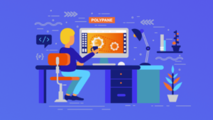
Kilian Valkhof introduces Polypane, a multi-function web browser built for developing websites in multiple views at once.

How do we support this ever-increasing array of devices? The answer is responsive web design, which allows websites to adapt to screens of all sizes.
This article outlines how to create a basic media query, utilizing logical operators and media features to target any type of device

David Berner explores how to create reusable, Responsive Web Components that can adapt and change inside responsive web designs.
Microsoft's Aaron Gustafson explains the challenge of truly responsive web design aimed at as many users as possible.
Microsoft's Aaron Gustafson explains the right way to design and test for the huge number of different devices used to access the web.
You're probably wondering if you should update your website so it's mobile friendly and consistent across all platforms. Read this article to find out.
Richa Jain discusses why we might have jumped on the bandwagon of Media Queries too quickly, not recognizing the real solution to cross-device layouts.
Matthew Setter shows us how to make responsive website testing a breeze with two Chrome-based tools.
Is your responsive web design only constrained by min-width and max-width media queries? Craig explains why min-height and max-height have good uses too.
Creating a responsive table can be tedious, requiring CSS and JavaScript skills. Brett Romero has a guide to getting it done easily, in Foundation.
This week's round-up of news and trends in web design includes a look at RWD bloat, a guide to dealing with CSS specificity, and a massive round-up of SVG.
Ty Strong looks at all the different media features you can use when working with Media Queries in your CSS, for targeting all sorts of devices and types.
In the news this week: Star Trek replicators, responsive web design and the importance of testing. Check out the best links in our weekly round-up.
The segregation of the mobile experience to a subdomain, the ‘m’ domain, seems a little old school. In this article, I'll discuss why it may still be valid.
"Mobile First" may be a clever and concise explanation of progressively-enhanced Responsive Web Designs, but it's confusing our clients and colleagues!

Designing responsively is important, as is designing responsibly. Here's how to Maintain Image Aspect Ratios in Responsive Web Design.
Read Talking Responsive Web Design with Russ Weakley - the Transcript and learn with SitePoint. Our web development and design tutorials, courses, and books will teach you HTML, CSS, JavaScript, PHP, Python, and more.
In a recent post, I detailed how to design a 12-column theme built around a 960 pixel grid. In this article, we will upgrade our theme concept and make the entire thing responsive.
Read Design Responsively With Malleable Mobile Menus and learn with SitePoint. Our web development and design tutorials, courses, and books will teach you HTML, CSS, JavaScript, PHP, Python, and more.