

Key Takeaways
- Responsive design ensures a consistent look and feel across various screen sizes, solving many problems associated with non-responsive sites, such as difficult navigation on mobile devices.
- Media queries, a feature of CSS, allow for the delivery of CSS specific to the detected screen size of the user’s device, enabling near infinite control of the layout.
- The 960 Grid system can be extended with media queries to accommodate various screen sizes, including tablet, mobile landscape, and mobile portrait sizes.
- The 960 Grid system is highly customizable and can be adapted to fit specific design needs, making it a valuable tool in creating responsive designs.
In a recent post, I detailed how to design a 12-column theme built around a 960 pixel grid. In this article, we will upgrade our theme concept and make the entire thing responsive.
By responsive, I mean that the various column widths will adapt to the screen size and keep your content organized. This allows for users with any screen size to see a consistent look and feel.
Responsive is different than fluid in that it steps through various screen sizes and locks the widths of the columns. The content will display consistently in this manner, allowing your site visitors to get a consistent look and feel.
I avoid fluid layouts primarily because I don’t have as much control — and I’m a bit of a control freak when it comes to layout. Bear in mind that this system can easily be modified once you know what you’re doing.
Why Responsive Design?
First and foremost, I hate going to sites on my phone that are not responsive because I’m having to squeeze, pinch, and rotate my screen to find the sweet spot for the site. Often content is difficult to see, text is tiny, and graphics are difficult to see as well.
Second, I also hate when a site has a “mobile” version that is stripped down. My clients hate managing two different versions of a site as much as I hate viewing them. Mobile versions also create problems with search engines that can cause major problems.
In short, responsive design solves a lot of problems and, once in place, is simple to maintain.
Extending the 960 Grid with Media Queries
Media queries are an amazing feature of CSS that allow the browser to detect the screen size the site visitor is using. Then, based upon the detected screen size, the CSS can be delivered specifically to fit the current constraints.
That’s what we’re going to be doing — creating a set of CSS specific to the screen size of the user’s screen. Using media queries, we can stage this very nicely and give ourselves near infinite control of the layout.
Here’s the framework that we’ll be working within. You can modify this to add more screen sizes or less, depending upon your needs:
[sourcecode language=”css”]
.img {width:100%;}
/* Everything before the media queries gets
applied to screen sizes greater than 960 pixels */
/*****************/
/* MEDIA QUERIES */
/*****************/
/* Tablet Screen Sizes */
@media only screen and (min-width: 768px) and (max-width: 959px) {
}
/* Mobile Landscape Screen Sizes */
@media only screen and (min-width: 480px) and (max-width: 767px) {
}
/* Mobile Portrate Screen Sizes */
@media only screen and (max-width: 479px) {
}
[/sourcecode]
Let’s break down what this CSS is doing. First, we make sure that images are going to scale to 100% of their container’s width, which is important for making sure that images resize for each of the various media screen sizes.
Then, we declare the @media screen, which means the code within the braces will apply only to screen sizes. Print is the other main media that you might declare separate CSS to handle, but 3D Glasses are another example that we may be seeing a lot more of…
Next, we establish minimum and maximum widths. This is like an IF statement — if the width in pixels falls in between one of the ranges, apply the following CSS.
Based on the above, our styles cascade in the following:
- All the styles above the media queries get applied
- If the screen width is greater than 768px but less than 959px {…}
- If the screen width is greater than 480px but less than 767px {…}
- If the screen width is less than 479px {…}
Again, you can break this into more or less chunks, but this is a fairly standard way to go.
Adding Tablet Screen Sizes to the 960 Grid
Now, let’s build out the various sizes we want our site to accommodate. For the tablet-sized screens (768px-959px), I simply reduce the sizes of the columns by 80%:
[sourcecode language=”css”]
/* Tablet Screen Sizes */
@media only screen and (min-width: 768px) and (max-width: 959px) {
/* Resize the body */
body {min-width:767px;}
/* Resize the row */
.row {width:767px;}
/* Resize the columns */
.col_12 {width:748px;}
.col_9 {width:492px;}
.col_8 {width:556px;}
.col_6 {width:364px;}
.col_4 {width:172px;}
.col_3 {width:236px;}
}
[/sourcecode]
First, we resize the body to a min-width and get the .row to be a fixed width of 767px. This makes sure the overall width of the page is fixed so long as the screen fits the criteria of this media query. The other columns are simply 80% of the main size.
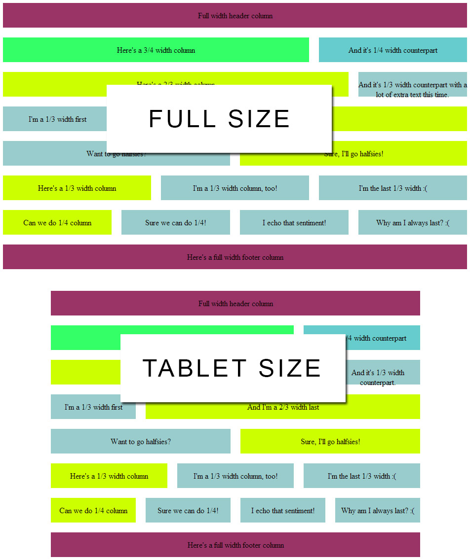
(Click for full-size version)
Adding Landscape Screen Sizes
For landscape views, I made the decision to make thirds, two-thirds, quarters, and three-quarters all equal to half. You may want to change this up.
Remember that you can always declare CSS in-line, so if you want a particular <div> to be a third with a two-thirds next to it, you can do that manually within the media query – just give those divs a unique ID.
So here’s how I changed this up and what it looks like compared to the full-size:
[sourcecode language=”css”]
/* Mobile Landscape Screen Sizes */
@media only screen and (min-width: 480px) and (max-width: 767px) {
/* Resize the body */
body {min-width:479px;}
/* Resize the row */
.row {width:479px;}
/* Resize the columns */
.col_12 {width:460px;}
.col_9 {width:225px;}
.col_8 {width:225px;}
.col_6 {width:225px;}
.col_4 {width:225px; margin-left:0px;}
.col_3 {width:225px; margin-left:0px;}
/* Fix the .last issue */
.last {
margin-left:0;
margin-right:10px;
}
}
[/sourcecode]
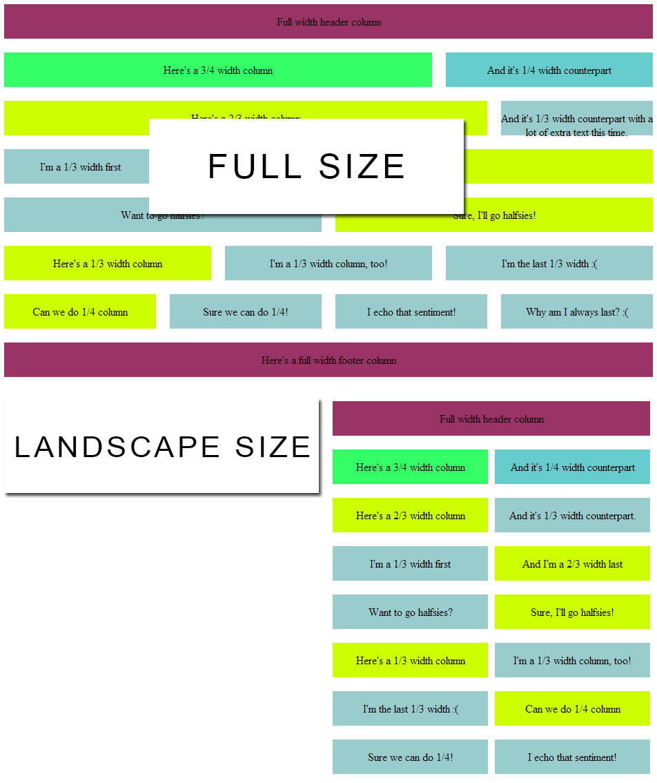
(Click for the full-size version)
As you can see, everything drops into nice, neat little half-width divs for you.
Adding Portrait Screen Sizes
Lastly, for the smallest screes sizes I made everything full-width. This makes it much easier to see and minimizes changes that need to be made site-wide:
[sourcecode language=”css”]
/* Mobile Portrait Screen Sizes */
@media only screen and (max-width: 479px) {
/* Resize the body */
body {min-width:320px;}
/* Resize the row */
.row {width:320px;}
/* Resize the columns */
.col_12 {width:300px;}
.col_9 {width:300px;}
.col_8 {width:300px;}
.col_6 {width:300px;}
.col_4 {width:300px; margin-left:0px;}
.col_3 {width:300px; margin-left:0px;}
/* Fix the .last issue */
.last {
margin-left:0;
margin-right:10px;
}
}
[/sourcecode]
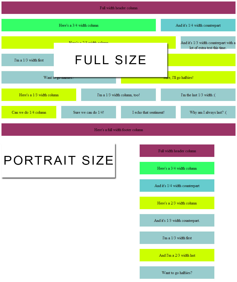
(Click for the full-size version)
Again, on a div-by-div basis, you can always add an ID and create a unique set of sizes just for those.
Putting it All Together
So here’s the full CSS and an HTML template you can work with:
[sourcecode language=”css”]
/* Fix the width of the body */
body {
min-width: 960px;
margin:auto;
}
/* Wrapper */
.row {
width:960px;
margin:auto;
}
/* Column margins */
.col_12, /* full width */
.col_9, /* 3/4 width */
.col_8, /* 2/3 width */
.col_6, /* half width */
.col_4, /* 1/3 width */
.col_3 /* 1/4 width */
{
margin-left: 10px;
margin-right: 10px;
display: inline;
float: left;
}
/* First and Last */
.first {
margin-left:0;
}
.last {
margin-right:0;
}
/* Column widths taking into account the margins */
.col_12 {width:940px;}
.col_9 {width:620px;}
.col_8 {width:700px;}
.col_6 {width:460px;}
.col_4 {width:220px;}
.col_3 {width:300px;}
img {width:100%;}
/*****************/
/* MEDIA QUERIES */
/*****************/
/* Tablet Screen Sizes */
@media only screen and (min-width: 768px) and (max-width: 959px) {
/* Resize the body */
body {min-width:767px;}
/* Resize the row */
.row {width:767px;}
/* Resize the columns */
.col_12 {width:748px;}
.col_9 {width:492px;}
.col_8 {width:556px;}
.col_6 {width:364px;}
.col_4 {width:172px;}
.col_3 {width:236px;}
}
/* Mobile Landscape Screen Sizes */
@media only screen and (min-width: 480px) and (max-width: 767px) {
/* Resize the body */
body {min-width:479px;}
/* Resize the row */
.row {width:479px;}
/* Resize the columns */
.col_12 {width:460px;}
.col_9 {width:225px;}
.col_8 {width:225px;}
.col_6 {width:225px;}
.col_4 {width:225px; margin-left:0px;}
.col_3 {width:225px; margin-left:0px;}
/* Fix the .last issue */
.last {
margin-left:0;
margin-right:10px;
}
}
/* Mobile Portrate Screen Sizes */
@media only screen and (max-width: 479px) {
/* Resize the body */
body {min-width:320px;}
/* Resize the row */
.row {width:320px;}
/* Resize the columns */
.col_12 {width:300px;}
.col_9 {width:300px;}
.col_8 {width:300px;}
.col_6 {width:300px;}
.col_4 {width:300px; margin-left:0px;}
.col_3 {width:300px; margin-left:0px;}
/* Fix the .last issue */
.last {
margin-left:0;
margin-right:10px;
}
}
[/sourcecode]
And your HTML template requires that the CSS document be in the same folder (see line 6 of the HTML):
[sourcecode language=”html”]
<!DOCTYPE html PUBLIC “-//W3C//DTD XHTML 1.0 Transitional//EN” “https://www.w3.org/TR/xhtml1/DTD/xhtml1-transitional.dtd”>
<html xmlns=”https://www.w3.org/1999/xhtml”>
<head>
<meta http-equiv=”Content-Type” content=”text/html; charset=utf-8″ />
<title>Sample 960, 12 Column Grid Layout</title>
<link rel=”stylesheet” type=”text/css” href=”960-12-col.css” />
<style>
/* Column margins */
.col_12, /* full width */
.col_9, /* 3/4 width */
.col_8, /* 2/3 width */
.col_6, /* half width */
.col_4, /* 1/3 width */
.col_3 /* 1/4 width */
{
height: 50px;
margin-top:10px;
margin-bottom:10px;
text-align:center;
display:table-cell;
vertical-align:central;
}
</style>
</head>
<body>
<div class=”row”>
<div class=”col_12 first” style=”background-color:#936;”><p>Full width header column<!–<img src=”banner.jpg” />–></p></div>
</div>
<div class=”row”>
<div class=”col_9 first” style=”background-color:#3F6″><p>Here’s a 3/4 width column</p></div>
<div class=”col_3 last” style=”background-color:#6CC”><p>And it’s 1/4 width counterpart</p></div>
</div>
<div class=”row”>
<div class=”col_8 first” style=”background-color:#CF0″><p>Here’s a 2/3 width column</p></div>
<div class=”col_4 last” style=”background-color:#9CC”><p>And it’s 1/3 width counterpart.</p></div>
</div>
<div class=”row”>
<div class=”col_4 first” style=”background-color:#9CC”><p>I’m a 1/3 width first</p></div>
<div class=”col_8 last” style=”background-color:#CF0″><p>And I’m a 2/3 width last</p></div>
</div>
<div class=”row”>
<div class=”col_6 first” style=”background-color:#9CC”><p>Want to go halfsies?</p></div>
<div class=”col_6 last” style=”background-color:#CF0″><p>Sure, I’ll go halfsies!</p></div>
</div>
<div class=”row”>
<div class=”col_3 first” style=”background-color:#CF0″><p>Here’s a 1/3 width column</p></div>
<div class=”col_3″ style=”background-color:#9CC”><p>I’m a 1/3 width column, too!</p></div>
<div class=”col_3 last” style=”background-color:#9CC”><p>I’m the last 1/3 width :(</p></div>
</div>
<div class=”row”>
<div class=”col_4 first” style=”background-color:#CF0″><p>Can we do 1/4 column</p></div>
<div class=”col_4″ style=”background-color:#9CC”><p>Sure we can do 1/4!</p></div>
<div class=”col_4″ style=”background-color:#9CC”><p>I echo that sentiment!</p></div>
<div class=”col_4 last” style=”background-color:#9CC”><p>Why am I always last? :(</p></div>
</div>
<div class=”row”>
<div class=”col_12 first” style=”background-color:#936″><p>Here’s a full width footer column</p></div>
</div>
</body>
</html>
[/sourcecode]
I hope you liked this introduction to building your own responsive HTML/CSS design. There’s more to come!
Frequently Asked Questions (FAQs) about Building a Responsive Design Using 960 Grid
What is the 960 Grid System and why is it important in responsive design?
The 960 Grid System is a popular framework used for web development that simplifies the process of designing a website. It is based on a width of 960 pixels, divided into 12 or 16 columns, which can be combined or reduced to fit the design. This system is important in responsive design because it allows for easy scaling and adaptability across different screen sizes, ensuring that your website looks good on all devices.
How can I start using the 960 Grid System in my web design?
To start using the 960 Grid System, you first need to download the framework from the official website. Once downloaded, you can include the CSS file in your HTML document. The grid system is then implemented by adding specific classes to your HTML elements, which correspond to the number of columns you want the element to span.
Can I customize the 960 Grid System to fit my design needs?
Yes, the 960 Grid System is highly customizable. You can adjust the number of columns, the column width, and the gutter width to fit your specific design needs. This flexibility allows you to create a unique layout that perfectly matches your vision.
What are the benefits of using the 960 Grid System over other grid systems?
The 960 Grid System offers several benefits over other grid systems. It is simple to use, highly flexible, and compatible with all major browsers. It also provides a consistent framework that can be used across different projects, saving you time and effort in the long run.
How does the 960 Grid System ensure a responsive design?
The 960 Grid System ensures a responsive design by allowing for easy scaling and adaptability. The grid is based on percentages rather than fixed pixels, meaning it can adjust to fit any screen size. This ensures that your website will look good on all devices, from desktops to mobile phones.
Can I use the 960 Grid System for mobile web design?
Yes, the 960 Grid System is suitable for mobile web design. The grid can be adjusted to fit any screen size, making it a great choice for responsive design. However, it’s important to note that for very small screens, you may need to adjust your layout or use a different grid system.
What are some common mistakes to avoid when using the 960 Grid System?
Some common mistakes to avoid when using the 960 Grid System include not properly aligning elements, not using the correct classes, and not testing your design on different screen sizes. It’s also important to remember that while the 960 Grid System is a powerful tool, it’s not a one-size-fits-all solution and may not be suitable for every project.
How can I troubleshoot issues with the 960 Grid System?
If you’re having issues with the 960 Grid System, the first step is to check your HTML and CSS for errors. Make sure you’re using the correct classes and that your elements are properly aligned. If you’re still having trouble, there are many online resources and communities that can provide help and advice.
Are there any alternatives to the 960 Grid System?
Yes, there are many alternatives to the 960 Grid System. Some popular ones include the 1200px Grid System, the 1140px Grid System, and the Bootstrap Grid System. Each of these alternatives has its own strengths and weaknesses, so it’s important to choose the one that best fits your specific needs.
Where can I learn more about the 960 Grid System?
There are many resources available online to learn more about the 960 Grid System. The official website provides a comprehensive guide, and there are numerous tutorials and articles available on web design blogs and forums. Additionally, many web design courses and bootcamps include lessons on the 960 Grid System.