When Ethan Marcotte wrote this piece outlining the concepts behind Responsive Web Design, I wonder if he knew how popular the concept would become. Or that it would be mainstream in just a few years. Today, every responsive site on the net relies heavily on media queries to adapt the layout and other elements to the size of the viewport. It’s almost like a bit of magic. We suddenly don’t have to create separate code, files and the works for each mobile device size. Our website magically ‘responds’.
But sometimes, I wonder if we took Ethan’s words too literally. That we got complacent about media queries. We pounced on media queries as the golden solution for responsive designs… and stopped looking beyond.
Don’t get me wrong. I love Responsive Web Design. I love that it enables us to show the same content, well enough, on all kinds of device sizes. And I love media queries — the technology that makes it possible for me to change layouts based on the device size (simplistically speaking). But the more I work with them, the more painfully aware I am of how inadequate and grossly overused they are.
Media Queries: The Origins
Those of you who are familiar with media queries, just bear with me for a minute.
Media queries came about from the need to tailor presentation to a range of output devices, without changing the content itself. A media query checks the media type against the user agent string, and if there’s a match, it goes on to check against certain physical attributes of the device, like height, width, orientation, etc. This is a simple and effective way to serve different presentations on devices with varying dimensions. It’s no coincidence that the need for media queries grew along with the increasing adoption of smart phones and other mobile devices worldwide.
The most commonly used media query features are the ones for height and width. For the browser window or view port there are width, height, min/max-width, min/max-height and for the device there are device-width, device-height, min/max- device-width, min/max- device-height. So you can effectively specify how you want things to change when the viewport or device size changes.
Yes, that’s more or less what it’s all about. Why am I repeating the basics? To draw the focus back to the basics of media queries — the basic concepts that we tend to overlook in our love for media queries:
- Media Queries were meant to address the problem of displaying the same content across multiple device sizes.
- They are not modular.
And this is where media queries start becoming a problem — when you really want to build modular, independent components.
Adjusting Elements to the Container, Not Viewport
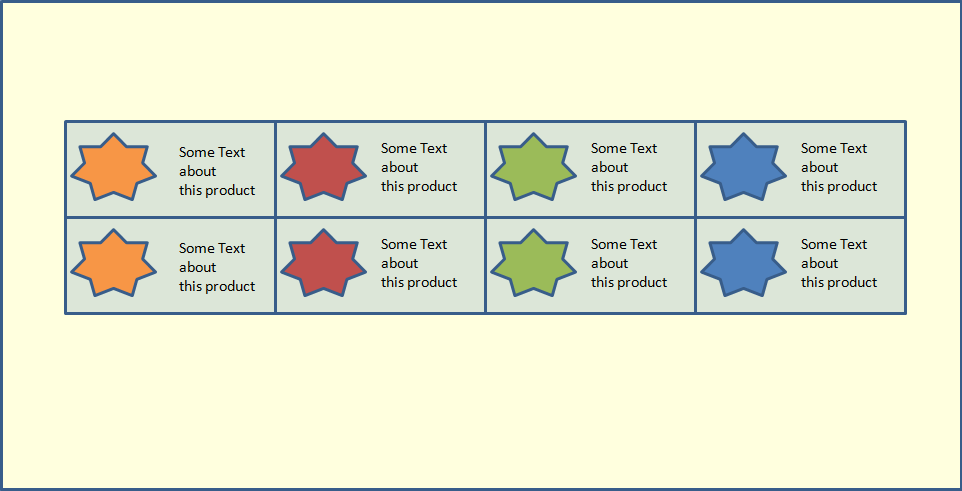
So imagine you’re working on an ecommerce site. Trying to be modular and write good code, you create an element, say my_product, to represent each product. This element has an image of the product and some text describing it. On the home page you want all the product elements to line up, four in a row. On the page for the “Buyer’s Guide”, you want them to line up vertically, one below the other, in the right side bar. Reasonable request. And common enough.
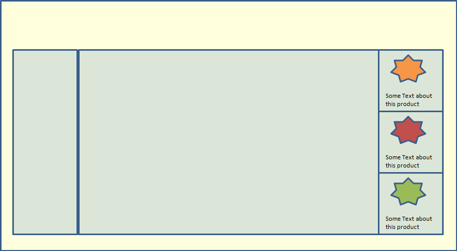
So how do you go about doing this? Media queries? A media query will check the viewport size only. In this case, the viewport size is the same in both these layouts. We haven’t even gotten around to considering different device sizes. We just want the my_product element to display differently depending on whether its container is narrow (i.e. limited to the sidebar), or wide (i.e. spread across the whole page). We can’t use media queries for this. Is there anything else in CSS that let’s us do this cleanly? Sadly no. There are a couple of hacks, and scripts that can help; but no clean way (that I know of) to do this. Heydon Pickering hit a similar wall when trying to make his design independent of the content and number of elements.
Modularity Goes Out the Window
To handle this, I’d have to maintain code to style my_product differently, depending on where it is used. If I want to make this responsive, and account for different device sizes, I’m in for more trouble. I’d have to figure out and maintain different breakpoints for this element, depending on the device size. I’m not even going to get into how contorted the code will get. You can look up Ian Storm Taylor’s account of struggling with media queries, Scott’s issues over at FilamentGroup, and Tyson Matanich’s discussion of the problem. Yes, I’m not the only one struggling with this.
I like simple, clean code. I like to keep it modular. I like DRY. I do not like having the same code sprinkled around in multiple places like confetti.
It’s a basic task — if an element gets too narrow (or small or whatever), change the style a bit. There should be a simple way to do it without getting all tangled. There should be a way to link the style of an element to its container, Instead of always linking to its viewport size or the device dimensions.
Workarounds
A few creative people, who struggled with this, have tried to make things easier for the rest of us mortals. Some innovative workarounds to address the current lack in our CSS specifications are:
- Elementary by Scott Jehl
- Element Queries by Tyson Matanich
- EQ.js by Sam Richards
- CSS Element Queries from Marcj
These are all good. And they serve the purpose. But they each have their own limitations and add in complexity. We need something simpler, cleaner, built into CSS.
Why Don’t We Have Element Queries Yet?
There’s been much discussion about having ‘Element Queries’ — along the same lines as media queries but tied to the component rather than the viewport. RICG is even working on a draft for the use cases and requirements. But it is still in the initial stages. There are a few practical issues that need to be sorted out first. The main issue relates to circularity. There are many ways you can specify an element’s size depending on its contents. What happens when those contents in turn depend on the size of the containing element? What comes first — the chicken or the egg? The debate is still on about the best way to handle this.
But like other problems that appeared impossible in the past, I’m sure this can also be worked out. It’s not impossible. It’s more a matter of the problem getting the attention it deserves. With media queries hogging the limelight, the discussion around element queries isn’t gathering enough momentum. While media queries help us with RWD, they are limited. We need to look beyond.
Media queries and ‘element queries’ are complementary. They address different situations and needs. Just because we now have media queries, doesn’t mean we should sit complacently and not push for further growth in CSS. We need to thrash out the best way to address the issue of element queries.
Over the next few years, the internet is poised for explosive growth, with more websites (good and bad!) being created every day than ever in the past, websites more complex than ever in the past. The majority of developers seem to be happy with what they have at the moment and are too busy, or lazy, to look towards the future. We need to look ahead and make sure we have the right set of tools to handle the complexities. Else we’ll have a few billion websites, with spaghetti code strewn all over.
How have you been handling this issue so far? Do you think the time’s ripe to get the focus onto element queries?
 Richa Jain
Once upon a time, Richa was a savvy techie & manager, in the semiconductor software industry. After her miraculous escape and recovery, she now works from her garden, creating websites, writing about technology, business & entrepreneurship; and helping others escape the cubicle lifestyle.