How to use Media Queries in JavaScript with matchMedia
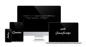
Craig Buckler gives you an accessible introduction to using media queries with JavaScript with matchMedia for a robust responsive design approach.
Craig Buckler gives you an accessible introduction to using media queries with JavaScript with matchMedia for a robust responsive design approach.

Craig Watson explains how to set up a responsive type scale with Bootstrap, so that your site’s typography will scale responsively on all devices.

Syed covers all the basic steps involved in building a responsive Bootstrap website, even if you're relatively new to web design and web technologies.

Syed Fazle Rahman introduces Bootstrap, the popular front-end UI library, and offers his reasons why he loves building projects with it.

Daniel Schwarz shows us how to design and publish static HTML/CSS websites using Sketch and two Sketch Plugins (Auto Layout and Launchpad).

We all have an understanding of responsive design, but how does it relate to 'Adaptive design'? Turns out the answer depends on who you ask.

Screen resolutions keep increasing and so do the challenges of front-end development. James George looks at the current state of play.
In this short video, I'll show you how to create a background container that scales seamlessly to fit any browser size.
Ryan Reese introduces the basics of the viewport meta tag and explains why RWD layouts should not be based on device-specific media queries.
Annarita Tranfici discusses the new picture element, that aims to simplify and consolidate responsive images.
You cannot create a good user experience without functional navigation. Annarita Tranfici looks at some of the patterns that can be utilised to create one.
Bootstrap is responsive and since version 3 is now mobile first. Syed examines some neat little responsive design tips from Bootstrap's CSS.
Wearables are set to redefine the world and how we interact with it, lets take a look through some advice and resources to get your skills up to date.
The segregation of the mobile experience to a subdomain, the ‘m’ domain, seems a little old school. In this article, I'll discuss why it may still be valid.
Hugo offers an elegant way to deal with breakpoints in responsive web design, using Sass.
Read 7 Ways to Improve Your Responsive Web Design Approach and learn with SitePoint. Our web development and design tutorials, courses, and books will teach you HTML, CSS, JavaScript, PHP, Python, and more.
Learn how to create responsive centered images in CSS3.
Responsive Web Design and Scrollbars
Read Build a Responsive, Mobile-Friendly Website From Scratch: Introduction and learn with SitePoint. Our web development and design tutorials, courses, and books will teach you HTML, CSS, JavaScript, PHP, Python, and more.
Read What to Expect From jQuery Mobile 1.3.0 and learn with SitePoint. Our web development and design tutorials, courses, and books will teach you HTML, CSS, JavaScript, PHP, Python, and more.
Read Understanding Responsive Web Design: Clear Concepts and Practical Applications and learn with SitePoint. Our web development and design tutorials, courses, and books will teach you HTML, CSS, JavaScript, PHP, Python, and more.
Read Viewport Resizer: a Better Responsive Web Design Bookmarklet and learn with SitePoint. Our web development and design tutorials, courses, and books will teach you HTML, CSS, JavaScript, PHP, Python, and more.
Read The Responsive Web Design Bookmarklet and learn with SitePoint. Our web development and design tutorials, courses, and books will teach you HTML, CSS, JavaScript, PHP, Python, and more.
Read New Repeating Background Image Options in CSS3 and learn with SitePoint. Our web development and design tutorials, courses, and books will teach you HTML, CSS, JavaScript, PHP, Python, and more.
Read Too Big, Too Small, or Just Right: Creating a Website for Multiple Screens and learn with SitePoint. Our web development and design tutorials, courses, and books will teach you HTML, CSS, JavaScript, PHP, Python, and more.
Read HTML5 Responsive Design: How to Determine the Real Dimensions of an Image in JavaScript and learn with SitePoint. Our web development and design tutorials, courses, and books will teach you HTML, CSS, JavaScript, PHP, Python, and more.