

With the release of version 3, Bootstrap has gone mobile first, building on its already responsive base.
What kinds of things does Bootstrap include in its CSS to help with this? Let’s examine a few things and gain some insight that might help us in our own custom projects.
Key Takeaways
- Bootstrap’s CSS includes clearly defined breakpoints for different devices, using CSS media queries. This categorization is essential for understanding responsive frameworks.
- Bootstrap’s grid system requires a specific HTML structure that starts with a container element. The container element defines the space a grid system should use, with two types available: .container and .container-fluid. The former has different widths for different device types, while the latter expands to fit the device’s width.
- Bootstrap uses percentage-based column widths to ensure responsiveness across different device types. Each device category has its own set of classes for columns of varying sizes, which default to width: auto unless specified within media queries.
- Bootstrap makes tables and images responsive. Tables are forced to fit the width of the parent element, and a .table-responsive class is available to make tables horizontally scrollable on smaller devices. Images are made responsive through the .img-responsive class, which scales images proportionally on smaller devices.
Defining Proper Media Queries
Bootstrap has clearly defined breakpoints for different kinds of devices, specified by using CSS media queries. The following are the breakpoint categories used for the different types of devices:
- Extra Small Devices (e.g. cell phones) are the default, creating the “mobile first” concept in Bootstrap. This covers devices smaller than 768px wide.
- “Small Devices” (e.g. tablets) are targeted with
@media (min-width: 768px) and (max-width: 991px) { ... }. - Medium Sized Devices (e.g. Desktops) have a screen size smaller than 1200px and greater than 991px, using
@media (min-width: 992px) and (max-width: 1199px) { ... }. - Larger Devices (e.g. wide-screen monitors) are greater than 1200px, targeted using
@media (min-width: 1200px) { ... }.
Note: Mobile devices that we use today come with 2 different screen orientations: Portrait and Landscape. So the above is mostly true for landscape view only. For example, if you are using a Samsung Galaxy Note III phone, the landscape view falls in the “Small Devices” category whereas the portrait view would fall under “Extra Small Devices”.
This kind of categorization is common in responsive frameworks and it’s something you can certainly benefit from understanding better.
The Grid System Demystified
If you are familiar with Bootstrap’s grid system, you might know that there is a specific HTML structure required to properly set up its grids. Let’s demystify it.
Let’s first have a look at Bootstrap’s HTML for a two-column setup:
<div class="container">

  <div class="row">
    <div class="col-xs-6">

      <p>Column 1</p>

    </div>
    <div class="col-xs-6">

      <p>Column 2</p>

    </div>
  </div>

</div>
As shown above, Bootstrap’s grid system starts with a container element. Containers define how much space a grid system should use. They can be of two types: .container has different widths for different types of devices whereas .container-fluid expands to fit the width of the device.
With the help of media queries, Bootstrap gives different widths to the .container depending on the size of the device:
- Extra small devices (<768px):
width: auto(or no width) - Small Devices (≥768px):
width: 750px - Medium Devices (≥992px):
width: 970px - Larger Devices (≥1200px):
width: 1170px
Here are some more CSS declarations that are applied to the .container class.
.container {

  padding-right: 15px;

  padding-left: 15px;

  margin-right: auto;

  margin-left: auto;

}
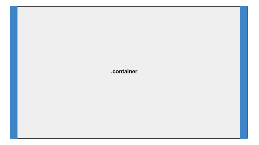
As seen in the above image, the .container prevents the content inside the element from touching the browser edge using 15px of padding on each side. It also ensures the container is centered using auto for left and right margins.
Rows are another important element in Bootstrap’s Grid System. Before creating columns, you can define a row using the class .row. Here’s a snippet from Bootstrap’s CSS for the .row class:
.row {

  margin-right: -15px;

  margin-left: -15px;

}
As shown above, our row has negative left and right margins of -15px to allow the row to touch the edge of its container element. This acts as a wrapper to hold columns, which can add up to 12 in number.
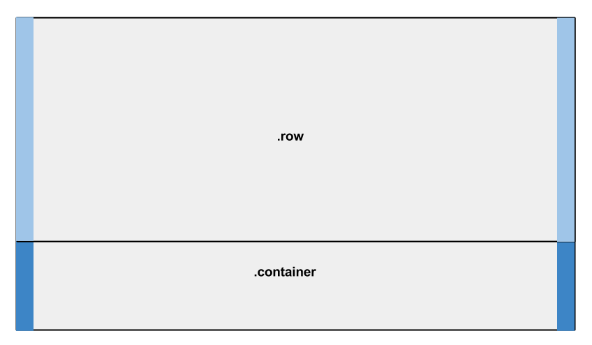
You may have noticed that the margins on the row seem to be counteracting the 15px of padding applied to the container. If we analyze the columns, we can see why this is needed.
Here’s a snippet from Bootstrap’s CSS for the .col-xs-6 class.
.col-xs-6 {

  padding-right: 15px;

  padding-left: 15px;

}
As shown, left and right padding of 15px is applied to the columns, resulting in something like the image below:
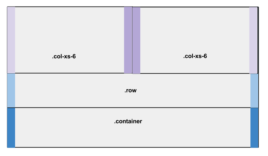
Because of the negative margins on the row, the columns are touching the edges of the row and the edges of the container. But the padding causes the contents that go inside these columns to remain 15px away from the edges of the container.
Containers are used for multiple purposes, not just for the grid system, so the 15px padding helps to avoid the content touching the edges of the browser (when using .container-fluid). Rows have the negative margins so that they are not pushed by the padding of the container.
If you are considering designing your own framework, you might want to consider using this padding/margin technique.
Defining Proper Column Widths
Bootstrap uses percentages (%) as the unit to define the widths of columns, helping with responsiveness. As stated above, there are 4 different categories of device-based breakpoints. Each category has its own set classes for columns of different sizes.
- Extra small devices use
.col-xs-*. - Small devices use
.col-sm-*. - Medium devices use
.col-md-*. - Large devices use
.col-lg-*.
The asterisk character (*) gets replaced by a number. For example, .col-xs-6 creates a column 6 times the size of a .col-xs-1 column; .col-sm-4 creates a column four times the size of .col-sm-1, and so on.
By default, all the columns have no width set, which defaults to width: auto. However, within the media queries, Bootstrap gives width values to each column class.
Here’s a snippet from Bootstrap’s CSS for the column classes with asterisks replacing the sizes for brevity (xs, sm, md, etc):
.col-*-12 {

  width: 100%;

}
.col-*-11 {

  width: 91.66666667%;

}
.col-*-10 {

  width: 83.33333333%;

}
.col-*-9 {

  width: 75%;

}
.col-*-8 {

  width: 66.66666667%;

}
.col-*-7 {

  width: 58.33333333%;

}
.col-*-6 {

  width: 50%;

}
.col-*-5 {

  width: 41.66666667%;

}
.col-*-4 {

  width: 33.33333333%;

}
.col-*-3 {

  width: 25%;

}
.col-*-2 {

  width: 16.66666667%;

}
.col-*-1 {

  width: 8.33333333%;

}
Let’s analyze the above code. A class .col-lg-6 will have a width of 50% in large devices but when viewed in medium, small, and extra-small devices, the default width: auto is used. This ensures that the columns are converted to a stacked layout (rather than side by side) in smaller devices.
Responsive Tables
Tables, used for displaying tabular data, are also responsive in Bootstrap.
To use Bootstrap’s table styles, we use the class .table, which has the following CSS:
.table {

  width: 100%;

  max-width: 100%;

  margin-bottom: 20px;

}
Bootstrap forces tables to fit the width of the parent element by applying a width of 100%. But this has an issue. A multi-column table will get squeezed on smaller devices and may not be readable.
Bootstrap has another class to remedy this: .table-responsive. Here’s the CSS:
.table-responsive {

  width: 100%;

  overflow-x: auto;

  overflow-y: hidden;

  -webkit-overflow-scrolling: touch;

  -ms-overflow-style: -ms-autohiding-scrollbar;

  border: 1px solid #ddd;

}
These styles cause the table to become scrollable on the horizontal axis on smaller devices.
Responsive Images
Working with larger images may be a problem for smaller devices. Bootstrap uses a class of .img-responsive to make any image responsive:
.img-responsive {

  display: block;

  max-width: 100%;

  height: auto;

}
This combination of max-width: 100% and height: auto will ensure the images scale down proportionally in smaller devices, while staying within the parent element’s constraints on larger devices.
Conclusion
These RWD tips are just a few things I’ve picked up from Bootstrap 3. If you’ve noticed anything else in their source code not mentioned here, feel free to share it in the comments.
Take your CSS skills to the next level with our book CSS Master, 2nd Edition by Tiffany B. Brown – covering CSS animations, transitions, transformations and much more.
Frequently Asked Questions on Responsive Web Design Tips with Bootstrap CSS
What is the significance of Bootstrap in responsive web design?
Bootstrap is a powerful front-end framework that enables developers to create responsive and mobile-first websites efficiently. It provides a comprehensive set of CSS and HTML templates for UI components like buttons, forms, and navigation bars. Bootstrap also includes a responsive grid system that allows developers to easily scale their websites to different screen sizes. This means that a website will automatically adjust its layout, images, and other elements to fit the screen on which it’s being viewed, whether it’s a desktop, tablet, or smartphone.
How does the Bootstrap grid system work?
The Bootstrap grid system uses a series of containers, rows, and columns to layout and align content. It’s built with flexbox and is fully responsive. The grid system is divided into 12 columns, and you can decide how many columns a particular element should span based on the screen size. For instance, you might want an element to span six columns on a desktop screen but only two on a mobile screen. Bootstrap’s grid system allows you to make these adjustments easily with class prefixes.
What are breakpoints in Bootstrap?
Breakpoints in Bootstrap are the points at which your site’s content will respond to provide the user with the best possible layout to consume the information. Bootstrap includes five predefined classes for building complex responsive designs. These are xs (for phones – screens less than 576px wide), sm (for tablets – screens equal to or greater than 576px wide), md (for small laptops – screens equal to or greater than 768px wide), lg (for laptops – screens equal to or greater than 992px wide), and xl (for desktops – screens equal to or greater than 1200px wide).
How can I customize Bootstrap’s components?
Bootstrap’s components are customizable through CSS. You can override the default styles by adding your own CSS rules. It’s recommended to create a separate CSS file for your custom styles to avoid conflicts with the original Bootstrap files. You can also customize Bootstrap’s components through Sass variables and mixins if you’re using the source files.
What are some best practices for using Bootstrap in web design?
Some best practices for using Bootstrap in web design include understanding the grid system thoroughly, using Bootstrap’s built-in classes and components whenever possible, customizing Bootstrap responsibly, and testing your design on various devices and screen sizes. It’s also important to keep your code clean and organized, and to make sure your site is accessible and user-friendly.
How can I make my Bootstrap website more accessible?
Bootstrap includes several features to make your website more accessible, such as ARIA roles and attributes, keyboard-friendly navigation, and visible focus states. However, it’s also important to follow other accessibility best practices, such as providing alt text for images, using clear and simple language, and ensuring sufficient color contrast.
Can I use Bootstrap with other CSS frameworks?
Yes, you can use Bootstrap with other CSS frameworks, but it’s not typically recommended because it can lead to conflicts and inconsistencies. If you do choose to use multiple frameworks, make sure to thoroughly test your site to ensure everything works as expected.
How can I optimize my Bootstrap website for performance?
There are several ways to optimize your Bootstrap website for performance, such as minifying your CSS and JavaScript files, optimizing images, and using a content delivery network (CDN). You can also improve performance by only using the Bootstrap components that you actually need.
What are some common mistakes to avoid when using Bootstrap?
Some common mistakes to avoid when using Bootstrap include not taking full advantage of the grid system, overusing inline styles, not customizing the default Bootstrap styles, and not testing your site on various devices and screen sizes.
Where can I find more resources to learn about Bootstrap?
There are many resources available to learn about Bootstrap, including the official Bootstrap documentation, online tutorials and courses, and community forums. You can also learn a lot by experimenting with Bootstrap on your own and building your own projects.