
Asha and Maria offer an accessible but thorough introduction to the use of CSS viewport units for truly responsive typography and layout elements on the web.
Craig Buckler presents the various CSS methods available for hiding elements on a web page, looking at how they differ and which is best when.
Craig Buckler demonstrates a neat trick for applying CSS3 transforms to background images. Rotating and skewing elements with stunning backgrounds will now be a breeze!
Adrian Sandu explains the purpose and advantages of rem units, demonstrating ways to use em and rem units in CSS layouts.
Tiffany Brown introduces Flexbox, explaining the basic principles behind flex layout, with examples of laying out a basic media object, flexible form components, vertical centering, and creating grid-like layouts, as well as explaining when to use Flexbox over CSS Grid.
Tiffany Brown introduces the basics of CSS Grid, covering the grid formatting context, defining a grid layout, explicit versus implicit grids, specifying track size for an implicit grid, creating flexible grids with flex units, using the grid-template shorthand property, and repeating rows and columns.
Scroll snap lets developers define the distance an interface should travel during a scroll action. You might use it to build slide shows or paged interfaces―features that currently require JavaScript and expensive DOM operations.
Transforms allow us to create effects and interactions that are otherwise impossible. When combined with transitions and animations, we can create elements and interfaces that rotate, dance, and zoom. In this piece, we'll look at 2D transform functions.
Think of CSS animation as the more sophisticated sister to CSS transitions. Animations differ from transforms in a few key ways, which we'll explore in this article
We’ll now look at two methodologies for naming things in CSS: Block-Element-Modifier (better known as BEM) and Atomic CSS.
Variables make it easier to manage colors, fonts, size, and animation values, and to ensure their consistency across a codebase.
In this article, Cláudio Ribeiro looks at the exciting new possibilities surrounding variable fonts — now bundled with the OpenType scalable font format — which allows a single font to behave like multiple fonts.
Craig Buckler shows how to add another dimension to your web pages and applications with the new 3D transformation functions and properties in CSS, covering transform, translate, rotations, scaling, perspective and more, along with z-index, browser gotchas, and ideal use cases.
Maria Antonietta Perna walks you through CSS variables/custom properties, the awesome new technology that adds more flexibility and fun to CSS coding.
Christian Krammer walks you through the basics of Flexbox, showing how you can use flexbox to lay out specific page elements, and also how flexbox can serve as a handy fallback method in browsers that don't yet support CSS Grids.
Ahmad Ajmi introduces CSS Grid Layout Module, showing beginner-friendly examples of how to use CSS Grid, as well as discussing current browser support and what to do if you need to support older browsers — from using a mobile-first layout as a fallback, to using other CSS fallbacks and even a polyfill.
Ivan Čurić covers the basics of CSS parsing, how to measure CSS selector performance, and how to deal with multiple render passing on dynamic pages.
Maria Antonietta Perna takes Bootstrap as representative of CSS frameworks, asking if there are still reasons to use frameworks now that we have CSS Grid.
Read Upgrade Your Project with CSS Selector and Custom Attributes and learn HTML & CSS with SitePoint. Our web development and design tutorials, courses, and books will teach you HTML, CSS, JavaScript, PHP, Python, and more.
Giulio Mainardi explains the new font-display property and how it will help CSS developers improve rendering of fonts during page load.
Zsolt Nagy discusses three principles of CSS architecture and why mastering them will help you keep your CSS maintainable and lean.
Asha Laxmi introduces and explains what CSS inheritance is, how it helps development, and what pitfalls to avoid while using it.
Asha Laxmi walks you through the CSS length units you have at your disposal to size fonts like a pro: from pixels to ems, rems, viewport units and more.
How do we support this ever-increasing array of devices? The answer is responsive web design, which allows websites to adapt to screens of all sizes.
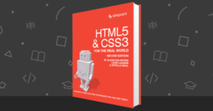
In this exclusive excerpt from our book, HTML5 & CSS3 for the Real World, we examine the different types of structural pseudo-classes you can use.
In this exclusive excerpt from our book, CSS Master by Tiffany Brown, we look at the best ways of managing the CSS Box Model
In this article, we'll talk about the basics of Pseudo-class, by the author Alexis Goldstein.
In this excerpt from our book, HTML5 & CSS3 for the Real World (2nd Edition), we look at Relational and Attribute Selectors in CSS3
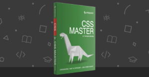
What exactly is Atomic CSS, and how do you use it? We give the lowdown through this exclusive excerpt from our book, CSS Master.
Andy Kirk looks at some neat techniques to achieve responsive CSS patterns while we wait for element and container queries to be available!
CSS animations are fast becoming an essential design tool and tap into a more engaged audience through micro interactions and visual validation.
Perhaps the most powerful of this new crop of pseudo-classes is :not(). It returns all elements except for those that match the selector argument.
Think of specificity as a score or rank that determines which style declarations are ultimately applied to an element
The CSS Pseudo-elements Module Level 4 specification clarifies behavior for existing pseudo-elements and defines several new ones. Only a few, however, have any degree of support in current browsers. Those are the ones we’ll talk about in this article.
In this article, We’ll focus on the new and lesser-known attribute selectors.
In this chapter, we’ll look at the current browser landscape for CSS selectors, with a focus on newer selectors.
Asha Laxmi shows how to use the new backdrop-filter CSS property to create stunning visual effects directly in the browser.
This article is part of our AtoZ CSS Series where we explore CSS values (and properties) of each letter of the alphabet. Letter Z is for z-index.
Guy Routledge explores CSS values and properties from each letter of the alphabet in our AtoZ CSS Screencast Series. Letter Z is for Z-index.
Guy Routledge explores CSS values and properties from each letter of the alphabet in our AtoZ CSS Screencast Series. Letter Y is for rotateY.
This article is part of our AtoZ CSS Series where we explore CSS values (and properties) of each letter of the alphabet. Letter X is for translate.
Guy Routledge explores CSS values and properties from each letter of the alphabet in our AtoZ CSS Screencast Series. Letter X is for translateX.
Asha looks at why you should be inlining your critical CSS, as well as how you can do it using Grunt, npm modules and other tools.
This article is part of our AtoZ CSS Series where we explore different CSS values (and properties) from a letter of the alphabet. Let's look at letter W.
Guy Routledge explores CSS values and properties from each letter of the alphabet in our AtoZ CSS Screencast Series. Letter W is for Widows and Orphans.
Guy Routledge explores CSS values and properties from each letter of the alphabet in our AtoZ CSS Screencast Series. Letter U is for Unicode Range.
Guy Routledge explores CSS values and properties from each letter of the alphabet in our AtoZ CSS Screencast Series. Letter S is for @supports.
Guy Routledge explores CSS values and properties from each letter of the alphabet in our AtoZ CSS Screencast Series. Letter R is for Required.
This article is part of our AtoZ Series where we explore CSS values (and properties) of each letter of the alphabet. Letter P is for Placeholder Text.
Guy Routledge explores CSS values and properties from each letter of the alphabet in our AtoZ CSS Screencast Series. Letter M is for Media Queries.
This article is part of our AtoZ CSS Series where we explore CSS values (and properties) of each letter of the alphabet. Letter K is for Keyframe.
Guy Routledge explores CSS values and properties from each letter of the alphabet in our AtoZ CSS Screencast Series. Letter K is for Keyframe.
Guy Routledge explores CSS values and properties from each letter of the alphabet in our AtoZ CSS Screencast Series. Letter J is for justifying text.
This article is part of our AtoZ CSS Series where we explore CSS values (and properties) of each letter of the alphabet. Letter I is ID Selector.
Guy Routledge explores CSS values and properties from each letter of the alphabet in our AtoZ CSS Screencast Series. Letter I is for ID Selector.
This article is part of our AtoZ CSS Series where we explore CSS values (and properties) of each letter of the alphabet. Letter H is for Hover..
Guy Routledge explores CSS values and properties from each letter of the alphabet in our AtoZ CSS Screencast Series. Letter H is for Hover.
Guy Routledge explores CSS values and properties from each letter of the alphabet in our AtoZ CSS Screencast Series. Letter F is for Float.
Guy Routledge explores CSS values and properties from each letter of the alphabet in our AtoZ CSS Screencast Series. Letter E is for :enabled.
Guy Routledge explores CSS values and properties from each letter of the alphabet in our AtoZ CSS Screencast Series. Letter C is for Color.
This article is part of our AtoZ CSS Series where we explore CSS values (and properties) of each letter of the alphabet. Letter B is for Box-Model.
Guy Routledge explores different CSS values and properties from each letter of the alphabet in our AtoZ CSS Series. Letter B is for Box-Model.
This article is part of our AtoZ CSS Series where we explore CSS values (and properties) of each letter of the alphabet. Letter A is for Auto.
Guy Routledge explores CSS values and properties from each letter of the alphabet in our AtoZ CSS Screencast Series. Letter A is for auto.
Anselm Urban looks at some neat tricks you can use today in CSS, from fancy CSS animations to a frosted glass effect.
Paul answers anything and everything about CSS positioning — from floats and relative, absolute and fixed positioning to table display and even flexbox.
Last week we spoke with Rachel Andrew, a CSS Working Group Invited Expert about CSS for paged media. Here's a recap of your questions for her.
Gajendar Singh looks at the huge range of possibilities available to developers via CSS filters and how to use each one.
Nitish Kumar looks at the text-align-last property, how it can be used and its various cross-browser quirks to keep an eye out for.
George Martsoukos looks at Flexbox and how to use z-index and auto margins in your CSS layouts.
Nitish Kumar explores the CSS clip-path property and how to use it to clip portions of elements.
Asha Laxmi explains and demonstrates how to use two CSS properties that can help when creating responsive layouts – object-fit and object-position.
Georgie Luhur looks at best practices for commenting HTML and CSS, and why well structured comments can make all the difference.
Discover the system of Flexbox axes and what it can do for you. First tip: they're different than the traditional top to bottom, left to right axes.
Maria Antonietta Perna takes a look at the syntax for the new @supports rule, which allows you to test for browser features, similar to how Modernizr is used.
Hugo Giraudel explains the new kid on the CSS processor block: CSS Modules and he relates why he thinks this concept is how CSS should be.
Maria Antonietta Perna discusses the capabilities of border images in CSS, describing each of the properties in the border image spec.
The CSS Scroll Snap Points spec is gaining more and more browser support and the standard has been refined. Simon breaks down the properties with examples.
David Kaye examines in detail how browsers parse CSS, demonstrating how single-line comments can be used even though these aren't technically legal.
Last week Tiffany Brown, author of CSS Master, joined us on the forums for a Q&A session discussing CSS Animations. Read the highlights of her conversation.
Gajendar Singh explains and demonstrates the different length units available in CSS, including absolute, relative, and viewport-relative units.
One of SitePoint's most popular articles of 2014 now has a sequel. Louis Lazaris has compiled another 12 interesting tricks and tidbits on CSS.
Ritesh Kumar delves into the CSS spec to explain, with demos and diagrams, what is meant by "block formatting contexts" and how they affect page layout.
The CSS selectors level 4 spec is starting to gain some browser support. Louis Lazaris discusses and demonstrates how to use most of the new features.
Gajendar Singh breaks down the CSS content property, with descriptions and demos for all the possible values.
Bashkim Isai works off an idea presented by BBC's developers to help you get up and running with flexbox with safe fallbacks for legacy browsers.
Maria Antonietta Perna has created some visual examples and demos to help understand CSS's cool new mix-blend-mode property and how it can be used today.
CSS counters are a rarely used CSS feature. But they can be very handy once you understand how they work and in what cases they are most practical.
Christ Poteet introduces the concept of mobile first design and how it differentiates from the technical aspect, with a light intro to the subject.
If Flexbox is your hot superpower, CSS table properties are the secret weapon you keep hidden for emergencies. Massimo adds a new string to your bow.
Nick Salloum introduces the concept of browser-controlled optimizations and how we can trigger these using CSS's new will-change property.
Ryan Reese introduces the basics of the viewport meta tag and explains why RWD layouts should not be based on device-specific media queries.
You've probably created CSS3 animations. But have you used the animation-fill-mode property and all its possible values? Louis takes a look, with visuals.
You can learn to overcome your fears and thoroughly understand CSS selectors and their uses. Learnable tutor Russ Weakley demonstrates the :empty pseudo class.
We rely on JavaScript for almost everything that involves dynamic elements and interactions. Tim Evko explores how to build such elements with just CSS.
Daniel Imms takes a look at why native CSS variables will have an edge over what can be done with variables in preprocessors like Sass.
Is your responsive web design only constrained by min-width and max-width media queries? Craig explains why min-height and max-height have good uses too.
Aurelio De Rosa takes a look at some JavaScript solutions for sticky navigation, while introducing CSS's new position: sticky feature, along with some polyfills.
Read CSS3 3D Transformations and learn with SitePoint. Our web development and design tutorials, courses, and books will teach you HTML, CSS, JavaScript, PHP, Python, and more.
Read CSS3 2D Transformation Functions and learn with SitePoint. Our web development and design tutorials, courses, and books will teach you HTML, CSS, JavaScript, PHP, Python, and more.