

The following is a short extract from Tiffany’s new book, CSS Master, 2nd Edition.
In this article, we’ll look at two methodologies for naming things in CSS. Both methods were created to improve the development process for large sites and large teams; however, they work just as well for teams of one. Whether you choose one or the other, neither, or a mix of both is up to you. The point of introducing them is to help you to think through approaches for writing your own CSS.
Key Takeaways
- BEM (Block-Element-Modifier) is a CSS methodology that encourages developers to think of a website as a collection of reusable component blocks. It offers a clear naming system, making it easier to understand the relationship between different parts of a website and is particularly beneficial for large development teams.
- Atomic CSS, on the other hand, focuses on creating highly granular, reusable styles instead of a ruleset for every component. It reduces specificity conflicts and allows for rapid HTML component development. However, it’s more suitable for smaller teams or individual developers.
- Both BEM and Atomic CSS can be used together, combining the structure of BEM with the reusability of Atomic CSS. This can result in a highly organized and maintainable CSS codebase.
- Despite their benefits, neither BEM nor Atomic CSS might be useful in situations where developers don’t have full control over the markup, such as with a CMS. In such cases, developers might need to use long and specific selectors to achieve their goals.
Block-Element-Modifier (BEM)
BEM, or Block-Element-Modifier, is a methodology, a naming system, and a suite of related tools. Created at Yandex, BEM was designed for rapid development by sizable development teams. In this section, we’ll focus on the concept and the naming system.
BEM methodology encourages designers and developers to think of a website as a collection of reusable component blocks that can be mixed and matched to create interfaces. A block is simply a section of a document, such as a header, footer, or sidebar, illustrated below. Perhaps confusingly, “block” here refers to the segments of HTML that make up a page or application.
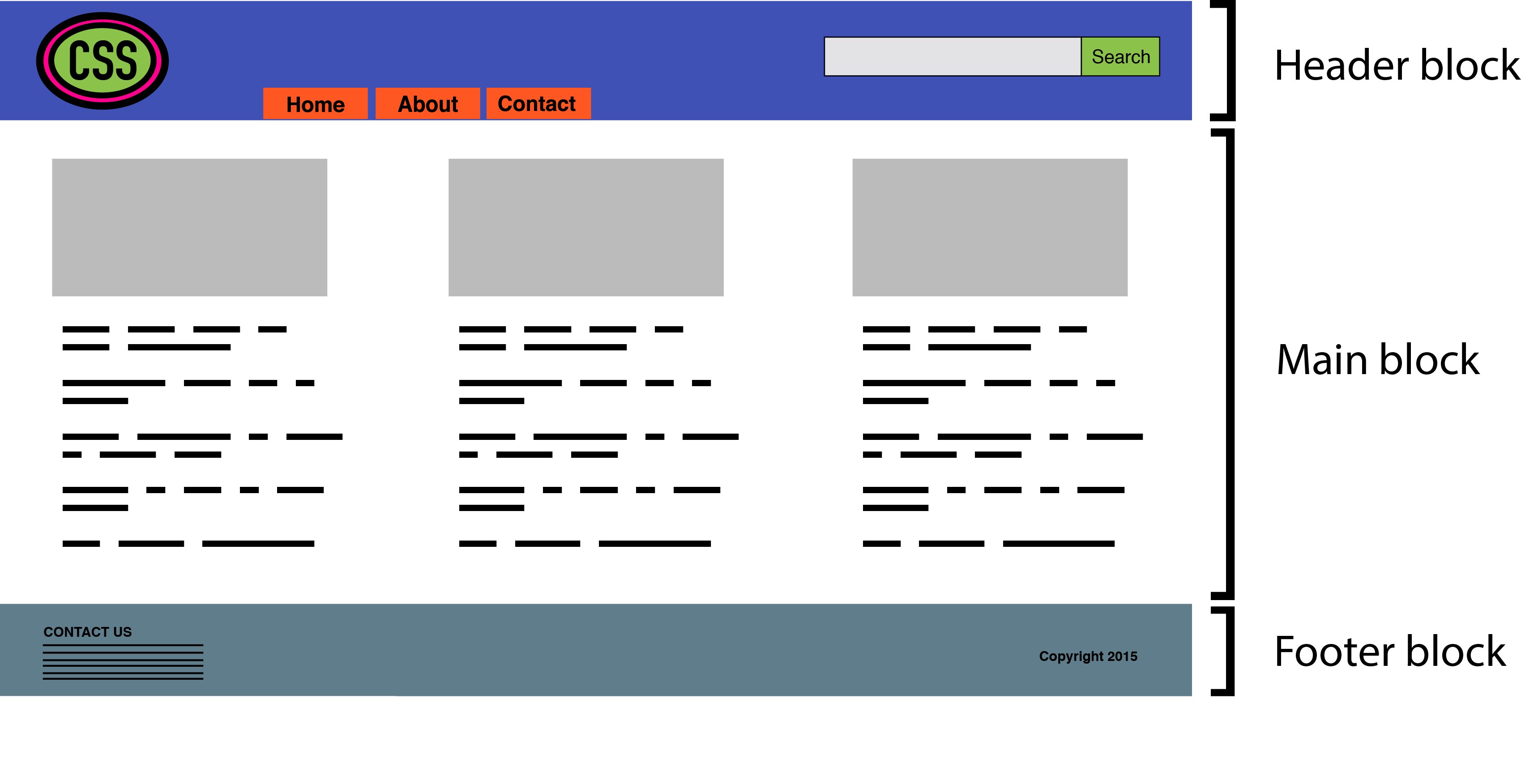
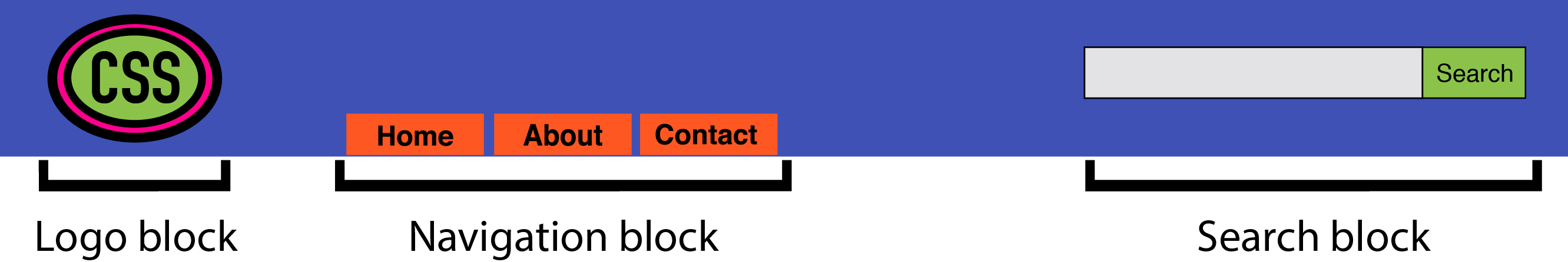
Blocks can contain other blocks. For example, a header block might also contain logo, navigation, and search form blocks, as seen in below. A footer block might contain a site map block.
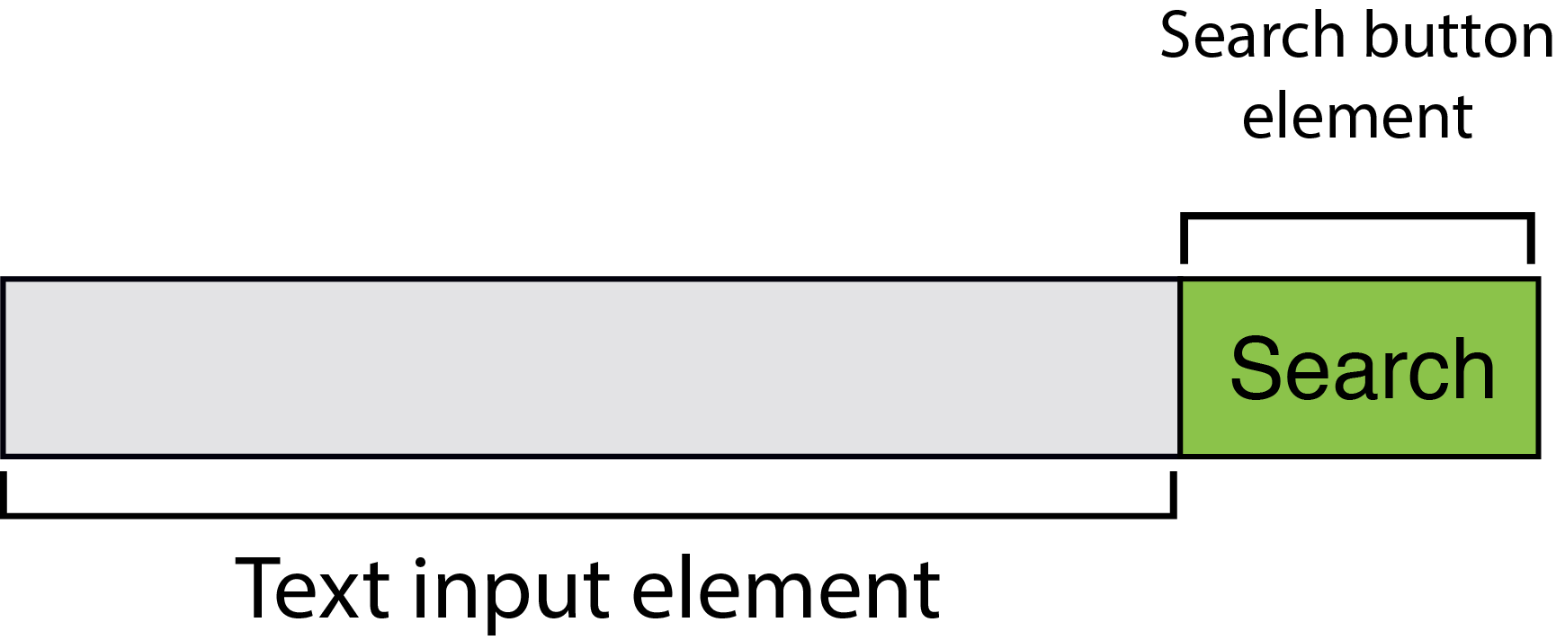
More granular than a block is an element. As the BEM documentation explains:
An element is a part of a block that performs a certain function. Elements are context-dependent: they only make sense in the context of the block they belong to.
A search form block, for example, contains a text input element and a submit button element, as evident in the image below. (To clarify, we’re using “element” in the design element sense rather than the HTML element sense.)
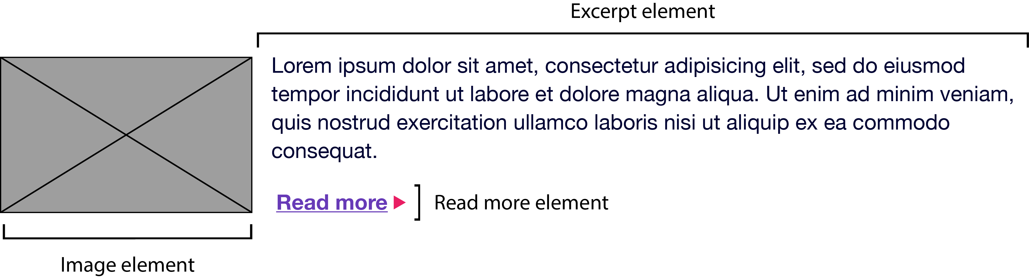
A main content block, on the other hand, might have an article-list block. This article-list block might contain a series of article promo blocks. And each article promo block might contain image, excerpt, and “Read more” elements, as presented below.
Together, blocks and elements form the basis of the BEM naming convention. According to the rules of BEM:
- block names must be unique within a project
- element names must be unique within a block
- variations of a block—say, a search box with a dark background—should add a modifier to the class name
Block names and element names are usually separated by a double underscore (.block__element). Block and element names are typically separated from modifier names by a double hyphen (for example, .block--modifier or .block__element--modifier).
Here’s what BEM looks like using a search form example:
<form class="search">
    <div class="search__wrapper">
        <label for="s" class="search__label">Search for: </label>
        <input type="text" id="s" class="search__input">
        <button type="submit" class="search__submit">Search</button>
    </div>
</form>
A variation of this form with a dark background might use the following markup:
<form class="search search--inverse">
    <div class="search__wrapper search__wrapper--inverse">
        <label for="s" class="search__label search_label--inverse">Search for: </label>
        <input type="text"  id="s" class="search__input search__input--inverse">
        <button type="submit" class="search__submit search__submit--inverse">Search</button>
    </div>
</form>
Our CSS might look like this:
.search {
    color: #333;
}
.search--inverse {
    color: #fff;
    background: #333;
}
.search__submit {
    background: #333;
    border: 0;
    color: #fff;
    height: 2rem;
    display: inline-block;
}
.search__submit--inverse {
    color: #333;
    background: #ccc;
}
In both our markup and CSS, search--inverse and search__label--inverse are additional class names. They’re not replacements for search and search__label. Class names are the only type of selector used in a BEM system. Child and descendant selectors may be used, but descendants should also be class names. Element and ID selectors are verboten. Enforcing block and element name uniqueness also prevents naming collisions, which can become a problem among teams.
There are several advantages to this approach:
- it’s easy for new team members to read the markup and CSS, and understand its behavior
- adding more developers increases team productivity
- consistent naming reduces the possibility of class-name collisions and side effects
- CSS is independent of markup
- CSS is highly reusable
There’s a lot more to BEM than can comfortably fit in a section of a chapter. The BEM site describes this methodology in much greater detail, and also features tools and tutorials to get you started. To learn more about the naming convention aspect of BEM, another fantastic resource is Get BEM.
Atomic CSS
If BEM is the industry darling, Atomic CSS is its rebellious maverick. Named and explained by Thierry Koblentz of Yahoo in his 2013 piece, “Challenging CSS Best Practices,” Atomic CSS uses a tight library of class names. These class names are often abbreviated and divorced from the content they affect. In an Atomic CSS system, you can tell what the class name does—but there’s no relationship between class names (at least, not those used in the stylesheet) and content types.
Let’s illustrate with an example. Below is a set of rules in what we might call a conventional CSS architecture. These rulesets use class names that describe the content to which they apply—a global message box, and styles for “success,” “warning,” and “error” message boxes:
.msg {
    background-color: #a6d5fa;
    border: 2px solid #2196f3;
    border-radius: 10px;
    font-family: sans-serif;
    padding: 10px;
}
.msg-success {
    background-color: #aedbaf;
    border: 2px solid #4caf50;
}
.msg-warning {
    background-color: #ffe8a5;
    border-color:  #ffc107;
}
.msg-error {
    background-color: #faaaa4;
    border-color: #f44336;
}
To create an error message box, we’d need to add both the msg and msg-error class names to the element’s class attribute:
<p class="msg msg-error">An error occurred.</p>
Let’s contrast this with an atomic system, where each declaration becomes its own class:
.bg-a {
    background-color: #a6d5fa;
}
.bg-b {
    background-color: #aedbaf;
}
.bg-c {
    background-color: #ffe8a5;
}
.bg-d {
    background-color: #faaaa4;
}
.bc-a{
    border-color: #2196f3;
}
.bc-b {
    border-color: #4caf50;
}
.bc-c {
    border-color:  #ffc107;
}
.bc-d {
    border-color:  #f44336;
}
.br-1x {
    border-radius: 10px;
}
.bw-2x {
    border-width: 2px;
}
.bss {
    border-style: solid;
}
.sans {
    font-style: sans-serif;
}
.p-1x {
    padding: 10px;
}
That’s a lot more CSS. Let’s now recreate our error message component. Using Atomic CSS, our markup becomes:
<p class="bw-2 bss p-1x sans br-1x bg-d bc-d">
    An error occurred.
</p>
Our markup is also more verbose. But what happens when we create a warning message component?
<p class="bw-2 bss p-1x sans br-1x bg-c bc-c">
    Warning: The price for that item has changed.
</p>
Two class names changed: bg-d and bc-d were replaced with bg-c and bc-c. We’ve reused five rulesets. Now, let’s create a button:
<button type="button" class="p-1x sans bg-a br-1x">Save</button>
Hey now! Here we’ve reused four rulesets and avoided adding any more rules to our stylesheet. In a robust atomic CSS architecture, adding a new HTML component such as an article sidebar won’t require adding more CSS (though, in reality, it might require adding a bit more).
Atomic CSS is a bit like using utility classes in your CSS, but taken to the extreme. Specifically, it:
- keeps CSS trim by creating highly granular, highly reusable styles, instead of a ruleset for every component
- greatly reduces specificity conflicts by using a system of low-specificity selectors
- allows for rapid HTML component development once the initial rulesets are defined
However, Atomic CSS is not without controversy.
The Case Against Atomic CSS
Atomic CSS runs counter to just about everything we’ve been taught on writing CSS. It feels almost as wrong as sticking style attributes everywhere. Indeed, one of the major criticisms of the Atomic CSS methodology is that it blurs the line between content and presentation. If class="fl m-1x" floats an element to the left and adds a ten-pixel margin, what do we do when we no longer want that element to float left?
One answer, of course, is to remove the fl class from our element. But now we’re changing HTML. The whole reason behind using CSS is so that markup is unaffected by presentation and vice versa. (We can also solve this problem by removing the .fl {float: left;} rule from our stylesheet, although that would affect every element with a class name of fl.) Still, updating the HTML may be a small price to pay for trimmer CSS.
In Koblentz’s original post, he used class names such as .M-10 for margin: 10px and .P-10 for padding: 10px. The problem with such a naming convention should be obvious. Changing to a margin of five or 20 pixels means we’d need to update our CSS and our HTML, or risk having class names that fail to accurately describe their effect.
Using class names such as p-1x, as done in this section, resolves that issue. The 1x part of the class name indicates a ratio rather than a defined number of pixels. If the base padding is five pixels (that is, .p-1x { padding: 5px; }), then .p-2x would set ten pixels of padding. Yes, that’s less descriptive of what the class name does, but it also means that we can change our CSS without updating our HTML, and without creating a misleading class name.
An atomic CSS architecture doesn’t prevent us from using class names that describe the content in our markup. You can still add .button-close or .accordion-trigger to your code. Such class names are actually preferable for JavaScript and DOM manipulation.
BEM versus Atomic CSS
BEM works best when you have a large number of developers building CSS and HTML modules in parallel. It helps to prevent the kind of mistakes and bugs that are created by sizable teams. It scales well, in part, because the naming convention is descriptive and predictable. BEM isn’t only for large teams, but it works really well for large teams.
Atomic CSS works better when there’s a small team or a single engineer responsible for developing a set of CSS rules, with full HTML components built by a larger team. With Atomic CSS, developers can just look at a style guide—or the CSS source—to determine which set of class names they’ll need for a particular module.
Know when to go your own way
In practice, your CSS may include a mix of approaches. You may have class names that describe content or components in addition to utility class names that affect layout. If you don’t have full control over the markup, as with a CMS, then neither of these approaches may be useful. You may even need to use long and specific selectors to achieve what you want.
Frequently Asked Questions (FAQs) on CSS Architecture: BEM and Atomic CSS
What is the main difference between BEM and Atomic CSS?
BEM (Block, Element, Modifier) and Atomic CSS are both methodologies for organizing and structuring CSS code. BEM focuses on a naming convention that makes CSS easier to read and understand. It divides the design into blocks, elements, and modifiers to create a clear, strict relationship between CSS and HTML. On the other hand, Atomic CSS is about writing small, single-purpose CSS classes that reflect visual function. It encourages reusability and aims to reduce the amount of code.
How does BEM improve CSS scalability?
BEM improves CSS scalability by providing a clear and strict relationship between CSS and HTML. It uses a specific naming convention that makes it easier to understand the relationship between different elements. This makes the code more maintainable and scalable, as it’s easier to add new features or modify existing ones without breaking anything.
Can I use BEM and Atomic CSS together?
Yes, it’s possible to use BEM and Atomic CSS together. Some developers find that combining the two methodologies brings the best of both worlds. BEM’s strict naming convention can be used to structure the CSS, while Atomic CSS’s single-purpose classes can be used to style individual elements. This combination can result in a highly organized and maintainable CSS codebase.
What are the benefits of using Atomic CSS?
Atomic CSS offers several benefits. It encourages reusability, which can significantly reduce the amount of CSS you need to write. It also promotes consistency in design, as the same classes are used across different components. Furthermore, Atomic CSS can make your stylesheets more manageable and easier to understand, as each class has a single, clearly defined purpose.
How does BEM handle CSS specificity issues?
BEM helps handle CSS specificity issues by encouraging developers to use class selectors instead of id selectors. This results in a flat specificity across the entire project, making it easier to override styles when necessary. Furthermore, BEM’s naming convention makes it clear which elements are related, reducing the likelihood of unintended style conflicts.
Is Atomic CSS suitable for large projects?
Yes, Atomic CSS is suitable for large projects. Its focus on reusability and single-purpose classes can help keep the CSS manageable, even as the project grows. However, it requires a disciplined approach to ensure that classes remain consistent and meaningful.
How does BEM help in team collaboration?
BEM’s clear and strict naming convention makes it easier for team members to understand the CSS code, regardless of when they joined the project. This can improve collaboration, as developers can easily understand and modify the code written by others.
What are the potential drawbacks of using Atomic CSS?
One potential drawback of Atomic CSS is that it can lead to a large number of classes in your HTML. This can make the HTML harder to read and understand. Additionally, Atomic CSS requires a disciplined approach to ensure that classes remain consistent and meaningful.
How can I start implementing BEM in my projects?
To start implementing BEM, you need to divide your design into blocks, elements, and modifiers. Then, use BEM’s naming convention to name your CSS classes. This will create a clear relationship between your CSS and HTML, making your code easier to read and maintain.
Can I use BEM or Atomic CSS with CSS preprocessors like Sass or Less?
Yes, both BEM and Atomic CSS can be used with CSS preprocessors like Sass or Less. These preprocessors can make it easier to manage your CSS, and they work well with the organizational principles of both BEM and Atomic CSS.