
Keep up to date on current trends and technologies
Blogs

SitePoint Holiday Gift Guide 2022
Simon Mackie

Write for SitePoint
SitePoint Team

SitePoint Premium New Releases: More Vue, Nuxt.js + JS Data Structures
Joel Falconer
Learn Angular: The Collection, Released June 2018
Joel Falconer

Practical ES6, released June 2018
Simon Julian
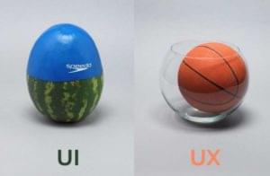
UI vs UX: What is the Difference?
Darin Dimitroff

Get a Free Year of Netlify Pro!
Daniel Graziano

I’m a Designer: How Do I Deal with a Cease and Desist Letter?
Adam Hatch

Uncovering the Secret Coded Language of Postage Stamps
Alex Walker
Taking the Double Trouble Out of Pull Quotes
Alex Walker
The Ultimate Guide to Link Building with Content
Eric Siu
How a 5-cent Eye-Patch Created a Million Dollar Story
Alex Walker
Puppies (Or Fun Ways to Get Sued for Copyright Infringement)
Alex Walker
The Trick to Writing Fun, Engaging Article Intros
Alex Walker
What Makes a Startup Website Great?
Laura Elizabeth
The 30 Best Websites to Learn Marketing for Free
Lauren Holliday
Is There a Perfect Paragraph Length for the Web?
Alex Walker
Deep Linking in Apps for Improved Discoverability
Kerry Butters
Social Media Certifications: Useful or Useless?
Lauren Holliday
Understanding the Mobile User
Richa Jain
How to Do a Content Audit of Your Website
Ilia Markov
Mobile SEO: 6 Steps to a Mobile-Friendly Website
John Tabita
Understanding Baidu — The Chinese Google
Shaumik Daityari
How to Decide Your Mobile Web Strategy
Richa Jain
Integrating Social Media without Sacrificing UX
Chris Brown
WordPress i18n and Localization
Collins Agbonghama
What Web Designers Can Learn from Art History
Gabrielle Gosha
SEO Disasters: What Happens When Google De-Indexes Your Site
Kerry Butters
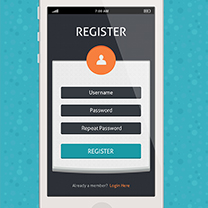
Design a Flat Registration Screen in Photoshop
Anum Khan
Link Text: Best Practices for Desktop and Mobile
Georgina Laidlaw
Bread-and-butter Layouts and Inspiration
Jason Beaird
The Principles of HTML Email Design
Mathew Patterson
Showing 32 of 36