

Key Takeaways
- The three most common website layouts are left-column navigation, right-column navigation, and three-column navigation. Each has its own advantages and disadvantages, and the choice depends on the content and goals of the website.
- Designers need not feel confined to these three layouts. Several design showcase and pattern sites offer innovative ideas for thinking outside the box, such as Unmatched Style, CSS Drive, Design Meltdown, Pattern Tap, and Yahoo Design Pattern Library.
- A “morgue” file is a valuable tool for collecting inspiration for a project. It involves clipping out and printing anything that might provide inspiration and keeping it in a folder. This method helps with the current project and can be a useful resource for future projects.
- Good design is often about what is left out rather than what is put in. The content is what visitors are there for, and increasingly, they are looking for it on the left. A simple site that doesn’t require secondary navigation might consider a narrow, column-less layout.
Most of what we’ve talked about thus far has been design theory. Theory’s helpful, but it can only take us so far towards understanding why some ideas work—and others don’t—in a website’s design. In my opinion, examples and practice are much more valuable. Most academic graphic design programs include a curriculum that’s rich in art history and fine art. These classes provide a great foundation for an understanding of graphic design from an art perspective, but they do little to prepare you for the specific challenges you encounter when you take your designs to the Web.
Pablo Picasso once said, “I am always doing that which I cannot do, in order that I may learn how to do it.” While I like to take that approach when designing a new website, it’s important first to know what you can do. When you look out across the Internet, you can see that the possibilities for layout are endless. Depending on the goals of the site, though, only a few of those possibilities make good design sense. That’s why we see certain configurations of identity, navigation, and content over and over again.
In this section, we’ll talk about the three most common layouts, and explore some of their advantages and disadvantages.
The Three Quintessential Layouts
Left-column Navigation
Regardless of whether we’re talking about liquid or fixed-width layout design, the left-column navigation format is a time-honored standard. The layout of the Porsche site, pictured just below, is a classic example of this configuration. Many sites that fit into this mold don’t necessarily use the left column as the main navigation block—sometimes you’ll see the navigation along the top of the page—but they still divide the layout below the header into a narrow (one-third or less) left column and a wide right column. It’s like a security blanket, or that comfortable shirt with holes in the armpits that you wear once a week—even though it drives your spouse crazy. For those reasons, a layout featuring left-column navigation is a safe choice for most projects.
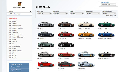
The downside to sites that use left-column navigation is that they can appear to lack creativity. It’s been done so many times, in so many ways, over so many years that they tend to look the same. That’s not to say you should avoid using a left-column navigation layout. At a guess, I’d say that 75% of the sites I’ve designed have a secondary left-column navigation, but I do try to mix it up a little when I can.
Speaking of mixing it up, how about picking that left column up and sticking it on the other side of the content? Then you’d have a right-column navigation layout.
Right-column Navigation
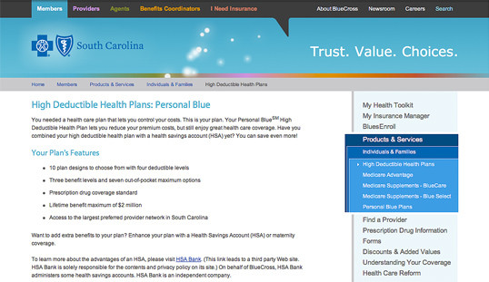
If you’re going to restrict your main content to one side of the page, it’s more widespread these days to push it to the left, placing navigation, advertising, and subsidiary content on the right. This is an especially common configuration for news sites, social networks, and websites with expansive navigation schemes that are unable to be contained within a simple top navigation. BlueCross BlueShield of South Carolina is an example of such a site. It features several different layouts and color schemes for each section. The screenshot below is a fourth-level page—that is, it’s four clicks away from the front page. By keeping the secondary navigation on the right, it stays out of the way of visitors who, if they’re this deep already, are looking for some very specific content.
Ultimately, the decision on whether to put a navigation column on the left or the right is a judgment call that’s really about the amount and type of content you have to organize. If it’s a simple site that doesn’t require any secondary navigation, consider a narrow, column-less layout. Good design is often more about what you leave out than what you put in. If you do need a secondary column, just remember that the content is what your visitors are there for … and more and more, they’re looking for it on the left.
Three-column Navigation
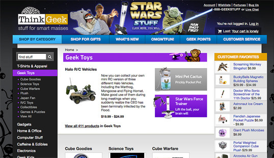
The typical three-column layout has a wide center column flanked by two diminutive navigational columns. The ThinkGeek store is an example of this web page layout staple. Although three columns may be necessary on pages that have a ton of navigation, short bits of content, or advertising to display, whitespace is essential if we’re to keep a layout from appearing cluttered.

Finding Inspiration
Just because the left-column, right-column, and three-column layout configurations are the bread and butter of most web page designs, there’s no need to feel confined to these layouts. A plethora—yes, a plethora—of design showcase and design pattern sites have been created to feature new and innovative ideas that might help you think outside the box, including the following (just to name a few):
- Unmatched Style
There are a ton of great CSS galleries out there. Unmatched Style is more selective than others, and the video podcasts and interviews are usually interesting as well. - CSS Drive
Like Unmatched Style, CSS Drive is a CSS gallery. What makes this one special is that they do a good job of categorizing featured sites by color schemes and layout. - Design Meltdown
From 2005-2009, Patrick McNeil collected and cataloged thousands of interested web designs. He has published two books, and the Design Meltdown site continues to be a great source of inspiration. - Pattern Tap
Unlike the first three examples, Pattern Tap is a gallery of interface patterns rather than entire websites. Here you’ll find collections of navigation styles, contact forms, pagination, tabs, and more. - Yahoo Design Pattern Library
Similar to Pattern Tap, but with far fewer examples and variations, the Yahoo Design Pattern Library is a great place to learn about standard user interface elements.
Using a “Morgue” File
I know what you’re thinking: “Great, I have a bunch of galleries and pattern libraries to look at—now what?” One of the most useful tips my first graphic design professor taught me was to create a morgue file whenever I was collecting inspiration for a large project. The concept is fairly simple: if you’re doing an illustration or marketing project that involves trains, you clip out and print up anything you can find that might give you inspiration and keep it all in a folder. It helps with your current project, and should you ever need to do another project involving trains, you’ll have lots of inspiration on hand.
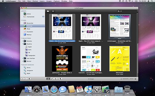
The morgue file idea slipped my mind until a few years ago. I found myself looking for a site I’d seen in a gallery site that I liked, but of which I was unable to remember the name or address. Sure it’s great to have access to lots of great inspiration resources, but they useless if you can’t find the specific example you’re looking for. That was when I started my own digital morgue file. Lately, I’ve been using an application called LittleSnapper for Mac that allows me to create a screenshot of part of the screen, or even a whole web page (no more scroll, snap, scroll, snap). LittleSnapper also lets you give each snapshot a name, and tags to make them easy to find later. Of course, no matter what operating system you prefer, there are plenty of ways to take a snapshot for your morgue file. Having a repository of website designs that I can look at has been a handy resource on countless occasions when I’ve been searching for inspiration.
Capture a Screenshot for Your Own Morgue File
- Select the browser window that’s displaying the page you wish to save as a screenshot.
- Copy a screenshot of the browser window to your clipboard — on a PC: press Alt + Print Screen or use the native Snipping Tool (Windows Vista or 7) to grab a section of the screen; on a Mac: press Shift + Command + 4, then Space to turn the cursor into a camera. Then, hold down Control, and click on the browser window.
- At this point, you should have a screenshot of the browser window in your clipboard. Open a new document in your favorite graphics program or document editor, and paste in the screenshot.
- Save your image or document.
Next up we’ll look at some new design trends.
The Principles of Beautiful Web Design
This article is from Jason Beaird’s The Principles of Beautiful Web Design book (the second edition of which is out now). This is the eighth and ninth part of the first chapter.
Frequently Asked Questions about Bread and Butter Layouts and Inspiration
What are some popular bread and butter layouts?
Bread and butter layouts refer to the basic, foundational designs that are often used in web design. These can include grid layouts, single column layouts, and multi-column layouts. Grid layouts are popular because they provide a structured and organized look to a website. Single column layouts are often used for blogs or websites with a lot of text, as they allow for easy reading. Multi-column layouts are great for websites that have a lot of different sections or categories, as they allow for easy navigation.
How can I find inspiration for my bread and butter layouts?
There are many ways to find inspiration for your bread and butter layouts. One of the best ways is to look at other websites that you admire and see how they have structured their design. You can also look at design blogs or websites like Pinterest for ideas. Additionally, you can experiment with different layouts on your own and see what works best for your content.
What are some tips for creating effective bread and butter layouts?
Some tips for creating effective bread and butter layouts include keeping your design simple and clean, making sure your layout is easy to navigate, and ensuring that your content is the focus of your design. It’s also important to make sure your design is responsive, meaning it looks good on all devices, not just on a desktop computer.
How can I make my bread and butter layouts more unique?
To make your bread and butter layouts more unique, you can experiment with different fonts, colors, and images. You can also play around with the layout itself, perhaps by adding a sidebar or creating a multi-column layout. Remember, the goal is to create a layout that is both functional and visually appealing.
What are some common mistakes to avoid when creating bread and butter layouts?
Some common mistakes to avoid when creating bread and butter layouts include making your design too cluttered, not making your design responsive, and not focusing on your content. It’s also important to avoid using too many different fonts or colors, as this can make your design look messy and unprofessional.
How can I improve my bread and butter layouts?
To improve your bread and butter layouts, you can get feedback from others, either from a professional designer or from your website’s users. You can also continually update and refine your design based on what is working and what isn’t. Remember, good design is always evolving.
What are some resources for learning more about bread and butter layouts?
There are many resources available for learning more about bread and butter layouts. Some popular ones include design blogs, online courses, and books on web design. You can also learn a lot by simply experimenting with different layouts and seeing what works best for your content.
How important are bread and butter layouts in web design?
Bread and butter layouts are extremely important in web design. They provide the foundation for your website and determine how your content is presented. A good layout can make your website easier to navigate, more visually appealing, and more effective at conveying your message.
Can I use more than one bread and butter layout on my website?
Yes, you can definitely use more than one bread and butter layout on your website. In fact, it’s common to use different layouts for different pages or sections of your website. For example, you might use a single column layout for your blog posts and a multi-column layout for your homepage.
How can I choose the best bread and butter layout for my website?
Choosing the best bread and butter layout for your website depends on your content and your goals. Consider what type of content you have and how you want it to be presented. Also consider your audience and what type of layout they might find most appealing and easy to navigate.

