

Last year, I shared five ways in which designers, as a whole, could learn from films in order to improve their designs. So, what about art history?
Inspiration can honestly be drawn from anywhere including the evolution of art which has seen many changes throughout the centuries.
That’s why today’s article will feature five key areas from art over the years where you as a web designer can pull inspiration, practices and techniques in order to better your websites.
Key Takeaways
- The golden ratio, a mathematical concept first discovered by the Ancient Greeks, is frequently used in web design to create visually appealing sites. It’s a default for sizing decisions and can be applied to various elements, from column layouts to the positioning of a horizon in a photograph.
- Web design, like art, doesn’t always have to follow the rules. Successful designers often disregard traditional guidelines to create innovative and unique designs. This approach mirrors art movements like Dada and artists like Picasso, who broke away from conventional aesthetics.
- Color is a powerful tool in both art and web design. It can evoke emotions, symbolize concepts, and draw attention. Understanding the meaning and cultural significance of different colors can help web designers create more impactful sites.
- Attention to detail is critical in web design, as it is in art. Mistakes can lead to significant problems, so it’s important to review work thoroughly and get feedback from others. Learning from the mistakes and failures in art history can help web designers avoid similar pitfalls.
Mathematics Has Always Been a Friend to Design

Let’s consider how the use of numbers created change in art.
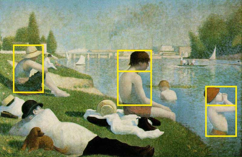
The golden ratio or golden section was first developed in by the Ancient Greek during their study of geometry where they found the number 1.61803398874989484820 during countless occurrences.
This number, what we most commonly refer to as “phi” has been considered throughout art history to be the most pleasing to the eye when the ratio for length to width of a rectangle fits this number.
Why does any of this matter?
Artists from the time of the Greeks, till today still apply the golden section to their work.
The exterior of the Parthenon designed by Phidas, Chartres Cathedral which was built during the Medieval times, Dali’s “The Sacrament of the Last Supper” and even the CN Tower in Toronto all implement the golden section.
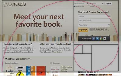
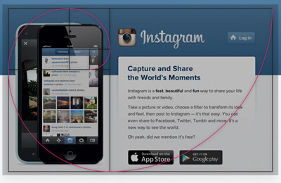
Many websites today use the golden ratio as well to make more visually appealing sites including Instagram, GoodReads.com and Paypal
How to apply it to web design:
It’s easy to see how to apply the golden ratio to column layouts, but there are so many other areas where it simplify your life.
For instance, try using the golden ratio in:
- positioning the horizon when cropping a photograph
- the sizing of your form labels in relation to your text fields.
- The height of your ‘x’ in relation to the height of your ‘l’ in a type design
The golden ratio is simply a great default in almost any sizing decision. It’s almost hard to get wrong.
You can also use the Phicalculator to create a website around the golden section.
Design Rules Can Be Broken
Douglas MacArthur once said:
“rules are mostly made to be broken and are too often for the lazy to hide behind”
While some may disagree, you should remember that it is often the disregarding of rules that yield the most unexpected and sometimes revolutionary surprises.
Whether you went to school for web design, was self-taught or learned under some other method you were more than likely introduced to a list of rules that were set for you to follow. These rules have been known to cause success but that isn’t always the case.
Not every method works for everyone, as one could see in the history of art.
Sometimes you as a designer have to break away from the mold and do what “feels right”. There has been numerous times in art history where artists did the same thing to be welcomed with praise, fame and notoriety.
Dada was an art movement back in the 20th century that incited change.
Its entire purpose was for people to reject and deny what was considered conventional and traditional forms of art where technique and genre were involved.
Dada took shape in all types of art including graphic design, literature and performance. It did not look to answer questions or to inspire. Dada broke down the conventional and built it anew with their own rules.
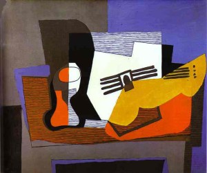
Even the famous Pablo Picasso broke the rules and has even been quoted as saying:
“learn the rules like a pro, so you can break them like an artist”
Like the Dada movement he broke what was considered traditional aesthetics.
He threw out the concept of three dimensional perspective, traded in proportion with distortion and incorporated aesthetics usually seen in more primitive art.
Sites like Akiyoshi Ishigami and Axel Aubert go outside the traditional sense and break rules as well.
How to apply it to web design:
If you don’t have a design book on hand that discusses your typical principles and various other design guidelines and rules you can find the information online.
Get yourself a firm understanding how these rules are put in practice and look at examples. You then can start experimenting by switching up the fundamentals and picking and choosing.
Try throwing out the rule of contrast within your design or completely disregard the rules of a typical layout.
Take a cue from Picasso and instead of creating exactly what you see, try to isolate the essential elements of an object — perhaps when designing icons.
A lot of these experiments will be dead-ends, but it is experimentation like these that can completely change your work in the long run.
Color Speaks Louder than Words
Web design demands the balancing of a host of elements and content, some wordier than others but it does not mean that it must overshadow your design.
Artists have been known to transform their words into visuals and allowed those visuals to “talk” for them. One way this was mastered was by the clever use of color. Color can speak volumes and lead the eye and the heart, a lesson which you should already know.
But do you truly understand its power?
 Think of how Andy Warhol utilized color or even how old propaganda posters use it.
The colors were generally bold and “loud” to attract audience attention whether for positive or negative reception or were meant to act as symbols and unspoken meanings.
Color played an important role in religious based art which can be seen throughout history. The use of certain colors were so widespread that colors like white, red and yellow have been seen as iconic.
It was these colors that stood as symbols in religion and spoke volumes to the viewer to a point where they were often emotionally moved. Association with these colors in religion could be even said to have crossed over into non-religious work.
White is often associated with purity while black is usually in reference to death or something evil, this however does not prove to be true in all cultures.
Religious art is not the only place where color is important. Much of art history utilizes color to incite some form of feeling including contemporary art that utilized intense bright color.

How to apply it to web design: It is important that when approaching your web design that you understand the purpose of why the site is being built.
- What is its intention?
- Are there emotions that it must appeal to?
- Who are the audience?
Questions like these will quickly point you towards the direction you need to go in regards to your color.
In order to find the right color however you need to play with shades and values. Look up the meaning of each color as well in order to make the right choices. Remember that sometimes colors have different cultural meaning so keep that in mind.
Attractive Visuals Garner Attention

The mind likes beauty, balance and meaning. We, as humans, have a fascination with the pretty and attractive, just as we have a fascination with the gruesome and fearsome.
Think about the golden ratio for a second. Remember that this number is thought to be the most pleasing to the eye.
It isn’t only numbers and proportions that have served to be pleasing but the ornate and decorative have as well. Designers as a whole have looked to past works to determine what their audience is attracted to and applied it to their work.
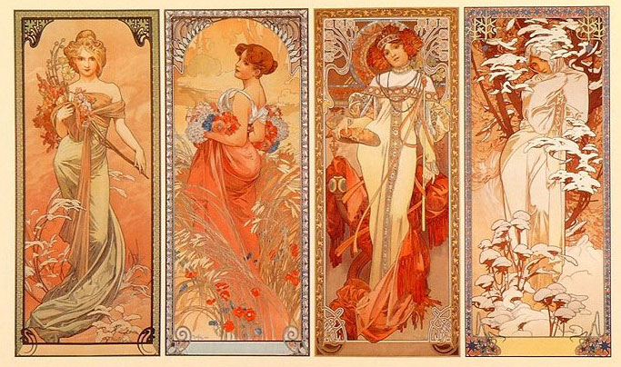
Art Nouveau was a movement that was inspired by natural forms and structures. Most often recognized by its use of floral and decorative elements along with curved lines this style has been adapted into various forms including furniture and architecture.
Designers taking cues from vintage designs are often found using elements from the Art Nouveau movement. Cues can also be taken from the Rococo movement which appeared after the Baroque style began to face a decline.
Rococo was very ornate in design much in the way that Art Nouveau was and had just as much of an impact. Floral, curves, abstract, symmetrical and asymmetrical decorations usually made up these designs accompanied with pastel hues or gold to give a elegant and rich feel.
How to apply it to web design: Sometimes your site just needs a little bit of kick to it. A proper assessment of your graphics should be done first along with feedback from others prior to any redesign or initial designing.
Take in the website’s graphics and see how they can be transformed. You want your visuals to be striking but not over the top.
Light effects like strokes and gradients may help make the visuals become more appealing. Changing color, applying contrasts or even more decorative elements may see your site looking better than before.
The Devil is in the Details
Accidents happen, even the greatest of greats create mistakes including old art masters. Details play a crucial part in just about every field and industry that you can imagine.
From mechanics, to food, to sports and of course, design, the tiny details make a difference. They can also manifest as big problems too.
If there is one thing that designers can learn from art history, it’s that not everything works the way it’s supposed to.
Movements come and go, whether because they simply don’t catch on, something better comes along or that proper consideration wasn’t given to the movement in the first place. Whatever the case there is always way to come back from mistakes or an apparent failure.
Sometimes, as history has shown us, things get misconstrued and mistranslated.
It happens from time to time and has even happened in regards to biblical imagery. There have been many images depicting Moses with horns upon his head as can be seen in such work like Michelangelo’s “Moses” and even in one of the windows in Auch Cathedral.
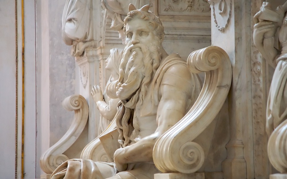
This has been thought to be the cause of a mistranslation on the behalf of Saint Jerome who had translated Hebrew into Latin for his Vulgate.
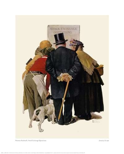
It isn’t just mistranslations of words that have caused distortions and inaccuracies in art either, a simple oversight has been the cause as well. Norman Rockwell’s “Four People Reading Stock Exchange” features a young man hunched over who appears to have three legs. Whether Rockwell just forgot to correct a line or did not notice at all, we may never know.
How to apply it to web design:
In order to avoid such mistakes web designers must remember to review their work. Read over content, go over graphics to make sure they make sense, test the code and make sure the pages work.
Doing this and having a thorough checklist will help you catch any mistakes.
It is also a good idea to have someone or a few people look over the site for you as well. They might see something that you did not.
Conclusion
Art has been serving as inspiration in regards to aesthetic choices for many years.
There are lessons within the history of art that web designers can surely learn from. From the reason for movements to the choice of colors and so on there is much that designers can pull from it. When you start on your next project try to look for similar elements in past art movements.
You may find yourself drawing inspiration.
Frequently Asked Questions about Web Design and Art History
How does art history influence modern web design?
Art history plays a significant role in modern web design. It provides a rich source of inspiration, offering a wide array of styles, techniques, and concepts that can be adapted and applied in digital design. For instance, the minimalist approach in web design can be traced back to the Minimalist art movement of the 1960s. Similarly, the use of bold colors and geometric shapes in many contemporary websites echoes the principles of the Bauhaus school of the early 20th century.
What can web designers learn from art history?
Art history can teach web designers about composition, color theory, typography, and visual hierarchy, among other things. By studying different art movements and styles, designers can gain a deeper understanding of how visual elements can be arranged to create a certain mood or convey a particular message. This knowledge can be invaluable when designing websites that are both aesthetically pleasing and effective in communicating their intended message.
How can I incorporate art history into my web design process?
Incorporating art history into your web design process can be as simple as using it as a source of inspiration. You can study different art movements and styles and see how you can adapt their principles to your designs. For instance, you could use the bold colors and geometric shapes of the Bauhaus style in your website design, or the simplicity and functionality of Minimalist art.
What are some examples of art movements that have influenced web design?
Several art movements have had a significant impact on web design. These include Minimalism, with its emphasis on simplicity and functionality; Bauhaus, known for its use of geometric shapes and bold colors; and Pop Art, which is characterized by its use of popular culture imagery and bright, contrasting colors. Each of these movements has contributed to the development of different web design trends and styles.
How does understanding art history benefit web designers?
Understanding art history can provide web designers with a broader perspective on design. It can help them understand the evolution of visual communication and the principles behind different design styles. This knowledge can be used to create more effective and engaging websites. Additionally, art history can serve as a source of inspiration, providing designers with new ideas and approaches to their work.
Can you give an example of a website that is influenced by a specific art movement?
Yes, many websites today are influenced by specific art movements. For instance, the website for the design agency ‘A Friend of Mine’ is heavily influenced by the Swiss Design movement, known for its emphasis on cleanliness, readability, and objectivity. The site uses a grid-based layout, sans-serif typography, and a limited color palette, all of which are characteristic of this movement.
What is the relationship between graphic design and web design?
Graphic design and web design are closely related disciplines. Both involve the use of visual elements to communicate a message. However, while graphic design is often concerned with static images, web design involves creating interactive experiences. Web designers need to consider factors such as usability, interactivity, and responsiveness, which are less relevant in graphic design.
How can studying art history help me become a better web designer?
Studying art history can help you become a better web designer by broadening your understanding of design principles and providing you with a rich source of inspiration. By learning about different art movements and styles, you can gain new ideas and perspectives that can enhance your design work. Additionally, understanding the historical context of different design elements can help you use them more effectively in your designs.
Are there any resources you recommend for learning more about art history and web design?
There are many resources available for those interested in learning more about art history and web design. Websites like Smashing Magazine, A List Apart, and Web Designer Depot regularly publish articles on design history and theory. Additionally, books like “Meggs’ History of Graphic Design” and “The Story of Art” provide comprehensive overviews of art and design history.
How has web design evolved over the years?
Web design has evolved significantly over the years. In the early days of the internet, websites were primarily text-based and had a very basic layout. As technology advanced, websites became more visually complex, incorporating images, animations, and interactive elements. Today, web design is a highly sophisticated discipline, with designers using a variety of techniques and technologies to create engaging, user-friendly websites.

