Keep up to date on current trends and technologies
Design & UX - Photoshop

How to Remove a Background in Photoshop: 7 Quick & Easy Methods
Amber Leigh Turner
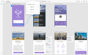
15 Top Prototyping Tools Go Head-to-Head
Dave KearneyDaniel Schwarz

10 Unexpected Sources of Design Inspiration
Aja Frost

7 Astonishing Artists and Designers to Follow on Behance
Gabrielle Gosha

4 Photoshop Styles to Lift Your Photos Above the Crowd
Gabrielle Gosha
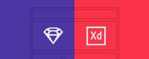
Adobe XD or Sketch: Which Will Result in the Best UX?
Daniel Schwarz

Prisma: The Rise and Fall and Rise of the One-Trick-Pony Filter
Alex Walker

10 Photoshop Plugins to Speed up Your Web Designs
Jerry Cao
6 Photography Hacks for Taking Photos with Your Smartphone
Liz Pekler
Why Your Images Might Be Ruining Your Site
Gabrielle Gosha
Parallax Burns: Converting Photographs from 2D to 3D with SVG
Alex Walker
7 MORE Photoshop Master Tips to Speed up Your Workflow
Ivaylo Gerchev
Adobe Stock Will Change the Way You Work
James George
7 Photoshop Master Tips to Boost Your Productivity
Ivaylo Gerchev
What is the WebP Image Format (And Why Does It Matter)?
Tanay Pant
Image Tricks to Make Users Feel Rather Than Think
Gabrielle Gosha
Generating Responsive Image Assets with Photoshop CC 2014
Alex Walker

3 Ways to Combine Text and Images
Annarita Tranfici
5 Photoshop Plugins to Save Your Time (and Sanity)
Simone Sala
Design Interactive Infographics in Adobe Edge Animate
Dan Carr
5 Impressive Photography Styles and How to Nail Them
Gabrielle Gosha
The Best Free (or Inexpensive) Graphics Editor for Windows
Simone Sala

5 Quick Photoshop Fixes for Bad Portrait Photos
James George
Faking Pro Portraits with your Phone Camera
Gabrielle Gosha
5 Free Web-Based Photoshop Alternatives
Ada Ivanoff

5 Must-Have Photoshop Brushes
Simone Sala

Learn GIMP: From Greenhorn to Guru in 19 Lessons
Ada Ivanoff
Linux Design Tools: High-end Design on a Low-end Budget?
Ada Ivanoff
Photoshop 101: Design an <em>Almost</em> Flat Calculator App Icon
Simone Sala
What is Flat Design (and how do I do it)?
Gabrielle Gosha
How to Create a Calendar App Icon in Photoshop
Simone Sala
Design a Flat Website Mockup in Photoshop
Gabrielle Gosha
Showing 32 of 159