
Key Takeaways
- The tutorial guides through the process of creating a mockup website using flat design in Photoshop, starting with setting up a new canvas, defining background color, adding guidelines, section colors and text, designing a button and logo, and creating sections for services, testimonials, and newsletters.
- Flat design, a trend that has been popularized in recent years, can give your work a refreshed, clean look, making it a great option if you’re looking to do something different in your design work.
- The process involves using a variety of Photoshop tools and features, including the Paint Bucket Tool, New Guide feature, Rectangle Tool, Blending Options, and Flat Icon Set, among others, allowing you to create visually appealing, neatly organized sections on your mockup website.
This year has featured several new trends in the design community as well as popularizing some techniques that have been around for a few years already. One of those trends happened to be the utilization of flat and almost flat design. Most commonly the technique has popped up in both mobile and web design. If you aren’t familiar with the trend or the various possibilities it can yield then you should check out my showcase of 20 Beautiful Flat Web and Mobile Designs.
Integrating flat design into your work is a great idea, especially if you are looking to do something different. The simple style can help your design not only look refreshed but also clean, which is always an important aspect to design. If you have always wanted to tackle flat design then today’s tutorial is for you. The tutorial below will walk you through creating your own mockup website using flat design, so let’s get started.
Resources That You Will Need:
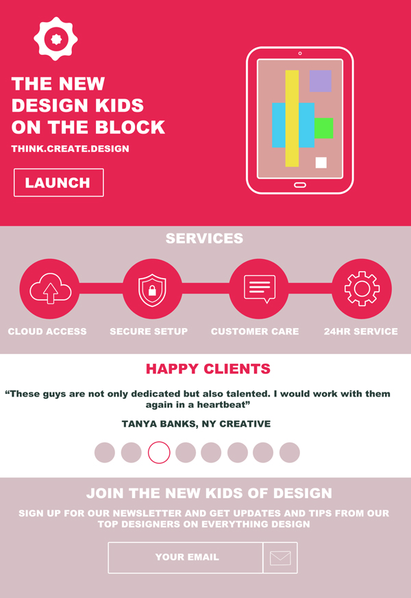
Step 1 New Canvas
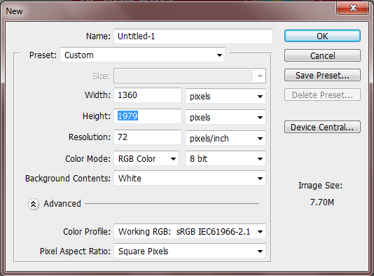
Open up your Photoshop program and create a new file by either going to File > New or simply pressing Ctrl + N. When the dialogue menu opens up you will want to give your new canvas the dimensions of 1360px x 1979px. Press Ok.
Step 2 Background Color
Create a new layer; this will be where you want to place your main background color. In this case I will be using the color #d5bfc4. Use the Paint Bucket Tool to fill in your layer.

Step 3 Guidelines
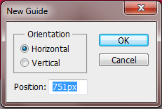
Now that you have your background colors in place you will need to add guidelines. The guidelines will help you divide up your canvas so each section of your page has its own designated area. To add guidelines you have to go to View > New Guide. A window will pop up next where you can enter your measurements. Below is an image showing you how to input the first dimensions of 751px.
Follow this method and add the last two measurements of 1163px and 1579px. Your final image should like this.

Step 4 Section Colors
In your first section of 751px you want to fill this space in with the color #e62452 like so.
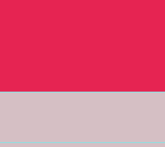
Leave the space that measures 1163px alone but fill the section underneath it with #ffffff.

Step 5 Section Text
We are now going to start adding content to our first color section. With the font Arial and the font size at 60pt type in your desired text in #ffffff and offset it to the left of your section.

Next type in 30pt underneath it your tag line or any other information that you prefer.

Step 6 Button
A button needs to be added underneath the text we have just created but we want to maintain a flat look. To do this use the Rectangle Tool to create a small rectangle underneath your secondary text making sure your foreground color is set to #fc2f60.

Double click on your button layer and open up the Blending Options dialogue menu. Check the Stroke Box and set the stroke size to 3px and the color to #ffffff. Press OK when finished.
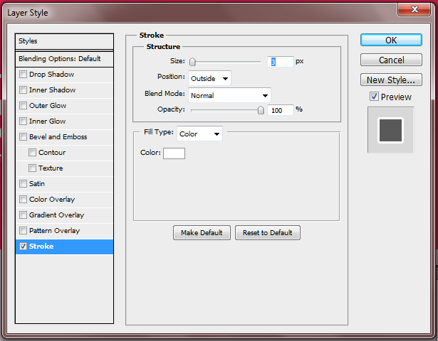
Change your layer mode to Darken so that you only have an outline of your button.
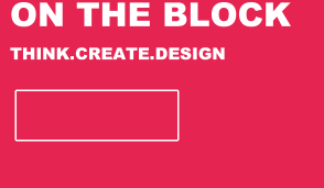
Finish up by adding the text “LAUNCH” to your button in 46pt.
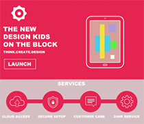
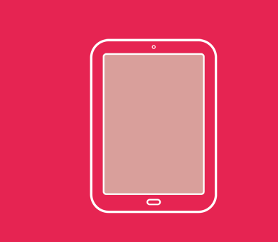
Step 7 Tablet
Open up the Flat Icon Set and select the image of the tablet. Copy and paste it on to your canvas then resize it so that it is slightly larger than the height of your text and button. Offset the tablet to the right of your color section.
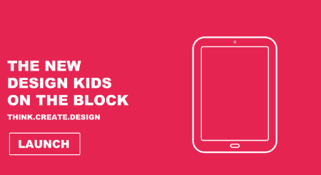
Fill the inside of the tablet with #d99f9b to represent a screen.
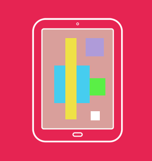
Now with various colors of your choosing create random geometric shapes inside of your tablet until you have something that looks similar to the image below.
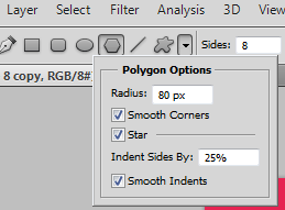
Step 8 Logo
With our main section nearly completed we can now go and add our logo to finish the section up. First make sure that your foreground color is set to #ffffff. Now up at the top of your screen indicate that you want your shape to have 8 sides. Click on the arrow of the Custom Shape Tool and fill in the following sections.
Now create your shape just above your text. The shape should look like this.
Next rasterize your layer by right clicking on it and selecting “rasterize layer”, when you have that done you can use the Circular Marquee Tool to take a chunk out of the middle of your logo shape.
Use the Custom Shape Tool one more time to add the original shape once more into the middle of your larger shape. Your logo should now look like the image below.

Step 9 Services Box
We will now go and start fleshing out our “service” box. First start by adding the title SERVICES at the top in 46pt font and in the color #ffffff.

With the same color you used to create your main color section you will want to use it again to create four evenly spaced circles. This is where your icons will go.

Now create 3 skinny rectangular bars and position them so that it looks like each circle is connected to the next.

Open up your Flat Icon Set once more and select the gear, the security shield, the speech bubble and the download cloud. Resize each icon and place one in each circle.

Finish up the service box by adding in your text.
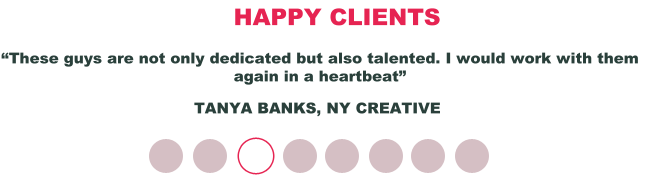
Step 10 Testimonial Box
Begin by adding your desired title text for your testimonial box.
Next in a smaller font than your title you will want to add in a testimonial quote as well as the person who wrote it.

Now with the color #d5bfc4 you will want to create eight little circles and place them evenly apart and underneath your testimonial quote.

Go to the third testimonial circle and open up the Blending Options menu. Check the Stroke box and change the stroke size to 3px and the stroke color to #e62452. Press OK and then change the layer mode to Lighten.
Step 11 Newsletter Box
Create a new text box to add in your title for your newsletter box.
Now in a smaller font of 30pt type your secondary text underneath your title.

Use the color #efefef to create a long skinny rectangle and a square beside it. This will be your form.

Just like you have been doing throughout add an outline of #ffffff at 3px around your boxes then change the layer mode to Darken.

Add your envelope icon into the square space and then type in “your email” into the larger space.

Here is what your final image will look like.
Download the PSD file
Frequently Asked Questions on Designing a Flat Website Mockup in Photoshop
What is the importance of creating a flat website mockup in Photoshop?
Creating a flat website mockup in Photoshop is crucial for several reasons. Firstly, it allows designers to visualize the final look of a website before it’s developed. This helps in identifying potential design issues early on, saving time and resources. Secondly, it provides a clear roadmap for developers, ensuring everyone is on the same page regarding the website’s design and functionality. Lastly, it’s an excellent tool for presenting design ideas to clients or stakeholders, facilitating better communication and feedback.
How can I create a responsive design in my website mockup?
To create a responsive design in your website mockup, you need to consider how your design elements will adapt to different screen sizes. Photoshop provides tools like artboards and smart objects that can help you design for multiple screen sizes simultaneously. You can also use guides and grids to ensure your design elements align correctly on different devices.
What are the standard sizes for a website mockup design in Photoshop?
The standard sizes for a website mockup design in Photoshop can vary depending on the device you’re designing for. However, a common size for desktop screens is 1366×768 pixels. For tablets, a common size is 768×1024 pixels, and for mobile devices, it’s typically 375×667 pixels. Remember, these are just guidelines, and the actual size may vary based on the specific device or screen resolution.
How can I add interactivity to my website mockup in Photoshop?
While Photoshop is primarily a static design tool, you can simulate interactivity by creating multiple artboards representing different states of your website (like hover, click, etc.) and linking them together. However, for a more interactive prototype, you might want to consider using a dedicated prototyping tool like Adobe XD or Sketch.
What are some common mistakes to avoid when creating a website mockup in Photoshop?
Some common mistakes to avoid when creating a website mockup in Photoshop include not using a grid system, which can lead to misaligned design elements; not considering responsive design, which can result in a design that doesn’t adapt well to different screen sizes; and not using layers and groups effectively, which can make your PSD file messy and hard to navigate.
How can I present my website mockup to a client or stakeholder?
When presenting your website mockup to a client or stakeholder, it’s important to clearly communicate your design decisions and how they align with the project’s goals. You can use Photoshop’s presentation features to create a slideshow of your design, or export your design as a PDF or JPEG for easy sharing. It’s also helpful to prepare a script or notes to guide your presentation.
Can I use Photoshop to create a mockup for a mobile app?
Yes, you can use Photoshop to create a mockup for a mobile app. The process is similar to creating a website mockup, but you’ll need to consider the specific requirements of mobile devices, such as touch interactions and smaller screen sizes.
How can I improve my skills in creating website mockups in Photoshop?
Improving your skills in creating website mockups in Photoshop involves practice, learning from others, and staying updated with the latest design trends and tools. Online tutorials, courses, and design communities can be great resources for learning and inspiration.
What are some alternatives to Photoshop for creating website mockups?
While Photoshop is a powerful tool for creating website mockups, there are several alternatives available. These include Sketch, Adobe XD, and Figma, which offer similar features and are specifically designed for UI/UX design.
How can I make my website mockup more realistic?
To make your website mockup more realistic, you can use high-quality images, realistic fonts, and accurate content. You can also add subtle details like shadows and textures to give your design depth and realism. Additionally, consider how your design will look on different devices and in different browsers to ensure it’s as realistic as possible.