
Though web content can take on many different forms – from text to graphics and video, it’s clear that photography is one of the web’s dominant forms.
In fact, nowadays you might be hard pressed to come upon a site that doesn’t have some form of photography. This is hardly surprising. Photography has always been as today able to evoke powerful emotional responses. It’s now faster, cheaper and cleaner than ever before.
While I can’t tell you what imagery to select, I can point you in the direction of good guidelines to follow to choose effective stock photography. The rules above can also be used in regards to photography you have taken yourself, but it doesn’t seek to aid you to customize or treat your images.
That’s where this article comes in.
As most of you are probably aware, most professional photos that are featured on websites have undergone some kind of treatment or editing. Most of the times this is done so that the photo matches the site content and theme as opposed to the possibility that the photo just plain sucked.
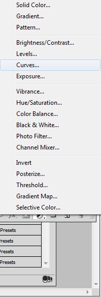
Key Takeaways
- Explore the timeless charm of the retro/vintage look by adjusting camera settings and layers, ideal for wedding and fashion websites.
- Achieve a dream-like quality with the muted look using desaturation techniques, perfect for design and personal blogs.
- Stand out with the monochromatic look by using a single color palette, simplifying design decisions for art and business sites.
- Embrace the classic black and white look, removing color to highlight textures and contrasts, suitable for various website categories.
- Capture attention with the high contrast look, enhancing colors and details for a cinematic effect, great for thematic and promotional websites.
Five Flavors
There are many styles to choose from but I’m going to walk you through five of my favorites today.
- The retro/vintage look
- The muted look
- The monochromatic look
- The black and white look
- The high contrast look
I’m going to give you a quick rundown on each look, share a few examples, highlight some Photoshop action plugins that can give you a ‘quick fix’ and then show you how to achieve these looks manually in Photoshop.
And remember, like most aspects of Photoshop, there’s almost always more than one way to achieve any of these effects.
The Retro/Vintage Look
The first style we will cover is the retro/vintage look. Over the years despite the advancement in technology and modern culture this look has become increasingly popular. Its popularity isn’t quite explained but using the effect can yield beautiful results.
It should be noted however that this look does not work with every photo so you really have to experiment and see which photos can benefit from this treatment. The original lighting and camera settings can affect your final look so adjusting your layers is important.
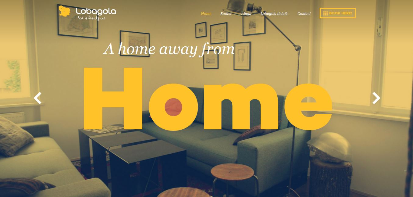
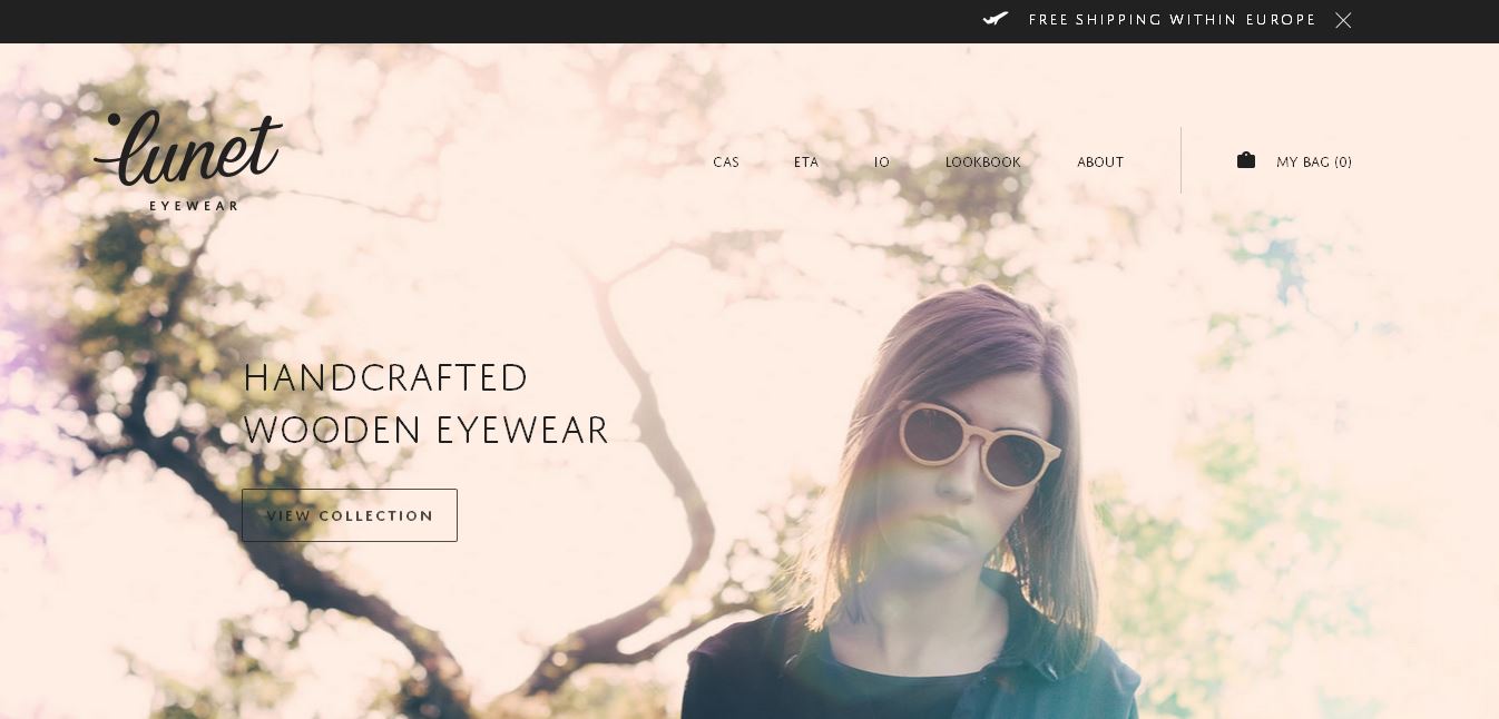
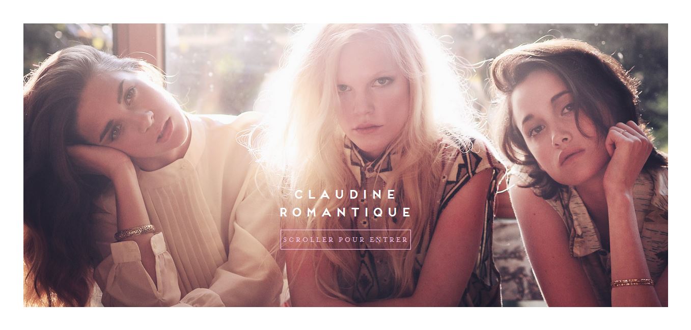
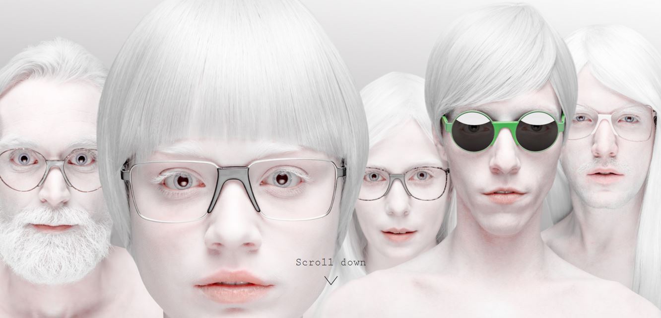
Though the retro/vintage look is extremely popular it is often used in wedding, fashion/makeup and “indie” related websites. The look has also been used with websites of various different content including nature and interior images so don’t let this stop you.
As noted before lighting and camera settings will generate a particular look when applying your vintage look. Colors often associated with this look are blue, red, purple, green and yellow. You can apply a muted look as well when using a retro/vintage look.
Keep in mind that if you are applying the style to images with dark colors or have a model with a darker shade of skin that you need to decrease your amount of adjustments as not doing so can have your model’s skin taking on one of the aforementioned colors.
Lobagola – http://www.lobagola.com/
Lunet Eyewear – http://luneteyewear.com/
Le Col de Claudine – http://www.lecoldeclaudine.com/fr
- Vintage Action: http://photoshop-stock.deviantart.com/art/Vintage-Effect-Ps-Actions-100468287
- Retro Action: http://www.deviantart.com/art/Retro-Fashion-PS-Action-Set-260465447
Master Class: Doing it by hand
Step 1: Open Your Image
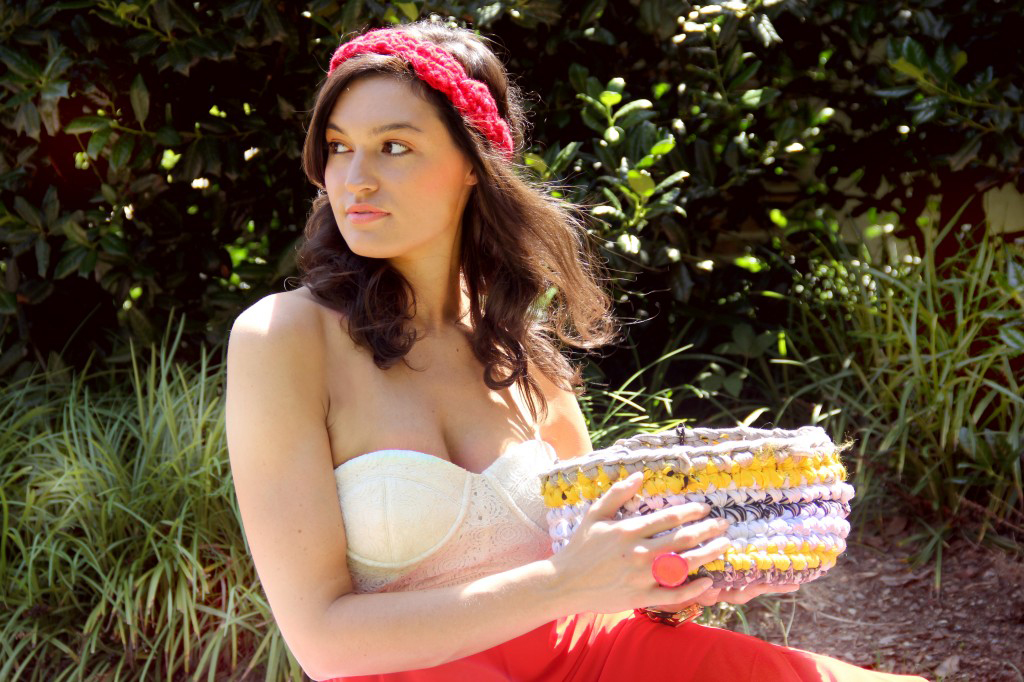
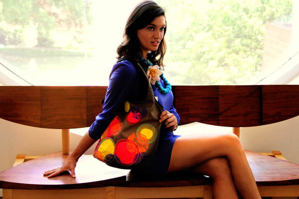
Pick your desired image that you want your effect to be applied to. In these tutorials I will be using photos that I have personally taken.
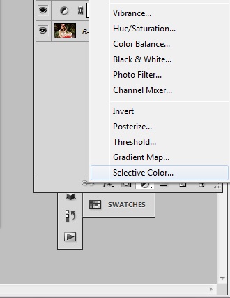
Step 2: Selective Color Click on the Adjustment Layer button at the bottom of your layer window and choose Selective Color.
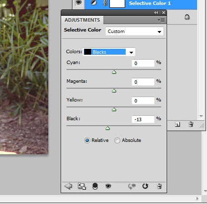
Go to the newly open window and select the Blacks from the drop down and then move the black channel to -13.
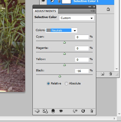
Now select the color to show Neutrals and move the black channel to -16.
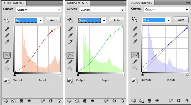
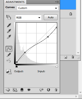
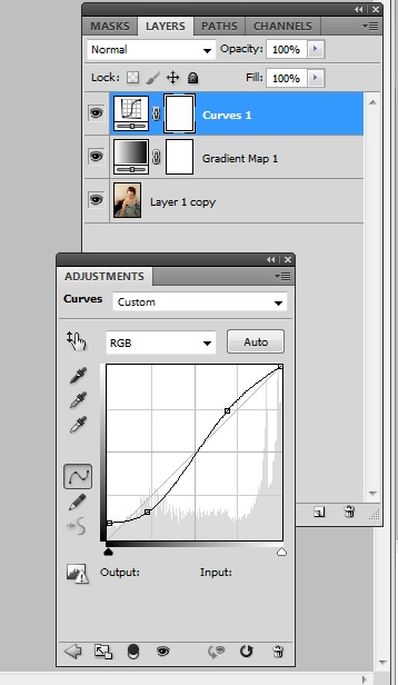
Step 3: Curves
Add a new adjustment layer the same way you did in step 2 but choose Curves instead. Change the Red, Green and Blue channels to reflect the image below.
Step 4: Gradient Fill
Create a gradient fill layer and change the colors so that they reflect #ec2a61 and #440332. Keeping a linear gradient you want to have an angle of -127.87 degrees.
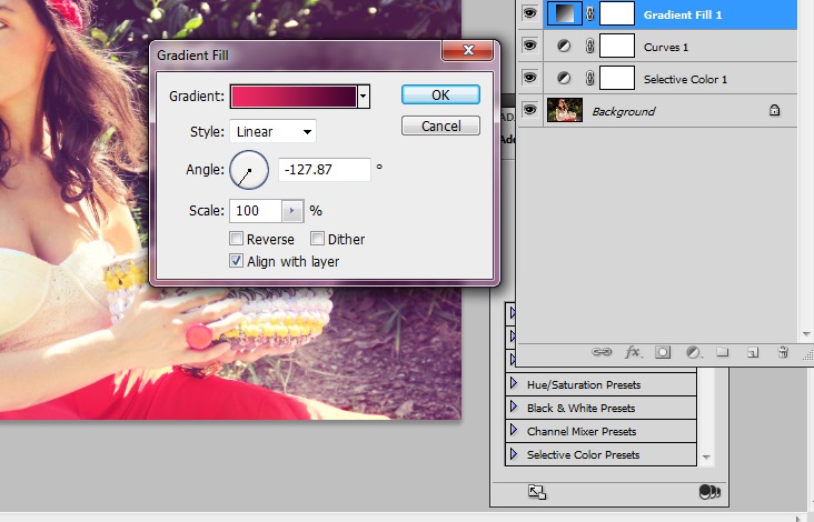
Change the layer mode to Screen and drop the opacity to 24%.
Step 5: Gradient Fill 2
Now add a second gradient fill layer but this time have your colors reflect #0065e1 and #1ab044. Have your linear gradient angled at 39.29 degrees.
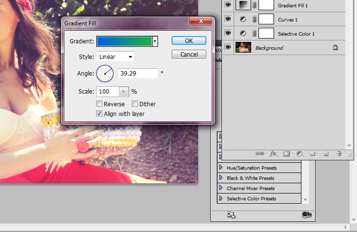
Change the layer mode to Lighten and drop the opacity to 15%.
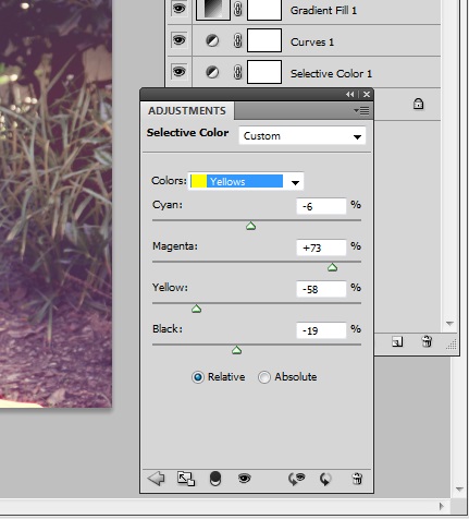
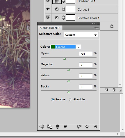
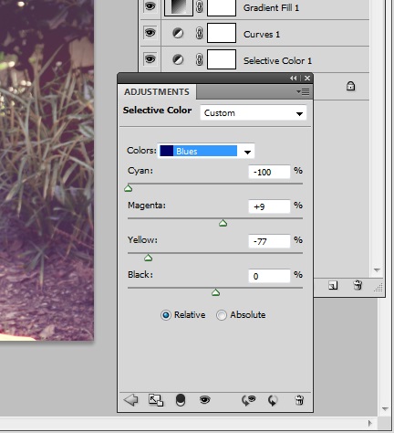
Step 6: Selective Color 2
To finish up our vintage look we will create one more selective color layer. This time we will change the Yellows, Greens and Blues.
Yellows
Greens
Blues
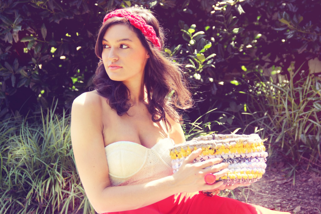
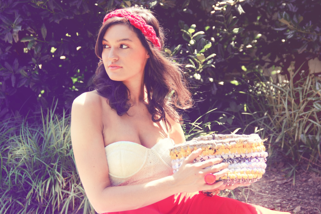
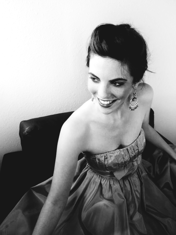
Here is the final look:
The Muted Look
The muted look is another look that can be easily applied in Photoshop. The idea is to simply mute your colors instead of making them pop. This can give your image a slightly unreal feeling — perhaps like a dream or a memory.
Do note that muting your colors does not mean that you eliminate the colors of your photo altogether. That would be the act of turning your image into a black and white or sepia image.
Though the muted look can be added to other stylized photo effects, particularly those that are retro/vintage or black and white it can be applied by itself with no other effects included. Also known as a faded, washed out or desaturated look, the muted look is perfect when you want to add an image but don’t want it as the main central focus of your website. It is also ideal if your website uses cool or pastel colors.
Unlike the retro/vintage look you don’t have to worry so much with the original settings and lighting of your photo as you do with how much of an adjustment you use. Basically while you are washing out your colors you don’t want to completely do away with them and you don’t want your final image looking too gray.
Websites that typically use this look are fashion, design and personal related sites. Like all other styles this look can be applied to any site category that you want such as sport and cultural sites. It’s really just up to your personal preferences.
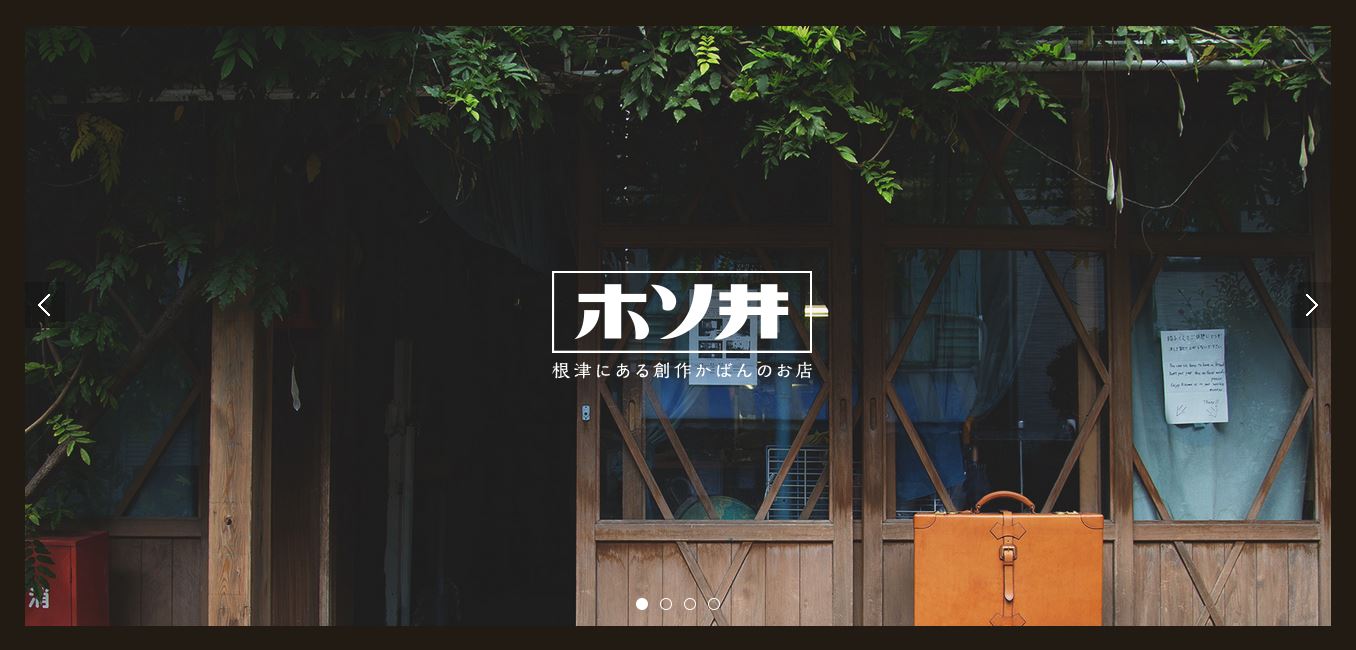
Kaban Hosoi : http://kabanhosoi.com/
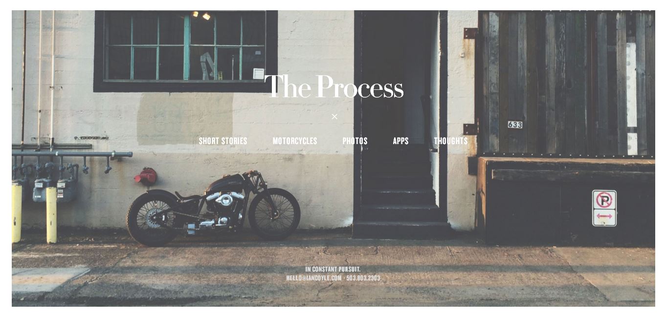
Ian Coyle : http://process.iancoyle.com/
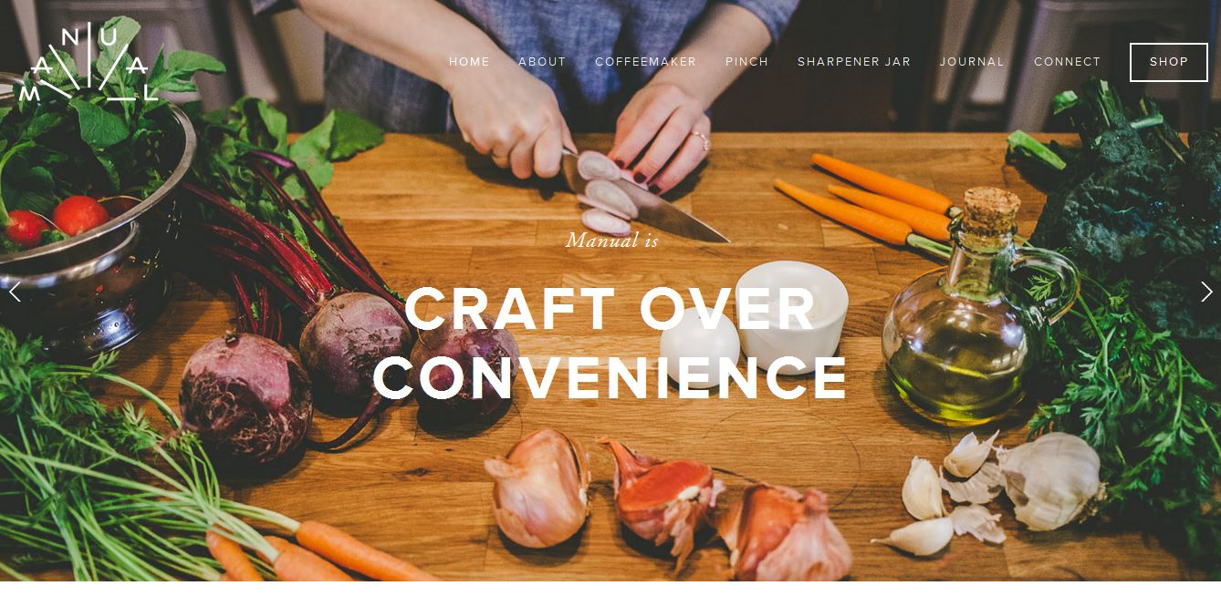
Manual : http://www.manual.is/
- Muted Action 1 : http://enhancers.deviantart.com/art/JJ-s-PSD-ATN-23-322581561
- Muted Action 2 : http://stacheactions.deviantart.com/art/Moody-Action-374844569
Master Class: Doing it by hand
Step 1: Open Your Image
Pick your desired image that you want your effect to be applied to. I will be using my own image here.
Step 2: Curves
Add a new adjustment layer by clicking on the black and white icon at the bottom of your layer window and choose curves.
On the RGB channel change the curves to reflect the image below.
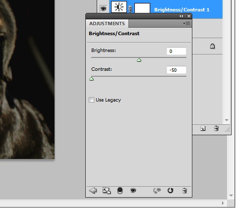
Step 3: Brightness and Contrast
Make a new adjustment layer but this time with the brightness and contrast. Scale the contrast slider to the far left so that it is -50.
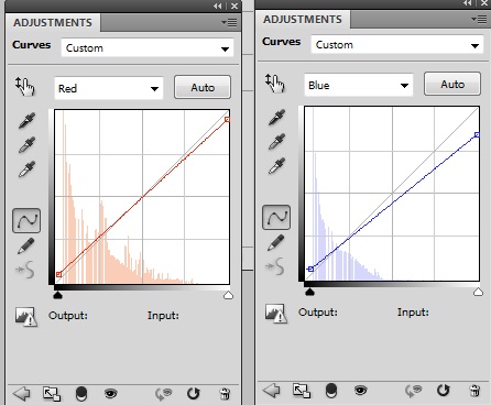
Step 4: Curves 2
Create another curves adjustment layer and change the Red and Blue channels only to reflect the image below.
Step 5: Color Fill
Finish up by adding an adjustment color fill layer. Change the fill color to #0a1939 and then set the layer mode to Screen at 60%.
Here is the final image:
The Monochromatic Look
While maybe not as popular as the other styles included in this article the monochromatic look has found some popularity within recent years. The look has not just been applied to just included photography but websites overall. This look should not be confused with achieving a black and white image. With applying a monochromatic look you are simply changing your image into one that uses one, singular color of varying shades (due to lighting) as opposed to multiple colors.
Adding a monochromatic look definitely makes your website stand out as the look is slightly unconventional. Not only that but it makes matching and choosing your elements a lot easier as you only need elements of one particular color.
This style is perhaps one of the more easier and faster looks to achieve besides black and white. While you can use any color to create the monochromatic look the colors typically used are red, blue and purple. Darker shades of these colors are often applied in lieu of pastel colors but adding a muted look has been used in conjunction for those who don’t want such a bold look.
There isn’t much to worry about when applying a monochromatic look but you should know how dark or light you want the color to appear. Even if you don’t know you can always experiment but do be careful as too dark of a color can make your photo hard to discern. You can often find this style used in websites that are agencies, art/illustrated and business related. Naturally you can also see these applied to sites that sell clothing.
Underbelly : http://underbelly.is
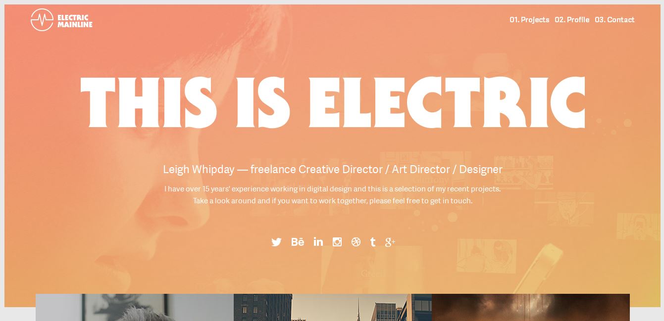
Electric Mainline : http://www.electricmainline.co.uk/
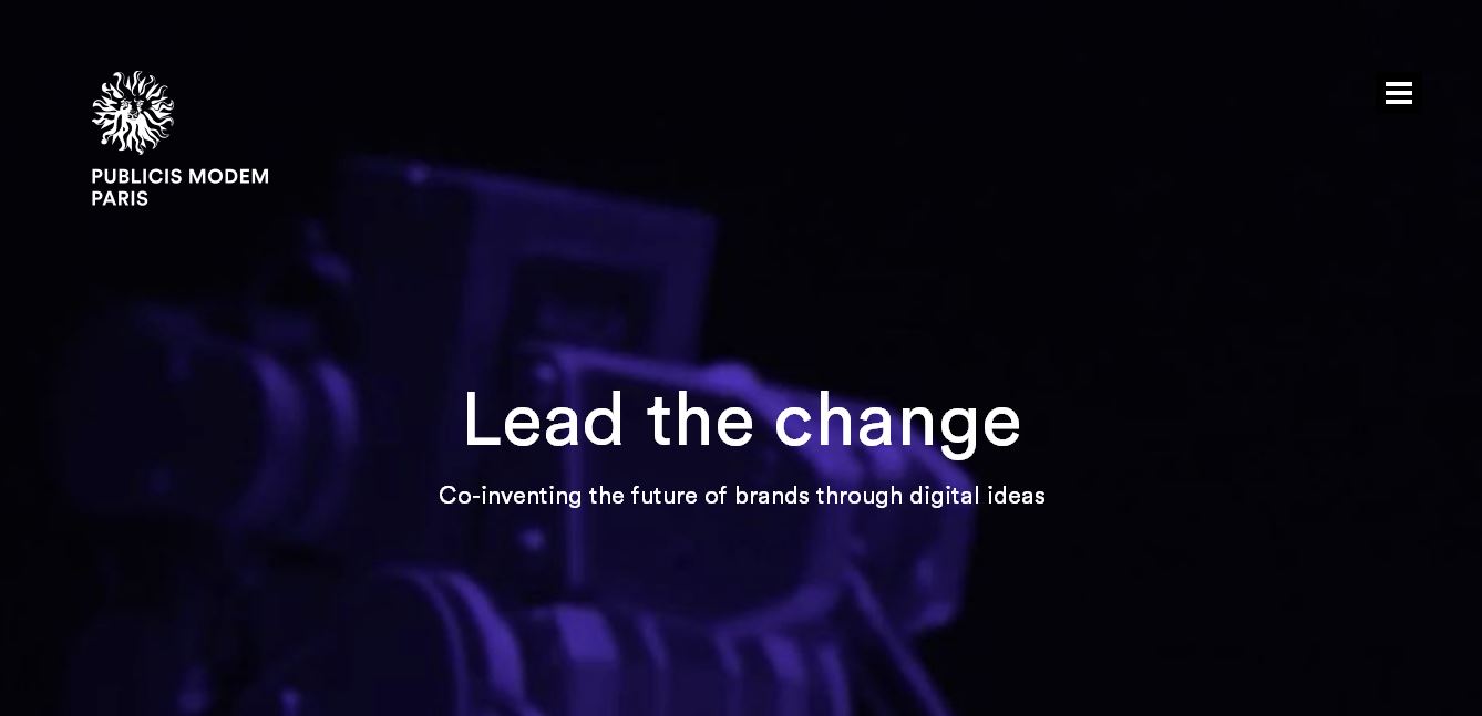
Publicis Modem : http://www.publicis-modem.fr/
- Monochromatic Action 1 : http://www.deviantart.com/art/Photoshop-Actions-Pack-4-121965700
- Monochromatic Action 2 : http://www.deviantart.com/art/50-Photoshop-Actions-Pack-2-121407402
Master Class: Doing it by hand
Step 1: Open Your Image
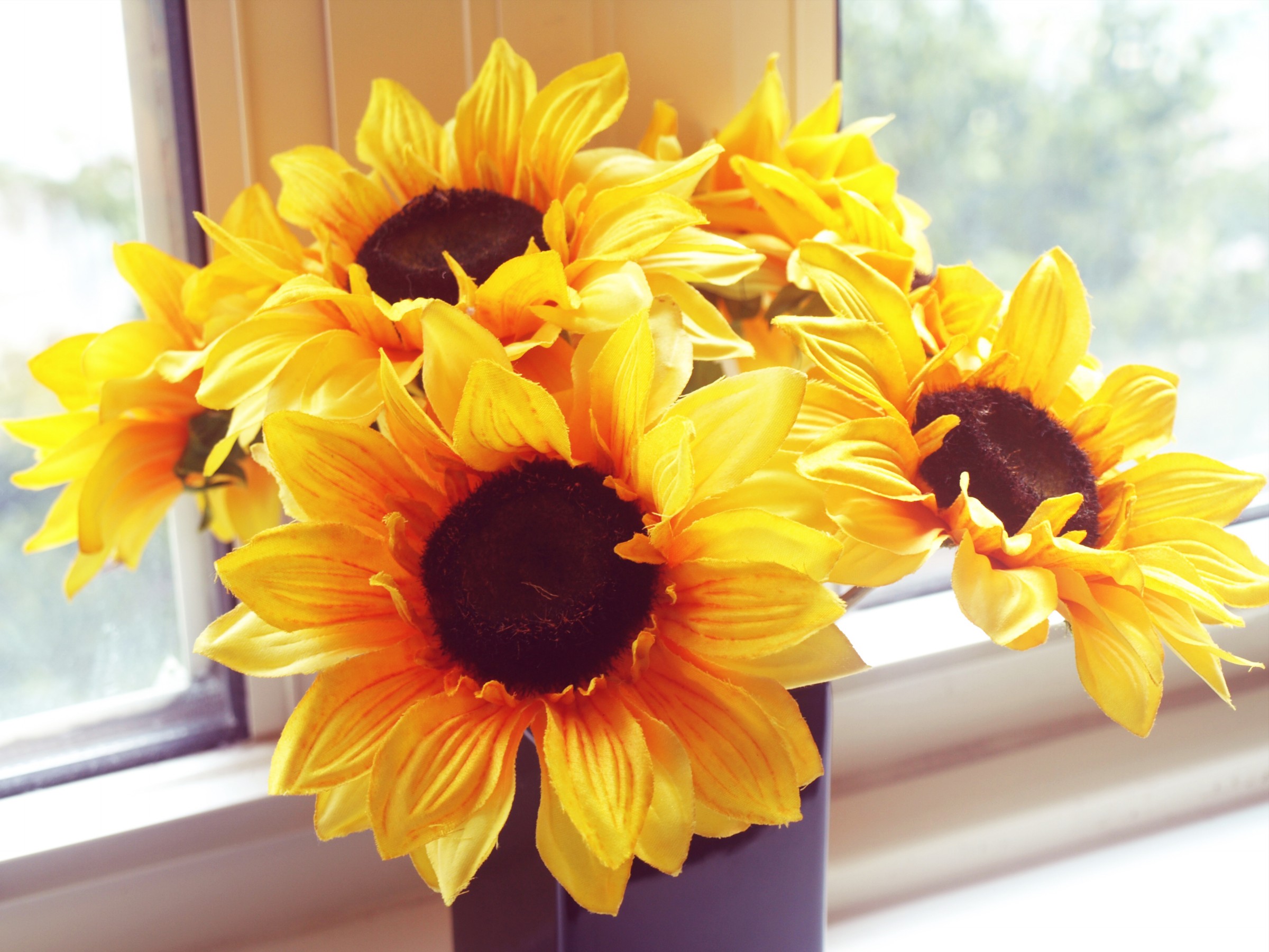
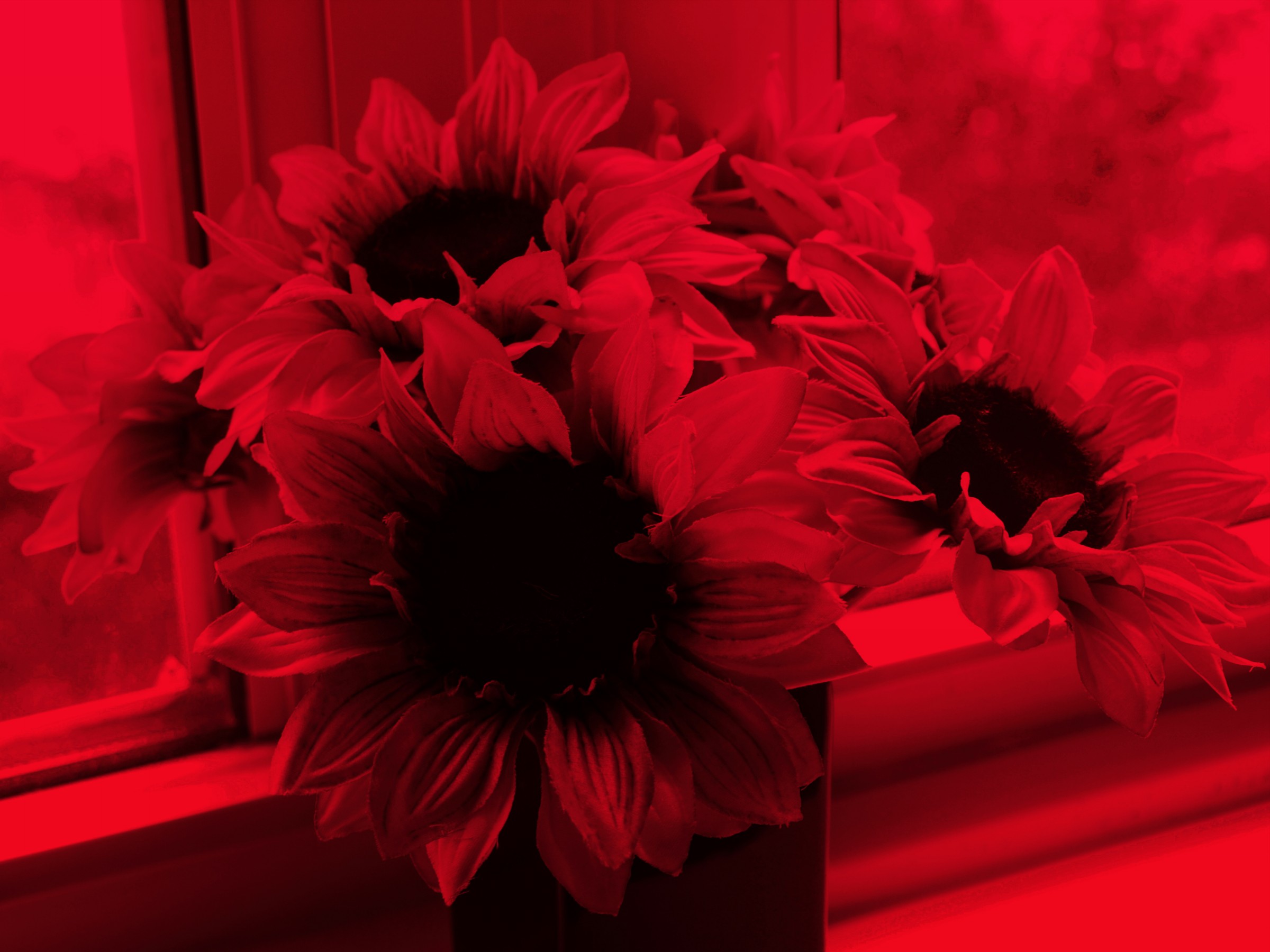
Pick the image that you want to work with to add a monochromatic effect to. I will be using my sunflower photo for this.
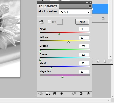
Step 2: Black and White
The first thing you want to do is convert your image to black and white under your adjustments menu. Once you have it black and white you will need to tweak the numbers like so.
Step 3: Gradient Map
Now add a gradient map to your image by accessing the adjustments menu. Make sure the colors are #e10019 and #6f0303 and you check the reverse box. Don’t forget to change the layer mode to Multiply.

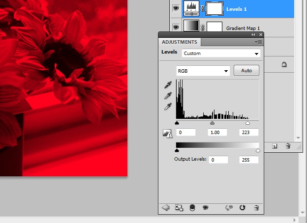
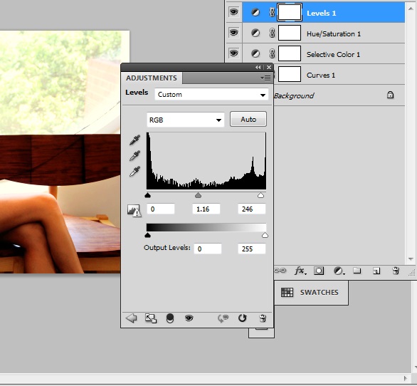
Step 4: Levels
To lighten up our image we will now add a levels adjustment and change the numbers to reflect the image below.
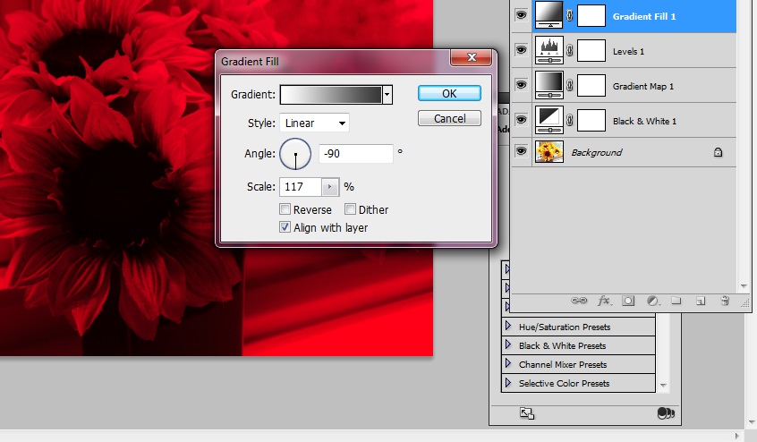
Step 5: Gradient Fill
We will now redirect the light of our image by adding a gradient fill. Change your colors to #ffffff and #373737. Make sure the linear angle is -90 degrees and the gradient scale is 117%. When you have input your numbers you can change your layer mode to Overlay with a 48% opacity.
Step 6: Color Fill
Finish your image by creating a color fill adjustment layer and fill it with #ffffff. Change the layer mode to Hue and drop the opacity to 9%.
Here is the final image:
The Black and White Look
The most popular of the styles, the black and white look has been around and used a long time as it was used before the application of color was invented in both film and photography. As the more popular of looks it should not be surprising that this look has several “sub-looks” and has been used all over the place. The application of the look isn’t difficult at all as it is simply the act of removing all and any color from your photo.
Photos that are black and white can be high contrast, overexposed, muted and even aged depending on what you’re going for. Tweaking your adjustment settings is the easiest way to get these sub-looks.
If you find that the other styles just don’t work for your photo or does it justice then typically converting it to black and white will do the trick. Your camera and lighting settings will definitely determine the look of your photo when applying a black and white filter but don’t let that discourage you. Manipulating such settings like the brightness and contrast or even the levels can help you achieve a customized look you can be happy with.
You will definitely catch this look used within websites of various categories as removing your photo’s color makes it a lot easier to include no matter if you’re an agency, architecture or artistic website. Do keep in mind that though this is true you do want to pay attention on how dark or light you make your final image.
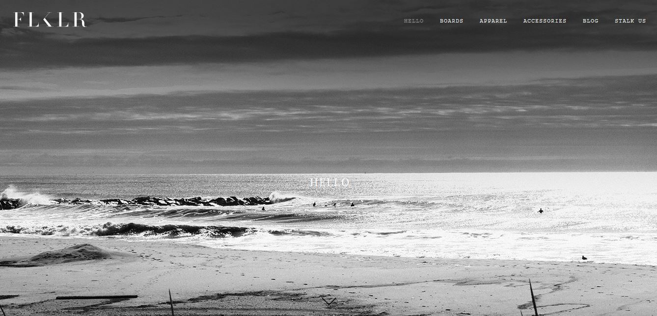
Folklore Surf http://www.flklrsurf.com/#hello
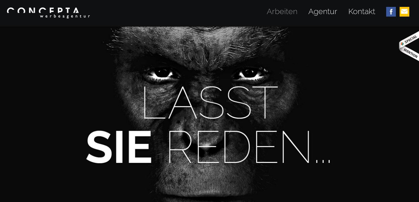
Concepta http://www.concepta.at/
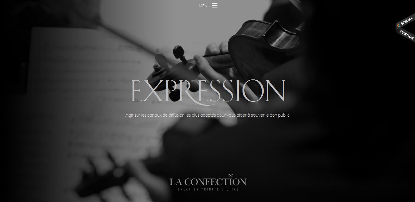
Agence de Communication Lille http://www.laconfection.fr/
- Black and White Action 1 – http://grace-like-rainx.deviantart.com/art/Black-and-White-Photoshop-Actions-336883111
- Black and White Action 2 – http://shadnavid.deviantart.com/art/Black-n-White-Tones-75105895
Master Class: Doing it by hand
Step 1: Open Your Image Pick your desired photo that you want to work with, preferably not a black and white image for this one. I will be using a photo I personally took.
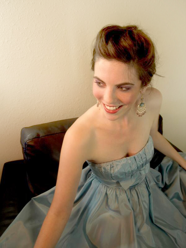
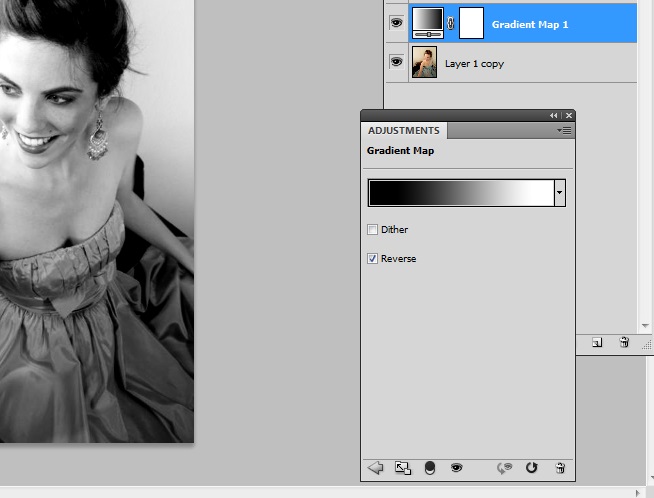
Step 2: Gradient Map First thing you need to do is set your foreground #ffffff and your foreground to #000000.
Next open up the gradient map adjustment layer menu and change the location of #ffffff to 12% and #000000 to 85%.
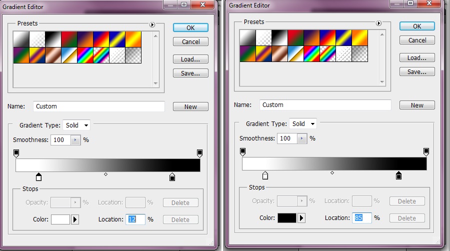
Check the reverse box.
Step 3: Curves Finish customizing your black and white image by adding a curves adjustment. Change the RGB channel to reflect the image below.
Here is the final image:
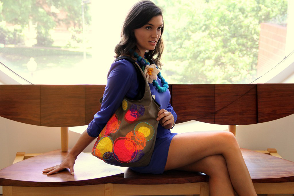
The High Contrast Look (With Color)
The last and final look we will cover here is the high contrast look. This is the look that you want if you want your image to be bold and eye-catching. When applying a high contrast look effectively your image will take on a “cinematic” look and will make your photos look as if they were taken by a professional even if they weren’t. The main goal of the look is to make your colors stand out just as much as the subject of the particular image.
High contrast looks are great for highly stylized and thematic websites as opposed to minimalistic designs. This does not mean that it can’t be used with layouts that take on more simplistic approaches however.
Do note that when using this style you can encounter the problem of producing an overexpose or over saturated look which often times than not does not compliment your image. To battle this problem you should concentrate more on the tweaking of your levels and curves instead of the brightness and contrast.
Also while you can add other styles like the retro/vintage effect this style tends to work better by itself.
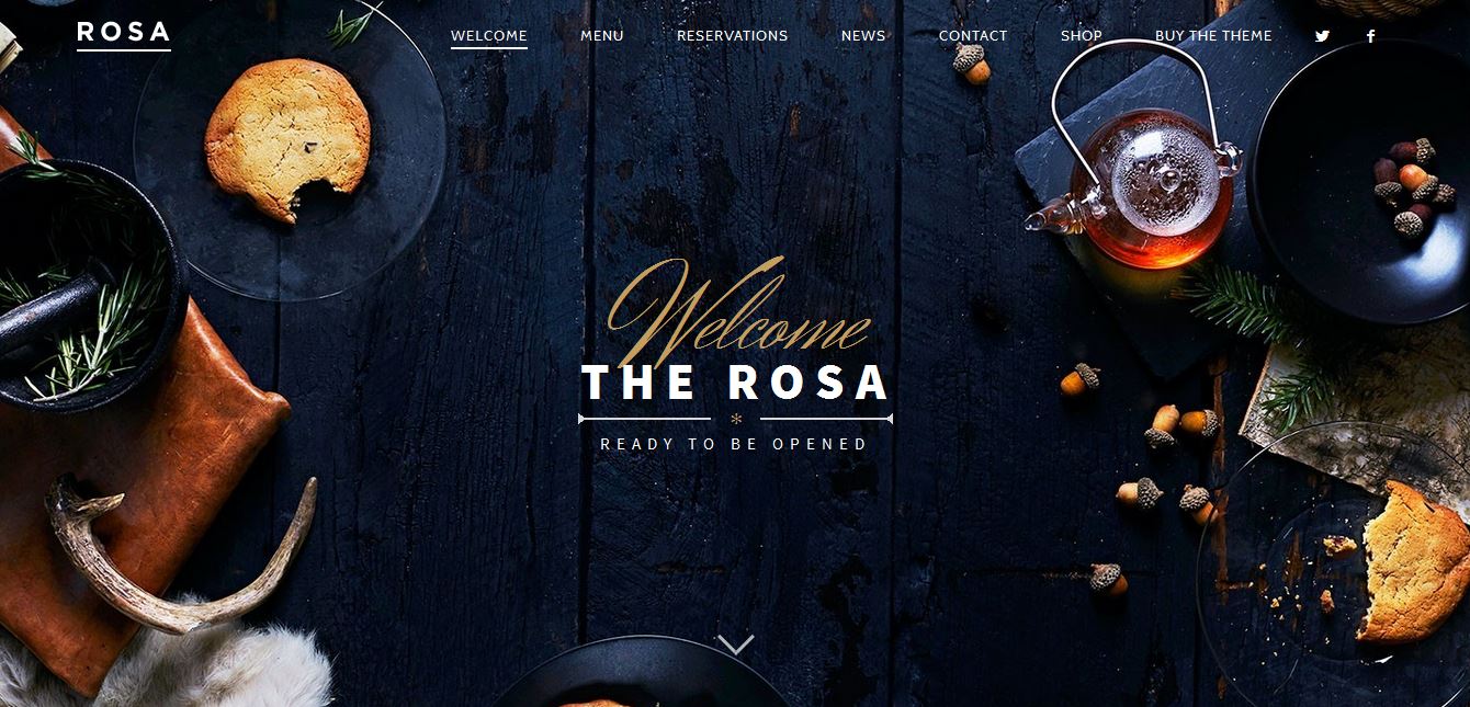
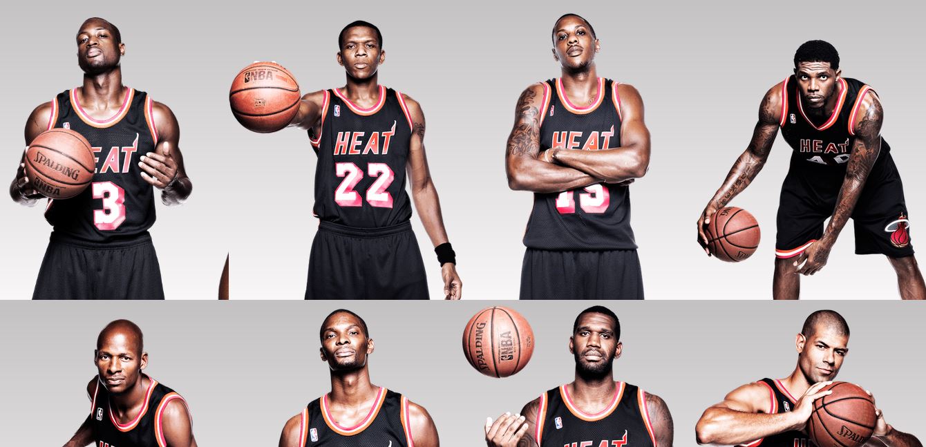
Like with black and white images you are likely to find this style added to photos on websites of multiple categories. Websites that are more likely to feature the looks are hospitality, promotional and food/drink as bold colors tend to work for these type of categories.
The Rosa – http://pixelgrade.com/demos/rosa/
Miami HEAT Throwback Black – http://throwbackblack.com/
Andy Wolf Eyewear
- High Contrast Action 1: http://auroille.deviantart.com/art/green-contrast-action-115918724
- High Contrast Action 2: http://pstutorialsws.deviantart.com/art/Murderess-Action-106065079
Master Class: Doing it by hand
Step 1: Open Your Image
Pick your desired photo that you want to work with, preferably not a black and white image for this one. I will be using a photo I personally took.
Step 2: Curves
Once you have your photo open go to the curves adjustment layer and change the curve in the RGB channel like so.

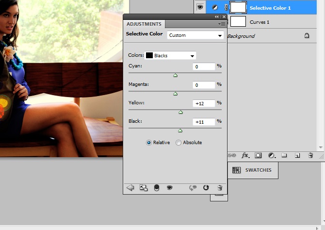
Step 3: Selective Color
Create a selective color adjustment layer next and choose Blacks from the drop down menu. Change the sliders to match the image below.
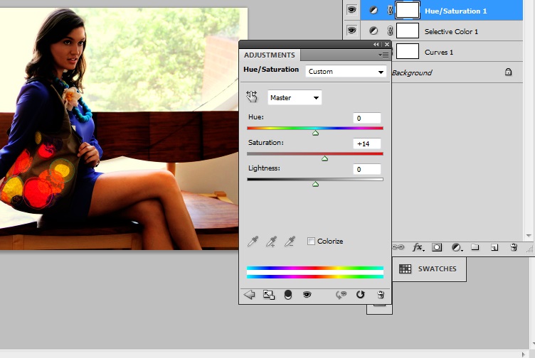
Step 4: Hue/Saturation
Add a hue/saturation adjustment layer and change the saturation to +14.
Step 5: Levels
Here is the final image:
Though I do have an affinity and have been known to use 4 out of the 5 styles here (monochromatic isn’t my thing) I do recommend that you experiment with all five styles.
Keep in mind my final images are entirely my personal preferences and may not appeal to everyone.Try to add your own alterations and tweaks as these can prove to benefit your photos and give them a unique look. Remember that isn’t necessary to keep your adjustment layers at 100% opacity. Sometimes lowering your chosen adjustment opacity gives you a better and more suitable look in the end.
If you personally edit your photos or just like photography let me know which is your favorite style to use.
Frequently Asked Questions (FAQs) about Photography Styles for Web Design
What are the key elements to consider when choosing a photography style for web design?
The key elements to consider when choosing a photography style for web design include the purpose of the website, the target audience, the brand’s identity, and the overall aesthetic of the site. The photography style should align with these elements to create a cohesive and engaging user experience. For instance, a website for a luxury brand might benefit from high-fashion or editorial photography, while a travel blog might be better suited to landscape or documentary photography.
How can I effectively use minimalist photography in web design?
Minimalist photography can be effectively used in web design by focusing on simplicity and the use of negative space. This style can help to draw attention to the main subject or message of the website, reduce distractions, and create a clean, modern aesthetic. It’s important to use high-quality images with strong compositions and to ensure that the minimalist style aligns with the overall design and purpose of the website.
What are some tips for using macro photography in web design?
Macro photography can add a unique and interesting element to web design. To effectively use this style, focus on capturing high-quality, detailed images of small subjects. These images can be used as background images, in sliders, or as part of the overall design aesthetic. It’s important to ensure that the images align with the brand’s identity and the purpose of the website.
How can I incorporate high-dynamic-range (HDR) photography into my web design?
High-dynamic-range (HDR) photography can be incorporated into web design by using it to create striking, detailed images with a wide range of tones. This style can be particularly effective for websites that want to showcase detailed images, such as real estate or travel websites. However, it’s important to use HDR photography sparingly and in a way that aligns with the overall design and aesthetic of the website.
What are the benefits of using black and white photography in web design?
Black and white photography can add a timeless, classic feel to a website. It can also help to create a sense of drama and emotion, draw attention to textures and shapes, and reduce distractions. This style can be particularly effective for websites with a minimalist design or for those that want to create a specific mood or atmosphere.
How can I use aerial photography in web design?
Aerial photography can be used in web design to provide a unique perspective and to create a sense of scale. This style can be particularly effective for websites related to travel, real estate, or any industry that benefits from showcasing large-scale images. It’s important to use high-quality, well-composed aerial images that align with the overall design and purpose of the website.
What are some tips for using portrait photography in web design?
Portrait photography can be used in web design to create a personal connection with the audience. This style can be particularly effective for websites related to personal branding, professional services, or any industry that benefits from showcasing people. To effectively use portrait photography, focus on capturing high-quality, engaging images that align with the brand’s identity and the purpose of the website.
How can I incorporate documentary photography into my web design?
Documentary photography can be incorporated into web design by using it to tell a story or to provide a behind-the-scenes look at a process or event. This style can be particularly effective for websites related to journalism, nonprofits, or any industry that benefits from showcasing real-life situations. It’s important to use high-quality, engaging documentary images that align with the overall design and purpose of the website.
What are the benefits of using abstract photography in web design?
Abstract photography can add a unique and creative element to a website. It can help to create a sense of intrigue and interest, draw attention to specific elements, and provide a unique visual experience. This style can be particularly effective for websites with a modern, creative design or for those that want to stand out from the crowd.
How can I effectively use landscape photography in web design?
Landscape photography can be effectively used in web design by using it to create a sense of place, to evoke emotion, or to provide a beautiful backdrop for other design elements. This style can be particularly effective for websites related to travel, outdoor activities, or any industry that benefits from showcasing beautiful natural scenery. It’s important to use high-quality, well-composed landscape images that align with the overall design and purpose of the website.