

Last year saw the emergence of many new and reinvented trends across the world of design. Some trends outshined others, in particular the appealing trend towards flat and almost flat design that made itself apparent in everything from icon design to mobile interfaces to classic web design.
While flat design is far from being a new trend, it certainly appears to have plenty of staying power. Today’s article features not only a breakdown of the flat trend, but we’ll also run through two mini-tutorials to get you off on the right (flat?) foot in Photoshop.
Key Takeaways
- Flat design is a design trend that uses simple geometry and flat colors, with no gradients or shadows, creating a minimalist, clean look. It has roots in the German Bauhaus movement and was popularized in the digital world by Microsoft’s Windows 8 redesign.
- There are two styles within flat design: classic flat design and ‘almost flat’ design. The latter incorporates subtle gradients, outlines, semi-transparent panels, glowing effects, and drop shadows, creating a slightly more layered look. Both styles often use bright, inviting colors and geometric shapes.
- Flat design can simplify the user experience by cutting through clutter and focusing on functionality. However, it can also pose challenges in distinguishing interactive elements from decorative ones. It’s a versatile style that can be combined with various trends without appearing cluttered, and typically results in more readable, navigable content.
So, what exactly is this Flat Design thing?
As we noted earlier, using flat color and simple geometry is certainly nothing new. One hundred years ago, german Bauhaus designers were railing against the finicky, intricate decoration of the dominant Arts and Craft movement.
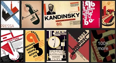
Their bold type and flat-color shapes arguably look fresher and more modern than ever in 2014. Similarly, Apple’s famous iPod commercials from the early 2000’s revolved around flat design elements.
Microsoft was one of the first to implement this current incarnation of the trend in a digital interface with their Windows 8 redesign.
Their original Metro UI design was reportedly inspired by the simple shapes and colors of the London Underground’s signage.
There’s a clear lesson here: Like those train stations, the digital landscape is a busy, complicated place, and often it takes simple, direct design elements to cut through the clutter.
Flat and Almost Flat
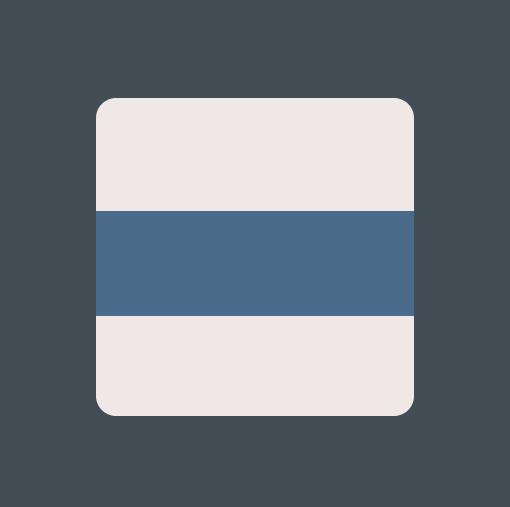
Within the realm of flat design you have two styles. The first is, of course, classic ‘flat’ design. There is no depth — no gradients, no shadows — to any element and they appear to be entirely integrated into the background.
Microsoft’s Windows 8 UI is a very pure example of this approach.
A variation on flat is the use of the ‘almost flat’ look. Google have championed this design aesthetic, originally through their Gmail interface, and now through their Google Plus UI.
The almost flat look often features gradients, outlines, semi-transparent panels, glowing effects and drop shadows which are implemented very subtly. Typically almost flat designs look like they are made from cut cardboard. Though subtle, almost flat design elements provide a distinction between the element itself and the background of which it is against.
While both flat and almost flat designs have their own appearance they are both commonly used with bright and inviting colors. They often take on geometric shapes that are spaced and sized evenly so that the page flows and is complementing to the design motif.
Keeping the elements with sharp and clean lines maintains a minimalistic look that most designers aim for.
How and when should I use it?
Like most new trends you are probably asking why you should use flat design when it comes to your design projects — especially when more decorative, 3D elements have taken such a dominant role within technology.
Well when you think of it like that, why wouldn’t you want to take a step in a different direction? Flat design is a refreshing direction for the design community whether you are for the trend or against it.
As you have probably noticed more and more designers are embracing the trend and implementing it in their personal portfolios, design agency websites, mobile navigation menus and in so many other areas to mostly positive reception.
Flat design does have its problems and detractors. If all interface elements are truly flat, how do we identify what parts are interactive and what is decoration? Buttons and panels can look the same.
This by no means should be a deterrent — you can design around these potential limitations. The great thing about using flat elements is that it tends to give your final look a clean and minimalistic feel. Flat design look is also so simple that you are often able to combine various trends without your design appearing cluttered.
It also generally cuts down on development time and makes for more readable, navigable content. The overall user experience is heightened with not only the ability to read the content but to also easily navigate from page to page and from content to content.
So, now that you understand flat design, lets run through two short tutorials to get you creating your own flat elements.
Make a Flat App Icon
This quick tutorial will walk you through creating a truly flat app icon design.
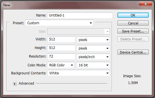
Step 1: New Canvas
Create a new canvas and give it the dimensions of 512px x 512px. Press OK for the canvas to appear.
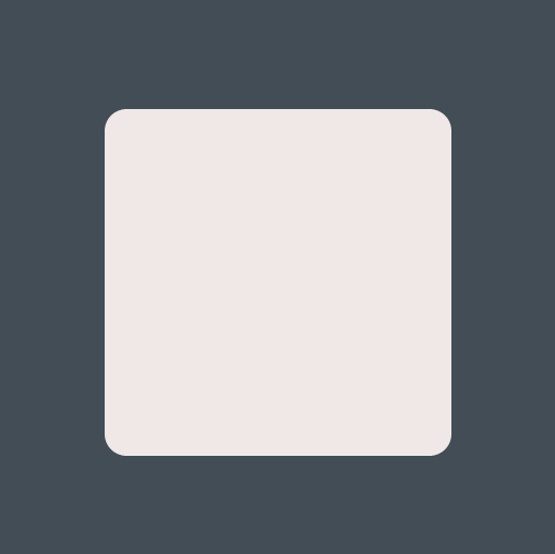
Step 2: Background Color
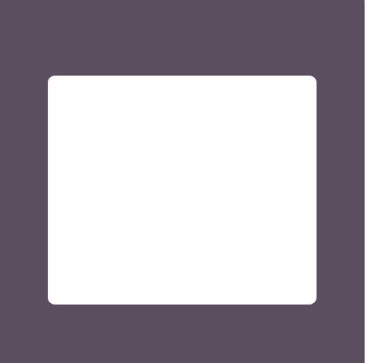
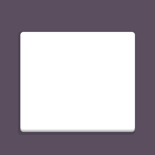
We want to add color to our background so change your foreground color to # 424d56 and fill in your canvas.
Step 3: Set up the camera body
Our flat app icon will be a camera design which means we need to create the body first. Select the Rounded Rectangle Tool and give the corners a 20px radius. With the color #efe8e7 create your camera body in the center of your canvas.
Step 4: Rectangle
Change your foreground color to ## 4a6b8a and with the Rectangle Tool create a long rectangle in the center of your camera body like so.
Step 5: Flashes/Lights
Use the Ellipse and Rectangle Tool to create your flash and orange light. The orange is #ff6528 and the white is #ffffff.
Step 6: Lens
Now it is time to create our lens. The lens is composed of several simple ellipses. Below you will find each ellipse and its color listed from largest to smallest. Of course, feel free to adjust them to your taste. That’s how you learn.
- Ellipse 1: #cdcdcd
- Ellipse 2: #515151
- Ellipse 3: #7b7b7b
- Ellipse 4: #343434
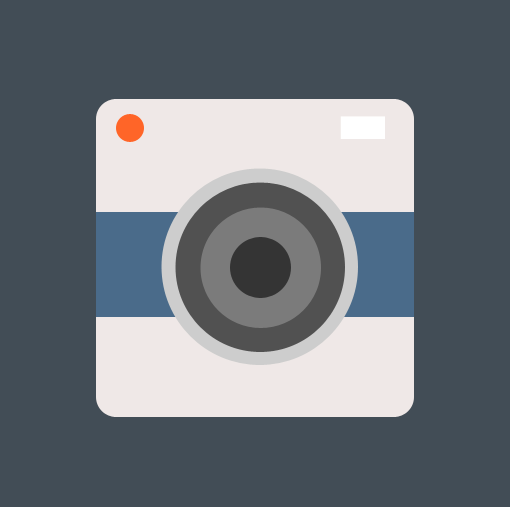
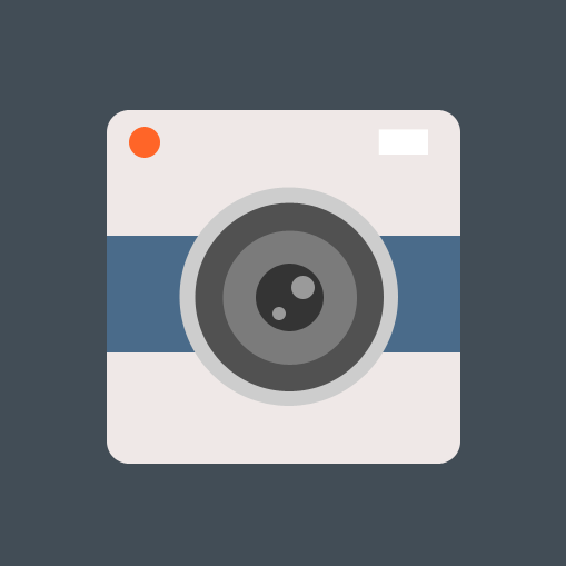
Step 7: Add Lens Reflections
Finish up your design by adding in two white lens reflections with the Ellipse Tool and drop the opacity to 50% for both. It’s tempting to want to make the lens reflections soft and graduated, but with flat design we have to stick with simple.
And there it is.
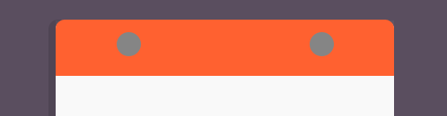
The Almost Flat Calendar
In this tutorial you will learn how to implement the almost flat style by creating a calendar icon.
Step 1: New Canvas
As with the first example, you’ll want to create a new canvas and give it the dimensions of 512px x 512px.

Step 2: Background Color
Change your foreground color to #5a4e5f and fill in the canvas with the Paint Bucket Tool.

Step 3: Calendar Sheet
Set your foreground color to #fffffff and select the Rounded Rectangular Tool. Change the radius of the corners to 10px and create your sheet of paper.
Step 4: Extra Calendar Sheets
We want to give some subtle depth to our calendar to match the almost flat style. To do so we will create two more sheets of paper, both with a different color. Simply duplicate the top sheet twice and place them underneath one another. The second sheet should be #dadada and the third should be #bababa.
Step 5: Shadow
Now we want to add a shadow behind our calendar. Use #777777 and create your shadow making sure to change the layer mode to Multiply and to drop the opacity to 22%.
Step 6: Top Shadow
We will also want to add a shadow to the top of our paper. Use the Rectangle Tool and with the color #b4b4b4 create a rectangle to cover a little bit more than half of the top sheet. Lower the opacity to 8%.

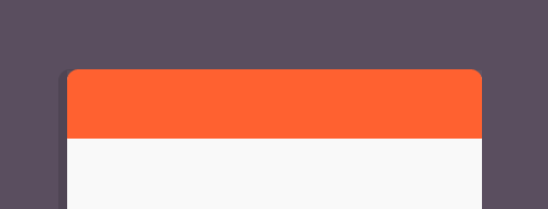
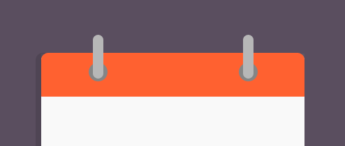
Step 7: Binding
Change your foreground color to #ff6130 for the binding. Use the Rounded Rectangle Tool to add the binding to the top half of the calendar. Once it is in place rasterize the layer and cut off the bottom half so you have angled corners opposed to rounded ones.
Step 8: Ring Holes
Use the Ellipse Tool and the color #858585 to create two small holes for the calendar rings to go.
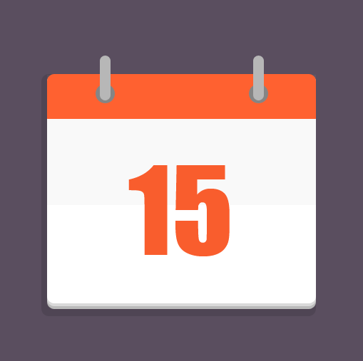
Step 9: Rings
Now change over to the Rounded Rectangle Tool and create two tall rectangles with #b7b7b7. Make sure to place them in the center of the ring holes like in the image below.
Step 10: Make a date!
Finish your calendar up by adding your date. I used Impact here at 160pt with # f95d2d as the color.
Conclusion
Flat design, while not a new trend is still a refreshing take on design, whether you are a fan of it or not. There are some issues that flat design poses but fans of minimalism and simplicity will definitely appreciate what the trend has to offer and hopefully will find a workaround. Even if you just want to take a break from the more detailed work often seen in design then you should definitely give the trend a try.
What do you think about flat design? Are you a fan of the trend? Why or why not.
Frequently Asked Questions about Flat Design
What is the history and evolution of flat design?
Flat design originated in the mid-20th century, influenced by the Swiss Style, also known as the International Typographic Style. This design style emphasized simplicity, cleanliness, and readability. It gained popularity in the digital world around 2010, with Microsoft’s Metro design language being one of the first major implementations. Since then, it has evolved to incorporate elements of depth and dimension, leading to the development of semi-flat or flat 2.0 design.
How does flat design improve user experience?
Flat design improves user experience by eliminating unnecessary elements and focusing on functionality. The simplicity of flat design makes it easier for users to understand and interact with the interface. It also improves load times and performance, providing a seamless experience across different devices.
What are the key principles of flat design?
The key principles of flat design include simplicity, minimalism, and functionality. It avoids the use of gradients, shadows, and textures, focusing instead on simple shapes, bright colors, and clean lines. Typography is also an important element, with sans-serif fonts often used for their readability and modern feel.
What are the advantages and disadvantages of flat design?
The advantages of flat design include improved usability, faster load times, and a modern aesthetic. However, it also has its disadvantages. The lack of depth and dimension can sometimes make it difficult to distinguish interactive elements from static ones. Also, the simplicity of flat design can sometimes lead to a lack of originality or personality in the design.
How is flat design used in web design?
In web design, flat design is used to create clean, minimalist websites that focus on content and functionality. It often involves the use of simple shapes, bright colors, and large, readable typography. Flat design also lends itself well to responsive design, making it a popular choice for mobile-friendly websites.
What is the difference between flat design and material design?
While both flat design and material design emphasize simplicity and functionality, there are key differences. Material design, developed by Google, incorporates depth and dimension through the use of shadows and movement. It also uses a specific color palette and typography guidelines, creating a more standardized and cohesive design language.
How can I implement flat design in my own projects?
To implement flat design, start by simplifying your design elements. Use simple shapes, bright colors, and clean lines. Avoid gradients, shadows, and textures. Focus on functionality and make sure your design is easy to navigate and understand. Remember, the goal of flat design is to improve user experience through simplicity and clarity.
What are some examples of flat design?
Some examples of flat design include the Windows 8 interface, Google’s Material Design, and Apple’s iOS 7. Many websites and apps also use flat design, including Airbnb, Spotify, and Uber.
What is the future of flat design?
The future of flat design is likely to involve a continued emphasis on simplicity and functionality. However, we may also see more blending of flat design with elements of depth and dimension, as seen in semi-flat or flat 2.0 design. As technology continues to evolve, flat design will likely adapt to incorporate new trends and innovations.
How does flat design relate to other design trends?
Flat design is often seen as a reaction to the skeuomorphic design trend, which involved the use of realistic textures and details. It also relates to other minimalist design trends, such as Swiss Style and Bauhaus. As design trends continue to evolve, it’s likely that flat design will continue to influence and be influenced by other trends.

