Craig Buckler reviews the art of creating printer-friendly web pages with CSS, showing how to retrofit them to any site, at minimal cost.

Craig Buckler reviews the art of creating printer-friendly web pages with CSS, showing how to retrofit them to any site, at minimal cost.

We cover the use of CSS margins vs padding, the box model, bleeding and collapsing margins, and concludes with some cool layout tricks.

Animation is a part of a UI designer's job. Here are 9 free animation libraries we think deliver the most power for the smallest file size.

CSS preprocessors are popular, but they have some drawbacks. Learn the advantages of PostCSS and what its extensive range of plugins can do.

By using SVGs with media queries, we can change their appearance based on user interaction or viewport size, and use them in multiple places.

Craig explains how to add CSS styles to SVGs when used as static images, inlined backgrounds and HTML, sprites, HTML content effects and portable files.

In this series on troubleshooting and optimizing your CSS, Tiffany Brown looks at ensuring code efficiency with the CSS Optimizer (or CSSO), a minification tool that runs on Node.js and which makes sure our file sizes are as small as they can be.

In this series on troubleshooting and optimizing your CSS, Tiffany Brown delves into the browser-based developer tools for Chrome, Safari, Firefox, and Microsoft Edge, covering the styles panel, cascade and inheritance problems, spotting invalid properties and values, and debugging responsive layouts.

In this series on troubleshooting and optimizing your CSS, Tiffany Brown introduces UnCSS and stylelint, two code-quality tools for analyzing the quality of your CSS.

Tiffany Brown introduces Flexbox, explaining the basic principles behind flex layout, with examples of laying out a basic media object, flexible form components, vertical centering, and creating grid-like layouts, as well as explaining when to use Flexbox over CSS Grid.

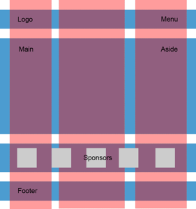
Tiffany Brown introduces the basics of CSS Grid, covering the grid formatting context, defining a grid layout, explicit versus implicit grids, specifying track size for an implicit grid, creating flexible grids with flex units, using the grid-template shorthand property, and repeating rows and columns.

Scroll snap lets developers define the distance an interface should travel during a scroll action. You might use it to build slide shows or paged interfaces―features that currently require JavaScript and expensive DOM operations.

Transforms allow us to create effects and interactions that are otherwise impossible. When combined with transitions and animations, we can create elements and interfaces that rotate, dance, and zoom. In this piece, we'll look at 2D transform functions.

Think of CSS animation as the more sophisticated sister to CSS transitions. Animations differ from transforms in a few key ways, which we'll explore in this article

We’ll now look at two methodologies for naming things in CSS: Block-Element-Modifier (better known as BEM) and Atomic CSS.

Variables make it easier to manage colors, fonts, size, and animation values, and to ensure their consistency across a codebase.

Craig Buckler demonstrates how use Gulp.js to automate CSS tasks, such as optimizing images, compiling Sass files, handling and inlining assets, automatically appending vendor prefixes, removing unused CSS selectors, minifying CSS, reporting file sizes, outputting sourcemaps and more.

Ahmed Bouchefra dives into CSS theming, explaining how to use CSS custom properties to create themes and switch dynamically between them with JavaScript, using an HSL color scheme and CSS filters to create a dark version of a light theme.

Diogo Souza walks through how to convert a traditional, float-based layout into one that harnesses the benefits of CSS Flexbox & Grid — while discussing graceful degradation and progressive enhancement along the way.

Craig Buckler discusses 20 ways to optimize your CSS so that it’s faster-loading, easier to work with and more efficient, covering analysis tools, CDNs, HTTP/2, CSS3, animations and transitions, fonts, concatenation and minifying, build tools, flexbox, grid, SVG, critical CSS, and more.

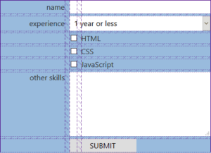
Craig Buckler discusses form layout in the age of CSS Grid, discussing the difficulties of laying out forms with floats and flexbox, and demonstrating the benefits of grid in terms of form layout, the possibilities it offers, and how and why to take a progressive enhancement approach to form layout.

Ahmed Bouchefra shows how to use various tools and related techniques to help build a better PWA by focusing on CSS optimization — demonstrating how to remove unused CSS, inline the critical path CSS, and minify the resulting code.

In this article on CSS and PWAs, David Attard discusses a number of techniques that can be used when creating the CSS required for the development of PWAs.

Ilya Bodrov explains how CSS transforms can be used in the real world to solve various tasks and achieve interesting results — showing how to adjust elements vertically, create nice-looking arrows, build loading animations and create flip animations.

Ahmed Bouchefra shows how to create a responsive modern CSS Grid layout, demonstrating how to use fallback code for old browsers, how to add CSS Grid progressively, and how to restructure the layout in small devices and center elements using the alignment properties.

Giulio Mainardi shows how to retrofit a popular, card-based Tumblr layout with CSS grid, demonstrating how to plan for responsive behavior and utilize other cutting edge CSS features such as object-fit: cover, @supports and the :focus-within pseudo-class.

Ilya Bodrov demonstrates how to retrofit a layout with CSS Grid, showing how easy it is to utilize CSS Grid to create robust layouts. He also discusses fallbacks for older browsers, should you need them.

In this article, Cláudio Ribeiro looks at the exciting new possibilities surrounding variable fonts — now bundled with the OpenType scalable font format — which allows a single font to behave like multiple fonts.

Craig Buckler shows how to add another dimension to your web pages and applications with the new 3D transformation functions and properties in CSS, covering transform, translate, rotations, scaling, perspective and more, along with z-index, browser gotchas, and ideal use cases.

Ahmed Bouchefra introduces key Bootstrap CSS classes for building layouts with the Bootstrap grid system, along with a quick introduction to using Flexbox.