
Keep up to date on current trends and technologies
Design & UX - Technology
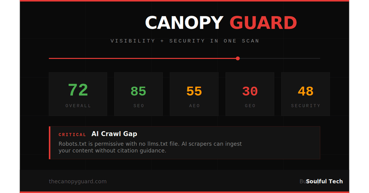
How I Built a 47-Signal Website Audit Tool That Runs in 15 Seconds
Adam McClarin
The Best Free Online Image Editors
Dianne Pena

How to Create a Color Palette for Your Design System
SitePoint Team
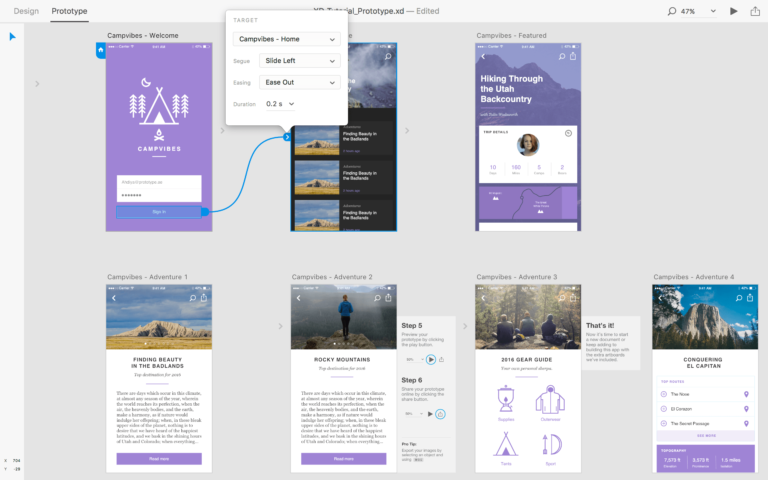
15 Top Prototyping Tools Go Head-to-Head
Dave Kearney
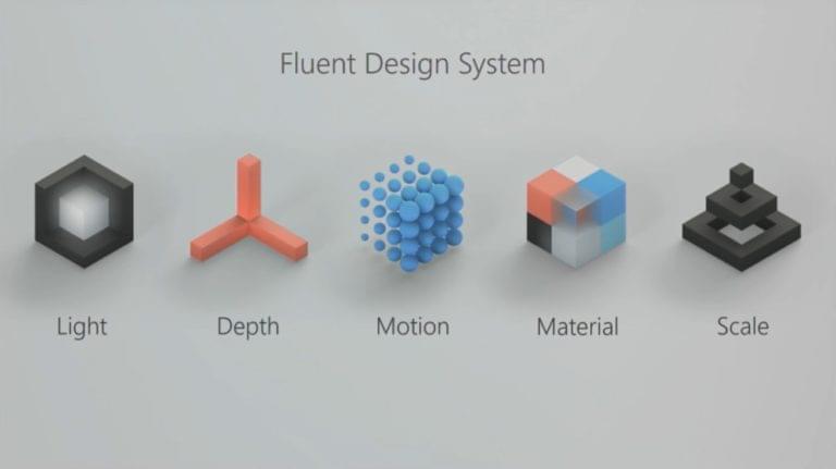
Introducing Microsoft’s Fluent Design System
Giannis Konstantinidis
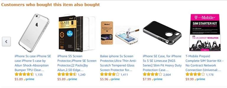
UX Lessons from Amazon: 4 Hacks Guaranteed to Boost Conversions
John Stevens
Can AI Solve Your UX Design Problems?
Mukund Krishna
7 Super-Useful Chrome Extensions for Designers in 2017
James George
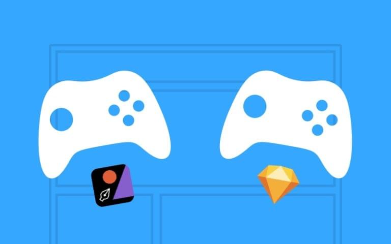
Figma or Sketch: Who Wins the War on Multiplayer Design?
Daniel Schwarz

Killer GIFs: How Can an Animated GIF Become a Weapon?
Alex Walker

How the Humble Speech Bubble Will Transform Our Future UIs
Aja Frost

The 5 Best Slack Apps to Accelerate Your Design Process
Theo Miller

The Talking Clock: Birth of the Voice-based UI
Alex Walker
5 Ways to Offer a Better UX to Disabled Users
Daniel Schwarz
5 Fancy (But Useless) Web Components You Should Avoid
Daniel Schwarz
Stevie Wonder and the Rise of the Machine Readers
Alex Walker
10 Guidelines for Better Website Background Videos
Angus Russell
The Ethics and User Experience Behind Programming Cars
Charles Costa
Mobile Accessibility Fails: Do we need a WCAG3?
Gian Wild
What Do Super High-Res Displays Mean for Your Website?
James George
Getting Random with David Bowie and Fractals
Alex Walker
Why Do We Love Scratchy Records, Halftone Dots & Other Flaws?
Alex Walker
7 Photoshop Master Tips to Boost Your Productivity
Ivaylo Gerchev
The Web Designer’s Guide To Programming
Richa Jain
What is the WebP Image Format (And Why Does It Matter)?
Tanay Pant
Build Your Own SVG Icons
Massimo Cassandro

5 Ways To Use Google Analytics for Your UX Research
Petras Baukys
Review: Apps for Creating Online Graphs and Charts
Amit Diwan
Generating Responsive Image Assets with Photoshop CC 2014
Alex Walker
Website Personalization: Shouldn’t Sites be Smarter?
Amir Glatt
Faking Pro Portraits with your Phone Camera
Gabrielle Gosha
The Designer’s Guide to Working with SVG – Pt 1
Alex Walker
Showing 32 of 43