

A color palette is one of the most important aspects of a design system. Designers can use them to create a visual hierarchy, define emotions, and create a unified look and feel. This article will discuss creating a color palette for your design system. We’ll also provide some tips on choosing colors that work well together. Let’s get started!
Key Takeaways
- A color palette is a fundamental aspect of a design system, helping to create a visual hierarchy, define emotions, and establish a unified look and feel. It typically consists of three to five colors that work well together.
- Creating a color palette involves identifying primary colors, designing a system for extended palettes, coming up with a naming convention, testing color palettes against inventory colors, defining the palette and usage guidelines, and implementing the palette in the CSS color system.
- It is essential to test the effect of new color palettes on the interface and confirm the contrast between colors for accessibility. A new palette should be introduced to all product designers and open to creative criticism, feedback, and change suggestions before finalizing.
- Understanding color theory is key to designing effective color palettes. This includes learning about the psychology of color, color temperature, chromatic value, and the application of choosing a color palette.
What Is a Color Palette?
A color palette is a set of colors used together in a design. A color palette is a group of colors that work well together to provide uniformity in the use of color in your designs and create consistency in how you leverage color in products.
Creating a color palette helps tie everything together and creates harmony in the colors you employ. Designers use color palettes to create a visual hierarchy, define emotions, and create a unified look and feel. A color palette typically consists of three to five colors, although it can have more.
Why do you need design system colors?
A sound color palette should:
- Improve your customer’s user experience
- Distinguish you from the competition
- Create consistency, hierarchy, and contrast in your design
- Increase design efficiency by providing organized, standardized colors to choose from
It is crucial to have a color palette for your design system because it will help create consistent branding and visual interest. A color palette can also help to create a visual hierarchy, define emotions, and provide a unified look and feel.
When all of your design elements use the correct colors, they will look more professional and polished. This cohesion is the ultimate goal of a design system, and a palette of defined brand colors keeps things consistent.
Palettes may make your work more appealing aesthetically, but they also help you be more productive. Wouldn’t it be simpler if everyone on your team agreed on the design language?
It helps to have a defined color palette when working with other designers or developers. They can easily see which colors to use when creating new designs or adding to existing ones. Think about how much more scalable your design will be with a single source of truth for color choices.
11 Steps to Creating a Color Palette for Your Design System
Let’s look at how to create a color palette for your design system. Creating color palettes does not have to be an intimidating process. Choose the tone and atmosphere you want for your design, and from there, everything gets easier.
That said, you might often find yourself not knowing where to start. We’ve all been there. Fortunately, we created this 11-step guide to help you navigate color palette design.
1. Identify any primary color in your color inventory
Building an effective color palette leverages one of the most widespread mental models: Using what you already have (or can easily get) to get to unknowns (or what you don’t have).
In this case, these are your base colors. Base colors refer to the most frequently used colors in your UI and those that distinguish your product.
Such colors set the tone of the design, speak a message or elicit an emotional or psychological response from your audience.
Some of the rules of primary colors include:
- Never go with an absolute black or white
- You can have one to three primary colors
- You’ll never go wrong with blue
You’ll often find most of these colors in your product’s logos, marketing, and overall design language.
2. Design a system for building extended palettes
Developing your accent colors is much easier once you have defined your primary colors. You can define an accent color as a variation of the base color.
A common practice is to define each accent color in three shades for use in different situations:
- Light
- Dark
- Bright
You use colors in your interface to communicate discrete things to your audience. This is what designers mean when they talk about semantic colors that highlight important information. For example, you could choose:
- Blue (or another bright color) to highlight a new feature, such as a message
- Red for confirmation of a serious action (such as account deactivation)
- Or green for a positive message such as a successful transaction
Here are a few color scheme options for you the next time you will be building extended palettes:
- Adjacent or analogous (select a primary color and choose colors next to it)
- Triad (draw an equilateral triangle over the color wheel)
- Shades (you can pick a primary color and its variations with different saturations)
3. Come up with a naming convention
A naming convention will help you bring all your designers and developers onto the same page and ensure they speak the same design language.
When choosing a naming convention for your color palette, you’re spoilt for choice.
You can use abstract names such as bx7300, but some common approaches include choosing actual color names (such as blue) or numbered names such as 07000.
Just because you can name your colors anything doesn’t mean you should. You’re better off with a standardized naming system that is easy to comprehend.
Some of the rules of naming conventions are:
- Don’t use color gradation nomenclature such as dark blue
- Offer an exact name for each color
- Keep your naming convention simple
You’ll never go wrong with choosing a functional name for your color palette. These are names that give the purpose of the color, such as primary green.
4. Test color palettes against inventory colors
Armed with an idea of both your primary and accent colors, you can then proceed and test the accessibility of these colors.
While you’re at it, ensure that your new colors match, and replace or merge with the colors you use in your current user interface.
5. Define the palette and usage guidelines
What you have now is just a set of primary and accent colors in your palette. You’re yet to decide what goes where.
Your next logical step is to assign each of these aspects of your color palettes to global UI elements. These can include:
- Background
- Text
- Container
- Buttons
6. Implement color palettes in your CSS color system
You have a color palette. Now you need to implement it in your CSS color system. This will help to ensure that your colors are applied consistently throughout your product interface.
Most designers today employ a blend of hexadecimal values, otherwise known as hex codes, to define color palettes.
You can make this effortless by using your list of color variables with a CSS preprocessor.
/*Variable names should be intuitive*/

$primary-color: #bada55;
$secondary-color: #c0ffee;

/*Usage*/

.some-class {
 color: $primary-color; /*This will make the element's text color equal to bada55 */  }
After you have all your colors set up as variables, you can then use them throughout your CSS files by calling the variable name. This has the added benefit of making it easy to change colors globally should the need arise.
7. Test the effect of new color palettes on the interface
What effects do the new colors you’ve chosen have on the existing interface?
You’ve no doubt tried the palette on for size in design mockups, but there’s nothing like actual usage for finding points of improvement.
You’re more likely to figure out where colors are too unreadable or too bright, or when the contrast of your buttons isn’t right, when you’re ingesting real information and not glossing over Lorem Ipsum.
There is only one way to find out, and it’s testing the effect of the changes you’ve made on your existing interface.
Spin up a development environment and give your palette some solid real-world usage. Answering the following questions will help:
- Does this new palette improve the interface?
- Does this new palette worsen the interface?
- How well do these changes integrate with existing colors?
8. Confirm the contrast between colors in your new interface
After introducing your new color palette to the interface, ensure that this new color palette offers enough contrast for accessibility.
We can do this by checking that the elements of our UI have sufficient contrast scores as regulated by the Web Content Accessibility Guidelines.
The easiest way is to use a plugin in your UI design tool of choice. Contrast for Figma is one example. Stark is a more fully-featured accessibility design platform that offers plugins for Figma, Adobe XD, and Sketch. It offers contrast checks on the free plan.
9. Introduce your new palette and UI to all product designers
If you’ve been working on this project on your own, you’ll have to introduce it to other product designers somewhere down the road.
This can be done in a few ways, but the most important thing is to communicate your design decisions early and often.
A great way to do this is by writing a short blog post or creating a screencast that goes over the new colors, how they were chosen, and how they should be used.
At this stage, your color palette is ripe to be introduced to other stakeholders of the design process, such as your colleagues, team members, partners, or clients.
10. Invite creative criticism, feedback, and change suggestions
Two heads are better than one, and design is no exception. Don’t be afraid of getting ideas and suggestions from stakeholders as you choose your color palette.
If you designed the color palette on your own, ensure you introduce it to your team and receive any suggestions from your colleagues.
11. Finalize the palette
Congratulations, you’re almost done. However, before you go, there are some final touches you have to make before your palette is ready.
You should:
- Add this palette to your design system documentation and style guides.
- Document the variables of your CSS processor (native or otherwise) in the design system.
One thing to remember is that choosing a color palette isn’t a science, and anyone that tries to sell you on one single formula is lying.
Most of the time, your eye will be the judge, and when you can’t trust it, you have your team members for consultation.
While finalizing, search for any inconsistencies, tweaks, or improvements that you can make.
Understanding Color Theory: The Key to Better Palettes
Designing color palettes shouldn’t be giving anyone sleepless nights.
If you want to go beyond implementation and learn to design color palettes that harmonize beautifully and convey the emotional tone of your brand, then it’s time to pick up some color theory.
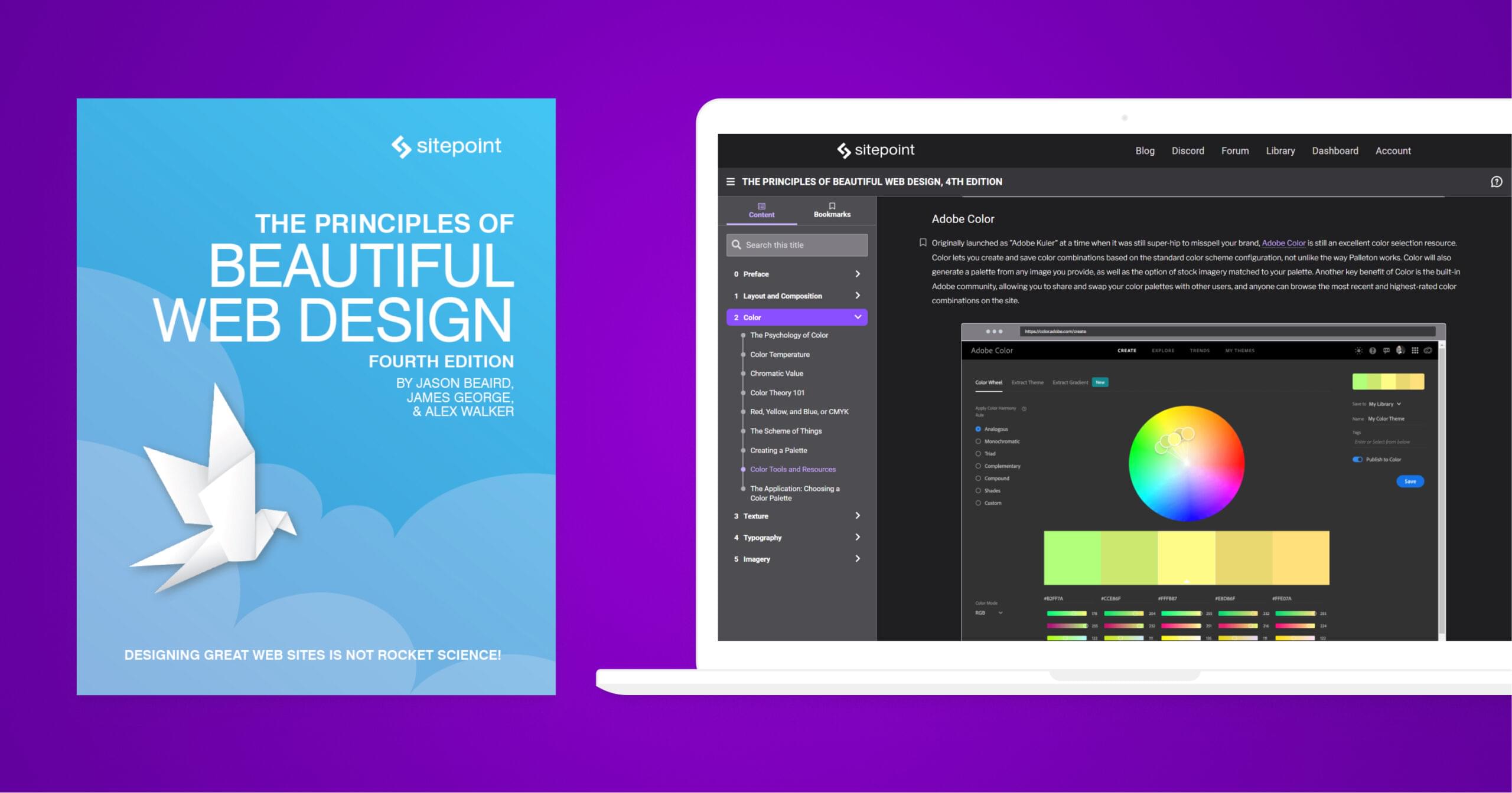
In the second section of The Principles of Beautiful Web Design, we teach a condensed masterclass in color theory that will rapidly make you dangerous with a color picker. Learn:
- The Psychology of Color
- Color Temperature
- Chromatic Value
- Color Theory 101
- Red, Yellow, and Blue, or CMYK
- The Scheme of Things
- Creating a Palette
- Color Tools and Resources
- The Application: Choosing a Color Palette
Frequently Asked Questions (FAQs) about Color Palette Design System
What is the Importance of a Color Palette in a Design System?
A color palette plays a crucial role in a design system. It helps in maintaining consistency across different platforms and products. The color palette is not just about aesthetics, but it also contributes to the functionality of the design. It aids in creating a visual hierarchy, drawing attention to important elements, and enhancing the user experience. Moreover, a well-defined color palette can evoke certain emotions and perceptions, thereby reinforcing the brand’s identity and message.
How to Choose the Right Colors for a Design System?
Choosing the right colors for a design system involves understanding the brand’s identity, the target audience, and the context of use. It’s important to consider the psychological effects of colors and how they can influence the user’s perception and behavior. Also, accessibility should be taken into account to ensure that the design is usable by as many people as possible. Tools like color wheel, color harmony principles, and color contrast checkers can be helpful in this process.
What are the Different Types of Color Palettes?
There are several types of color palettes, including monochromatic, analogous, complementary, split-complementary, triadic, and tetradic. Each type has its own characteristics and uses. For instance, a monochromatic palette uses different shades, tints, or tones of a single color, creating a harmonious and balanced look. On the other hand, a complementary palette uses colors that are opposite each other on the color wheel, creating a vibrant and high-contrast look.
How to Create a Color Palette for a Design System?
Creating a color palette for a design system involves several steps. First, define the primary colors that represent the brand’s identity. Then, choose the secondary colors that complement the primary colors. Next, add neutral colors that provide balance and flexibility. Finally, consider adding feedback colors that indicate certain states or actions, such as error, success, warning, and information. Tools like color palette generators can be helpful in this process.
How to Implement a Color Palette in a Design System?
Implementing a color palette in a design system involves defining color variables in the code, creating color swatches in the design tools, and documenting the color usage guidelines. It’s important to ensure that the colors are used consistently and correctly across different platforms and products. Also, it’s recommended to test the colors in different conditions, such as light and dark modes, high and low contrast settings, and various screen sizes and resolutions.
How to Test the Usability of a Color Palette?
Testing the usability of a color palette involves checking the color contrast, color blindness compatibility, and legibility in different conditions. Tools like color contrast checkers and color blindness simulators can be helpful in this process. Also, it’s recommended to conduct user testing to get feedback from the actual users. This can help in identifying any issues and making necessary adjustments.
How to Update a Color Palette in a Design System?
Updating a color palette in a design system involves reviewing the current color usage, identifying any issues or needs, exploring new color options, and making the changes in the code, design tools, and documentation. It’s important to communicate the changes to all stakeholders and provide clear guidelines on how to use the new colors. Also, it’s recommended to phase in the changes gradually to minimize disruption.
How to Deal with Color Inconsistencies in a Design System?
Dealing with color inconsistencies in a design system involves identifying the causes, such as different color spaces, color profiles, screen calibrations, and rendering engines. Then, implement solutions, such as using standardized color values, ensuring color management settings, and providing color correction guidelines. Also, it’s important to educate the team about the importance of color consistency and how to achieve it.
How to Use Colors to Create a Visual Hierarchy in a Design System?
Using colors to create a visual hierarchy in a design system involves using different colors, shades, tints, or tones to differentiate elements, indicate importance, and guide the user’s attention. For instance, darker or brighter colors can be used for primary actions or important information, while lighter or softer colors can be used for secondary actions or less important information. Also, color can be used to group or separate elements, creating a sense of order and coherence.
How to Use Colors to Evoke Emotions and Perceptions in a Design System?
Using colors to evoke emotions and perceptions in a design system involves understanding the psychological effects of colors and how they can influence the user’s perception and behavior. For instance, red can evoke feelings of excitement or urgency, while blue can evoke feelings of trust or calmness. Also, cultural and personal factors can affect how colors are perceived, so it’s important to consider the target audience and the context of use.