

Key Takeaways
- Foundation 5 and Sass can be used to create more semantic grids, enhancing the clarity and efficiency of your code. This is achieved by leveraging pre-built Sass mixins.
- Foundation’s core mixins – grid-row, grid-column, and block-grid – offer a range of parameters to customize rows, columns, and block grids respectively. These can be adjusted to define the layout and behavior of the grid system.
- By using media queries in conjunction with grid-column mixin, developers can create responsive layouts that adapt to different screen sizes. This allows for the creation of different layouts based on the viewport width.
- Foundation 5 Sass, when combined with semantic markup, delivers cleaner, more efficient code. It provides better organization of CSS and helps maintain consistency across a project, making it a powerful tool for responsive web design.
In one of my previous articles, I compared the grid systems of both Foundation 5 and Bootstrap 3.
This time however, I’ll go beyond the basics of Foundation’s grid structure. That being said, I’ll show you how to create more semantic grids by taking advantage of its pre-built Sass mixins. To demonstrate it, I’ll reconstruct the demo page of the aforementioned article. But first, let me introduce the project that will be used for this article.
Project Structure
Using Foundation’s Command Line Interface, I set up a Compass project. Its structure can be shown below:
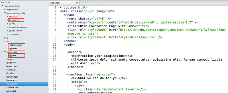
Keep an eye on the following folders:
| Folder Name | Description |
|---|---|
| foundation | Contains all Foundation’s assets (css, scss partials, js). |
| scss | Contains the files you can use to customize Foundation. |
| stylesheets | Contains the output CSS file. |
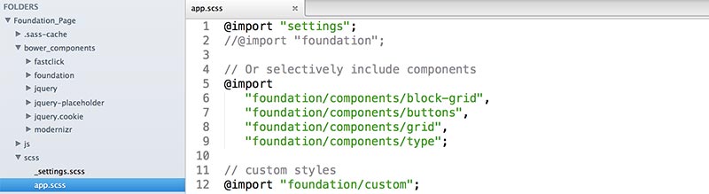
The app.scss file determines the components that our project will include. By default, all of them are imported. However, in our case we select to import four of them. That happens because we’re only interested in using mixins that are located in three partial files (_block-grid.scss, _grid.scss, _buttons.scss). Moreover, we want to maintain Foundation’s typographic styles and hence we also import the _type.scss partial.
In addition to the predefined components, the app.scss file can contain as well custom styles. Here’s the structure of our file:
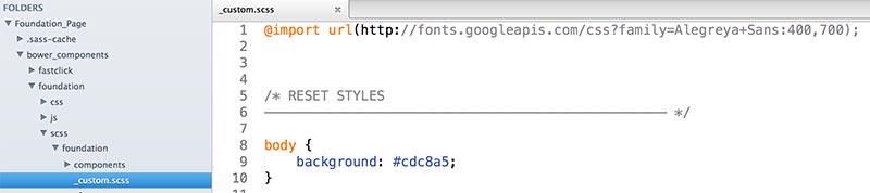
Below is the path to the custom partial:
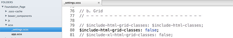
Furthermore, we have to limit the output CSS (reduce its size). In fact, we want the app.css file to include only Foundation’s typographic styles and our custom ones. For this reason, we set the following variable values to false:
include-html-grid-classesinclude-html-block-grid-classesinclude-html-button-classes
We can change their values in the _settings.scss partial file:
Last but not least, all the files of this project can be found here.
Let’s continue by covering three of Foundation’s core mixins. Please, keep in mind that examples of those mixins are available in a second project. Here’s how it looks like:
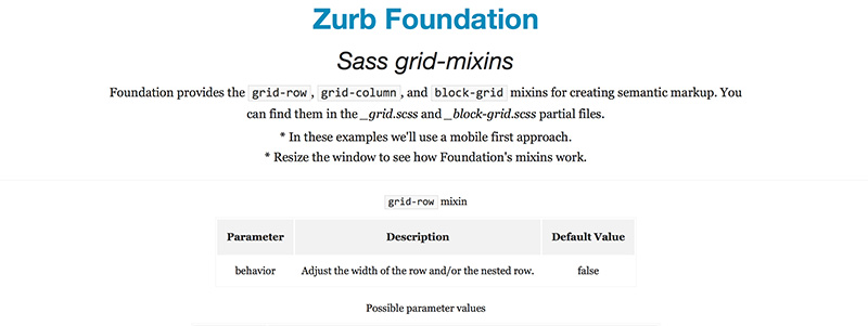
Rows
The grid-row mixin allows you to define the rows of your grid. Below is its parameter:
| Parameter | Description | Default Value |
|---|---|---|
| behavior | Adjusts the width of the row and/or the nested row. | false |
And here are the possible values of this parameter:
| Values | Description |
|---|---|
| false | Use this option when you want to wrap your columns inside a row. This will give it a max-width property value. Moreover, it’ll set its margin-left and margin-right property values to auto. |
| collapse | Use this option when you want to wrap your columns inside a row. This will give it a max-width property value. Moreover, it’ll set all its margins to 0. |
| nest | Use this option when you want to create a nested row. This will give it a negative margin-left and a negative margin-right property values. |
| nest-collapse | Use this option when you want to create a nested row. This will set all its margins to 0. |
Columns
The grid-column mixin generates your columns. The following table shows its parameters:
| Parameter | Description | Default Value |
|---|---|---|
| columns | The number of desired columns. | false |
| last-column | Is this the last column? | false |
| center | Center these columns? | false |
| offset | The number of columns to offset. | false |
| push | The number of columns to push. | false |
| pull | The number of columns to pull. | false |
| collapse | Remove the column padding? | false |
| float | Float this column? | true |
| position | The positioning type. | false |
Block Grid
In case you want to take advantage of the block grid, Foundation provides the block-grid mixin. Here are its parameters:
| Value | Description | Default Value |
|---|---|---|
| per-row | The number of items to display per row. | false |
| spacing | The number of ems to use as padding on each block item. | 0.625rem |
| include-spacing | Adds padding to the list item. | true |
| base-style | Applies a base style to block grid. | true |
Putting It All Together
At this point, hopefully, we’re ready to create our demo page.
In the following screenshot, you can have a look at the desired layout for one of our sections:
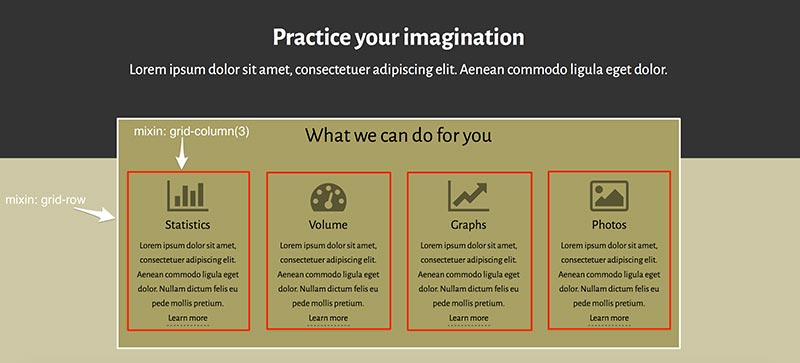
Based on the viewport width, we make the following assumptions:
| Window width | Description |
|---|---|
| ≤640px | Each article covers the full width of their parent container. |
| Between 641px and 1024px | Set the value of the columns parameter to 6. That means, each article covers 50% of their container’s width. |
| ≥1025px | Set the value of the columns parameter to 3. That means, each article covers 25% of their container’s width. |
Here’s the relevant HTML:
<section class="services">

    <h2>What we can do for you</h2>

    <article>

        <div>

            <i class="fa fa-bar-chart fa-4x"></i>

            <h4>Statistics</h4>

            <p>

                <!-- content -->

            </p>

            <a href="#">Learn more</a>

        </div>

    </article>

    <article>

        <!-- content -->

    </article>

    <article>

        <!-- content -->

    </article>

    <article>

        <!-- content -->

    </article>

</section>
Our Sass code:
.services {

    @include grid-row;
    article {

        @include grid-column(12);
        @media #{$medium-up} {

            @include grid-column(6);

        }
        @media #{$large-up} {

            @include grid-column(3);

        }

    }

}
And the resulting CSS:
.services {

    width: 100%;

    margin-left: auto;

    margin-right: auto;

    max-width: 62.5rem;

}
.services article {

    padding-left: 0.9375rem;

    padding-right: 0.9375rem;

    width: 100%;

    float: left;

}
@media only screen and (min-width: 40.063em) {

    .services article {

        width: 50%;

        float: left;

    }

}
@media only screen and (min-width: 64.063em) {

    .services article {

        width: 25%;

        float: left;

    }

}
Note: To keep things simple, I’ve only included some of the rules from the compiled CSS. If you want to see the complete CSS that Foundation outputs, take a look at the app.css file.
In the same way, let’s continue with our second example. Below are the styles we want to apply to the footer element:
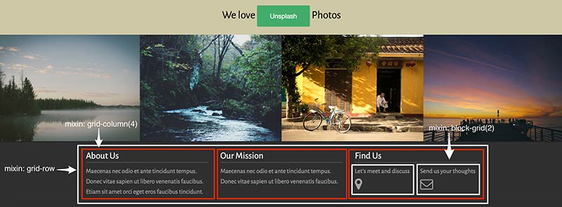
Again, we structure it by taking into account some assumptions:
| Window width | Description |
|---|---|
| ≤640px | Each div element covers the full width of their parent container. |
| ≥641px | Set the value of the columns parameter to 4. That means, each div element covers around 33.33% of their container’s width. |
Furthermore, we take advantage of the block-grid mixin to include the nested row in the last div element.
The HTML code can be shown below:
<footer>

    <section>

        <div>

            <h4>About Us</h4>

            <!-- content -->

        </div>

        <div>

            <h4>Our Mission</h4>

            <!-- content -->

        </div>

        <div>

            <h4>Find Us</h4>

            <ul>

                <!-- content -->

            </ul>

        </div>

    <section>

</footer>
Here’s our Sass code:
footer {

    section {

        @include grid-row;
        div {

            @include grid-column(12);
            @media #{$medium-up} {

                @include grid-column(4);

            }

        }
        ul {

            @include block-grid(2);

        }

    }

}
And the compiled CSS:
footer section {

    width: 100%;

    margin-left: auto;

    margin-right: auto;

    max-width: 62.5rem;

}
footer section div {

    padding-left: 0.9375rem;

    padding-right: 0.9375rem;

    width: 100%;

    float: left;

}
footer ul > li {

    float: left;

    width: 50%;

    padding: 0 0.625rem 1.25rem;

    list-style: none;

}
@media only screen and (min-width: 40.063em) {

    footer section div {

        width: 33.33333%;

        float: left;

    }

}
Note: Again, for simplicity, I’ve only included some of the rules from the compiled CSS. To see the complete CSS that Foundation outputs, look at the app.css file.
Conclusion
In this article, I presented to you three Foundation’s mixins you can use to deliver cleaner and more semantic HTML code. As a next step, I encourage you to dive into its Sass files and examine all of the mixins (46 with the current version). Thankfully, the documentation is really pretty good, so I hope you’ll not have any problem understanding them! In this way, you’ll have the opportunity to combine the power features of this framework alongside with your own customizations.
Frequently Asked Questions (FAQs) about Semantic Markup and Foundation 5 Sass
What is semantic markup and why is it important?
Semantic markup is a coding practice that uses HTML tags for their given meaning. It is important because it allows web browsers, search engines, and other web services to better understand the content on a webpage. This can lead to improved SEO, accessibility, and interoperability. Semantic markup also makes it easier for developers to understand and maintain the code.
How does Foundation 5 Sass work with semantic markup?
Foundation 5 Sass is a CSS preprocessor that allows developers to use variables, nested rules, mixins, and more, all with a CSS-compatible syntax. When used with semantic markup, Foundation 5 Sass can help create cleaner, more efficient code. It allows for better organization of CSS and helps maintain consistency across a project.
What are some examples of semantic elements in HTML5?
HTML5 introduced several new semantic elements to better define different parts of a web page. These include
How does semantic markup improve SEO?
Semantic markup improves SEO by providing search engines with more context about the content on a webpage. This can help search engines understand what the page is about and index it more accurately. It can also improve the display of search results, making them more attractive to users.
How can I start using Foundation 5 Sass in my projects?
To start using Foundation 5 Sass, you first need to install it on your system. This can be done through the command line using npm or bower. Once installed, you can import it into your project and start using its features. Foundation 5 Sass also comes with a robust documentation to help you get started.
What are the benefits of using Foundation 5 Sass?
Foundation 5 Sass offers several benefits. It allows for more efficient, organized, and maintainable CSS. It also includes a responsive grid system, UI components, and a variety of plugins. Additionally, it supports customization, allowing you to tailor the framework to your project’s needs.
How does semantic markup enhance website accessibility?
Semantic markup enhances website accessibility by providing additional context about the content. This can be particularly helpful for screen readers and other assistive technologies, as it allows them to interpret the content more accurately and provide a better user experience.
What is the difference between semantic and non-semantic markup?
The main difference between semantic and non-semantic markup is that semantic markup uses HTML tags that convey meaning about the type of content they contain, while non-semantic markup does not. Non-semantic tags, like
Can I use Foundation 5 Sass with other CSS preprocessors?
Foundation 5 Sass is a CSS preprocessor itself, so it’s not typically used with other preprocessors. However, it can be used alongside regular CSS or other CSS methodologies.
How does Foundation 5 Sass contribute to responsive web design?
Foundation 5 Sass includes a responsive grid system that makes it easy to create layouts that adapt to different screen sizes. It also includes media query mixins that allow for more precise control over how styles are applied at different breakpoints. This makes it a powerful tool for responsive web design.

