The teaser poster for the movie “The Ugly Truth” is a simple and fun design (haven’t seen the movie so can’t comment on its quality). The repetition of the heart between the head and the groin area is humorous and there is also repetition in the typography and with the contrast of light and bold black text in the actor’s names and in the movie title.
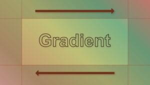
 Repetition In A Border
In this new series of book covers from Pentagram, you can clearly see the connection and consistency between each book. The border thickness and position is repeated on each cover, as is the small Penguin logo. The same typefaces are used on each book and the Author’s Name, Book Title and the words “Modern Classic” appear in the exact same position on each book. That leaves room for individual illustrations for each cover, without losing the visual harmony that has been established through the series.
Repetition In A Border
In this new series of book covers from Pentagram, you can clearly see the connection and consistency between each book. The border thickness and position is repeated on each cover, as is the small Penguin logo. The same typefaces are used on each book and the Author’s Name, Book Title and the words “Modern Classic” appear in the exact same position on each book. That leaves room for individual illustrations for each cover, without losing the visual harmony that has been established through the series.


 See the Pentagram blog for more information on the Nabokov books.
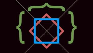
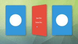
Repetition In Decoration
Concentric Studios repeat their logo (of concentric circles) in the background of the left and right blocks on their site.
See the Pentagram blog for more information on the Nabokov books.
Repetition In Decoration
Concentric Studios repeat their logo (of concentric circles) in the background of the left and right blocks on their site.
 A Crayon’s Life Blog
uses a canvas texture in the light colored background and also in the blog title and headlines. The orange and tan color scheme is repeated in the navigation and main drawing on the site.
A Crayon’s Life Blog
uses a canvas texture in the light colored background and also in the blog title and headlines. The orange and tan color scheme is repeated in the navigation and main drawing on the site.
 When you’re working on your designs, take some time to explore repetition and how you can use it to achieve consistency and harmony.
Next week, I’ll look at how thematic reference has a part to play in visual harmony, hope you will join me.
When you’re working on your designs, take some time to explore repetition and how you can use it to achieve consistency and harmony.
Next week, I’ll look at how thematic reference has a part to play in visual harmony, hope you will join me.
Frequently Asked Questions about Harmony in Design and Repetition
What is the principle of repetition in design?
The principle of repetition in design refers to the re-use of the same or similar elements throughout your design. It brings a clear sense of unity, consistency, and cohesiveness. Repetition can be applied in colors, shapes, textures, spatial relationships, line thicknesses, sizes, etc. It helps to guide the viewer’s eye along a path or to emphasize a design element.
How does repetition contribute to harmony in design?
Repetition contributes to harmony by creating a sense of unity and consistency. When elements are repeated in a design, it creates a pattern that the human eye finds pleasing. This pattern can create a rhythm that guides the viewer’s eye through the design and creates a sense of balance and cohesion.
Can repetition in design become monotonous?
While repetition brings unity and consistency, too much of it can make a design monotonous and boring. It’s important to strike a balance between repetition and variety. Introducing some variations or breaks in the pattern can make the design more dynamic and interesting.
What is the difference between repetition and pattern in design?
Repetition refers to one object or shape repeated; pattern is a combination of elements or shapes repeated in a recurring and regular arrangement. While repetition can be a part of pattern, a pattern is more complex and involves multiple elements.
How can I use repetition effectively in my designs?
To use repetition effectively, consider the elements that you can repeat – these could be colors, shapes, lines, textures, or even spatial relationships. Be mindful not to overdo it, as too much repetition can lead to monotony. Introduce some variations or breaks in the pattern to keep the design interesting.
What is the role of harmony in design?
Harmony in design is the pleasing arrangement of parts, which creates a sense of balance and proportion. It is the feeling that all the elements of the design fit together in a cohesive whole. Harmony can be achieved through the use of repetition, balance, contrast, and other design principles.
How does harmony relate to other design principles?
Harmony is closely related to other design principles like balance, contrast, and unity. All these principles work together to create a design that is pleasing to the eye. For instance, balance can be achieved through the use of repetition, while contrast can be used to break the monotony and add interest to the design.
Can a design be harmonious without repetition?
Yes, a design can be harmonious without repetition. Harmony is about the balance and proportion of all elements in a design. While repetition can contribute to harmony by creating a sense of unity and consistency, other design principles like balance, contrast, and unity can also create harmony.
How can I achieve harmony in my designs?
Achieving harmony in design involves a careful consideration of all elements and how they fit together. This includes the use of color, shape, size, texture, and space. Repetition can be used to create a sense of unity, while contrast can be used to add interest and break the monotony.
What are some examples of harmony and repetition in design?
Examples of harmony and repetition in design can be found in many places. In graphic design, a logo that uses the same color and font style throughout creates harmony and repetition. In web design, a consistent layout and navigation structure create a sense of harmony. In interior design, repeating colors, shapes, or textures can create a harmonious space.
 Jennifer Farley
Jennifer Farley is a designer, illustrator and design instructor based in Ireland. She writes about design and illustration on her blog at Laughing Lion Design.