
In this article, we’ll explore Houdini’s features by constructing a 3D card flip animation. This will help you uncover Houdini’s core concepts and guide you through practical code implementation.
We’ll explore how you can elevate your development workflow and achieve cutting-edge CSS animations using CSS Houdini, thereby gaining more control over your animation process.
Traditional CSS animations, while powerful, often confine developers to a predefined set of tools and effects. On the other hand, Houdini — a collection of experimental browser APIs — breaks these limitations, granting unprecedented control over the browser’s rendering engine. It gives developers the ability to create custom visual experiences that were previously unimaginable, thereby pushing the boundaries of web design.
Key Concepts Covered in this Article
Here’s a breakdown of the key concepts you’ll learn in this article:
- How to work with Houdini’s major triad
- Worklets
- CSS Houdini custom properties
- The Paint API
- Crafting interactive 3D animations with CSS Houdini
- Expanding upon the card flip
How to Work with Houdini’s Major Triad
CSS Houdini is a collection of browser APIs that empower developers to extend and enhance the capabilities of the browser’s rendering engine. With Houdini, developers can create custom animations, effects, and styles, pushing the boundaries of web design.
In the upcoming sections, we’ll delve into a detailed explanation of the three primary APIs, unlocking their potential and understanding how they can elevate your web design and development capabilities.
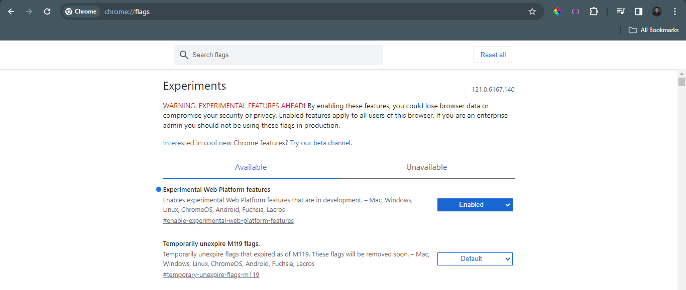
Note: to enable Houdini on your browser, enter chrome://flags/ in the address bar, then search for experiments and activate it.
Worklets
Houdini worklets are JavaScript modules that operate within the browser’s rendering engine, allowing developers to define custom paint, layout, and animation behaviors, thereby extending the capabilities of CSS. With worklets, you can do the following:
-
Create dynamic animations. Imagine animating the stroke width of a path based on user interaction or dynamically controlling the speed of an animation based on scroll position. These are some of the possibilities that can be achieved with Houdini worklets.
-
Craft interactive effects. Create custom effects like particle systems, ripple animations, or even interactive text manipulation, all powered by worklet logic.
-
Extend visual styles. Generate custom gradients, patterns, or even textures based on complex algorithms, all within the worklet environment.
-
Bridge the gap with JavaScript. Integrate your existing JavaScript libraries and functionalities seamlessly into your CSS styles using worklet communication channels.
Getting Started with Worklets
As mentioned, worklets enable developers to create more complex and customizable effects in real life applications. To illustrate further, let’s build a starry night effect using Houdini worklets:
<html lang="en">
<head>
<meta charset="UTF-8">
<meta name="viewport" content="width=device-width, initial-scale=1.0">
<link rel="stylesheet" href="styles.css">
<title>Starry Night Sky</title>
</head>
<body>
<section id="night-sky">
</section>

<script>
CSS.paintWorklet.addModule('./app.js');
</script>
</body>
</html>
In the code snippet above, we prepare a dedicated section in the HTML, ready to accommodate the worklet effect when it’s implemented:
<script>
    CSS.paintWorklet.addModule('./app.js');
</script>
The line CSS.paintWorklet.addModule('./app.js') tells the browser to grab the JavaScript code defining our paint worklet.
body {
margin: 0;
background-color: #000; /* Dark background for the night sky */
}

#night-sky {
width: 100vw;
height: 100vh;
background-image: paint(starrySky);
}
In the CSS code above, background-image: paint(starrySky) tells the #night-sky element to use our registered paint worklet named starrySky to generate the background instead of an image.
The JavaScript code below directly employs a standard loop and canvas drawing techniques to generate a varied starry sky effect with customizable colors, sizes, and random star positions:
class Star {
paint(ctx, geom, properties) {
const numStars = 100; // Adjust this to change the number of stars
const starColors = properties.get('--star-colors') || ['white', 'grey', 'darkorange'];
const sizeRange = properties.get('--star-size-range') || '2,3'; // the browser interprets the unit as pixels as default

for (let i = 0; i < numStars; i++) {
 const randomColor = starColors[Math.floor(Math.random() * starColors.length)];
 const minSize = parseFloat(sizeRange.split(',')[0]);
 const maxSize = parseFloat(sizeRange.split(',')[1]);
 const starSize = Math.random() * (maxSize - minSize) + minSize;
 const x = Math.random() * geom.width;
 const y = Math.random() * geom.height;
 ctx.fillStyle = randomColor;
 ctx.beginPath();
 ctx.arc(x, y, starSize, 0, 2 * Math.PI);
 ctx.fill();
 ctx.closePath();
}
}
}

registerPaint('starrySky', Star);
Here are some things to note in the code above:
class Star. This defines our paint worklet, a blueprint for drawing a single star.paint(ctx, geom, properties). This is the core of the worklet.ctxprovides drawing tools,geomgives information about the element’s size, andpropertiesaccesses our custom CSS properties for star colors and size.- Loop and randomness. We draw multiple stars in a loop, choosing their position and color randomly for a natural starry effect.
registerPaint('starrySky', Star). This registers ourStarclass as a paint worklet namedstarrySky, making it accessible from CSS.

CSS Houdini Custom Properties
Custom properties in CSS Houdini are advanced variables offering enhanced control in web development. They go beyond traditional CSS variables, providing features like type checking, syntax definition, and custom logic for dynamic styling.
A circular progress bar with custom rendering
Let’s dive into a practical example that showcases the power of paint worklets in creating visually captivating progress bars, looking at a simple example.
The simple HTML structure below establishes the foundation for our progress bar. A <div> element with the class progress serves as the canvas, while the data-progress attribute dynamically stores the current progress value:
<html lang="en">
<head>
<meta charset="UTF-8">
<meta name="viewport" content="width=device-width, initial-scale=1.0">
<title>Moving Circular Progress Bar</title>
<link rel="stylesheet" href="styles.css">
</head>
<body>
<div class="progress" data-progress="0"></div>

<script src="app.js"></script>
</body>
The CSS snippet below employs Houdini’s custom properties to craft a circular progress bar. The @property rule introduces --progress with a <percentage> syntax, initialized at 0%, ensuring non-inheritance. Subsequently, the .progress class styles the circular container, utilizing a conic gradient to depict progress dynamically. This concise code harnesses the flexibility of Houdini custom properties for creating visually engaging circular progress elements in web development:
@property --progress {
 syntax: '<percentage>';
 inherits: false;
 initial-value: 0%;
}

.progress {
 --progress: 0%;
 width: 200px;
 height: 200px;
 border-radius: 50%;
 background: conic-gradient(rgb(255, 58, 255) 0%, rgb(255, 58, 255) var(--progress), transparent var(--progress), transparent 100%);
 position: relative;
 overflow: hidden;
}

.progress::before {
 content: attr(data-progress);
 position: absolute;
 top: 50%;
 left: 50%;
 transform: translate(-50%, -50%);
 font-size: 24px;
 font-weight: bolder;
 color: purple;
 text-align: center;
}
Next, we have the custom property definition (@property rule):
@property --progress {
 syntax: '<percentage>';
 inherits: false;
 initial-value: 0%;
}
Some things to note in the code above:
- The
@propertyrule is part of the Houdini CSS Typed OM specification. - It defines a custom CSS property named
--progresswith the syntax of<percentage>. inherits: false;specifies that the custom property doesn’t inherit its value from its parent elements.initial-value: 0%;sets the initial value of the custom property to 0%.
Next, let’s style the circular progress bar:
.progress {
 --progress: 0%;
 width: 200px;
 height: 200px;
 border-radius: 50%;
 background: conic-gradient(#ccc 0%, #ccc var(--progress), transparent var(--progress), transparent 100%);
 position: relative;
 overflow: hidden;
}
Some things to note above:
--progress: 0%;initializes the custom property to 0%.- The
.progressclass styles the circular progress bar. widthandheightset the dimensions of the circular container.border-radius: 50%;creates a perfect circle.backgrounduses a conic gradient to create the circular progress effect, with the progress determined by the--progressproperty.position: relative;andoverflow: hidden;are used for positioning and overflow management.
Next, we’ll create our paint worklet.
Our circular progress bar springs to life through the dynamic partnership of CSS Houdini and JavaScript. Leveraging CSS Houdini, we define a custom property, --progress, while the paint worklet takes charge of custom painting. This synergy enables real-time updates to our progress bar based on the evolving value of the custom property. This collaboration not only enhances flexibility but also provides a potent avenue for creating unique rendering effects, resulting in an engaging and visually captivating circular progress bar for our web application:
class PaintWorklet {
 paint(ctx, { width, height, progress }) {
 ctx.clearRect(0, 0, width, height);
 ctx.beginPath();
 ctx.arc(width / 2, height / 2, width / 2, 0, (Math.PI * 2 * progress) / 100);
 ctx.fillStyle = '#42f445';
 ctx.fill();
 }
}
Here are some points to not in the code above:
class PaintWorkletis a JavaScript class representing a paint worklet, part of the Houdini Paint API.- The
paintmethod defines the custom painting logic for the circular progress bar. ctxis the 2D rendering context, and it’s used to draw the circular progress.
Next, we register the paint worklet and custom property:
CSS.paintWorklet.addModule('paint-worklet.js');
const progressElements = document.querySelectorAll('.progress');
progressElements.forEach(element => {
 const paintWorklet = new PaintWorklet();
 CSS.registerProperty({
 name: '--progress',
 syntax: '<percentage>',
 inherits: false,
 initialValue: '0%',
 paint: (ctx, geometry, properties) => {
 paintWorklet.paint(ctx, {
 width: geometry.width,
 height: geometry.height,
 progress: parseFloat(properties.get('--progress').toString()),
 });
 },
 });
});
Some points to note in the code above:
CSS.paintWorklet.addModule('paint-worklet.js');loads the paint worklet module.CSS.registerPropertyregisters the custom property--progressand associates it with the paint worklet.- The
paintmethod is called to provide the custom painting logic based on the current value of--progress.
Now let’s set the progress over time:
let currentProgress = 0;
function updateProgress() {
 currentProgress += 0.1; // Increment to control the speed of rotation
 if (currentProgress > 100) {
 currentProgress = 0;
 }
 progressElements.forEach(element => {
 element.dataset.progress = currentProgress.toFixed(2);
 element.style.setProperty('--progress', `${currentProgress.toFixed(2)}%`);
 });

 requestAnimationFrame(updateProgress);
}

updateProgress();
Some points to note in the code above:
currentProgressis incremented over time to simulate the progress.element.dataset.progressandelement.style.setPropertyupdate the DOM and custom property to reflect the progress.requestAnimationFrameensures smooth animation by requesting the next frame.

Introducing the Paint API
The Paint API is integral to CSS Houdini, and it revolutionizes web painting by enabling dynamic and customized visual styles. It empowers developers to create on-the-fly designs using user-defined custom properties. Explore its secrets to unleash unparalleled potential.
Simplified foundations
Here are some Paint API features:
- Paint worklet. A JavaScript function that acts as your artistic genie, conjuring up visuals based on your instructions.
- Custom properties. Variables you define using CSS’s
var()syntax, holding values that can be dynamically referenced and manipulated. - The
paint()function. The magic wand that calls upon your paint worklet to weave its visual enchantment onto elements.
Painting with code: a practical example
To illustrate “painting with code” in action, let’s dive into a practical example that showcases the power of the CSS Paint API.
This code snippet below demonstrates how developers can create dynamic and customizable patterns that break free from the constraints of static images, breathing life into web experiences:
<html lang="en">
<head>
<meta charset="UTF-8">
<meta name="viewport" content="width=device-width, initial-scale=1.0">
<link rel="stylesheet" href="styles.css">
<title>Paint API Demo</title>
</head>
<body>
<section id="screen">
</section>

<script>
CSS.paintWorklet.addModule('./app.js');
</script>
</body>
</html>
Linking the paint worklet
CSS.paintWorklet.addModule('./app.js') registers the custom paint worklet defined in app.js, enabling its use in CSS.
The CSS snippet provided below exemplifies the utilization of the Paint API in CSS Houdini. The background-image: paint(awesomePattern) property integrates the awesomePattern paint worklet, exemplifying the power and simplicity of dynamically generating visuals:
body {
  margin: 0px;
  padding: 0px;
}

#screen {
  box-sizing: border-box;
  margin: 10px;
  padding: 0px;
  width: calc(100vw - 20px);
  height: calc(100vh - 20px);
  background-color: #111;
  background-image: paint(awesomePattern);
}
Applying the paint worklet
background-image: paint(awesomePattern) applies the registered paint worklet as a background image to the #screen element, showcasing CSS Houdini’s ability to create dynamic visuals.
CSS properties can control the pattern’s appearance:
--numShapes: number of circles--shapeSize: size of circles--colors: color palette
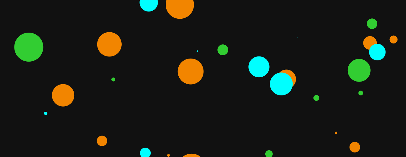
In the JavaScript code below, the Shape class takes center stage. Its paint method, fueled by user-defined properties like --numShapes, --shapeSize and --colors, orchestrates the creation of a canvas adorned with randomized shapes. The registration of the awesomePattern paint worklet solidifies the integration of CSS and JavaScript, delivering a seamless synergy of dynamic visual elements:
class Shape {
paint(ctx, geom, properties) {
  // Access input properties for customization
  const numShapes = properties.get('--numShapes') || 30;
  const shapeSize = properties.get('--shapeSize') || 50;
  const colors = properties.get('--colors') || ['#F28500', '#00FFFF', 'limegreen'];
  // Optimized random color selection
  const getRandomColor = () => colors[Math.floor(Math.random() * colors.length)];
  for (let i = 0; i < numShapes; i++) {
    const x = Math.random() * geom.width;
    const y = Math.random() * geom.height;
    const radius = Math.random() * shapeSize;
    const color = getRandomColor();
    ctx.fillStyle = color;
    ctx.beginPath();
    ctx.arc(x, y, radius, 0, 2 * Math.PI);
    ctx.fill();
    ctx.closePath();
    }
  }
}

registerPaint('awesomePattern', Shape);
Defining the paint worklet
class Shape { ... }defines a class with apaint()method, the core of the Paint API.properties.get()retrieves customization options from CSS, demonstrating Houdini’s integration with CSS properties.- The
paint()method uses canvas-like drawing commands to create the dynamic circle pattern, highlighting Houdini’s ability to extend CSS with custom rendering capabilities. registerPaint('awesomePattern', Shape)registers theShapeclass as a paint worklet, making it available for use in CSS.
Crafting Interactive 3D Animations with CSS Houdini
This is our process of building a captivating 3D card flip animation using CSS Houdini, worklets, Paint API, and custom Houdini properties. CSS Houdini allows for the creation of custom paint worklets, enabling a more flexible and dynamic approach to styling. The animation is triggered by a hover event, showcasing the power of Houdini in seamlessly combining both the visual and interactive aspects of web development.
In the code below, you’ll find the complete code, with concise explanations of the CSS Houdini elements:
<html lang="en">
<head>
<meta charset="UTF-8">
<meta name="viewport" content="width=device-width, initial-scale=1.0">
<link rel="stylesheet" href="styles.css">
<script type="module" src="app.js" defer></script>
</head>
<body>
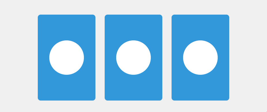
<div class="card" id="flip-card">
<div class="card-inner" id="flip-card-inner">
<div class="card-front">
Front Content
</div>
<div class="card-back">
Back Content
</div>
</div>
</div>
</body>
</html>
The CSS code below establishes the foundational structure for a card element in a web project. The layout centers within the viewport using Flexbox properties, and the card itself is defined with specific dimensions and a three-dimensional perspective.
Notably, the Houdini feature, paint: card-flip;, applies a custom paint worklet to the .card-inner element, introducing a dynamic flip effect on hover. The transition is controlled by the transform property, smoothly animating a 180-degree rotation. Styling details include vibrant background colors, font properties, and border-radius for a polished appearance on both front and back faces. The code achieves a visually appealing and interactive card design:
body {
  display: flex;
  align-items: center;
  justify-content: center;
  height: 100vh;
  margin: 0;
  background-color: #f0f0f0;
}

.card {
  width: 200px;
  height: 300px;
  perspective: 1000px;
}

.card-inner {
  --card-rotation: 0deg;
  paint: card-flip;
  paint-order: normal;
  width: 100%;
  height: 100%;
  transform-style: preserve-3d;
  transition: transform 0.6s;
  transform: rotateY(var(--card-rotation));
}

.card:hover .card-inner {
  --card-rotation: 180deg;
}

.card-front,
.card-back {
  width: 100%;
  height: 100%;
  position: absolute;
  backface-visibility: hidden;
  display: flex;
  align-items: center;
  justify-content: center;
  font-size: 20px;
  color: white;
  border-radius: 10px;
}

.card-front {
  background-color: #3498db;
}

.card-back {
  background-color: #e74c3c;
  transform: rotateY(180deg);
}
In the JavaScript code below — from app.js — the script checks if the browser supports the paintWorklet feature, and if so, it adds a paint worklet module named paintWorklet.js. Additionally, an event listener is attached to the element with the ID flip-card, toggling the flipped class on a click event:
if ('paintWorklet' in CSS) {
  CSS.paintWorklet.addModule('paintWorklet.js')
  .catch(error => console.error('Failed to register paint worklet:', error));
}

document.getElementById('flip-card').addEventListener('click', function () {
  this.classList.toggle('flipped');
});
The paintWorklet.js file extends the JavaScript functionality by registering a custom paint worklet named card-flip with CSS. This worklet, seamlessly integrated with the existing code, dynamically paints the flipping animation of the card element using canvas operations.
The --card-rotation property controls the rotation angle. Together with the interactive click event listener, this modular approach enhances the overall visual appeal of the web project.
paintWorklet.js
class CardFlipPainter {
  static get inputProperties() {
    return ['--card-rotation'];
  }

  paint(ctx, geom, properties) {
    const rotation = properties.get('--card-rotation').toString();
    ctx.clearRect(0, 0, geom.width, geom.height);
    ctx.fillStyle = '#3498db';
    ctx.fillRect(0, 0, geom.width, geom.height);
    ctx.fillStyle = '#e74c3c';
    ctx.save();
    ctx.translate(geom.width / 2, geom.height / 2);
    ctx.rotate((parseFloat(rotation) || 0) * (Math.PI / 180));
    ctx.fillRect(-geom.width / 2, -geom.height / 2, geom.width, geom.height);
    ctx.restore();
  }
}

registerPaint('card-flip', CardFlipPainter);
class CardFlipPainter { ... }defines the custom paint worklet.static get inputProperties() { ... }accepts the--card-rotationproperty.paint(ctx, geom, properties) { ... }performs the custom painting logic using canvas operations.registerPaint('card-flip', CardFlipPainter);registers the worklet with CSS.

Expanding upon the Card Flip
Here’s how the card flip, created with Houdini, can be incorporated into a company site. Allow me to present a real-project scenario:
<html lang="en">
<head>
<meta charset="UTF-8">
<meta name="viewport" content="width=device-width, initial-scale=1.0">
<link rel="stylesheet" href="styles.css">
<script type="module" src="app.js" defer></script>
</head>
<body>
<div class="flex-container">
<div class="card" id="flip-card">
<div class="card-inner" id="flip-card-inner">
<div class="card-front">
<div class="image">
</div>
</div>
<div class="card-back">
<div class="content">

<p>John Doe</p>
<p> Marketing Lead </p>

</div>
</div>
</div>
</div>

<div class="card" id="flip-card">
<div class="card-inner" id="flip-card-inner">
<div class="card-front">
<div class="image">
</div>
</div>

<div class="card-back">
<div class="content">

<p>Jane Doe</p>
<p> Senior Dev. </p>

</div>
</div>
</div>
</div>

<div class="card" id="flip-card">
<div class="card-inner" id="flip-card-inner">
<div class="card-front">
<div class="image">
</div>
</div>

<div class="card-back">
<div class="content">

<p>Mike Doe</p>
<p>Dev Ops</p>

</div>
</div>
</div>
</div>
</div>
</body>
</html>
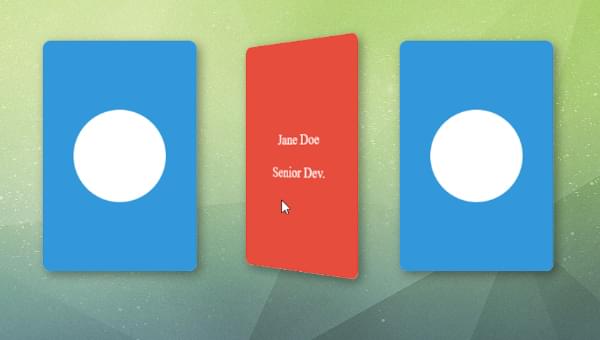
I’ve designed a staff section for the website where the card flip is utilized to display the staff members’ images as the front content, with their job title and name revealed on the back.
Let’s go through a few of the changes I made to the code.
Arrange all the cards within a flex container:
<div class="flex-container">
</div>
In the card front section, I’ve incorporated an image div, where you can easily integrate any image of your choice by utilizing a background image in the CSS.
<div class="card-front">
  <div class="image">
  </div>
</div>
In the card back section, you’ll find a content div that includes specific details like the staff member’s name (“Mike Doe”) and job title (“Dev Ops”). These elements have been assigned the class content for ease of CSS styling. Feel free to personalize this information to align with your specific content requirements.
<div class="card-back">
  <div class="content">
    <p>Mike Doe</p>
    <p>Dev Ops</p>
  </div>
</div>
The forthcoming CSS code snippet showcases practical changes to demonstrate the application of the CSS card flip in a real web project. Adjust these styles according to your preferences:
body {
  display: flex;
  align-items: center;
  justify-content: center;
  height: 100vh;
  margin: 0;
  background-color: #f0f0f0;
}

.card {
  width: 200px;
  height: 300px;
  perspective: 1000px;
}

.card-inner {
  --card-rotation: 0deg;
  paint: card-flip;
  paint-order: normal;
  width: 100%;
  height: 100%;
  transform-style: preserve-3d;
  transition: transform 0.6s;
  transform: rotateY(var(--card-rotation));
}

.card:hover .card-inner {
  --card-rotation: 180deg;
}

.card-front,
.card-back {
  width: 100%;
  height: 100%;
  position: absolute;
  backface-visibility: hidden;
  display: flex;
  align-items: center;
  justify-content: center;
  font-size: 20px;
  color: white;
  border-radius: 10px;
}

.card-front {
  background-color: #3498db;
}

.card-back {
  background-color: #e74c3c;
  transform: rotateY(180deg);
}

.flex-container {
  display: flex;
  gap: 2rem;
}

.content {
  text-align: center;
}

.image {
  height: 120px;
  width: 120px;
  border-radius: 50%;
  background-color: #fff;
  /* background-image: url(); */
}
In the container that encompasses all the cards, the CSS code utilizes flex display and sets a gap of 2 rem between the cards. Adjust the gap value according to your design preferences.
.flex-container {
  display: flex; gap: 2rem;
}
The CSS code for the content class centers the text within the specified element. Adjust as necessary to achieve the desired alignment for your content:
.content {
  text-align: center;
}
The CSS code for the image class in the front card content sets a circular image with a height and width of 120px, a border-radius of 50%, and a white background color. Additionally, there is a commented-out line for a background image; you can uncomment this line and provide the appropriate URL for the image you want to use. Adjust the dimensions and background properties as needed to suit your design preferences:
.image {
  height: 120px;
  width: 120px;
  border-radius: 50%;
  background-color: #fff;
  /* background-image: url(); */
}
Conclusion
In summary, the article explores the transformative features of Houdini, focusing on a 3D card flip animation. It highlights the power of worklets for dynamic animations, interactive effects, and extending visual styles. Custom properties and the Paint API offer additional flexibility and creative possibilities.
The practical examples, including a circular progress bar and the integration of the 3D card flip into a company site, showcase Houdini’s real-world applications. The article encourages you to embrace Houdini’s limitless potential, providing tools to redefine web design and inspire creative development.