


In this article, we’ll dive into CSS logical properties. We’ll look at what they are, how they work, and what they’re useful for. We’ll also provide a handy cheat sheet so you can easily compare CSS logical properties with their physical equivalents.
Even if you choose not to use logical properties yourself, it’s a good idea to get familiar with them, as they’re starting to appear in the code of more and more websites and online demos.
For example, you might come across this:
p {
  margin-block-start: 1em;
}
Unless you’re familiar with CSS logical properties, that probably won’t mean much to you. If you read on, you’ll soon be a logical property ninja!
Download our handy logical properties PDF cheat sheet.
Key Takeaways
- CSS logical properties offer a new way of declaring properties, such as width, height, padding, margin, and border, based on the direction of text instead of the physical dimensions of a computer screen.
- Logical properties are adaptable to changes in text direction, making them especially useful for websites with multiple language versions. They also offer advantages for monolingual websites, such as adaptability to changes in text direction due to media or container queries.
- CSS logical properties include variations for size, margin, padding, inset (positioned elements), borders, border radius, floating and clearing, text alignment, resizing, overflow, and overscroll-behavior. Each of these properties has a logical equivalent that adapts to the direction of text.
- Text direction can be specified in both HTML and CSS. In HTML, it can be set using the dir attribute, and in CSS, it can be set using the direction property. For vertical text, the writing-mode property in CSS can be used.
- Browser support for CSS logical properties has advanced rapidly in the early 2020s, and they are now strongly supported across the major browsers. However, for older browsers, it may be necessary to declare both the logical and physical property.
What Are Logical Properties?
Logical properties offer a new way to declare properties like width and height, padding, margin, border, border radius, position, float, text alignment, and overflow. Traditionally, these properties have been declared in relation to the physical dimensions of a computer screen — left, right, top and bottom. Logical properties instead are based on the direction of text.
Some languages run from left to right, such as English. Others run from right to left, like Arabic. Others sometimes run from top to bottom, such as Japanese. Many websites have multiple versions in different languages, such as the BBC’s news site in English, Arabic and Chinese, or Al Jazeera’s site in English, Arabic and Chinese.
Having styles linked to the direction of text offers a number of advantages, as they can adapt to changes in text direction and thus apply across all versions of a site.
Understanding text direction
To better grasp the purpose of logical properties, we really need to understand a few things about text direction.
We can specify the direction of text in both HTML and CSS.
HTML has the dir attribute, which specifies whether text runs from left to right across the page (dir="ltr"), right to left (dir="rtl"), or whether the browser should make up its own mind based on the language being used (dir="auto"). The dir attribute can be applied to the whole document (the norm if the whole document uses the same language) or to an individual element.
Instead of using the dir attribute in HTML, we can use the direction property in CSS. To specify left-to-right text, use direction: ltr, and for right-to-left text, use direction: rtl.
It doesn’t really matter whether we set text direction in HTML or CSS, although it’s often recommended that we use the dir attribute in HTML, as that ensures text will run in the correct direction even if something goes wrong with our style sheet.
We can also use CSS to specify that text runs from top to bottom. For vertical text that runs from left to right, we use writing-mode: vertical-lr, and for vertical text that runs from right to left, we use writing-mode: vertical-rl. (There’s no dir option for vertical text.)
In this article, we’ll look at a series of demos that compare the effects of physical and logical CSS properties. These demos will illustrate the direction of text using a paragraph consisting of emojis — a sort of universal language!
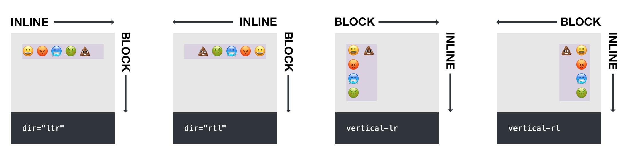
In the Pen below, we have four boxes containing our emoji sentence. The first is set to dir="ltr" (the browser default), the second to dir="rtl", the third to writing-mode: vertical-lr, and the fourth to writing-mode: vertical-rl.
See the Pen
Logical Properties: text direction by SitePoint (@SitePoint)
on CodePen.
In this demo, you can see how the text-direction settings affect the order of the characters in the paragraph.
Aside: see how the rows line up nicely in the demo above? That’s thanks to the new subgrid value in CSS Grid. We covered how to line up rows with subgrid in our recent quick tip.
Understanding block and inline in CSS
As CSS grows and develops, the focus is less on things that go left, right, up and down on a screen, and more on the flow of content. You may be familiar with the main and cross axes in Flexbox, for example, which vary depending on the direction in which text flows, as does the direction of Grid content.
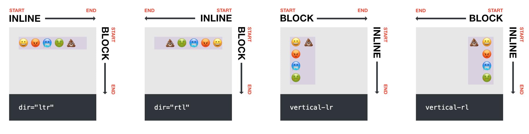
The CSS block and inline properties are determined by the direction of text. In the image below, block and inline direction varies depending on the direction of the text.
For a paragraph that runs left to right, like this one, the inline direction is left/right, and the block direction is up/down.
Logical properties are set in terms of block and inline dimensions, which automatically swap around as text direction changes. This makes them much more adaptable than physical properties.
Inline start and end are determined by where text starts and ends, as are start and end in the block direction.
Are logical properties only for multilingual sites?
Logical properties are useful for all websites. There are plenty of situations where monolingual websites might benefit from using logical properties.
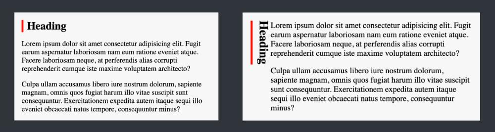
For example, you might find yourself changing the text direction of an element while using media or container queries. Imagine a heading with a left red border. On small screens, the heading might be horizontal, above the following paragraphs. On wide screens, you might set the heading to display vertically. The image below shows what would happen if you used border-left: 5px solid red on the heading.
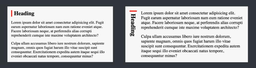
Once the heading displays vertically, that left border stays on the left, when we most likely want it at the start of the text. Using logical properties, we can instead specify that the red border appears at the inline start of the heading (border-inline-start), no matter what direction it’s pointing in, producing the result pictured below.
(You can check out a live demo of this on CodePen.)
This shows how, with logical properties, our layout is more adaptable to change without having to add extra CSS for different scenarios.
In addition to this, we’ll also see that logical properties offer a number of useful shorthands that help make CSS coding more efficient for everyone — whether working with multiple languages or not.
Size (Width and Height Dimensions)
Instead of width and height, which are based on the physical screen, logical properties use inline-size and block-size. To decide which to use to set width and height, we have to know what direction the text will go in.
In the demo below, the paragraphs in the first row have been given a block-size of 80px. In each case, the 80px is set on the block direction, whichever that may be.
Compare this with the second row of paragraphs, which are each set to height: 80px. In each case, the height is set in relation to the screen.
See the Pen
Logical Properties: Size (width and height) by SitePoint (@SitePoint)
on CodePen.
Other size properties include:
max-inline-sizemin-inline-sizemax-block-sizemin-block-size
See the cheat sheet for all size options and how to use them with each text direction, along with browser support information.
Margin
Using logical properties, margin is set with variations of margin-inline and margin-block.
For left-to-right languages, margin-inline-start: 40px will apply a margin at the start of the text (on the left of the screen). When applied to a right-to-left language, that margin will appear on the right of the screen. For vertical text, the margin will appear at the top, as shown in the demo below.
Compare the effect of margin-inline-start applied to each paragraph in the first row with the margin-left: 40px applied to each paragraph in the second row in the demo below.
See the Pen
Logical Properties: Margin by SitePoint (@SitePoint)
on CodePen.
Other margin properties include:
margin-inline-endmargin-block-startmargin-block-endmargin-inlinemargin-block
Note that margin-inline can be used as shorthand for margin-left and margin-right, which comes in very handy in a lot of situations — such as margin-inline: auto.
See the cheat sheet for all margin options and browser support information.
Padding
Using logical properties, padding is set with variations of padding-inline and padding-block.
For left-to-right languages, padding-block-start: 40px will apply padding at the top of the text (on the top of the screen). When applied to a right-to-left language, that padding will also appear on the top of the screen. For vertical text, the padding will appear on the left or right, depending on its horizontal direction.
Compare the effect of padding-block-start in the first row with the padding-top: 40px applied to each paragraph in the second row in the demo below.
See the Pen
Logical Properties: Padding by SitePoint (@SitePoint)
on CodePen.
Other padding properties include:
padding-inline-startpadding-inline-endpadding-block-endpadding-inlinepadding-block
Note that padding-inline can be used as shorthand for padding-left and padding-right.
See the cheat sheet for all padding options, in each text direction, along with browser support details.
Inset (Positioned Elements)
Have you come across the very handy inset property? It’s used for positioning elements (such as when you’re using position: absolute). For example, inset: 0 is shorthand for top: 0; right: 0; bottom: 0; left: 0;.
Let’s try this out in our emoji demo. The containing divs are set to position: relative and the paragraphs are set to position: absolute. The paragraphs in the first row are set to inset-block-end: 30px, while those in the second row are set physically to bottom: 30px.
See the Pen
Logical Properties: Inset by SitePoint (@SitePoint)
on CodePen.
Other properties for inset include:
inset-block-startinset-blockinset-inline-startinset-inline-endinset-inline
Note the convenient shorthand inset-block and inset-inline, which can be used in just two directions. (inset-block: 20px is equivalent to inset: 20px auto. See a simple demo here.)
View the full list of inset properties and how they work with text direction in the cheat sheet.
Borders
We can set a border all around an element with the border shorthand, such as border: 5px solid red. But if we just want to style particular sides of an element, we’re suddenly dealing with border-top, border-bottom, border-left and border-right, for which there are logical equivalents.
Borders are a little more involved, because they involve three values — width (the thickness of the border), style (solid, dotted, and so on), and color.
Let’s see what happens when we apply border-inline-start: 5px solid red to our paragraphs, and compare that with border-left: 5px solid red;.
See the Pen
Logical Properties: Border by SitePoint (@SitePoint)
on CodePen.
Other logical properties for border include:
border-inline-endborder-block-startborder-block-endborder-inlineborder-block
Notice that border-inline is a nice shorthand for border:left and border-right in left-to-right flow, and border-block for border-top and border-bottom.
We can drill down further into border logical properties to target just a single value. For width we have these:
border-block-start-widthborder-block-end-widthborder-block-widthborder-inline-start-widthborder-inline-end-widthborder-inline-width
For style we have these:
border-block-start-styleborder-block-end-styleborder-block-styleborder-inline-start-styleborder-inline-end-styleborder-inline-style
For color we have these:
border-block-start-colorborder-block-end-colorborder-block-colorborder-inline-start-colorborder-inline-end-colorborder-inline-color
Check out the cheat sheet for all the combinations and permutations of these properties as they apply to each text direction.
Border Radius
We can set a border radius to all corners of an element with the border-radius property. If we’re targeting individual corners with physical properties, we first consider whether it’s at the top or bottom of the element, and then whether it’s on the left or right of the element. So the top left corner is specified with border-top-left-radius.
When setting border radius with logical properties, instead of top/bottom-left/right, we need to think about block[start/end]-inline[start-end].
That is, to choose the right property for a particular corner, you have to ask yourself whether it’s at the start or end of the element’s block direction and whether it’s at the start or end of the element’s inline direction, giving four possible options in the middle:
-start-start-
-end-start-
-start-end-
-end-end-
In the first row of the following demo, we’re setting a border radius of 20px at the start of the block and inline text directions with border-start-start-radius. Compare that with border-top-left-radius in the second row.
See the Pen
Logical Properties: Border Radius by SitePoint (@SitePoint)
on CodePen.
There aren’t any special shorthands here, so if you want to round two corners, you have to do something like this:
border-start-start-radius: 20px;
border-end-start-radius: 20px;
Oh well! (See a demo of that here.)
See the cheat sheet for all border radius options and browser support information. It took longer for border radius logical properties to be supported by browsers, but support is now good in modern browsers.
Floating and Clearing
Logical properties for float and clear offer new options for how to float and clear an element. Before logical properties, the only options were float: left and float: right, clear: left, and clear: right. Where text was vertical, there was no option to float in the same direction as the text.
With logical properties, floating and clearing can now be done specifically in relation to the inline flow of text, thanks to inline-start and inline-end.
In the demo below, a span element is floated with the logical value inline-start, compared with the physical value left in the second row.
See the Pen
Logical Properties: Float by SitePoint (@SitePoint)
on CodePen.
The inline-start and inline-end values also apply to the clear property. (Here’s a CodePen demo of that.)
There’s no need for a logical alternative for clear: both, because it already clears in both inline directions — which is quite logical!
Text Alignment
We already have text alignment values like left, right, center, and justify. Two logical values have now also been added: start and end. They can be used to align text along the inline axis, no matter what direction it runs in.
In the demo below, the paragraphs in the first row have been set to text-align: end. As you can see, the emojis are all pushed to the far end of the inline axis.
See the Pen
Logical Properties: Text Alignment by SitePoint (@SitePoint)
on CodePen.
The cheat sheet shows how to apply start and end values to work with the various text directions.
Resizing
The resize property allows for resizing certain elements in specified directions, and now there are inline and block options.
The demo below shows the difference between resize: inline and resize: horizontal. (There’s a tiny resize handle at the bottom right corner of each box that you can drag.)
See the Pen
Logical Properties: Resize by SitePoint (@SitePoint)
on CodePen.
(In the demo above, the resizing for the right-to-left box is a bit wild because dir="rtl" isn’t being applied to the whole document but just to the containing div.)
Overflow
The physical properties of overflow-x and overflow-y now have logical complements of overflow-inline and overflow-block.
Note that there’s very little support for these new properties at the time of writing (April 2024).
Overscroll-behavior
The overscroll-behavior property is a new one that refines how overflowing elements scroll. We won’t delve into it here, but you can read more on MDN.
Suffice it to say that there are logical versions of these properties as well as physical. For example, overscroll-behavior-x for left-to-right languages can be replaced by overscroll-behavior-inline, and so on. (See the cheat sheet for a full list of examples.)
Browser Support
Browser support for CSS logical properties advanced rapidly in the early 2020s, and logical properties are now strongly supported across the major browsers.
Logical properties carry the same weight as their physical counterparts, so if you’re worried about the experience in older browsers, you could declare two values, like so:
blockquote {
  border-left: 5px solid red;
  border-inline-start: 5px solid red;
}
Older browsers will use the first declaration, while newer ones will use the second.
However, it would be tedious to duplicate code like this throughout a style sheet, so if you really are worried about older browsers, perhaps go easy on logical properties for now.
Caniuse has an overview of logical property support, and each section in the cheat sheet also has links to support for specific properties.
Conclusion
In this article, we’ve covered almost every logical property that’s currently available. (You can also check out logical properties for caption-side and for size containment if you want to go further.)
If nothing else, it’s worth understanding what logical properties are and how to use them, even if you choose not to use them for now. At least you’ll understand the new CSS logical property code that’s appearing all over the Web now.
Logical properties do offer benefits, even if you’re not working on multilingual sites. The various shorthands like margin-inline are very useful and are nice tools to have in your kit.
If you’ve read right through this article, you should be able to recognize logical properties wherever they appear. (Look out for those block and inline keywords!) Hopefully you’re also confident enough to use them occasionally in your CSS — unless you’ve been inspired to go full ninja!
Don’t forget to download our handy logical properties PDF cheat sheet.