


Scatter plots are a type of data visualization that shows the relationship between two variables. They are particularly useful for spotting trends, clusters, and outliers within data sets. Without the right tools, creating these plots can be a tedious process, often requiring extensive coding and design skills.
One library that lets you create complex graphs quickly is Plotly. Plotly is a graphing library that makes it easy to create interactive, publication-quality graphs online. It offers a range of plot types and styles, and its interactivity is ideal for creating scatter plots.
Key Takeaways
- Plotly provides a powerful platform for creating interactive scatter plots, offering extensive customization options.
- Vanilla JavaScript and React can both be utilized with Plotly to build dynamic data visualizations.
Plotly allows for quick and easy generation of scatter plots, which are not only accurate but also highly interactive. This interactivity is key for professional developers who want to provide end users with the ability to explore data in depth, through features like hovering to reveal data points, panning, and zooming.
Why Choose Plotly?
Plotly is a popular choice among developers for creating scatter plots due to its comprehensive features that cater to professional needs. Here’s why it stands out:
- Interactivity. Plotly’s scatter plots are not just static images; they’re fully interactive. Users can zoom in on areas of interest, hover to get more information about specific data points, and even click to interact with the data in real time. This level of interactivity is crucial for in-depth data analysis and makes the exploration process much more user-friendly.
- Ease of use. One of Plotly’s most significant advantages is its simplicity. The library provides a high-level interface that abstracts away the complexities of creating detailed charts. This means that developers can produce sophisticated visualizations with less code, which is particularly beneficial when time is a constraint or when working on rapid prototyping.
- Customization. With Plotly, every aspect of a scatter plot can be customized to fit the specific needs of your project. From the color and size of the markers to the layout of the axes and the style of the gridlines, Plotly gives you control over how your data is presented. This flexibility ensures that the final visualization aligns with your design requirements and conveys the intended message effectively.
- Compatibility. Plotly’s compatibility extends beyond just JavaScript and React. It can be used with a variety of programming languages and frameworks, making it a versatile tool in a developer’s arsenal. Whether you’re working on a web application, a mobile app, or even a server-side project, Plotly can be integrated smoothly into your workflow.
- Performance. Handling large datasets can be challenging, but Plotly is designed to manage them efficiently. It uses WebGL for rendering, which helps maintain performance without sacrificing the quality or responsiveness of the visualizations. This is particularly important for applications that require real-time data updates or for those working with big data.
- Community and support. Plotly has a strong community presence and extensive documentation, which are invaluable resources for developers. Whether you’re troubleshooting an issue, looking for best practices, or seeking inspiration for your next project, the community and support available can help guide you through the process.
Getting Started with Plotly
Plotly is a graphing library that makes it easy to create interactive, publication-quality graphs online. It offers a range of plot types and styles, and its interactivity is ideal for creating scatter plots.
Setting Up Plotly
For vanilla JavaScript: you can include Plotly directly in your HTML:
<script src="https://cdn.plot.ly/plotly-latest.min.js"></script>For React: install Plotly using npm:
npm install plotly.js-dist-minThen import it into your React component:
import Plotly from 'plotly.js-dist-min';Creating a Basic Scatter Plot
Let’s start with a basic scatter plot.
Vanilla JavaScript:
const data = [{
x: [1, 2, 3, 4],
y: [10, 15, 13, 17],
mode: 'markers',
type: 'scatter'
}];
const layout = {
title: 'Basic Scatter Plot',
xaxis: { title: 'X-Axis' },
yaxis: { title: 'Y-Axis' }
};
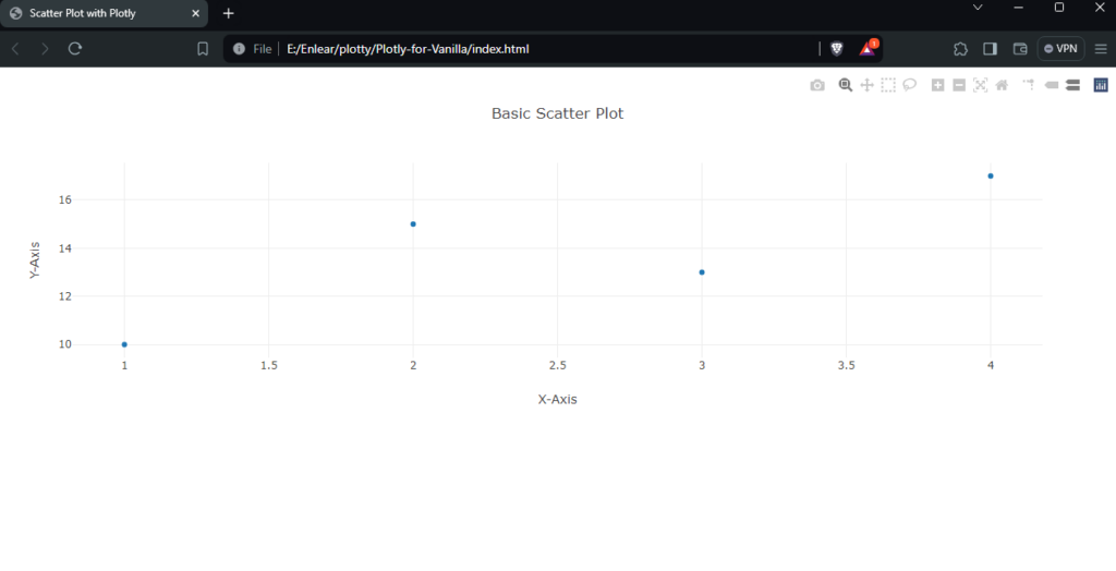
Plotly.newPlot('myDiv', data, layout);After opening the HTML file in a browser, your basic scatter plot should look like the one below.
React:
import React from 'react';
import Plot from 'react-plotly.js';
function ScatterPlot() {
const data = [{
x: [1, 2, 3, 4],
y: [10, 15, 13, 17],
mode: 'markers',
type: 'scatter'
}];
const layout = {
title: 'Basic Scatter Plot',
xaxis: { title: 'X-Axis' },
yaxis: { title: 'Y-Axis' }
};
return <Plot data={data} layout={layout} />;
}
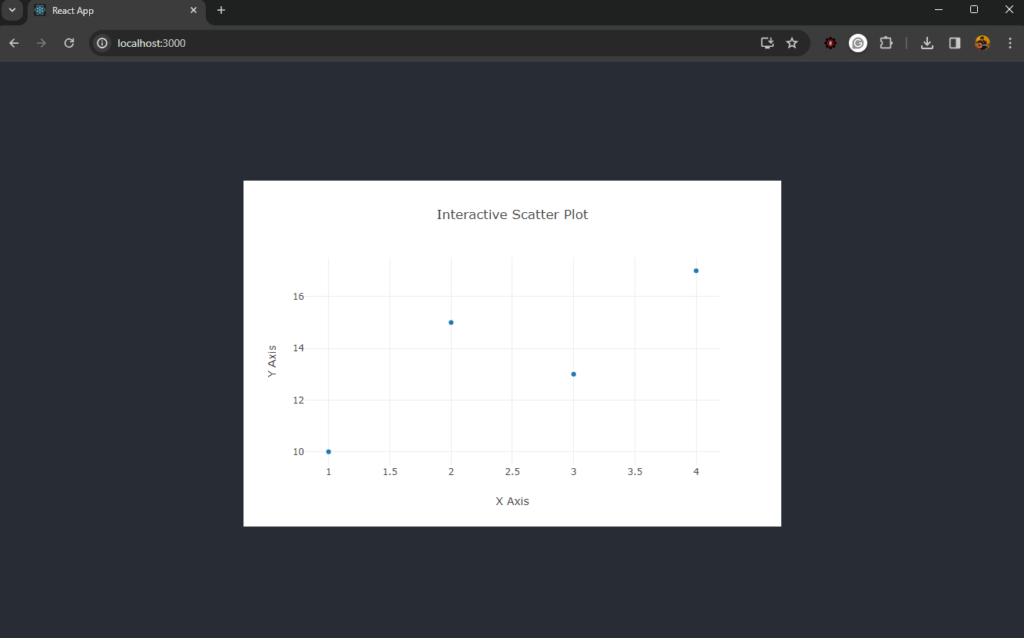
export default ScatterPlot;Run npm start in your React project, and you should see something similar to this:
Enhancing Scatter Plots
You can enhance scatter plots by adding more traces, customizing markers, and adding annotations.
Adding multiple traces:
const trace1 = {
  x: [1, 2, 3, 4],
  y: [10, 15, 13, 17],
  mode: 'markers',
  type: 'scatter',
  name: 'Dataset 1'
};

const trace2 = {
  x: [2, 3, 4, 5],
  y: [16, 5, 11, 9],
  mode: 'markers',
  type: 'scatter',
  name: 'Dataset 2'
};

const data = [trace1, trace2];

Plotly.newPlot('myDiv', data);
Customizing markers:
const trace = {
  x: [1, 2, 3, 4],
  y: [12, 9, 15, 12],
  mode: 'markers',
  type: 'scatter',
  marker: {
    color: 'rgb(219, 64, 82)',
    size: 12
  }
};

const data = [trace];

Plotly.newPlot('myDiv', data);
Creating an Interactive Scatter Plot
Interactive scatter plots allow users to engage with the data points directly.
Vanilla JavaScript:
const trace = {
  x: [1, 2, 3, 4],
  y: [10, 11, 12, 13],
  mode: 'markers',
  type: 'scatter',
  marker: { size: 12 }
};

const layout = {
  title: 'Interactive Scatter Plot',
  xaxis: { title: 'X Axis' },
  yaxis: { title: 'Y Axis' },
  hovermode: 'closest'
};

Plotly.newPlot('myDiv', [trace], layout);

document.getElementById('myDiv').on('plotly_click', function(data){
  alert('You clicked on a data point!');
});
For an interactive preview of the scatter plots, check out this CodePen demo.
See the Pen Plotly for Vanilla by Binara Prabhanga (@Binara-Prabhanga) on CodePen.
React:
import React from 'react';
import Plot from 'react-plotly.js';

class InteractiveScatterPlot extends React.Component {
  onPlotClick = (data) => {
    alert(You clicked on a data point with coordinates (${data.points[0].x}, ${data.points[0].y}) );
  };

  render() {
    const trace = {
      x: [1, 2, 3, 4],
      y: [10, 11, 12, 13],
      mode: 'markers',
      type: 'scatter',
      marker: { size: 12 }
    };

    const layout = {
      title: 'Interactive Scatter Plot',
      xaxis: { title: 'X Axis' },
      yaxis: { title: 'Y Axis' },
      hovermode: 'closest'
    };

    return <Plot data={[trace]} layout={layout} onClick={this.onPlotClick} />;
  }
}

export default InteractiveScatterPlot;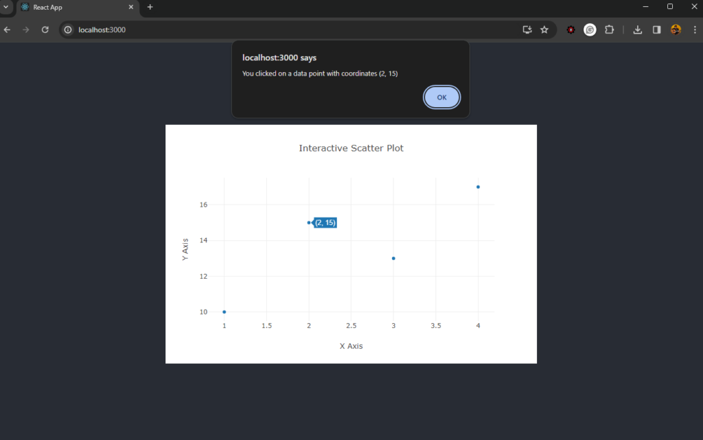
To see the scatter plots in action, check out this CodeSandbox demo.
Wrapping Up
This tutorial has covered the basics of creating scatter plots with Plotly, including setting up your environment, creating a basic plot, enhancing it with additional features, and making it interactive.
If you wish to check out the code for these graphs, here’s my CodeSandbox demo.
Experiment with these examples and explore Plotly’s documentation for more advanced features and customization options. If you’re looking for info on how to create great data visualizations, we have a handy guide here.
FAQs About Plotly
Absolutely. Plotly is versatile and can be integrated with a variety of JavaScript frameworks and libraries, such as Angular, Vue.js, and even Python for server-side rendering with Dash.
Tooltips enhance the user experience by providing additional information on hover. In Plotly, you can add tooltips by setting the text property within the trace object. You can also customize the content and appearance of these tooltips using the hoverinfo and hovertemplate attributes.
Yes, Plotly provides functionality to export charts in various formats. You can save your visualizations as static images like PNG or JPEG for reports, or as interactive HTML files that can be embedded in web pages. This is particularly useful for sharing insights with others who may not have access to the Plotly environment.
Plotly is engineered to manage large datasets effectively. It uses WebGL for rendering, which helps in maintaining performance even with substantial amounts of data. However, the performance might be influenced by the dataset’s complexity and the user’s system capabilities.
The appearance of markers in a scatter plot can be customized through the marker attribute in the trace object. This includes options for color, size, and even marker symbols. You can set these properties statically or dynamically based on data for more insightful visualizations.
Plotly provides several features to make scatter plots more accessible, including options for setting descriptive titles, axis labels, and text annotations. Additionally, you can control the contrast and color choices to accommodate users with visual impairments.