It’s time for another short series on design principles. Over the next 3 weeks I’ll post short articles about visual harmony in design and how you can achieve it in your work.
Visual Harmony basically means binding or agreement between the elements in your design both aesthetically and thematically. Over the next few weeks we’ll look at examples of harmony in design under the following headings:
- Repetition
- Thematic Reference
- Visual Echo
Visual harmony is achieved through a balance of unity and variety. That can mean choosing complementary or analogous color schemes to achieve color harmony, or choosing typefaces that are concordant or contrasting but not conflicting. A common trait between elements could be texture, patterns, color, shape or size.
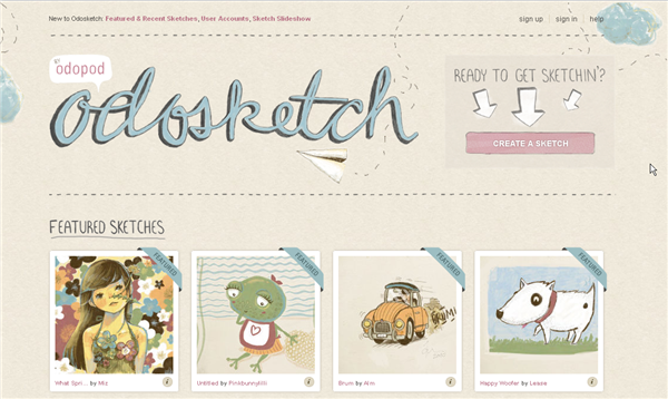
As an example, if you take a look at the odosketch site, you’ll see it uses complementary colors and also has an entirely sketchy theme. A visual echo is created by the correlation between colors, sketch paper texture, typography, logo design and the actual content of the site.
Harmony doesn’t mean boring or dull. And it doesn’t mean you should seek harmony only in design work about “nice things.” You can create a harmonious design piece about war, famine, cancer, death. The design elements may be different than in a happy piece, but they are still in visual and thematic agreement with each other.
Poster by Harry Pearce of Lippa Pearce/Pentagram
Poster by Harry Pearce of Lippa Pearce/Pentagram
In the Burma poster there is repetition in the color of the fire and the orange used in the text and the small logo. There is thematic reference between the burning letters and the information on the poster about villagers driven from their homes.
You can see harmony is all aspects of visual art from sculpture to painting and cinema. Just look a bit more closely at your everyday surroundings and you’ll see it in almost everything around you that has been “designed.”
Next week we’ll look at the use of repetition, I hope you can join me.
Frequently Asked Questions about Harmony in Design
What is the concept of harmony in design?
Harmony in design refers to the visual equilibrium that is achieved when all elements of a design work together in unity. This concept is crucial in creating a balanced, cohesive, and aesthetically pleasing design. Harmony can be achieved through the use of similar colors, shapes, sizes, textures, and patterns. It can also be achieved through the strategic placement of contrasting elements to create a sense of balance and proportion.
How can I achieve harmony in my designs?
Achieving harmony in design involves careful consideration of every element in your design. This includes the colors, shapes, sizes, textures, and patterns you use. Consistency and repetition of these elements can help create a sense of unity and balance. Additionally, the strategic use of contrast can also contribute to harmony by creating a sense of balance and proportion.
What is the role of color in creating harmony?
Color plays a significant role in creating harmony in design. Using a consistent color palette can help create a sense of unity and cohesion. Additionally, the strategic use of contrasting colors can also contribute to harmony by creating a sense of balance and proportion.
How does harmony contribute to the overall effectiveness of a design?
Harmony contributes to the overall effectiveness of a design by creating a sense of unity and cohesion. This can make the design more visually appealing and easier to understand. Additionally, a harmonious design can also create a sense of balance and proportion, which can make the design more comfortable to look at and interact with.
Can you have too much harmony in a design?
While harmony is generally desirable in design, it is possible to have too much of a good thing. Too much harmony can make a design feel monotonous and boring. To avoid this, it can be helpful to introduce some contrast or variation into your design. This can help create a sense of balance and proportion, and keep the design interesting and engaging.
What is the difference between harmony and balance in design?
While both harmony and balance are important principles of design, they are not the same thing. Harmony refers to the sense of unity and cohesion that is created when all elements of a design work together. Balance, on the other hand, refers to the distribution of visual weight within a design. A balanced design feels stable and grounded, while an unbalanced design can feel chaotic and disorganized.
How can I use texture to create harmony in my designs?
Texture can be a powerful tool for creating harmony in your designs. Using a consistent texture across different elements of your design can help create a sense of unity and cohesion. Additionally, the strategic use of contrasting textures can also contribute to harmony by creating a sense of balance and proportion.
How does harmony relate to other principles of design?
Harmony is closely related to other principles of design such as balance, proportion, and unity. These principles all contribute to the overall effectiveness of a design by creating a sense of order and cohesion. By understanding how these principles work together, you can create more effective and visually appealing designs.
Can harmony be achieved in abstract designs?
Yes, harmony can be achieved in abstract designs. Even though abstract designs may not represent real-world objects, they can still create a sense of harmony through the use of consistent colors, shapes, sizes, textures, and patterns. Additionally, the strategic use of contrast can also contribute to harmony by creating a sense of balance and proportion.
How can I improve my understanding of harmony in design?
Improving your understanding of harmony in design can be achieved through study and practice. There are many resources available online and in print that can help you learn more about this important principle of design. Additionally, practicing creating your own designs and analyzing the work of others can also help you develop a deeper understanding of harmony in design.
Jennifer Farley is a designer, illustrator and design instructor based in Ireland. She writes about design and illustration on her blog at Laughing Lion Design.


