It has been almost a week since I have started using Twine. I still feel compelled to explore and find out new things, much more so than on any other social networking site I have used.
The good thing so far is that I don’t (yet) feel overwhelmed with information. There are some peek periods were things pile up, but never too much. Think of it as an intelligent feed that has been hand crafted by some close friends and associates. The other reason there doesn’t seem to be information overload is that people are mindful of what they share. I know I am. with del.icio.us I just chuck anything in it, and that is what it is there for. Kind of like my desk drawer, whatever needs to be kept just gets dropped in.
With Twine it is more like the desktop that your colleagues and friends might see. I don’t want to be so messy, I want to portray at least some semblance of being together and knowing what I am talking about :) Of course with Twine you can do whatever you want. In my private twines I dump things in a more unordered fashion, lots of emails, bookmarks, documents, whatever and have Twine make sense of it. That is the great thing with Twine — auto extraction of tags (that get smarter the longer I use the system) and auto extraction of known things (along the lines of Open Calais from Reuters).
Visual improvements
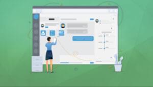
The area that I feel needs the most attention is in the way information is presented. There is a lot there, I don’t feel lost, but I do feel that there is more going on. Things that I would like to experience and explore. As I make more connections with people and join more twines, that swimming against a strong tide is starting to sink in. I want more visualisations and more intuitive ways to browse.
Search sucks
Currently, the only way to navigate this wealth of information is search. Search Sucks. Don’t get me wrong, searching is good for some things and the search engine built into Twine is very powerful. But that is the problem as well, it is very powerful. Because of that I have to do a number of things to get what I want.
I want to see immediately what is out there, visualise the connections and be able to turn dials and zoom in and out. This is what next generation Web means to me. Search is Web 2.0. Ask Yahoo!, they get it. They are embracing change quickly and visually.
The glorious connections
The Giant Global Graph is becoming more real; tag clouds and search don’t cut it anymore.
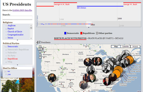
Think Exhibit…
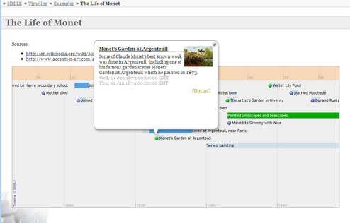
Think Timeline…
Think Timeplot…
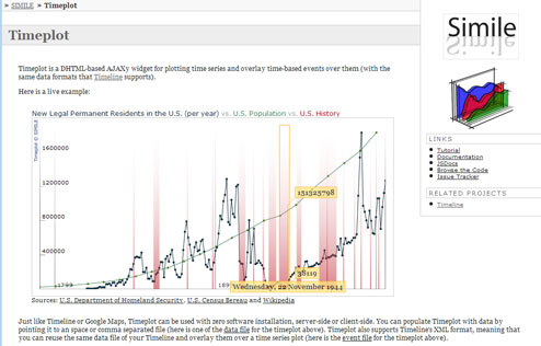
All three examples above are from the amazing people at the Simile group. David Huynh in particular is an unstoppable force when it comes to visualising information. He is the main contributor behind the above efforts and many others.
Exhibit, Timeline and Timeplot don’t just look nice, but they function extremely well in the browser and the amazing thing about them is the fact that they can all be linked together. Move one slider left and all visuals will update. Filter by one property and all systems are go. Just the sort of thing the Data Web needs.
 David Peterson