The Power And Simplicity Of The Silhouette In Logo Design

We’ve looked previously at some popular trends and styles in logo design. These included using rainbow colors and cubism. Today we’re looking at another popular technique in logo design, which is the use of silhouettes. A silhouette shows the shape of the subject without any detail. For this reason, silhouettes are particularly useful and work well as symbols in logo design.
A style can define the visual and emotional mood of an organization and it is achieved through the use of images, typeface and color. To find the style required for a logo, the designer needs to research who the target audience is. This will be a major factor in choosing the type of symbol and/or typeface you’ll use in a logo.
The main points to remember when designing a logo are:
- Keep it simple
- Make it aesthetically pleasing
- Represent an idea or concept with a symbol or suitable typography
If we keep these principles in mind, it’s easy to see why many logo designers will use a silhouette for their identity work. Below you can see the logo for the National Basketball Association of America. The reversed out outline of the basketball player with ball is easily identified.
![]()
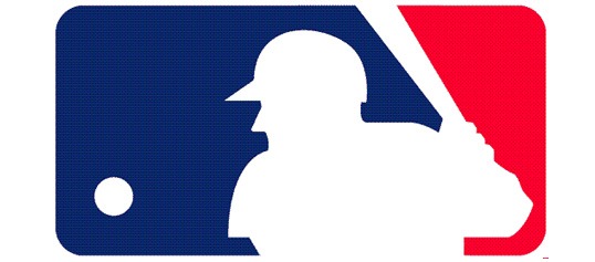
The American Major League Baseball logo follows a very similar style.
A silhouette is easy to create using Illustrator or Photoshop. You could do it by tracing around an existing photograph or scan in a drawing and trace around, then fill with black. It’s important to use a delicate hand when creating your outline and to choose a suitable and easily recognizable object to trace. If you can’t tell what the object is when it’s filled with a flat color then you need to simplify.
So now for your viewing pleasure and design inspiration, let’s take a look at some examples where logo designers have applied the silhouette style. I’ve taken these logos from Logopond, Logo Faves, Logo Moose and Logo Gala – all useful sources of inspiration.

Longshot Motion Pictures
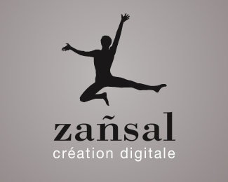
Zansal
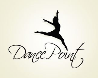
Dance Point Dance School

Yoga Australia (This logo featured in a previous post on white or negative space in Logo Design).
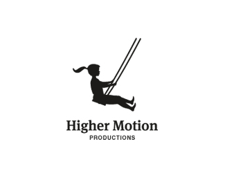
Higher Motions
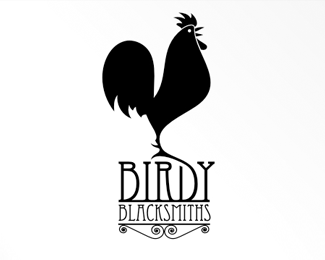
Birdy Blacksmiths
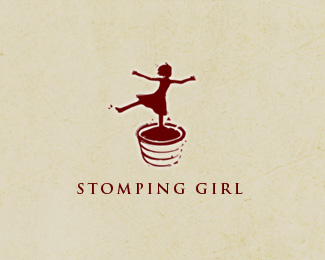
Stomping Girl

Art Rebuy

The Find Music
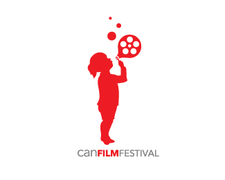
Child Abuse Network (CAN) Film Festival
What do you think of this style of logo design? Is it something you’ve applied in your own work. What other examples have you seen that you really like?
Frequently Asked Questions about Silhouette in Logo Design
Why is the silhouette technique popular in logo design?
The silhouette technique is popular in logo design because it creates a strong visual impact. Silhouettes are simple, yet powerful, and can convey a lot of information in a minimalistic way. They are easily recognizable and memorable, which is crucial for brand identity. Moreover, silhouettes are versatile and can be adapted to various styles and themes, making them suitable for a wide range of businesses.
How can I create a silhouette logo?
Creating a silhouette logo involves a few steps. First, you need to decide on the image or shape that will represent your brand. This could be anything from an animal, a person, or an object. Next, you need to simplify this image into a basic, recognizable shape. This can be done using graphic design software like Adobe Illustrator. The final step is to remove all the details and color, leaving only the outline of the shape.
What are some examples of successful silhouette logos?
Some of the most successful silhouette logos include Apple, Twitter, and Puma. These logos are simple, yet instantly recognizable. They effectively convey the brand’s identity and values without the need for words or additional design elements.
Can I use colors in a silhouette logo?
While traditional silhouette logos are black and white, you can certainly use colors to make your logo stand out. However, it’s important to ensure that the silhouette remains clear and recognizable even in a single color. The use of color should enhance the logo, not complicate it.
What should I avoid when designing a silhouette logo?
When designing a silhouette logo, avoid using overly complex shapes or images. The goal is to create a simple, recognizable logo, so it’s best to stick to simple shapes and forms. Also, avoid using too many colors or gradients, as this can make the silhouette less clear.
How can I make my silhouette logo unique?
To make your silhouette logo unique, try to incorporate elements that represent your brand’s identity or values. This could be a specific shape, object, or even a play on words. Also, consider the style and theme of your logo. A unique style or theme can set your logo apart from others.
Can a silhouette logo be detailed?
While silhouette logos are typically simple and minimalistic, they can include some level of detail. However, it’s important to ensure that the details do not compromise the clarity and recognizability of the silhouette. The details should enhance the silhouette, not distract from it.
How can I test the effectiveness of my silhouette logo?
You can test the effectiveness of your silhouette logo by conducting a logo recognition test. This involves showing your logo to a group of people and asking them to identify it. If most people can recognize your logo and associate it with your brand, it’s a good indication that your logo is effective.
What are the benefits of using a silhouette logo?
The benefits of using a silhouette logo include simplicity, versatility, and recognizability. Silhouette logos are easy to design and can be adapted to various styles and themes. They are also easily recognizable, which is crucial for brand identity.
Can I use a silhouette logo for any type of business?
Yes, silhouette logos can be used for any type of business. They are versatile and can be adapted to represent a wide range of businesses. However, it’s important to choose a silhouette that accurately represents your business and resonates with your target audience.
Jennifer Farley is a designer, illustrator and design instructor based in Ireland. She writes about design and illustration on her blog at Laughing Lion Design.
