
Key Takeaways
- The responsive design process can be simplified with the use of tools such as InterfaceSketch for initial sketches, StyleTiles for defining visual language, and Responsive Wireframes for creating adaptable layouts.
- Generating responsive HTML and CSS can be made easier with tools like Pure CSS, which offers a set of CSS modules for mobile devices, and Macaw, a web design tool that allows users to draw code.
- Attention should be paid to the finer details of responsive design such as fonts, images, and videos. Tools like FlowType, Adaptive Images, and FitVids.js can help optimize these elements for different devices.
- Before launching a responsive website, it should be tested on various device layouts. Tools like DesignModo’s Responsive Test and Brad Frost’s Ish can simulate different devices for testing purposes.
Translating client requirements to a full fledged, live website is no easy task. At the best of times, it requires multiple rounds of discussions between clients, designers, and developers, resulting in multiple iterations of the design, and the website itself. Throw in the whole responsive concept – having your design adapt to all kinds of mobile devices – and it can get a bit much to handle.
Fortunately, designers and developers are an innovative, caring, and sharing lot. We like to ease each other’s pain. Along with the growing need for responsive websites, there’s been a parallel growth of tools to help make responsive web design and development just a little bit easier. I’ve sorted through some of the tools available and put together this list to help through the phases of the responsive design and development process. Note that this is by no means an exhaustive list, so if you have another tool to share, be sure to post a comment.
Mock-ups, Prototyping and Wireframing Tools
Let’s start with the basics. The design usually starts with a sketch, a wireframe, or a mock-up. The key element here is to get the layouts properly aligned for a variety of mobile devices. Here are some tools to help with that.
1. InterfaceSketch
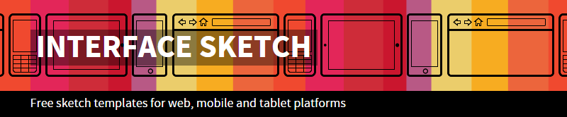
I’m old fashioned and still prefer paper and ink for basic sketches. And I love that InterfaceSketch gives designers a bunch of simple (and free) PDF templates designed to match the screen of various mobile devices. You can print out these PDFs and use them to sketch out initial designs with the best design tool ever – a good old pencil. Though it’s basic, it’s a great way to visualize how you’d want things to be.
2. StyleTiles
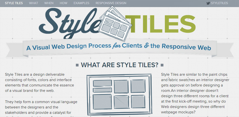
No one likes getting caught up in creating multiple mock-ups and wireframes for clients. StyleTiles eases part of that pain by enabling web designers to borrow design concepts from interior design. StyleTiles are akin to the swatches of fabric and paint tiles interior designers use. Instead of creating full mock-ups, you can instead use StyleTile swatches to help define the visual language for clients and take them through iterations easily. This is perfect for responsive designs, since there’s no fixed dimensions or layouts defined, but instead it’s all about the visual appeal. Once that’s frozen with the clients, it becomes that much easier for the designer to proceed to the wireframe or real mock-up.
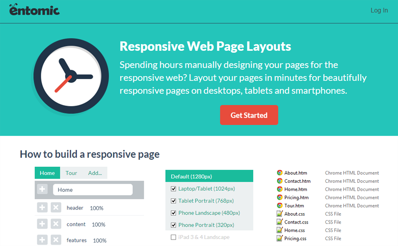
3. Responsive Wireframes
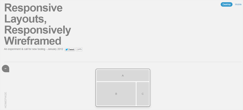
Now that we’ve got the first sketches and the visual language, time to move on to the wireframes. Traditionally wireframes have been a static representation how the website will eventually look. But what about responsive sites? You don’t want to create separate wireframes for multiple screen sizes. James Miller has a work-workaround. He’s adapted the most typical layouts and created responsive wireframes for them. This saves you the headache of creating them from scratch and lets you easily see which areas of your layout will draw the user’s focus on different devices.
4. Wirefy
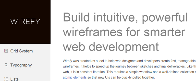
For those looking to create their own wireframe, Wirefy is a great option. It has a very simple workflow with an extensive collection of atomic components that can be moved around easily. It enables designers to build functional wireframes with fluid designs that help keep the focus on the actual content.
Generating Responsive HTML and CSS
After the mock-ups and the wireframes, it will be time to get down to the code. Writing out the CSS with multiple breakpoints and media queries isn’t exactly the most enjoyable part of coding. The following tools take the drudgery out of it and help generate responsive code. While purists may not like them, in my humble opinion, they’re a good way to get started and avoid re-inventing the wheel.
5. Pure CSS
PureCSS is a small set of CSS modules especially designed for mobile devices. It boasts a really tiny footprint (total 4.4KB, minified and gzipped), which drops off further if you use only a subset of the modules. You can create a responsive layout using the Grid and Menu modules. There are also separate modules for other typical CSS elements such as buttons, tables, and forms.
6. Responsive Web CSS
Responsive Web CSS takes a slightly different approach. It lets you create a layout by adding div elements for each section of the page and then setting the size of each div depending on how you want it to appear across different devices. Once you have all the elements and sizes in place, you can download a skeleton HTML+CSS for your site.
7. Macaw
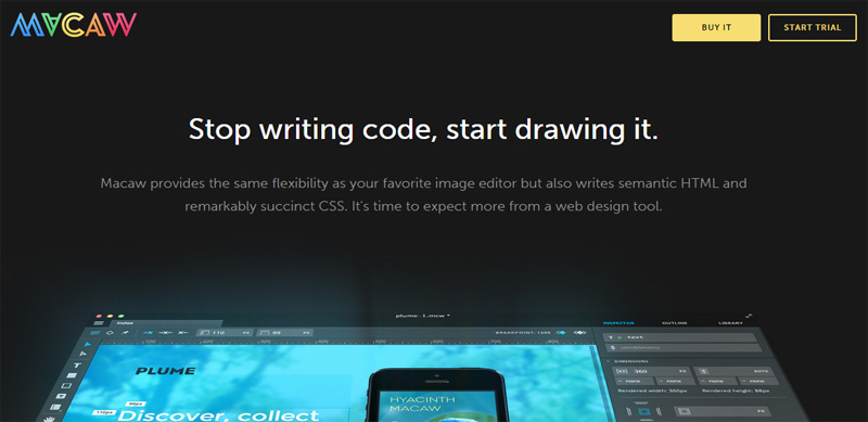
Macaw truly empowers designers to create websites without any help. Positioned as a web design tool rather than a web development tool, the tagline says it all “Stop writing code, start drawing it.” Macaw is a native application that you need to download and install, rather than an in-browser tool. Macaw gives users the flexibility of an image editor, the ability to drag and drop elements, create layouts, set typography, define global styles, and more – all with their real-time, fluid layout engine called Stream. The design-to-code engine, called Alchemy, converts these designs into semantically correct HTML and succinct CSS. Tall order for anyone! Make use of the free trial and give it a spin.
Fonts, Images, and Videos
Once we have the basic code in place, we’ll need to get to the finer details – the fonts, images, videos, etc. jQuery plugins can help do most of the heavy lifting here. Let’s take a look.
8. FlowType
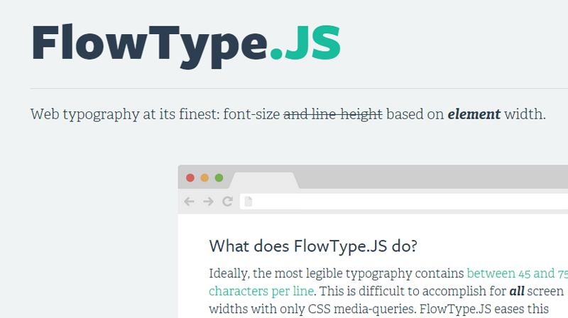
Though text is often the most ignored part of responsive design, you need to pay attention to it. FlowType is a neat jQuery plugin that changes the font size based on a specific element’s width to achieve the optimal character count, which is between 45-75 characters per line. No more guessing what em size you need to set the font to for a 4-inch screen versus a 6-inch screen. There are also other options to set the font and element size thresholds and ratios.
9. Adaptive Images
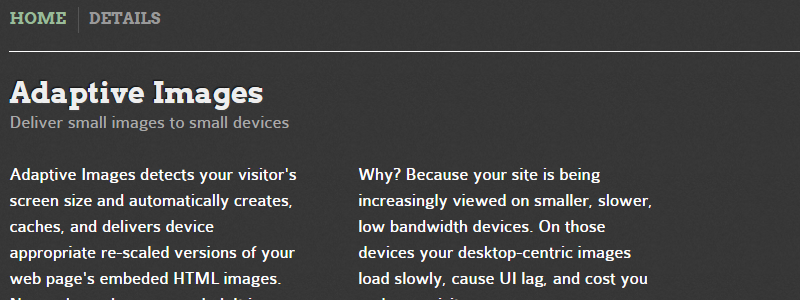
On smaller, lower bandwidth devices, loading desktop-centric images on your site will increase your page load times and consume the user’s bandwidth. Adaptive Images incorporates the principles of fluid images so you don’t have to hard code changes in your markup. It checks the visitor’s screen size and accordingly creates and delivers a scaled version of the images embedded in your web page.
10. FitVids.js

After images, it’s time to make videos responsive. Unless you really know your way around responsive coding, you may want to just skip over to FitVids.js. It’s a lightweight jQuery plugin that adjusts the size of embedded videos to match the screen size, while maintaining the right aspect ratio.
Responsive Design Testing Tools
The tools listed above were to help you design and develop your responsive website. But of course, you can’t launch your site without testing it. And if you’re like the rest of us, you really don’t have 10 different device layouts on hand to test in. Instead of fretting about how to test on multiple devices, you can use these neat simulators.
Of course, these kinds of testing tools are never the same as actual device testing, but they can serve as a replacement if actual device testing is not an option for you.
11. DesignModo’s Responsive Test
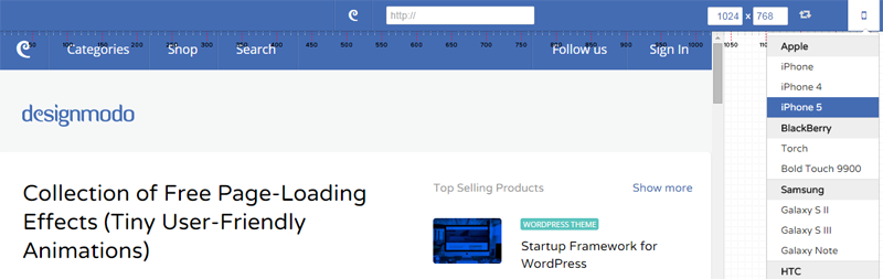
DesignModo has perhaps one of the best responsive testers available. Just feed in the site URL and the dimension you want to test it on, or alternatively, select the specific device you want to test it on. The tool supports a wide range of smartphones, tablets, and desktops, including Macs. If you need help deciding breakpoints, you can just drag the window separator around to see how the layout changes at different widths.
12. Brad Frost’s Ish
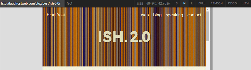
Brad Frost’s tool is another nice one you might want to consider. It lets you set the window width in px or em or you can drag the window resizer bar. There are also a number of size presets including something called “Hay” mode, which automatically starts the tool at a small size and slowly increases, allowing you to see exactly where your “break” points occur.
There are other responsive design testing tools, like the Responsive Test by Matt Kersley and the Responsinator. The main differences being the range of preset device or size options they provide. Just play around with them a bit and see which one works best for you.
Any Other Recommendations?
I hope this list of tools helps make your responsive design process a tad bit easier. Like I said earlier, there are other tools available (and a whole bunch of responsive grids and frameworks) that you could use as well. You’ll need to experiment a bit to figure out which one best suits your requirements. Have you tried any of the tools above? Do share your experiences with us in the comments below. Or is your favourite tool not on this list? We’d love to know about it – just leave a comment below.
Frequently Asked Questions on Essential Responsive Design Tools
What are the key features to look for in a responsive design tool?
When choosing a responsive design tool, there are several key features to consider. Firstly, the tool should offer a flexible grid system that allows you to easily adjust the layout based on the screen size. Secondly, it should provide a variety of pre-designed templates that can be customized to fit your brand. Thirdly, the tool should support media queries, which allow you to apply different styles for different devices. Lastly, it should offer a preview mode that lets you see how your design will look on various devices.
How can responsive design tools improve the user experience?
Responsive design tools can significantly improve the user experience by ensuring that your website or app looks and functions well on all devices. They allow you to create designs that automatically adjust to the screen size, resolution, and orientation of the user’s device. This means that users won’t have to zoom in or scroll horizontally to view content, which can be frustrating and time-consuming. Additionally, these tools often include features for optimizing images and other media, which can help to reduce load times and improve performance.
Are there any free responsive design tools available?
Yes, there are several free responsive design tools available. These include frameworks like Bootstrap and Foundation, which provide a set of pre-designed components that you can use to create responsive designs. There are also free online tools like Responsinator and Am I Responsive, which allow you to preview how your design will look on various devices. However, keep in mind that these free tools may not offer as many features or as much flexibility as paid options.
What are the benefits of using a responsive design tool rather than coding from scratch?
Using a responsive design tool can save you a significant amount of time and effort compared to coding from scratch. These tools provide a visual interface that allows you to create and adjust your design without having to write any code. They also include a variety of pre-designed components and templates, which can help to ensure consistency and speed up the design process. Additionally, many of these tools automatically generate the necessary code for you, which can help to reduce errors and ensure compatibility with different devices.
How can I test the responsiveness of my design?
There are several ways to test the responsiveness of your design. One of the simplest methods is to use the preview mode in your design tool, which should allow you to see how your design will look on various devices. You can also use online tools like Google’s Mobile-Friendly Test or Responsinator. Additionally, it’s a good idea to test your design on actual devices if possible, as this can give you a more accurate idea of how it will look and function in real-world conditions.
Can I use responsive design tools if I don’t have any coding experience?
Yes, many responsive design tools are designed to be user-friendly and do not require any coding experience. These tools provide a visual interface that allows you to create and adjust your design by dragging and dropping elements onto the page. They also automatically generate the necessary code for you, so you don’t need to worry about writing any code yourself. However, having a basic understanding of HTML and CSS can be helpful for making more advanced customizations.
What are some common mistakes to avoid when creating a responsive design?
Some common mistakes to avoid when creating a responsive design include not testing your design on actual devices, using too many different fonts or colors, and not optimizing images and other media for different screen sizes. It’s also important to ensure that your design is not only visually appealing, but also easy to navigate and use. This means making sure that buttons are large enough to be easily tapped on a touchscreen, and that text is large enough to be easily read on small screens.
How can I ensure that my responsive design is accessible to all users?
To ensure that your responsive design is accessible to all users, it’s important to follow best practices for web accessibility. This includes using clear, legible fonts, ensuring sufficient contrast between text and background colors, and providing alternative text for images. It’s also important to ensure that all interactive elements, such as buttons and links, are easily clickable and can be navigated using a keyboard. Additionally, you should test your design using accessibility tools to identify and fix any potential issues.
Can I use responsive design tools to create a mobile app?
Yes, many responsive design tools can be used to create designs for both websites and mobile apps. These tools allow you to create designs that automatically adjust to the screen size and orientation of the user’s device, whether it’s a desktop computer, a tablet, or a smartphone. However, keep in mind that designing for mobile apps may require additional considerations, such as optimizing for touch input and ensuring compatibility with different operating systems.
How can I learn more about responsive design?
There are many resources available for learning more about responsive design. This includes online tutorials and courses, books, and blogs. Many responsive design tools also provide documentation and tutorials to help you get started. Additionally, there are many online communities and forums where you can ask questions and learn from other designers.