The Power Of Negative Space In Logo Design

The logo designer’s job is, amongst other things, to create attractive eye-catching logos. This is achieved using a variety of design elements and concepts. Some designers have a wonderful skill for using negative space to create clever and memorable logos. Often the negative space part of the logo may initially appear to be hidden but on closer inspection will reveal an icon or message. Once noticed, the formerly hidden element then becomes the most obvious part of the logo design, raising a smile or nod of acknowledgement. Negative space gives the viewer’s eye a place to rest.
What Exactly Is Negative Space?
Negative space is the empty space around and between the subject of an image. For example, in a two-tone black-and-white image, a subject is normally depicted in black and the space around it is left blank (white), creating a silhouette. If you reverse the colors so that the space around the subject is black and the subject itself is left blank, the negative space forms a shape around the subject. Negative space can be used to depict a subject in a chosen medium by showing everything around the subject but not the subject itself.
A well documented example of negative space in logo design is the hidden arrow between the letters E and X in the FedEx logo.

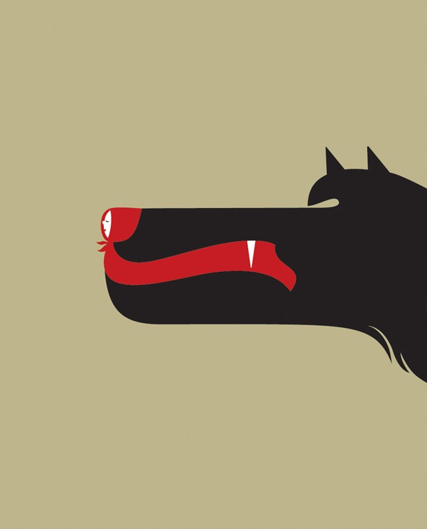
One of my favorite illustrators, Noma Bar has amazing skill when it comes to creating outstanding work using negative space.


How To Use Negative Space In Logo Design
Looking at the work of Noma Bar, I think you’ll agree it’s not as simple as it looks. As with any type of logo design, sketching and experimentation are imperative.
Here’s some tips to consider when creating a logo with negative space as a major design element.
- Simple is best. Keep the icon or symbol simple so as to avoid confusing the viewer. Remember the trick in the FedEx logo is a simple hidden arrow.
- The negative space does not have to be white (or black).
- If the logo consists mainly of text, try adding a shape behind the text and reversing the colors.
- Placing two symmetrical shapes in close proximity can produce a full image in the negative space in-between.
And now for your viewing pleasure, here’s a small collection of logos which are using the negative space in a clever and artistic fashion to create visually appealing logos.

![]()


What do you think of these negative space logos? Is this a design element you’ve employed in your own design work?
Frequently Asked Questions about Negative Space in Logo Design
What is the significance of negative space in logo design?
Negative space is a crucial element in logo design as it helps to create a visually appealing and memorable logo. It is the space around and between the subject of an image which can be used creatively to depict more than one concept, thus adding depth and complexity to the logo. It can also help to balance the design, making it more aesthetically pleasing.
How can I effectively use negative space in my logo design?
To effectively use negative space in your logo design, you need to think beyond the primary image or text. Consider the space around and between these elements and how it can be used to convey additional messages or images. Start with a simple design and gradually incorporate negative space into it. Remember, simplicity is key in logo design.
Can you provide some examples of successful use of negative space in logo design?
Some famous examples of successful use of negative space in logo design include the FedEx logo, where the space between the ‘E’ and ‘x’ forms an arrow, symbolizing speed and precision. Another example is the WWF logo, where the negative space forms the iconic panda image.
What are the common mistakes to avoid while using negative space in logo design?
One common mistake is overcomplicating the design. Negative space should be used subtly and effectively, not forced. Another mistake is not considering the scalability of the logo. The negative space elements should still be recognizable when the logo is scaled down.
How does negative space contribute to brand identity?
Negative space can contribute significantly to brand identity by making the logo more memorable and unique. It can also convey the brand’s values and personality in a subtle and clever way.
Is negative space a trend in logo design?
While negative space has been used in logo design for many years, it has gained popularity recently due to its ability to create unique, clever, and memorable logos. However, it’s not just a trend but a timeless design technique.
Can negative space be used in any type of logo design?
Yes, negative space can be used in any type of logo design, whether it’s a wordmark, pictorial, abstract, or combination logo. The key is to use it creatively and effectively to enhance the overall design.
How can I improve my skills in using negative space in logo design?
Practice is key to improving your skills in using negative space. Start by analyzing successful logos that use negative space and try to incorporate similar techniques in your designs. You can also take design courses or tutorials that focus on this technique.
What tools can I use to design a logo with negative space?
There are many design tools available, both free and paid, that you can use to design a logo with negative space. Some popular ones include Adobe Illustrator, CorelDRAW, and Inkscape. These tools offer various features that can help you effectively use negative space in your designs.
Can I use colors in negative space logo design?
Yes, you can use colors in negative space logo design. However, it’s important to ensure that the colors don’t distract from the overall design and that they work well in both color and black and white versions of the logo.
Jennifer Farley is a designer, illustrator and design instructor based in Ireland. She writes about design and illustration on her blog at Laughing Lion Design.