

Cubism was a 20th century avant-garde art movement, which is closely associated with Pablo Picasso and Georges Braque. This art style revolutionized European painting and sculpture.
 In cubist artworks, and as we’ll see in the case of the logos featured, objects are broken up, and re-assembled in a very abstract and somewhat disconcerting form. The cubist artist depicts objects from more than one viewpoint, with surfaces intersecting at random angles. A normal sense of depth in an object is removed.
Today, identity designers are using this fine art style for inspiration for their logo work. The cubist style reduces images down to a level of simplicity, and simplicity is one of the more important features of a good logo. Many of the logos have an illustrated hand-drawn feel about them which is eye-catching and aesthetically pleasing, moving away from the very clean, computerized look of some vector-based logos.
So for your viewing pleasure and design inspiration, here’s a small collection of cubist style logos.
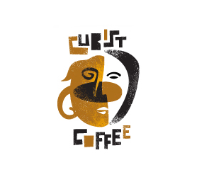
Cubist Coffee by James Strange

Vanguard by Karmesi

Toro by Van Paul

Melbourne City Logo

U.S. Virgin Islands by J Walter Thompson
![]()
Cubist (Cultural Business: Impact, Strategy and Technology) Research Group
![]()
Ok, maybe this one isn’t so inspirational, but I just had to include the London 2012 Olympics logo.
What do you think of these logo designs?
Main Image Credit: Georges Braque: Woman with a guitar, painted 1913, in the Musée Nationale d’Art Moderne, Centre Georges Pompidou, Paris, France.
Frequently Asked Questions about Cubism in Logo Design
What is the significance of using Cubism in logo design?
Cubism, an artistic movement pioneered by Pablo Picasso and Georges Braque, is characterized by the fragmentation of three-dimensional forms on a two-dimensional plane. This unique style can be effectively used in logo design to create visually striking and memorable logos. The use of geometric shapes and abstract forms in Cubism can help to convey a sense of innovation, creativity, and modernity. Moreover, Cubist logos can stand out in a crowded market due to their distinctive and unconventional design.
How can I incorporate Cubism into my logo design?
Incorporating Cubism into your logo design involves the use of geometric shapes, abstract forms, and multiple perspectives. Start by sketching out your ideas, focusing on breaking down the elements of your logo into simple geometric shapes. Experiment with different arrangements and perspectives, and don’t be afraid to be bold and unconventional. Remember, the goal is to create a logo that is unique, memorable, and reflective of your brand’s identity.
What are some examples of successful Cubist logos?
There are many successful examples of Cubist logos in various industries. For instance, the logo for the Museum of Modern Art in New York features a Cubist-inspired design, with its abstract forms and geometric shapes. Another example is the logo for the fashion brand Chanel, which uses interlocking geometric shapes to create a distinctive and memorable logo.
What are the challenges of using Cubism in logo design?
While Cubism can create visually striking logos, it also presents certain challenges. The abstract and unconventional nature of Cubist designs can sometimes make them difficult to understand or recognize. Therefore, it’s important to strike a balance between creativity and clarity when using Cubism in logo design. Additionally, Cubist logos may not be suitable for all types of businesses, particularly those in more conservative or traditional industries.
Can Cubism be combined with other design styles in a logo?
Absolutely. Cubism can be effectively combined with other design styles to create a unique and distinctive logo. For instance, you could combine Cubism with minimalism to create a logo that is both abstract and clean. Or, you could blend Cubism with a vintage style for a logo that is both modern and nostalgic. The key is to experiment with different combinations and find a style that best represents your brand.
How can I ensure my Cubist logo is effective?
An effective Cubist logo should be visually striking, memorable, and reflective of your brand’s identity. It should also be versatile, meaning it should work well in various sizes and on different platforms. To ensure your logo is effective, it’s important to get feedback from others and make necessary adjustments. You might also consider hiring a professional designer who has experience with Cubist logos.
What are the key elements of Cubism that I should incorporate into my logo?
The key elements of Cubism that you should incorporate into your logo include geometric shapes, abstract forms, and multiple perspectives. These elements can help to create a logo that is visually striking and distinctive. However, it’s important to remember that the use of these elements should be balanced with the need for clarity and recognizability in your logo.
How can I learn more about Cubism and its application in logo design?
There are many resources available for learning more about Cubism and its application in logo design. You could start by studying the works of Cubist artists like Pablo Picasso and Georges Braque. There are also many books and online resources that provide in-depth information about Cubism and its principles. Additionally, you could take a course or workshop on logo design that covers different design styles, including Cubism.
Can Cubism be used in logo design for any industry?
While Cubism can be used in logo design for a wide range of industries, it may not be suitable for all. Businesses in more conservative or traditional industries may prefer a more conventional logo design. However, for businesses in creative, innovative, or modern industries, a Cubist logo can be a great way to stand out and convey a sense of creativity and innovation.
What is the future of Cubism in logo design?
The future of Cubism in logo design looks promising. As businesses continue to seek unique and distinctive logos to stand out in a crowded market, the use of unconventional design styles like Cubism is likely to increase. Moreover, with the growing popularity of abstract and geometric designs in the digital world, Cubism is set to remain a popular choice for logo design in the foreseeable future.