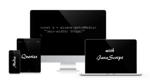
Craig Buckler gives you an accessible introduction to using media queries with JavaScript with matchMedia for a robust responsive design approach.

Craig Buckler gives you an accessible introduction to using media queries with JavaScript with matchMedia for a robust responsive design approach.
Screen resolutions keep increasing and so do the challenges of front-end development. James George looks at the current state of play.
Kitty shows us how we can use Sassy Tester and gulp to help us when testing a Sass library.
Christ Poteet introduces the concept of mobile first design and how it differentiates from the technical aspect, with a light intro to the subject.
Una shows some simple things we can use Sass maps for to keep our code readable and organized.
Ryan Reese introduces the basics of the viewport meta tag and explains why RWD layouts should not be based on device-specific media queries.
Hugo shows us how we can extend a Sass media query mixin to allow for global layout changes and specific component changes.
James Steinbach walk us through a complex Sass mixin that will generate CSS that scales across media query breakpoints to ease development.
Is your responsive web design only constrained by min-width and max-width media queries? Craig explains why min-height and max-height have good uses too.
Ty Strong looks at all the different media features you can use when working with Media Queries in your CSS, for targeting all sorts of devices and types.
Ten Ways to Make Your Website More Mobile Friendly that are simple and can be accomplished today.
Sass doesn't allow you to @extend a placeholder inside a media query from another scope. Here is a complex, but easy to use solution.
Read 7 Ways to Improve Your Responsive Web Design Approach and learn with SitePoint. Our web development and design tutorials, courses, and books will teach you HTML, CSS, JavaScript, PHP, Python, and more.