Visual Harmony In Design Part 4: Visual Echo
Over the past few weeks, we’ve looked briefly at how designers can achieve visual harmony in their compositions. We’ve seen how repetition of elements brings harmony and attracts attention and how “thematic reference” establishes a connection between themes in both the content and the design elements. In the final part of this short series, we’ll discuss the idea of “visual echo”. A visual echo establishes an attractive sense of unity between design elements in a layout, whether that layout is for the web or for print.
Echo Through Color
One easy way to achieve a visual echo is to reuse or echo the colors in a photograph or illustration in the colors, typography and styles of your layout. Use the eyedropper tool in Photoshop or your graphics editor to pick out a color from your image, or use Kuler to create a color scheme from an image.
Look at this poster for the movie Collateral. The main photograph is very subdued in terms of color, but the golden skin color on Tom Cruise’s face is echoed in both the actor’s names and the movie title.
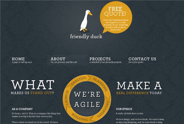
The Friendly Duck site is deceptively simple. The white and orange colors in the duck illustration are echoed in the type, the speech bubble and in the circular chart on the page you can see below. This is not an accident. This design would be nowhere near as effective if each of those design elements were completely different colors.
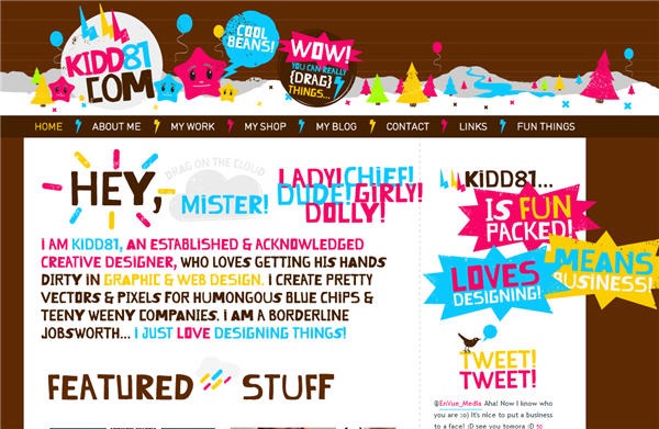
Echo can also be achieved through typography. The same style of typography on the Kidd 81 site appears in the logo and header, in the introduction and in the sidebar. Often when a design appears weak, it is because the designer hasn’t followed through with the use of typography. This designer has not been afraid to use the hand-drawn style in several sections of the site. For practical purposes, such as Search Engine Optimisation, the designer will be required to use a web safe font for the main text on the site, but on this site the echo is strong and meaninful.
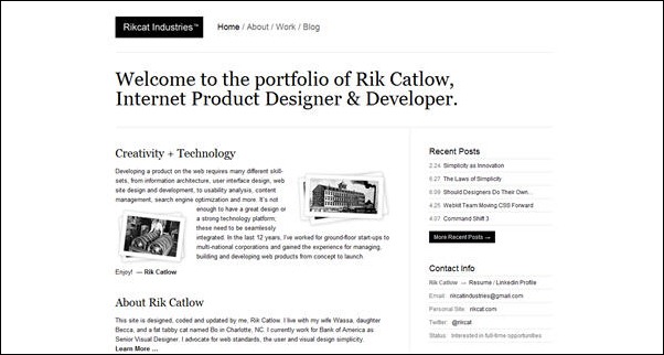
Rikcat industry is a similar but more subtle example of echo in typography. The type in the logo, navigation and sidebar is the same sans-serif typeface while the headings use a serif font. The use of black on white and white on black provides an interesting contrast.
You can also create echo through style. This advertising for female icons is a combination of hand-scrawled, grungy typography combined with a stylised black and white photograph sitting slightly skewed on a pink background. It doesn’t say “I’m a girly, girl”, it shouts “I’m a hardcore, rockin’ woman!”
Everywhere you look you’ll find examples of visual harmony. As I mentioned in the first post of this series, harmony doesn’t mean the design has to be only for a “nice” subject, it just means that all the elements agree with each other. They can be rough, course and shocking or as nice as pie as long as you are making the choices about colors, styles, typography and textures.
That finishes this short series on achieving harmony in your compositions. I hope you’ve found it useful.
Frequently Asked Questions on Visual Echo in Design
What is the concept of visual echo in design?
Visual echo is a design principle that involves the repetition of visual elements to create a sense of unity, balance, and harmony in a design. It’s like an echo in sound, where a certain sound repeats itself, creating a pattern. In visual design, elements such as shapes, colors, textures, or patterns are repeated to create a visual echo. This principle is widely used in various fields of design, including graphic design, web design, and interior design, to create visually appealing and coherent designs.
How does visual echo contribute to the overall design?
Visual echo plays a crucial role in enhancing the overall design. It helps in creating a sense of unity and harmony by repeating certain elements throughout the design. This repetition creates a pattern that guides the viewer’s eye through the design, making it easier to understand and more engaging. Moreover, visual echo can also help in emphasizing a particular element or message in the design.
How can I effectively use visual echo in my designs?
To effectively use visual echo in your designs, start by identifying the key elements that you want to repeat. These could be shapes, colors, textures, or patterns. Once you’ve identified these elements, repeat them in a consistent and balanced manner throughout your design. However, be careful not to overdo it as too much repetition can make your design look monotonous and uninteresting. It’s all about finding the right balance.
What is the difference between visual echo and pattern?
While both visual echo and pattern involve repetition of elements, they are not the same. A pattern is a regular and predictable repetition of elements, whereas a visual echo involves repetition but not necessarily in a regular or predictable manner. Visual echo is more about creating a sense of unity and harmony through repetition, while pattern is about creating a visual rhythm.
Can visual echo be used in web design?
Yes, visual echo can be effectively used in web design. It can help in creating a consistent and cohesive look and feel across different pages of a website. By repeating certain elements like colors, shapes, or typography, you can create a visual echo that enhances the user experience and makes your website more engaging and easy to navigate.
How does visual echo relate to other design principles?
Visual echo is closely related to other design principles like balance, rhythm, and unity. By repeating certain elements, visual echo helps in creating a sense of balance and rhythm in the design. It also contributes to the unity of the design by tying together different elements into a cohesive whole.
What are some common mistakes to avoid when using visual echo?
One common mistake to avoid when using visual echo is overdoing it. Too much repetition can make your design look monotonous and uninteresting. Another mistake is not maintaining consistency in the repeated elements. Inconsistent repetition can confuse the viewer and disrupt the harmony of the design. It’s also important to ensure that the repeated elements are relevant and contribute to the overall message of the design.
Can visual echo be used in logo design?
Yes, visual echo can be effectively used in logo design. By repeating certain elements, you can create a logo that is visually appealing and memorable. However, it’s important to keep the logo simple and not overdo the repetition.
How can I learn more about visual echo and other design principles?
There are many resources available online where you can learn more about visual echo and other design principles. Websites like SitePoint, UX Design, and others offer articles, tutorials, and courses on various aspects of design. You can also read books on design or take design courses to deepen your understanding.
Can visual echo be used in combination with other design principles?
Absolutely, visual echo can and should be used in combination with other design principles. For instance, you can use it with the principle of contrast to create a design that is both harmonious and dynamic. Or you can use it with the principle of balance to create a design that is visually stable and pleasing. The key is to understand how different design principles interact with each other and use them in a way that enhances your design.
Jennifer Farley is a designer, illustrator and design instructor based in Ireland. She writes about design and illustration on her blog at Laughing Lion Design.


