 With the advent of new web technologies such as sIFR, Cufon and Typekit, we can be more adventurous with our choice of typefaces. Earlier this year I wrote about Slab Serif fonts. In this post, we’re looking at the Modern Typeface.
Despite its name, the “Modern” Typeface, also known as Didone, is not new. In the eighteenth century improvements in paper quality combined with more advanced printing methods brought about changes in how typefaces were created.
Modern is the term used to categorize fonts created at that time or in the style of that time.
Modern fonts are recognizable by their thin, long horizontal serifs, and clear-cut thick/thin transitions in the strokes. The stress is vertical, i.e. there is no slant on the letters.
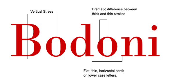
They tend to look very structured and could be considered cold. Having said that, modern fonts can look really eye-catching and very elegant at large sizes. They are not suitable for large amounts of body text, either on the web or in print. When used for body copy in print, an effect called “dazzling” occurs, the thick lines become very prominent while the thin lines almost disappear. It’s best to keep them for headings and sub-headings. You may not use the modern typeface too often, but as a designer it’s nice to be able to pick out and recognize font categories.
You probably have a number of Modern fonts on your computer already. Some examples are Didot, Onyx and Times Bold. I’ve picked out seven more which are available to download for free.
Bedini
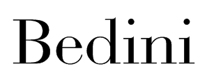
Edition Regular

Rundfunk
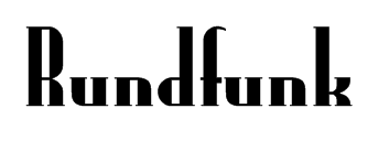
Dubiel
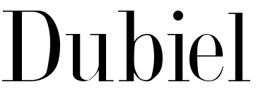
Orgreave

Bodoni
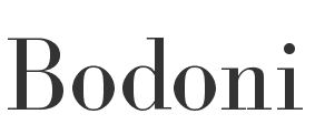
Latin Modern Roman

That’s a small selection of free Modern typefaces. There are tons available to buy if you like this style, and if you think you’re after something else entirely, try our guide to finding free fonts.
Frequently Asked Questions (FAQs) about Modern Typeface
What is the history of modern typeface?
Modern typeface, also known as Didone, emerged in the late 18th century as a contrast to the traditional typefaces of the time. It was characterized by a stark contrast between thick and thin strokes, and a lack of bracketing around the serifs. This style was popularized by type designers such as Firmin Didot and Giambattista Bodoni, who sought to create a more dramatic and contemporary aesthetic in print. The modern typeface has since evolved, with many variations and sub-styles, but its distinctive features remain influential in typography today.
How does modern typeface differ from other typefaces?
Modern typefaces are characterized by their extreme contrast between thick and thin strokes, vertical stress, and unbracketed serifs. This is in contrast to other typefaces such as Old Style, which have less contrast between strokes and bracketed serifs, or Sans Serif, which do not have serifs at all. Modern typefaces also tend to have a more geometric and precise appearance, which can give a sense of elegance and sophistication.
What are some popular examples of modern typeface?
Some popular examples of modern typeface include Bodoni, Didot, and Walbaum. These typefaces are often used in fashion and luxury branding due to their elegant and sophisticated appearance. Other examples include Century Schoolbook and Times New Roman, which are commonly used in print due to their readability.
How can I choose the right modern typeface for my project?
Choosing the right modern typeface depends on the nature of your project and the message you want to convey. Consider the tone and style you want to achieve – for example, a typeface like Bodoni might be suitable for a high-end fashion brand, while Century Schoolbook might be more appropriate for an academic paper. Also consider readability, especially for longer texts.
Can modern typefaces be used for web design?
Yes, modern typefaces can be used for web design. However, due to their high contrast and thin strokes, they may not be as readable on screens, especially at smaller sizes. It’s important to test the typeface on different devices and screen resolutions to ensure it works well in your design.
What are the best practices for using modern typeface?
When using modern typeface, it’s important to consider the context and audience. Because of their high contrast, modern typefaces can be difficult to read in large blocks of text, so they are often used for headings or short pieces of text. Also, consider pairing a modern typeface with a simpler sans serif typeface to balance readability and style.
How has modern typeface evolved over time?
Modern typeface has evolved significantly since its inception in the late 18th century. While the original modern typefaces were characterized by extreme contrast and unbracketed serifs, contemporary interpretations often play with these conventions, creating a wide variety of styles and aesthetics. Despite these changes, the influence of the original modern typefaces is still evident in many designs today.
What is the impact of modern typeface on branding and marketing?
Modern typeface can have a significant impact on branding and marketing. Its elegant and sophisticated appearance can convey a sense of luxury and refinement, making it a popular choice for high-end brands. However, it’s important to consider the context and audience, as the high contrast and thin strokes of modern typeface may not be as readable in certain formats.
How can I learn more about modern typeface?
There are many resources available for learning more about modern typeface. Online blogs and articles, typography books, and design courses can all provide valuable information. Additionally, studying the work of renowned type designers can provide insight into the use and evolution of modern typeface.
Where can I find modern typefaces to use in my designs?
There are many online platforms where you can find modern typefaces, such as Google Fonts, Adobe Fonts, and Font Squirrel. These platforms offer a wide range of typefaces, many of which are free to use. Always make sure to check the licensing terms before using a typeface in your designs.
Jennifer Farley is a designer, illustrator and design instructor based in Ireland. She writes about design and illustration on her blog at Laughing Lion Design.
Published in
·Animation·Canvas & SVG·Design·Design & UX·HTML & CSS·HTML5·Illustration·Resources·Software·June 7, 2016
Published in
·Accessibility·Design·Design & UX·Freelancing·Illustration·Sketch·Software·UI Design·Usability·UX·Web·March 23, 2016
