Big, Bold (And Sometimes) Beautiful Serif Slab Fonts
 Bold and Slab Serifs have become popular again, maybe as an antidote to the digital perfection of some newer, cleaner fonts. Slab Serifs work extremely well when mixed and matched with lighter typefaces and that’s something we’re seeing in web design now. Big, bold headings and logos used alongside “web-safe” body copy. Slab Serif typefaces offer a huge amount of variety and are excellent for providing contrast and drawing attention both to graphic design and web design work.
The term “Slab” actually covers a multitude, so it should be noted that within that umbrella term, there are several sub-categories such as Clarendons, Contemporary Text Faces, Classic Text Faces, Standard-Bearers, and Massive Display Examples. Basically everything from the old Playbill style lettering to electric typewriter style falls under Slab.
A (very) short history.
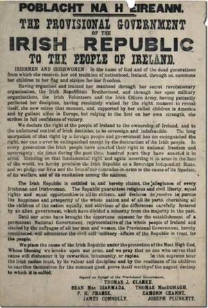 In the nineteenth century, wood type became very popular for advertisements and posters. Engravers carved individual letters out of wood. Naturally enough, it would be difficult to cut the very fine and thin lines which were achievable with metal type, and from this came big, bold typefaces. Slab Serif fonts were particularly suited for this method of creating fonts. This was the start of development of typefaces for “display” purposes.
Slab Serif fonts were sometimes referred to as “Egyptian” fonts because in 1809, Napoleon returned from an Egyptian expedition and published a book called Description de l’Égypt. It seems like everyone went bananas for the look and feel of Eqypt, and typographers used the term because it was in vogue. The term does not have anything to do with Hieroglyphs.
They were used frequently on the “Wanted” posters of the American West and some still convey that sense of the Wild West. Initially, the typefaces were created as all-caps, with lower-case letters appearing later. On the right you can see the famous (in Ireland!) 1916 Rising Proclamation using this style of font.
Free Slab Serif Fonts
I’ve picked out ten examples of Slab Serif typefaces which are free to download.
All of these fonts are free for personal use but it’s a good idea to check the license terms for commercial use.
Fette Egyptienne

Acknowledgement


Broadcast Titling – A nice 3D variation of a slab.

Shadowed-Serif

Chunk
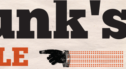
All Star

Nilland

Trashed – A somewhat distorted heavy slab.

Museo – 300, 500 and 700 weights are free.

Five Websites Using Slab Serif Fonts
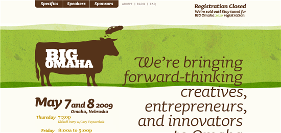
Big Omaha
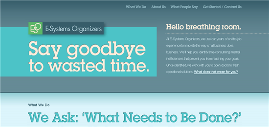
E-Sytems Organisers
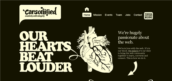
Carsonified
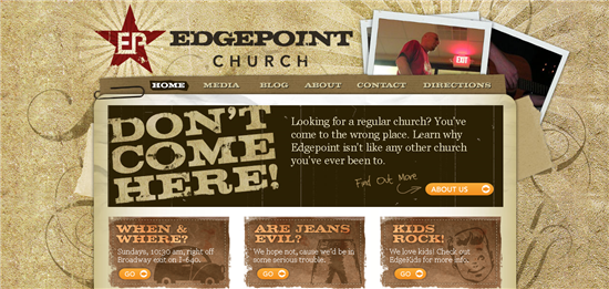
Edgepoint Church
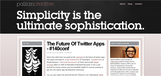
Pallian Creative
Another company that I’ve come across which makes use an interesting use of Slab Serif fonts in their work is Made In Hollywood. They don’t use it on their website, but rather in their designs which are made entirely from foam.
Would you use this kind of typeface in your design work? Have you seen other Slab Serif fonts you really like?
Frequently Asked Questions about Slab Serif Fonts
What is the history of slab serif fonts?
Slab serif fonts, also known as Egyptian or square serif, originated during the 19th century. They were initially used in advertising, to create a bold and attention-grabbing effect. The first slab serif font was created by Vincent Figgins in 1815 and was named ‘Antique’. These fonts are characterized by thick, block-like serifs, which are the small lines or strokes attached to the end of a larger stroke in a letter or symbol.
How do slab serif fonts impact the readability of text?
Slab serif fonts are known for their bold and robust appearance. They are highly readable, especially in print, making them a popular choice for headlines and titles. However, due to their heavy weight, they can be less suitable for body text, especially in large amounts.
What are some popular slab serif fonts?
Some popular slab serif fonts include Rockwell, Courier, Archer, and Clarendon. Each of these fonts has its own unique characteristics, but they all share the common feature of thick, block-like serifs.
How can I choose the right slab serif font for my project?
Choosing the right slab serif font depends on the nature of your project. For instance, if you’re working on a project that requires a vintage or retro feel, a font like Clarendon might be a good choice. On the other hand, if you’re looking for something more modern, a font like Archer could be a better fit.
Can slab serif fonts be used for body text?
While slab serif fonts are typically used for headlines and titles due to their bold and robust appearance, they can also be used for body text. However, it’s important to choose a slab serif font that is readable and doesn’t strain the reader’s eyes, especially when used in large amounts.
Are slab serif fonts suitable for digital use?
Yes, slab serif fonts can be used in digital designs. However, due to their heavy weight, they may not be as readable on screens as they are in print. It’s important to test the font on different screen sizes and resolutions to ensure it’s readable.
What is the difference between slab serif and sans serif fonts?
The main difference between slab serif and sans serif fonts is the presence of serifs. Slab serif fonts have thick, block-like serifs, while sans serif fonts do not have any serifs.
How can I pair slab serif fonts with other fonts?
When pairing slab serif fonts with other fonts, it’s important to consider contrast. Pairing a slab serif font with a sans serif font can create a nice contrast and make your text more dynamic.
Are slab serif fonts formal or informal?
Slab serif fonts can be both formal and informal, depending on the specific font and how it’s used. Some slab serif fonts have a more traditional and formal appearance, while others have a more casual and playful feel.
Can slab serif fonts be used in logos?
Yes, slab serif fonts can be used in logos. They can create a bold and striking effect, making your logo stand out. However, it’s important to ensure that the font is readable and suits the style of your brand.
Jennifer Farley is a designer, illustrator and design instructor based in Ireland. She writes about design and illustration on her blog at Laughing Lion Design.
