

“Web design is 95% typography.” – Oliver Reichenstein
“Typography is not ‘picking a cool font.'” – Jeff Croft
“Typography is … about shaping text for optimal reading experience.” – Oliver Reichenstein
Over the last few months, I’ve spent more time than I intended on exploring the whole idea of fonts and typography for the Web. (My friend, typography expert Simon Pascal Klein, writes, “The former is a stylized set of glyphs of characters,” while “the other [is] the whole art of creating type and setting it into the written word.” For more clarification and illumination, consult Jon Tan and Mark Simonson.)
In the process, I’ve been considering the idea of font stacks – using the well-known font-family CSS property – to list as many different fonts as possible in order to optimize the web site experience for a maximum number of users.
What About User Preferences?
There’s a strong argument for leaving well enough alone, and simply specifying serif or sans serif fonts, thus letting the user’s own settings determine the font display. I can understand this philosophy, but personally I prefer exerting more control over the display of my sites.
Fonts matter more than we may realize; they’re as important a choice in determining the visual impact and informational flow of a web page as the color scheme or the navigation layout. And as a designer (even an admitted amateur), I’m unable to leave these crucial elements to whatever settings a user may have.
Different Categories of Fonts
Of course, there are more distinctions among typefaces than just the presence of a serif. The traditional categories, especially for web use, are: serif, sans serif, monospace, cursive/script, and decorative or “fantasy” fonts, which are useful primarily in snazzy graphic creations.
Daniel Mall has a useful list of categories for his typeface collection, including pixel (the really little guys), symbol (Wingdings), and blackletter (used in medieval manuscripts and heavy metal bands). I list these because a lot of very capable web designers are simply unaware of what exists beyond serif, sans serif, and monospace.
In fact, this is how I also viewed typography for years, until I came to understand that the more you learn about typography as a designer, the more informed choices you can make, and the better your sites will be. Rather than an afterthought, your typographical decisions should be at the forefront of your design, navigation, and structural choices in any site you design. The difference good typography makes in a site are often subtle, but equally profound.
Expanding Your Typographic Options
The idea behind creating recommended font stacks is simple: since most web designers don’t know a great deal about font selection and typography for the Web, and have far too much on their plates to spend the time needed to learn, they need a one-stop shop of font stacks that provides a wide variety for all platforms – Windows, Mac and Linux.
Additionally, those designers who do understand enough about typography may feel like their creativity is limited by the restrictions of the standard “web safe” set of fonts. Using font stacks is one possible way of increasing a designer’s options.
The font stacks listed here are grouped together by the universal font that forms the base of that stack. A designer can therefore decide on a typographical look for their site, grab the appropriate font stack, and tweak it to suit their needs.
I hope that readers use this as a springboard for their own typographical research and experimentation, developing their own stacks to suit themselves and the needs of their site users.
Introducing the Stacks
Eight font stacks are listed, combining Windows, Mac, Linux, and Adobe fonts in groups that are relatively similar among themselves. Each stack takes the following format:
exact font, nearest alternative, platform-wide alternative(s), universal (cross-platform) choice(s), generic
A second structure is also listed – one that will often conflict with the first structure:
Windows fonts, Mac fonts, Linux fonts, universal, generic
In this article I’ve listed three serif stacks, four sans serif stacks, and a monospace stack. Of course, the idea that these might be definitive is laughable, the title of this article notwithstanding. They are merely a starting point for experimentation. I’m happy to update this article with changes if there’s a strong enough argument to do so, and welcome your feedback in the comments.
Here are the font stacks as they currently stand. Copy and paste as you will.
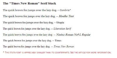
The Times New Roman-based serif stack:
font-family: Cambria, "Hoefler Text", Utopia, "Liberation Serif", "Nimbus Roman No9 L Regular", Times, "Times New Roman", serif;
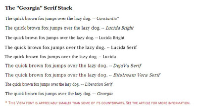
A modern Georgia-based serif stack:
font-family: Constantia, "Lucida Bright", Lucidabright, "Lucida Serif", Lucida, "DejaVu Serif", "Bitstream Vera Serif", "Liberation Serif", Georgia, serif;
Frequently Asked Questions about Font Stacks
What are the benefits of using font stacks in web design?
Font stacks are a crucial aspect of web design as they ensure that your website maintains a consistent appearance across different browsers and operating systems. When you specify a font stack in your CSS, you’re essentially providing a list of fallback fonts. If a user’s system doesn’t support the first font in the stack, it will try the next one, and so on. This ensures that your website’s typography remains as consistent as possible, regardless of the user’s system.
How do I choose the right fonts for my font stack?
Choosing the right fonts for your font stack depends on several factors. Firstly, consider the overall aesthetic and tone of your website. Different fonts can evoke different emotions, so it’s important to choose fonts that align with your brand’s identity. Secondly, consider readability. Make sure the fonts you choose are easy to read on various screen sizes and resolutions. Lastly, consider compatibility. Some fonts are more widely supported than others, so it’s a good idea to include a mix of popular and widely supported fonts in your stack.
What is the difference between serif and sans-serif fonts?
Serif fonts have small lines or strokes attached to the ends of larger strokes in a letter or symbol. Examples include Times New Roman and Georgia. On the other hand, sans-serif fonts do not have these small lines or strokes. Examples include Arial and Helvetica. Serif fonts are often used for large blocks of text as they are considered easier to read, while sans-serif fonts are commonly used for headings and short pieces of text.
How many fonts should I include in my font stack?
There’s no hard and fast rule for how many fonts you should include in your font stack. However, a good rule of thumb is to include at least three: a primary font, a fallback font, and a generic family. The primary font is your first choice, the fallback font is used if the primary font is not available, and the generic family is used if neither the primary nor fallback fonts are available.
What are some popular font stacks used in web design?
Some popular font stacks used in web design include the “Helvetica/Arial” stack, the “Georgia” stack, and the “Courier” stack. These stacks are popular because they include widely supported and versatile fonts that work well in a variety of design contexts.
How do I implement a font stack in CSS?
To implement a font stack in CSS, you use the “font-family” property. You list your chosen fonts in order of preference, separated by commas. For example, to implement the “Helvetica/Arial” stack, you would write: font-family: Helvetica, Arial, sans-serif;
Can I use Google Fonts in my font stack?
Yes, you can use Google Fonts in your font stack. However, keep in mind that Google Fonts are hosted on Google’s servers and are loaded over the internet, so they may not be available if a user is offline or has a slow internet connection. It’s a good idea to include fallback fonts in your stack for these situations.
What is a generic font family?
A generic font family is a last-resort fallback in a font stack. It’s a keyword that refers to a group of fonts that share similar characteristics. The five generic font families are: serif, sans-serif, cursive, fantasy, and monospace.
What are web-safe fonts?
Web-safe fonts are fonts that are pre-installed on many computer systems, and are therefore likely to be available on a wide range of users’ systems. Examples include Arial, Times New Roman, and Courier New. Including web-safe fonts in your font stack increases the likelihood that your website will appear as you intended on different systems.
Can I use custom fonts in my font stack?
Yes, you can use custom fonts in your font stack. However, keep in mind that custom fonts need to be loaded from a file, which can slow down your website’s load time. It’s a good idea to include fallback fonts in your stack in case the custom font fails to load or is not supported on a user’s system.