Design an Appealing Print-Ready Restaurant Menu in Illustrator
Key Takeaways
- Designing a visually appealing restaurant menu can significantly enhance the dining experience and influence customers’ food choices. Using high-quality images, maintaining a consistent theme, and organizing the menu logically can make it more attractive.
- Adobe Illustrator is a popular choice for designing restaurant menus due to its advanced vector graphics features. It allows for precise control over typography and layout, crucial for creating a professional menu. However, other software like Adobe Spark, Canva, and even Microsoft Word can also be used.
- When preparing a menu design for print, it’s essential to set the correct resolution (300 dpi is standard for print), choose the right color mode (CMYK for print), and ensure there is enough bleed area to prevent important elements from being cut off during printing.
- The menu should reflect the restaurant’s brand. Use colors, fonts, and imagery that align with the brand identity. The tone of the menu descriptions should also reflect the brand’s personality. The menu can also be used on the restaurant’s website or social media pages, but the layout or format may need to be adjusted to suit different platforms.

Step 1
Create a new document in Illustrator. I am going to design an 8.5in by 11 inch flyer today with a quarter inch bleed size. Bleeds are the segments of your designs that will be cut after print. We will use CMYK color mode to get a sharp print with strong colors.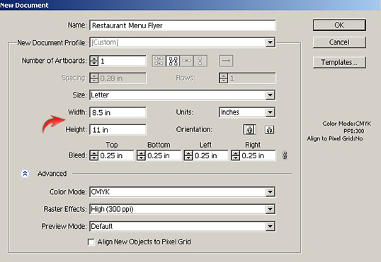
Step 2
Now we’ll set the guides over the artboard. You can see red outlines around the artboard below; these are the bleeds. Now, press Ctrl + “R” to view the “Rulers,” drag the guides from the horizontal and vertical rulers, and position them along the black borders around the artboard shown below.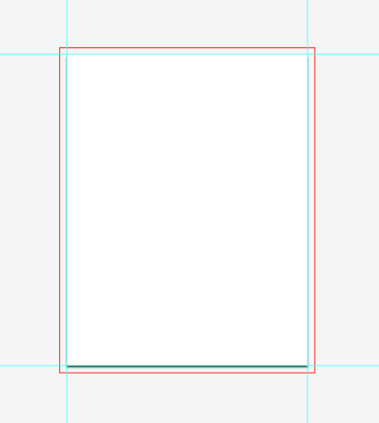
Step 3
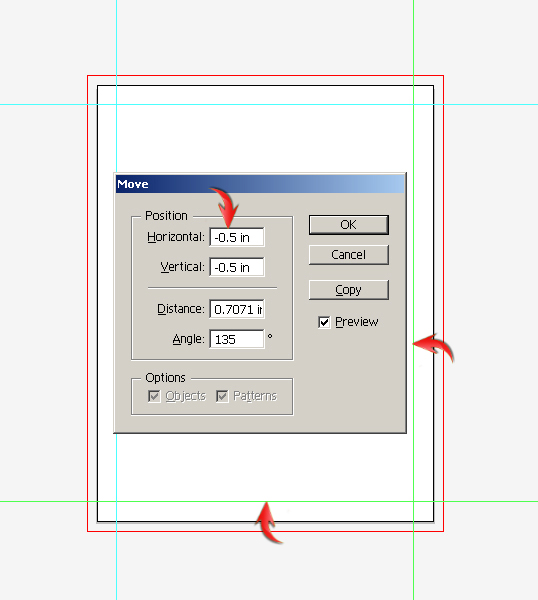
Next, we’ll move these guides a half inch inward from the borders to define the margins. Margins are used for safety purposes to make sure that all the important content is at some distance from the edges. To accomplish this, select the left vertical guide and the bottom horizontal guides by pressing the “Shift” key. Once the two guides are selected, press “Enter” to open the “Move” window. Write “0.5 inches” into the horizontal and vertical fields and click “OK.”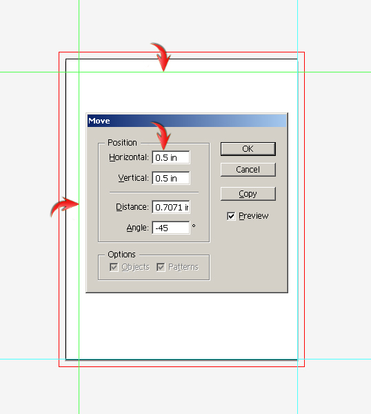 Now, select the remaining guides and open the “Move” window. This time, enter “-0.5inches” in the fields. Then, hit right-click your mouse and select “Lock Guides.”
 Step 4
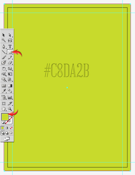
Draw a rectangle covering the artboard completely within the red bleeds using color #C8DA2B. That’s going to serve as the background.
Step 5
Duplicate the rectangle layer and apply the following gradient to it.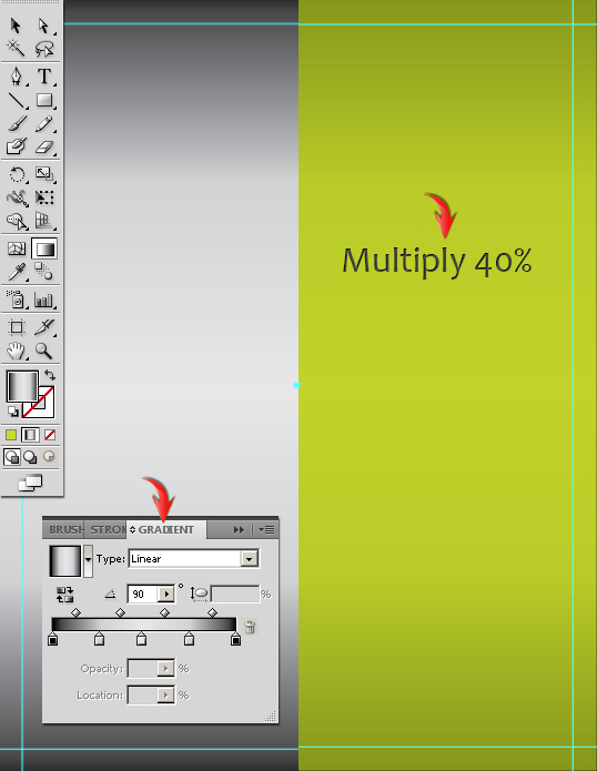
Step 6
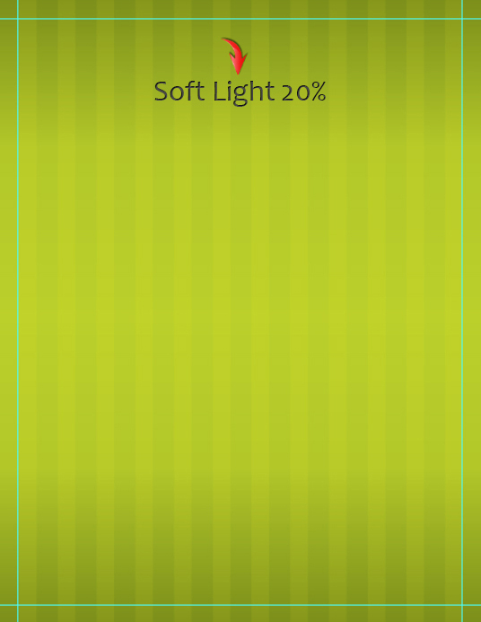
To make the pattern, draw a vertical rectangle in pure black color, select it and go to “Effect” > “Distort &Transform” > “Transform.” Use the following settings here.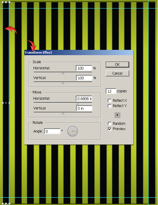 Change the blending mode of pattern layer to “Soft Light” and reduce its opacity to 20%.
Step 7
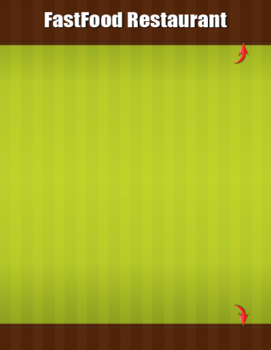
Draw two rectangles for the header and footer area using color #57290D. Make sure to draw these rectangles below the pattern layer.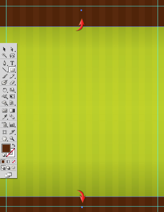
Step 8
Next, we’ll add the brand name into the header. Select the type tool and type in your desired text above the rest of the layers. I’ve used “Impact” font here in pure white color.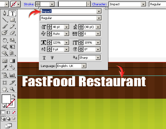 Duplicate the text layer, change its color to black, and place it below the original layer. Drag it a bit downward and to the right to get the effect shown below.
Step 9
To create stitched effect, draw a line horizontally across the header using the line tool, set fill to “none” and set a stroke 1pt pure black. Apply the following settings in the stroke panel to give it the stitched effect. Duplicate the stitches layer, turn the stroke color to white, and reduce its opacity to 40%. Place it below the black stitches layer and drag it downward.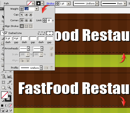 Once you are done, collect both stitches layers into a new layer, duplicate it, and drag it towards the footer.
Step 10
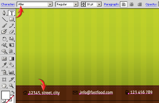
Next, we’ll add few icons and text into the footer area. Open the symbols window by pressing Shift + Ctrl + F11. Now, click on “Symbol libraries menu” icon present in the bottom-left corner of symbols window and select “Web icons category. Choose the desired icons from the symbols window. Now, simply pick and drop the desired symbols onto a new layer and resize each of them appropriately. In order to change the color of icons, you need to expand them first. Click on one of the icons to select it and go to “Object” > “Expand.” Expand both the object and fill. Now you can easily change its color. I’ve used color #3C2415 for my icons. Next, we’ll add contact details. I’ve used “Aller” font here.
Step 11
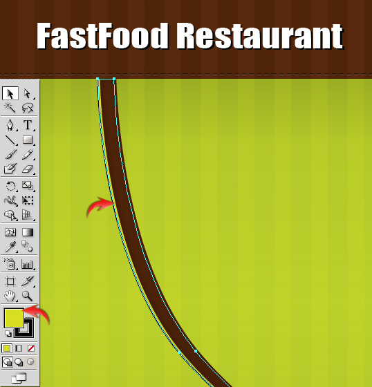
Now we’ll make curved dividers. Select the pen tool to draw the shape shown below using fill color #57290D.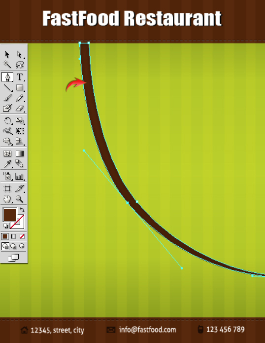 Duplicate the curve layer, change its fill color to #D7DF23, and set its stroke to #231F20. Place it below the original layer and drag a bit towards the left. Collect both the curves into a new layer and label it “1st divider.”
Step 12
Duplicate the first divider layer, right-click on the artboard, and choose the option of “Transform” > “Reflect.” Reflect it horizontally. Now, rotate and position it as shown below using the selection tool (“V”). Place this layer below the footer.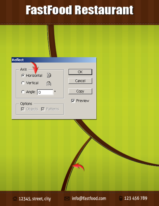
Step 13
Next, we’ll bring the products onto the canvas. Main item should be separated from the background; you can use Photoshop for this task. Load the images in Photoshop; select the products using the quick selection tool, press Ctrl + “C” to copy and Ctrl + “V” to paste each selection onto a new layer. Hide the background layer and save the file in transparent PNG format. Then, come back to the Illustrator document and go to “File” > “Place,” and select the PNG file. This will open the file inside of the flyer document; you can resize and position it using the selection tool (“V”).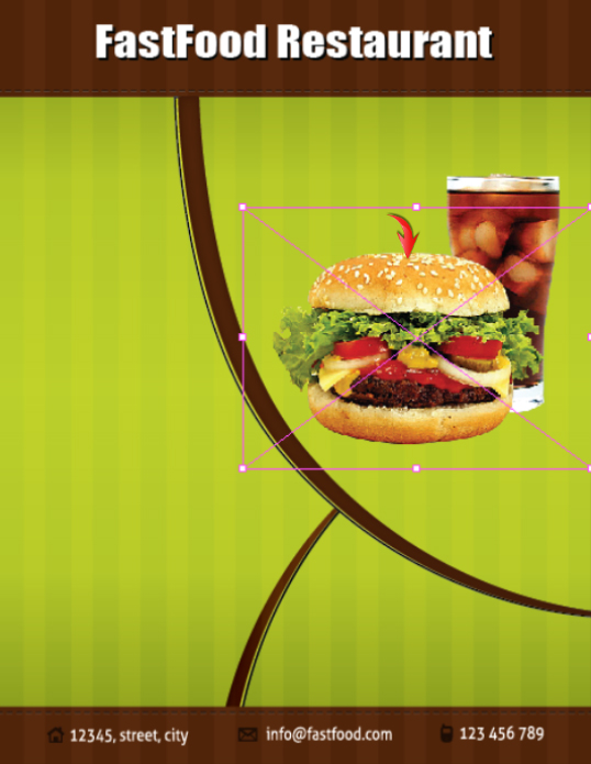
Step 14
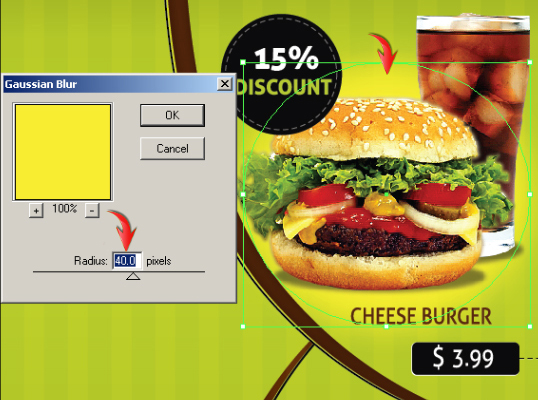
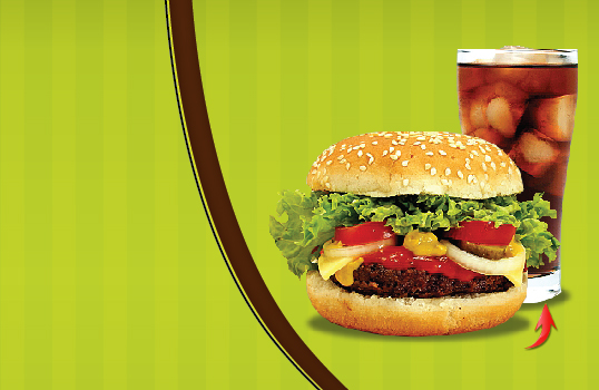
To make shadows, draw an ellipse below the main product layers and go to “Effect” > “Blur” > “Gaussian Blur.” Use the following values for your Gaussian blur effect.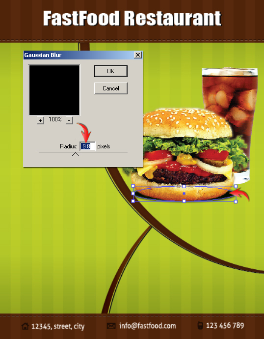 Reduce shadow opacity to 40%. Duplicate this ellipse and place it below the cold drink to make its shadow.
Step 15
Add the tagline above the product. I’ve used “Cambria” font for this purpose.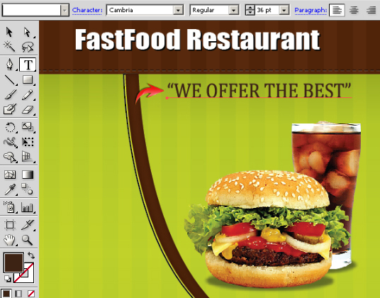
Step 16
Next, we’ll make a simple discount badge. Draw an ellipse with a pure black fill color. Draw another smaller ellipse over the previous one. Change the newer ellipse’s fill color to “none” and set a stroke of pure white. Use the following settings to apply a stroke.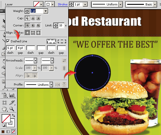 Now we’ll add text inside of the badge. I’ve used “Aller Display” font for the text inside the badge and “Aller” font for labeling the product.
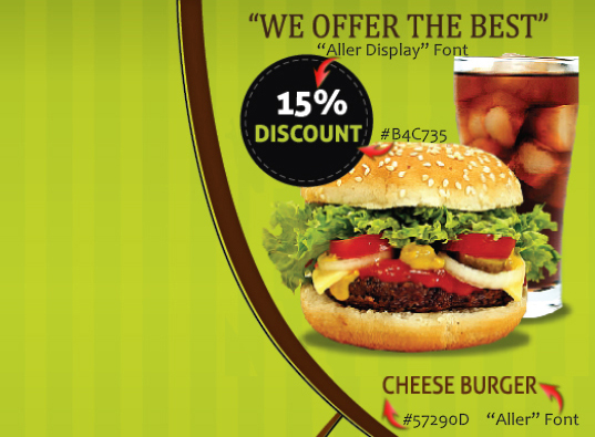
Step 17
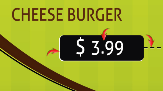
Next, we’ll make the price tag. Select the rounded rectangle tool, right-click the artboard and use the following values for the rectangle. Set its fill to black, and set it’s stroke to “none.”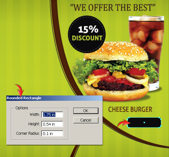 Duplicate this rectangle, change its fill color to white, place it below the original rectangle, and drag it a bit towards the left and downward. Add the price using “Aller” font. Duplicate the stitches layer made in step 9 and position it as shown below.
Step 18
You can add glow behind the product to enhance the overall effect. Simply draw an ellipse behind the main product layers with fill color #F9ED32 and apply the following values as a Gaussian blur.Step 19
Next, we’ll make the “order now” element. For that, duplicate the price tag layers, increase the size of rectangles, and use “Aller Display” font to add text. Make the inner stitches the same way we made them for the badge. We can add a phone icon to make the tag more appealing. You can draw it easily using the pen tool and the rounded rectangle tool.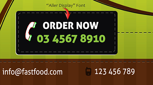
Step 20
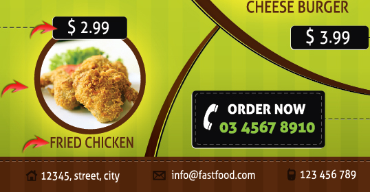
Now, we’ll add a few items on the left side of the flyer. We just need to make a circular frame for this; we already have the rest of the elements. Draw an ellipse using fill color #57290D, duplicate it, decrease its size a bit, and position it just over the original ellipse. Select both the ellipses and hit “Minus Front” shape mode in the “pathfinder” window to get the frame shown below. Press “Shift + Ctrl + F9” to open the pathfinder panel.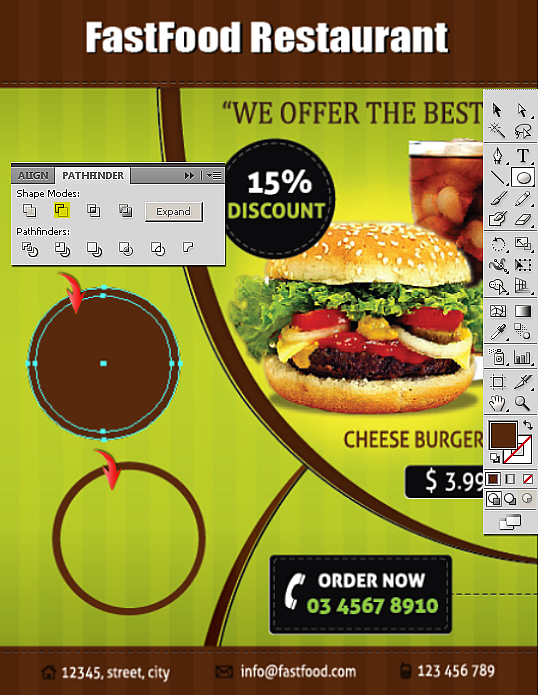
Step 21
Next, we’ll place the image inside the frame. To do so, make an ellipse covering the frame completely on a new layer and select “Draw inside” mode.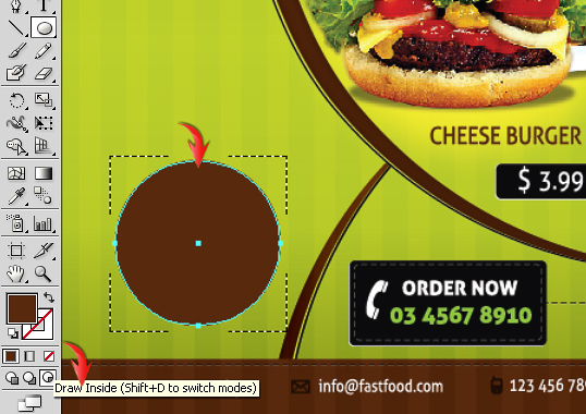 Now go to “File” >“Place” and select the photo of the next food item. It would be confined to the frame now; you just need to resize and position it correctly within the circular frame. Duplicate the yellow glow and price tag layers. Adjust them according to the frame and label your product.
Step 22
Add additional food items in the same way.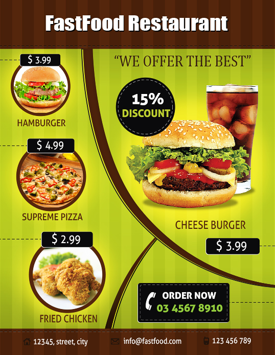
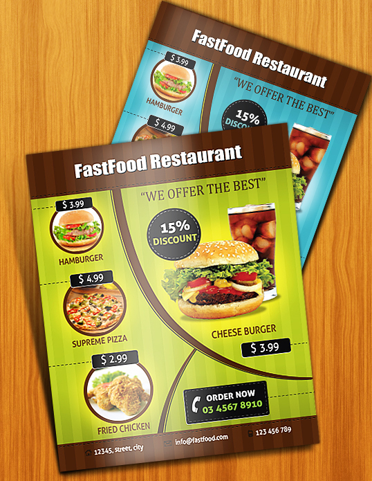 That’s it! I hope you enjoyed the tutorial and learned something useful. Do share your thoughts!
Frequently Asked Questions on Designing a Print-Ready Restaurant Menu
What software is best for designing a restaurant menu?
Adobe Illustrator is a popular choice for designing restaurant menus due to its advanced vector graphics features. It allows for precise control over typography and layout, which is crucial for creating an appealing and professional menu. However, other software like Adobe Spark, Canva, and even Microsoft Word can also be used depending on your design needs and expertise level.
How can I make my restaurant menu more appealing?
A well-designed menu can enhance the dining experience and influence customers’ food choices. Use high-quality images, maintain a consistent theme, and organize the menu logically. Also, consider the use of color psychology. For example, red and yellow are known to stimulate appetite.
How do I prepare my menu design for print?
Once your design is complete, you need to prepare it for print. This involves setting the correct resolution (300 dpi is standard for print), choosing the right color mode (CMYK for print), and ensuring there is enough bleed area to prevent important elements from being cut off during printing.
What size should a restaurant menu be?
The size of your menu will depend on the amount of content and the style of your restaurant. However, standard sizes include 8.5 x 11 inches (letter size) or 11 x 17 inches (tabloid size). You can also consider a folded design if you have a lot of items to include.
How can I make my menu easy to read?
Use clear, legible fonts and ensure there is enough contrast between the text and background. Group related items together and use headings or boxes to separate different sections. Avoid overcrowding the menu – white space can help make it easier to read.
Can I design a menu if I don’t have design skills?
Yes, there are many online tools and templates available that can help you create a professional-looking menu even if you’re not a designer. These tools often have drag-and-drop interfaces and pre-designed elements, making the design process much simpler.
How often should I update my restaurant menu?
This depends on your restaurant’s concept and offerings. Some restaurants update their menus seasonally to take advantage of fresh, local ingredients. Others may only update their menus once a year or less. However, it’s a good idea to review your menu regularly to ensure it’s still appealing and profitable.
What should I include on my restaurant menu?
Besides the names and descriptions of your dishes, consider including prices, ingredients, and allergen information. You may also want to highlight any special or signature dishes. Remember to include your restaurant’s name and contact information as well.
How can I make my menu reflect my restaurant’s brand?
Your menu is a key part of your restaurant’s brand. Use colors, fonts, and imagery that align with your brand identity. The tone of your menu descriptions should also reflect your brand’s personality – whether that’s formal, casual, quirky, or something else.
Can I use my restaurant menu design online?
Yes, you can use your menu design on your restaurant’s website or social media pages. However, you may need to adjust the layout or format to suit different platforms. Also, ensure the text is still legible when viewed on smaller screens like smartphones.
Anum is Web and Graphic designer. Addicted to Photoshop and crazy for pixel perfection. She is also an active blogger, sharing her passions, skills and creative details on her blog Websoulz. She loves to connect with the community, sharing the latest design gossips and rolling her eyes on boring trends.
Published in
·Design·Design & UX·HTML & CSS·Photography & Imagery·Photoshop·Resources·Review·Software·September 23, 2014

