
Widespread browser support for @font-face has done wonders for web typography, allowing us the freedom to use custom fonts wherever we want. But different fonts are not the whole story with web typography. There are other things that the web has long been weak at, such as proper hyphenation of long words, and usage of open type font features such as ligature and stylistic swashes that often get locked away inside font files and never see the light of day.
In this article we will look at some of these new CSS font features.
Key Takeaways
- The CSS3 hyphens property can be used to improve the appearance of justified text and long words in text columns by adding typographically appropriate hyphens where needed.
- The text-rendering property in CSS provides information to the browser’s rendering engine about optimizing for speed, legibility, and geometric precision while rendering text.
- The font-feature-settings property in CSS allows control over the usage of alternative glyphs residing inside open type font files, such as ligatures and stylistic swashes.
- To optimize usage of advanced font features, it is advised to set up a test file with different sections of text styled with all the different possible font feature settings, and to use font subsets to save bandwidth and processing power.
hyphenation
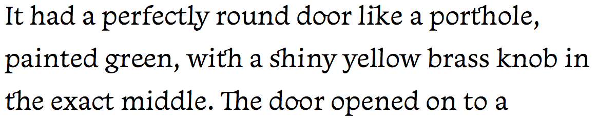
This section could also be named something like “solving the problem of justified text/long words looking awful in text columns” … but that would sound really terrible too, so I just stuck with plan A. In brief, the problem lies with the fact that, for years, there has been no decent way to use text-align: justify without it looking awful.
Fortunately there are now ways to deal with the problem, which work across most browsers you might have in your support matrix. The best of these is the CSS3 hyphens property, which adds typographically appropriate hyphens where needed, giving a nice visual clue that the word continues on the next line. It also makes an effort to break words that don’t quite span the full width of the column, effectively reducing the rivers-of-whitespace effect. The code looks like so:
p {

  font-size: 2.1em;

  text-align: justify;

  -webkit-hyphens: auto;

  -moz-hyphens: auto;

  -ms-hyphens: auto;

  hyphens: auto;

}
There are other values for the hyphens property too: none will turn off hyphens if they have already been set somewhere else, and manual will cause words to break only when manual hyphens have been set on the words using the ‐ or characters.
Below is a demo, which you’ll have to view in a supporting browser:
See the Pen Hyphenation example by SitePoint (@SitePoint) on CodePen.
text-rendering
The text-rendering property provides information to the browser’s rendering engine to indicate what to optimize for when rendering text. The possible values are:
- auto: Allows the browser itself to make a decision about when to optimize for speed, legibility, and geometric precision while drawing text. WebKit/Blink browsers generally treat this as
optimizeSpeed(see below), whereas Gecko usesoptimizeSpeedwhen rendering text of 20px or smaller, andoptimizeLegibilitywhen rendering text larger than that. - optimizeSpeed: The browser puts speed first, disabling expensive features such as kerning and ligatures.
- optimizeLegibility: The browser puts legibility first, enabling features such as kerning and ligatures when they are available in the font you are using.
- geometricPrecision: The browser puts geometric precision first, meaning that certain aspects of fonts that do not scale linearly — such as kerning — can be made to scale more smoothly at different zoom sizes. Gecko treats this value the same as
optimizeLegibility.
p {

  text-rendering: optimizeLegibility;

}
These features are supported in Firefox, Chrome, and Safari, with the caveats listed above.
font-feature-settings
font-feature-settings is a great new property that allows you to control the usage of the cool alternative glyphs residing inside your open type font files (some of them, anyway) such as ligatures and stylistic swashes, which otherwise wouldn’t see the light of day.
How do you know what font features are available?
Good question. This used to be pretty difficult, as font foundries seemed surprisingly bad at communicating such information. Fortunately more recently this information has been made more readily available, for example via hosted font services such as Fontdeck.
Once you know what your font has available, you can start turning said font features on and off, using the font-feature-settings property. Its value takes the form of a list of codes that represent the different features you want to use, so for example:
p {

    -webkit-font-feature-settings: "dlig" 1, "kern" 1, "frac" 1;

    -moz-font-feature-settings: "dlig" 1, "kern" 1, "frac" 1;

    -ms-font-feature-settings: "dlig" 1, "kern" 1, "frac" 1;

    font-feature-settings: "dlig" 1, "kern" 1, "frac" 1;

}
Firefox and IE11 no longer need the prefixed version, but I’ve left those in for the benefit old older versions that might. Blink and WebKit browsers still need the prefix, and so does IE10.
Let’s look at the different options available in font feature settings.
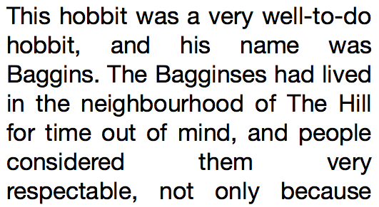
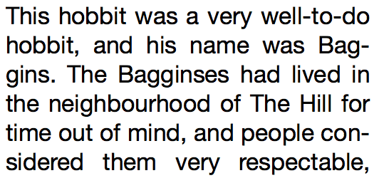
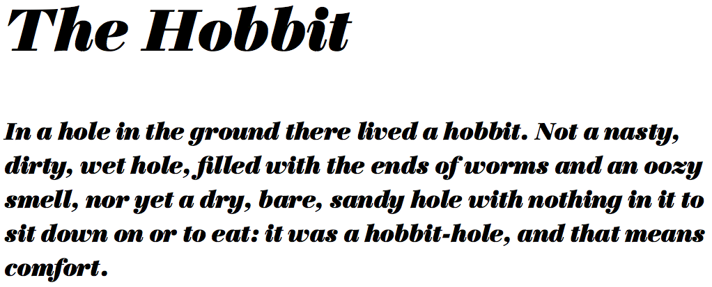
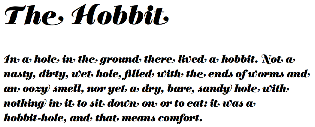
Ligatures and discretionary ligatures
These take the form of stylistic joins between appropriate letter couplets, such as “oo” and “th”.
p {

    -webkit-font-feature-settings: "liga" 1, "dlig" 1;

    -moz-font-feature-settings: "liga" 1, "dlig" 1;

    -ms-font-feature-settings: "liga" 1, "dlig" 1;

    font-feature-settings: "liga" 1, "dlig" 1;

}
The above image shows discretionary ligatures (dlig) applied to Monarcha Book from Fontdeck.
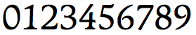
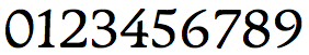
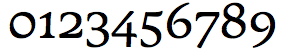
Numerals, fractions, and ordinals
There are a number of different open font features that change the presentation of numerals in many advantageous ways. For example:
p {

    -webkit-font-feature-settings: "onum" 1, "tnum" 1, "frac" 1;

    -moz-font-feature-settings: "onum" 1, "tnum" 1, "frac" 1;

    -ms-font-feature-settings: "onum" 1, "tnum" 1, "frac" 1;

    font-feature-settings: "onum" 1, "tnum" 1, "frac" 1;

}
Again, using our Monarcha font from Fontdeck, let’s examine a few interesting numeral variations.
In my experience, tabular numerals (tnum) and proportional numerals (pnum) tend to look very similar, and the intended effect is quite similar. Tabular numerals are supposed to be optimized for tabular display, meaning uniform, legible and evenly spaced, and proportional numerals are supposed to be a proportionate size.
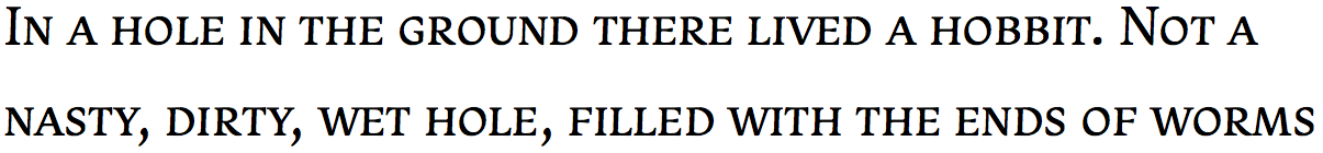
Old-style numerals (onum) are what they say on the tin — those old fashioned numerals that don’t all sit on the font baseline and are not uniform height.
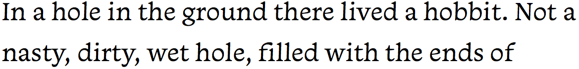
In the below examples, you can see the original numeral representation in the first image. In the second image, you can see the effect of proportional (pnum) and tabular numerals (tnum). And the third image shows the effect of old-style numerals (onum).
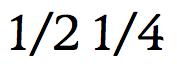
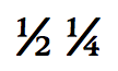
Some fonts also have special glyphs to represent the subscript and superscript required for fractions — frac is the relevant feature setting. The below shows a before and after example.
Small caps and petite caps
Small caps and petite caps are supposed to provide a much better, calculated look for small caps than has historically been provided by the CSS font-variant: small-caps option.
p {

    -webkit-font-feature-settings: "smcp" 1;

    -moz-font-feature-settings: "smcp" 1;

    -ms-font-feature-settings: "smcp" 1;

    font-feature-settings: "smcp" 1;

}</p>
<p>p {

    -webkit-font-feature-settings: "pcap" 1;

    -moz-font-feature-settings: "pcap" 1;

    -ms-font-feature-settings: "pcap" 1;

    font-feature-settings: "pcap" 1;

}
The above image shows small caps (smcp) applied again to Monarcha Book from Fontdeck.
Kerning
Kerning refers to the practice of adjusting the gaps between certain pairs of characters to make the gaps appear more natural and consistent with the gaps everywhere else. This tends to be an issue with letter pairings such as “Wo”, “Na”, with more angular characters. Some fonts have kerning information built in, which can be turned on and off. I’ve included an obvious example below.
p {

    -webkit-font-feature-settings: "kern" 1;

    -moz-font-feature-settings: "kern" 1;

    -ms-font-feature-settings: "kern" 1;

    font-feature-settings: "kern" 1;

}
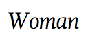
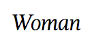
This kerning example uses the Magneta Book Italic font, available from Fontdeck.
Stylistic sets and other assorted effects
Finally, I’ll look at a kind of miscellaneous bucket of effect types. You’ll find fonts that have completely different letter forms available, or swashes and letter forms that only appear in certain contexts.
p {

    -webkit-font-feature-settings: "ss01" 1, "swsh" 1, "cswh" 1, "calt";

    -moz-font-feature-settings: "ss01" 1, "swsh" 1, "cswh" 1, "calt";

    -ms-font-feature-settings: "ss01" 1, "swsh" 1, "cswh" 1, "calt";

    font-feature-settings: "ss01" 1, "swsh" 1, "cswh" 1, "calt";

}
ss = stylistic set.
swsh = stylistic swash
cswh = contextual swash
calt = contextual alternative
There are probably others available too, which we may uncover in due course.
If we apply stylistic swashes to the Trilogy Fatface Regular font from Fontdeck:
p {

    -webkit-font-feature-settings: "swsh" 1;

    -moz-font-feature-settings: "swsh" 1;

    -ms-font-feature-settings: "swsh" 1;

    font-feature-settings: "swsh" 1;

}
We get the following interesting effects:
Stylistic sets are even more fun. The font Majestic Mishmash from Fontdeck contains completely different stylistic sets.
p {

    /* standard font */

}
The image below represents the way the font normally looks (i.e. the “standard” look without using font-feature-settings):

Now we’ll apply the following CSS:
p {

    -webkit-font-feature-settings: "ss01" 1;

    -moz-font-feature-settings: "ss01" 1;

    -ms-font-feature-settings: "ss01" 1;

    font-feature-settings: "ss01" 1;

}
And the image below shows the result:

Tips for font-feature usage
To wrap things up, below are some tips for usage.
Build up test files
When deciding what fonts to use, it is a good idea to set up a test file that includes different sections of text set to be styled with all the different possible font feature settings. So you can then apply different fonts to the page (for example from Fontdeck), and see what the different open type font features look like when rendered on the page.
Use font subsets
You’ll probably not want to use advanced font features on all of your type. Most likely, you’ll just want to apply such features to headings, single characters, or small strings of characters in specific places. In many situations you could probably save some bandwidth and processing power by using small subsets of your fonts that just contain the characters you need
p {

    font-family: 'my posh font subset';

    -webkit-font-feature-settings: "ss01" 1, "swsh" 1, "cswh" 1, "calt";

    -moz-font-feature-settings: "ss01" 1, "swsh" 1, "cswh" 1, "calt";

    -ms-font-feature-settings: "ss01" 1, "swsh" 1, "cswh" 1, "calt";

    font-feature-settings: "ss01" 1, "swsh" 1, "cswh" 1, "calt";

}
Conclusion
That’s it for this one. If you have any experience with these features or have anything to add, we’d love to hear your comments.
Frequently Asked Questions on Cross-Browser Web Fonts
What is the @font-face rule in CSS and how does it work?
The @font-face rule in CSS is a powerful tool that allows web designers to use custom fonts on their websites that aren’t installed on the user’s system. This rule works by defining a name for the font and pointing to the font file. When the browser encounters this rule, it will download the font file and use it wherever that font is called in the CSS. This allows for a greater range of typography options and can help to create a unique and consistent brand identity across a website.
How can I ensure my web fonts are cross-browser compatible?
Ensuring cross-browser compatibility for web fonts involves a few steps. Firstly, you should use the @font-face rule in your CSS, which allows you to specify the font file for each browser. Secondly, you should provide multiple font formats to cater to different browsers, such as .woff, .woff2, .ttf, .svg, and .eot. Lastly, you should include a generic font family as a fallback in case the custom font fails to load.
What is image-rendering in CSS and how does it affect web fonts?
The image-rendering property in CSS provides hints to the browser about what aspects of an image are most important to preserve during the scaling process. It can affect the quality of web fonts, especially when they are scaled up or down. By using the ‘optimizeLegibility’ value, you can enhance the readability and rendering of text, which can be particularly useful for web fonts.
How can I use the FontFace API in my web development?
The FontFace API is a JavaScript interface that allows you to control and manipulate fonts in your web development. You can use it to load fonts asynchronously, check the loading status of fonts, and apply different styles and variations to your fonts. This can give you greater control over the typography on your website and can help to improve the user experience.
What are some common issues with using custom web fonts and how can I solve them?
Some common issues with using custom web fonts include slow loading times, poor rendering on different browsers, and issues with font licensing. To solve these issues, you can use techniques such as font subsetting to reduce the file size of your fonts, use the @font-face rule to ensure cross-browser compatibility, and always ensure you have the correct licensing for your fonts.
How can I check the compatibility of my web fonts across different browsers?
You can use tools such as “Can I use” to check the compatibility of your web fonts across different browsers. This tool provides up-to-date information on the support for various web technologies, including web fonts, across all major browsers.
What are some best practices for using @font-face in CSS?
Some best practices for using @font-face in CSS include providing multiple font formats for cross-browser compatibility, specifying font characteristics such as style, weight, and stretch, and using a font loading strategy to improve performance.
How can I optimize the performance of my web fonts?
You can optimize the performance of your web fonts by using techniques such as font subsetting, which reduces the file size of your fonts, using a font loading strategy to control how and when your fonts load, and using the FontFace API to load fonts asynchronously.
What are some alternatives to using custom web fonts?
If you’re having issues with custom web fonts, you might consider using system fonts or web-safe fonts. These are fonts that are pre-installed on most systems or have wide support across all major browsers, so they don’t need to be downloaded and are less likely to cause performance or compatibility issues.
How can I ensure the readability of my web fonts?
To ensure the readability of your web fonts, you should consider factors such as font size, line height, letter spacing, and color contrast. You can also use the ‘optimizeLegibility’ value for the image-rendering property in CSS to enhance the readability and rendering of text.