Twitter Bootstrap 3 – JavaScript Components

Twitter Bootstrap happens to be the easiest and the best CSS framework on the Internet today. It allows developers with no CSS knowledge to build basic templates without any efforts. But this doesn’t stop designers from using Bootstrap.
Twitter Bootstrap has one of the best sets of powerful JavaScript components. These components are easy to use and are usable in your web project, today.
In this tutorial, I will discuss some of the best Twitter Bootstrap’s JavaScript components and how to use them.
Key Takeaways
- Twitter Bootstrap 3 is a powerful CSS framework with a comprehensive set of JavaScript components, allowing developers to build templates even without CSS knowledge.
- The JavaScript components of Twitter Bootstrap 3 are written in jQuery and include Modal, Dropdown, ScrollSpy, Tab, Tooltip, Popover, and Alert. Each component has specific functions and is customizable to fit different web project needs.
- To use these JavaScript components, Twitter Bootstrap 3 setup from getbootstrap.com, a web browser, and a text editor are needed. The Bootstrap CSS must also be included for the JavaScript components to function properly.
- Twitter Bootstrap 3’s JavaScript components are a significant reason for the framework’s popularity. They offer a convenient solution for developers with zero CSS knowledge and designers looking to enhance their design turnover time.
Let’s get started!
To begin with, we will need Twitter Bootstrap 3 setup from getbootstrap.com, a web browser (preferably Google Chrome) and a good text editor (I am using Sublime Edit). The first thing that we should understand is that Bootstrap’s JavaScript components are written in jQuery. So we need jQuery to work with them.
After, you have downloaded Bootstrap 3, copy the contents of the dist folder and paste it inside a new work-space.
You must be thinking why do we need the CSS and fonts folder when we are going to learn JavaScript? There are many Bootstrap JavaScript components that depends on CSS to work properly. So unless you include the Bootstrap CSS it won’t function properly.
Twitter Bootstrap 3 also allows us to use each module individually instead of downloading all the JavaScript components. We will see at the end of this tutorial how to use a single module instead of including all the components.
Some of the main Twitter Bootstrap JavaScript components explained in this tutorial are:
- Modal
- Dropdown
- ScrollSpy
- Tab
- Tooltip
- Popover
- Alert
We will cover each of them in this tutorial. We will also experiment a bit with each component so that we get a customized Bootstrap 3 JavaScript component. Take a look at our demo page here.
Modal
A modal is a dialog prompt just like a traditional alert. It comes with advanced features like modal title, modal body, modal footer, close button and a close symbol at the top right corner. It can be used as a confirmation window in many applications such as before making a payment, or deleting an account, etc.
<!-- Button trigger modal -->
<button class="btn btn-primary btn-lg" data-toggle="modal" data-target="#myModal">
Launch demo modal
</button>
<!-- Modal -->
<div class="modal fade" id="myModal" tabindex="-1" role="dialog" aria-labelledby="myModalLabel" aria-hidden="true">
<div class="modal-dialog">
<div class="modal-content">
<div class="modal-header">
<button type="button" class="close" data-dismiss="modal" aria-hidden="true">×</button>
<h4 class="modal-title" id="myModalLabel">Modal title</h4>
</div>
<div class="modal-body">
<h1>Hello World!</h1>
</div>
<div class="modal-footer">
<button type="button" class="btn btn-default" data-dismiss="modal">Close</button>
<button type="button" class="btn btn-primary">Save changes</button>
</div>
</div><!-- /.modal-content -->
</div><!-- /.modal-dialog -->
</div><!-- /.modal -->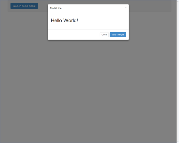
Bootstrap Modal has three sections: header, body and footer. You can decide what to place in each of them.
DropDown
Creating a drop down menu in Twitter Bootstrap 3 gets extremely easy. You just have to understand right markup required. You can use this DropDown in a navigation bar or inside any div you wish.
<div class="dropdown">
  <a data-toggle="dropdown" href="#">Show Links <b class="caret"></b></a>
  <ul class="dropdown-menu" role="menu">
    <li><a href="#">First Link</a></li>
    <li><a href="#">Second Link</a></li>
    <li role="presentation" class="divider"></li>
    <li><a href="#">Third Link</a></li>
  </ul>
</div>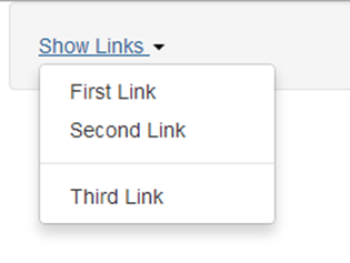
First, you have to give the class “dropdown” to any parent element that you want to treat as a drop down element. In my case, I have used a div element. You can even make an li element as “dropdown”. Then you have to place an “<a>” tag immediately inside the dropdown element. Add a new attribute “data-toggle” to the link tag and give the value as “dropdown”. Finally add a ul list below the link tag. You have to add class as “dropdown-menu” to the ul tag.
To add a separator between li elements, add a new emplty li element with class as “divider” to the list.
if you are not comfortable with the data-* attributes then you can even trigger drop down using jQuery. Give a unique id to the link element and call the dropdown method as below:
$('#myDropDown').dropdown();ScrollSpy
ScrollSpy is an interesting JavaScript module added to the Twitter Bootstrap library. It is basically a combination of navigation menu and contents below. Its role is to update the active item in the navigation bar as you scroll down the content area.
To use the ScrollSpy feature you have to add data-spy=”scroll” and data-target=”#top-navigation” attribute to the body element. Here #top-navigation is the id of my navigation bar. Make sure the links in the navigation bar are internal links. See the demo page for a live example.
Tabs
Twitter Bootstrap 3’s tabs take inspiration from traditional jQuery tabs. They both look and function alike. To use Bootstrap Tabs you need to define two separate sections: the tabs navigation and tab areas.
The markup goes like below:
<!-- Nav tabs -->
<ul class="nav nav-tabs">
  <li class="active"><a href="#home" data-toggle="tab">Home</a></li>
  <li><a href="#profile" data-toggle="tab">Profile</a></li>
  <li><a href="#messages" data-toggle="tab">Messages</a></li>
  <li><a href="#settings" data-toggle="tab">Settings</a></li>
</ul>
<!-- Tab panes -->
<div class="tab-content">
  <div class="tab-pane active" id="home">...</div>
  <div class="tab-pane" id="profile">...</div>
  <div class="tab-pane" id="messages">...</div>
  <div class="tab-pane" id="settings">...</div>
</div>
The navigation is created using a ul element with the class “nav-tabs” while the additional class “nav” is used to apply the navigation CSS style. Each li element is composed of an internal link that should define the attribute “data-toggle” as “tab”. This triggers Twitter Bootstrap’s Tabs JavaScript and the respective tab area is displayed.
Coming to the tabs area, it consists of a set of div elements. The parent div should have a class as “tab-content” and the child divs should have a class “tab-pane”. Each tab-pane must have an id corresponding to the internal links defined in the tabs navigation. In the above example, I have set a class of the first tab-pane as active. This makes it visible by default.
ToolTip
ToolTip is an extremely useful JavaScript plugin provided by Twitter Bootstrap 3. It helps in showing help texts on any HTML element. It’s cross-browser compatible, too!
To use ToolTip, the markup goes like this:
<button id="myButton" type="button" class="btn btn-default" data-toggle="tooltip" data-placement="left" title="" data-original-title="Tooltip on left">Tooltip on left</button>The above markup displays a button with the tooltip feature. Attribute “data-toggle” is used by Bootstrap to identify on which element it has to display the tooltip. Attribute “data-original” is used to define what goes inside the tooltip. Attribute “data-placement” is used to help bootstrap where to show the tooltip.
For performance reasons, Bootstrap will not initialize the ToolTip and Popover components by default. You have to initialize them manually by using the following jQuery:
$('#myButton').tooltip();Popovers
If you have ever been a hardcore iBook reader, then you would understand what popovers are. They are the extended version of ToolTip with some more functionalities. You can display more HTML elements like img tags, links, additional divs, etc inside Popovers.
<button type="button" class="btn btn-default" data-toggle="popover" data-placement="left" data-content="Vivamus sagittis lacus vel augue laoreet rutrum faucibus." data-original-title="" title="">
          Popover on left
        </button>
The HTML snippet displays a button with popover functionality. It also has set of custom data- attributes that you must necessarily understand.
Attribute “data-toggle” identifies which element must control the popover.
Attribute “data-content” contains the data that should be displayed inside the popover.
Attribute “data-placement” tells on which side should the popover appear.
In the above case, the data must be plain text only. If you want to display HTML content inside the popover, then you have to add the additional attribute “data-html” as true. The HTML data-content must go inside the double quotes with escaped characters wherever necessary.
The markup for the HTML data contents inside the popover should be like below:
<button id="myPopover" type="button" class="btn btn-default" data-toggle="popover" data-placement="left" data-html="true" data-content="<a href=\"http://www.google.com\">Go to google</a>" data-original-title="" title="">
          Popover on left
        </button>
Use the below jQuery to initialize popovers:
$('#myButton').popover();Alerts
Alerts by Twitter Bootstrap are not like window popups. They are a set of divs with predefined background colors and a dismiss button. The markup goes like below:
<div class="alert alert-warning fade in">
        <button type="button" class="close" data-dismiss="alert" aria-hidden="true">×</button>
        <strong>Holy guacamole!</strong> Best check yo self, you're not looking too good.
      </div>
The above alert has a pale yellow background, since it is a warning message. You can change the color to red by changing the class of the alert to “alert-danger”. Every alert div must have a close button with a set of data- attributes as defined above. Attribute “data-dismiss” hides the alert div when clicked.
Conclusion
You might now have a better understanding of how Twitter Bootstrap helps us in writing JavaScript components without writing a single line of jQuery in our code. These JavaScript components are one of the main reasons why the Twitter Bootstrap framework is so popular in the web today.
It has become a framework not only for the developers with zero CSS knowledge but also for designers to enhance their design turnover time. In my next tutorial, I will explain how to create sliders using Twitter Bootstrap 3’s Carousel component.
Hopefully, you have enjoyed reading my post. If you have any queries feel free to leave them in the comment section. I will be happy to help.
If you are new to Twitter Bootstrap then visit my author’s page on Sitepoint and read my previous Twitter Bootstrap Tutorials.
Frequently Asked Questions about Twitter Bootstrap 3 JavaScript Components
What are the key differences between Bootstrap 2 and Bootstrap 3?
Bootstrap 3 is a major update from Bootstrap 2. It introduces a mobile-first design philosophy, meaning it’s designed to look great on mobile devices right out of the box. It also introduces a new flat design and a variety of new components, such as panels and list groups. The grid system has also been revamped, with a new four-tier grid system replacing the old two-tier one.
How do I use Bootstrap 3’s JavaScript components?
To use Bootstrap 3’s JavaScript components, you need to include the Bootstrap JavaScript file in your HTML file. This file should be included after jQuery, as Bootstrap’s JavaScript components depend on it. Once you’ve included the necessary files, you can use the JavaScript components by adding the appropriate data attributes to your HTML elements.
What are some common use cases for Bootstrap 3’s JavaScript components?
Bootstrap 3’s JavaScript components can be used to add interactive features to your website. For example, you can use the Modal component to create pop-up windows, the Dropdown component to create drop-down menus, and the Carousel component to create image sliders. These components can greatly enhance the user experience of your website.
How can I customize Bootstrap 3’s JavaScript components?
Bootstrap 3’s JavaScript components can be customized using options. These options can be passed as data attributes in your HTML, or as parameters when initializing the component with JavaScript. For example, you can customize the transition effect of the Carousel component by passing the ‘slide’ or ‘fade’ option.
Are there any compatibility issues I should be aware of when using Bootstrap 3’s JavaScript components?
Bootstrap 3’s JavaScript components are compatible with most modern browsers. However, they may not work properly in older browsers, such as Internet Explorer 8 and below. If you need to support these browsers, you may need to include additional polyfills or fallbacks.
How do I troubleshoot issues with Bootstrap 3’s JavaScript components?
If you’re having trouble with Bootstrap 3’s JavaScript components, there are a few things you can check. First, make sure you’ve included the Bootstrap JavaScript file and jQuery in the correct order. Second, check your HTML for any syntax errors or missing data attributes. Finally, check the JavaScript console for any error messages.
Can I use Bootstrap 3’s JavaScript components without using the rest of Bootstrap?
Yes, you can use Bootstrap 3’s JavaScript components without using the rest of Bootstrap. However, keep in mind that the components are designed to work with Bootstrap’s CSS, so you may need to provide your own styles if you’re not using Bootstrap’s CSS.
How do I update from Bootstrap 2 to Bootstrap 3?
Updating from Bootstrap 2 to Bootstrap 3 involves a few steps. First, you’ll need to replace the Bootstrap 2 files with the Bootstrap 3 files. Then, you’ll need to update your HTML to use the new grid system and components. Finally, you’ll need to test your website to make sure everything works as expected.
What are some best practices for using Bootstrap 3’s JavaScript components?
When using Bootstrap 3’s JavaScript components, it’s important to keep a few best practices in mind. First, always include the Bootstrap JavaScript file after jQuery. Second, use data attributes to initialize components whenever possible, as this makes your code more readable and maintainable. Finally, always test your website in multiple browsers to ensure compatibility.
Where can I find more information about Bootstrap 3’s JavaScript components?
For more information about Bootstrap 3’s JavaScript components, you can refer to the official Bootstrap documentation. This provides detailed information about each component, including how to use it, how to customize it, and what options are available. You can also find examples and demos to help you get started.
Web Designer with over 6 years of experience, including user experience and front end development. Currently, CEO and Co-Founder of Hashnode, a network of software developers. Has published two books: Jump Start Bootstrap and Jump Start Foundation for SitePoint Premium.


Published in
·Business·Content Marketing·Entrepreneurship·Freelancing·Marketing·SEO & SEM·December 31, 2013