

Key Takeaways
- Twitter Bootstrap is a valuable tool for creating invoices, offering a variety of features to customize and save your invoice as a PDF file.
- The process involves setting up an HTML file with Bootstrap’s CSS and utilizing an extra small grid to ensure the invoice maintains its format when printed or saved as a PDF.
- It’s important to remember that Bootstrap alters some styles for print, such as making backgrounds transparent and removing text-shadow. These changes can be reset in the bootstrap.css file for a more personalized invoice design.
A few days ago I had to create an invoice. I searched Google for online services to create an invoice quickly. I found a website, created a simple invoice, and when I clicked on the Save as PDF button, it prompted me to sign up. I was not ready to register to download my very simple invoice as a PDF.
I am a Bootstrap user and love this wonderful framework, so I just decided to see if I could create my invoice with Bootstrap.
It took some time to create an invoice with Bootstrap, but it was a learning experience for me. In this article I will share my experience with you.
Twitter Bootstrap is a very popular framework to create websites, it offers great features. You can create a website very quickly with Bootstrap, but in this article I will create something different with Bootstrap. I will show you how to create an invoice with Twitter Bootstrap and save it as a PDF.
What we need
We need a text editor for editing our HTML files. You can use any text editor of your choice, I will use SublimeText. We also need the Twitter Bootstrap framework and a Google Chrome browser, as this lets us save web pages as PDF files.
Download Links
Getting started
Create a new folder on your desktop and name it Invoice. Now open Bootstrap’s zipped archive, under dist folder, you will have CSS, JS and fonts folder, for our project we need Bootstrap’s CSS files. Just copy the CSS folder from the dist folder to your new invoice folder.
In the CSS folder, you will see four CSS files. We need bootstrap.css, you can delete the other files if you like.
Open your text editor, create a new file and save it as invoice.html in our invoice folder, then add the following code in the invoice.html file.
<!DOCTYPE html>
<html lang="en">
  <head>
    <meta charset="utf-8">
    <title>INVOICE Template</title>
    <link href="css/bootstrap.css" rel="stylesheet">
  </head>
  <body>
    <div class="container">
        <div class="row">
            content here
        </div> <!-- /row -->
    </div> <!-- /container -->
  </body>
</html>
This is the basic HTML code for our file. For our invoice project we will use extra small grid. We will use Bootstrap’s col-xs-* class for an extra small grid.
Why we need to use a non-responsive grid
We will use Google Chrome to save our final invoice as a PDF. If we use a medium grid, Chrome will stack the columns below each other when we print our page. Look at the following image.
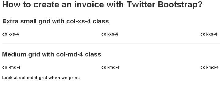
As you can see, the medium grid looks fine on a normal web page, but when we try to print our page, Chrome stacks the medium grid columns below each other. Now you understand why we will use an extra small col-xs-* class.
Alternative method: Use non-responsive CSS from Bootstrap 2
If you are familiar with Bootstrap 2, then you can use it as an alternative, as this offers non responsive CSS. Bootstrap 2 was not mobile first, you had to add an extra style sheet to make your web pages responsive.
If you do want to use Bootstrap 2, then you can use span* class to create the columns (replace * with a number from 1 to 12 for the column width). The following example will create a layout with three equal columns.
<div class="row">
    <div class="span4"></div>
    <div class="span4"></div>
    <div class="span4"></div>
</div>
Warning: If you want to use Bootstrap 2, then you will have to use two style sheets, first one from Bootstrap 2 for the non responsive grid and a second one from Bootstrap 3 for Panels, because Panels are new in Bootstrap 3.
What we are going to use
Bootstrap 3, Small Grid and Panels For this article I am going to use Bootstrap 3, because I will use the .panel class to create panels, which are available in Bootstrap 3. There are different panels available, you can use whatever you like. I will use panel-primary and panel-info classes to create panels.
.panel-default .panel-success .panel-danger .panel-warning .panel-info classes are available for contextual panels.
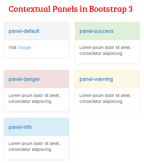
There are some more classes available to style panel content. .panel .panel-default .panel-body .panel-title .panel-heading .panel-footer .panel-collapse
Something important about Bootstrap’s print styles
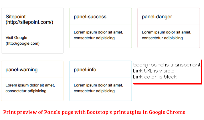
Keep in mind Bootstrap removes some styles for print. For example Bootstrap makes background transparent, removes text-shadow, box-shadow for print. For links, the URLs of links will be displayed after the link text. That means your background color and link color won’t be visible on PDF, when you print your web pages in Chrome.
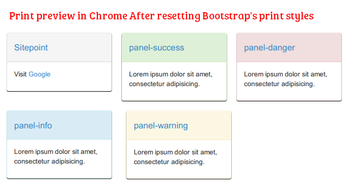
How to Reset Bootstrap’s print styles
You can find Bootstrap’s print style on line 33 in bootstrap-min.css, and in bootstrap.css print styles starts from line 217 and ends at line 290.
In bootstrap.css Print styles starts from
@media print {
  * {
    color: #000 !important;
    text-shadow: none !important;
    background: transparent !important;
    box-shadow: none !important;
  }
and ends at line 290
  .table {
    border-collapse: collapse !important;
  }
  .table-bordered th,
  .table-bordered td {
    border: 1px solid #ddd !important;
  }
}
To remove/reset print styles just select print styles and press Ctrl+/ in SublimeText. This will comment out all print styles.
Now we have set up all necessary features. In Part 2 of this article, we will create our invoice and save it as a PDF.
Frequently Asked Questions (FAQs) about Creating an Invoice with Twitter Bootstrap
How can I customize the invoice template to match my brand?
Customizing the invoice template to match your brand is quite straightforward. You can change the color scheme, fonts, and logo to align with your brand identity. To change the color scheme, you can modify the CSS file associated with the template. For changing the fonts, you can import your preferred font from Google Fonts and use it in your CSS file. To add your logo, you can replace the placeholder logo in the HTML file with your own.
Can I add more fields to the invoice template?
Yes, you can add more fields to the invoice template. You can do this by modifying the HTML file. For example, if you want to add a field for discounts, you can add a new row in the ‘invoice-body’ section and include the necessary HTML elements for the discount field.
How can I make the invoice template responsive?
The invoice template is built with Twitter Bootstrap, which is a responsive framework. This means the template is designed to adjust its layout based on the screen size of the device it’s viewed on. However, if you want to further optimize the responsiveness, you can modify the CSS file and use Bootstrap’s grid system to control the layout on different screen sizes.
Can I use this invoice template for e-commerce websites?
Yes, you can use this invoice template for e-commerce websites. You can integrate the template into your e-commerce platform and generate invoices for each transaction. You might need to modify the template to include specific details relevant to e-commerce transactions, such as product details, shipping information, and payment method.
How can I print the invoice directly from the webpage?
You can add a print button to the invoice template that triggers the browser’s print function. This can be done using JavaScript. You can add a button element in the HTML file and use the ‘window.print()’ function in JavaScript to print the invoice.
Can I save the invoice as a PDF?
Yes, you can save the invoice as a PDF. There are several JavaScript libraries, such as jsPDF, that allow you to generate a PDF from HTML content. You can integrate one of these libraries into your project and use it to generate a PDF version of the invoice.
How can I add a barcode or QR code to the invoice?
You can add a barcode or QR code to the invoice by using a JavaScript library such as JsBarcode or jquery.qrcode. You can generate the barcode or QR code based on the invoice number or any other relevant information.
Can I add a digital signature field to the invoice?
Yes, you can add a digital signature field to the invoice. There are several JavaScript libraries, such as Signature Pad, that allow you to add a signature pad to your webpage. You can integrate one of these libraries into your project and add a signature field to the invoice template.
How can I add a payment gateway to the invoice?
You can add a payment gateway to the invoice by integrating a payment gateway API, such as Stripe or PayPal, into your project. You can add a ‘Pay Now’ button to the invoice template that redirects the user to the payment gateway.
Can I use this invoice template with other front-end frameworks?
While this invoice template is built with Twitter Bootstrap, you can modify it to work with other front-end frameworks. You would need to replace the Bootstrap-specific classes and components with equivalent ones from the other framework. However, this might require a good understanding of both Bootstrap and the other framework.

