
When I need to create charts, my first choice is Google Charts or another dedicated library. Sometimes, though, I need some specific features that I can’t find there. In these cases, SVG images prove to be very valuable.
Recently, I had to build a report page that was able to show a map of Italy in which each region had a different color tone according to some values retrieved from a database. Thanks to SVG, this task was very easy.
Key Takeaways
- SVG images can be used to create dynamic geo maps with differing color tones for each region, based on data retrieved from a database. This is achieved by drawing each region as a single object with a unique level name that matches the code used in the database to identify its data.
- The map can be made interactive with CSS and jQuery, allowing it to display specific data, such as population value, when the mouse hovers over a region. This is achieved by adding a CSS rule for g:hover and a new info_panel class to style the information boxes, then modifying the previous for cycle, adding .data() to store information that will be displayed on hover.
- SVG maps can be made responsive, used with other JavaScript libraries, used for data visualization, and even animated. They can also be customized and optimized for performance. However, creating a custom map requires a good understanding of both SVG and geographic data, and complex animations can impact performance.
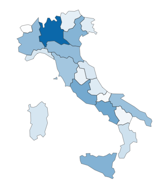
Creating the SVG Map in Illustrator
First, I drew a map of Italy with Illustrator:
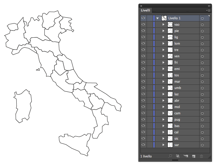
Every region is drawn as a single object, and each of them has its own level, with a name matching the code used in the database to identify its relative data (for example: “tos” for Tuscany).
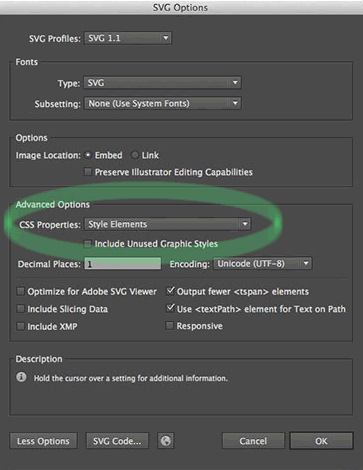
Finally the map must be saved as an SVG file. You have to pay attention to set the “CSS property” option to “Style Elements” in Illustrator, as shown below:
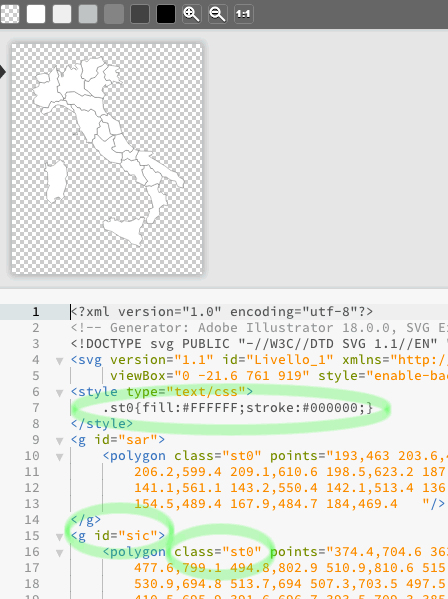
Opening the file just created, you will see it contains a set of g tags whose IDs match the names of Illustrator levels.
Building our HTML File
Each item contained in g tags has a st0 class so that the stroke and fill CSS properties can be assigned to them:
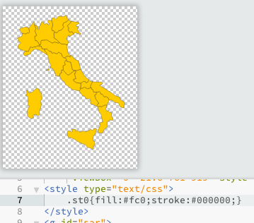
If you try to change those values, the map will change immediately:
Now, we can use that code to build our html file with inline SVG as shown below (code has been shortened for convenience):
<!doctype html>

<html>

<head>

    <meta charset="UTF-8">

    <title>Map Sample</title>

    <style type="text/css" media="all">

        .map svg {

            height: auto;

            width: 350px;

        }

        .map g {

            fill: #ccc;

            stroke: #333;

            stroke-width: 1;

        }

    </style>

</head>

<body>

    <div class="map">

        <svg version="1.1" id="Livello_1" xmlns="https://www.w3.org/2000/svg" xmlns:xlink="https://www.w3.org/1999/xlink" x="0px" y="0px" viewBox="0 -21.6 761 919" style="enable-background:new 0 -21.6 761 919;" xml:space="preserve">

            <g id="sar">

                <polygon class="st0" points="193,463 ...    "/>

            </g>
            <!-- etc ... -->
        </svg>

    </div>

</body>

</html>
You can see that the style attribute inside the svg tag has been erased and replaced by a new one located inside the document head; all g elements have been initially filled with a light grey.
The st0 class is no longer used (you can remove it from your SVG code) and it has been replaced by the .map g selector. Anyway, this is not mandatory, you can use the CSS selectors you prefer.
The second step consists of binding our map to some data retrieved from our database. In this example, our goal is to paint the map according to the population of each region.
Adding the JSON Data and JavaScript
Data is retrieved in JSON format and pasted directly inside our HTML file (in the real world, of course, data would be retrieved using Ajax or similar).
Now our page will contain JSON in our JavaScript file that looks like this (again, abbreviated):
var regions=[

    {

        "region_name": "Lombardia",

        "region_code": "lom",

        "population": 9794525

    },

    {

        "region_name": "Campania",

        "region_code": "cam",

        "population": 5769750

    },
    // etc ...
];
After that, a color is chosen (in this case, #0b68aa), and we assign it to the region with the highest population value. The other regions will be colored with tones of the main color in proportion to their percentage of the population.
Next we can add some JavaScript.
First of all, we have to determine the region with the maximum population value. This can be done with a few rows of code.
Once a temporary array containing the population values has been built, we can use the Math.max method on it:
var temp_array= regions.map( function( item ) {

    return item.population;

});
var highest_value = Math.max.apply( Math, temp_array );
Then we can cycle through all regions’ items and apply to them a percentage of transparency according to the calculation population / maximum value (with a little help from jQuery):
$(function() {

  for(i=0; i < regions.length; i++) {

    $('#'+ regions[i].region_code).css({'fill': 'rgba(11, 104, 170,'

     + regions[i].population/highest_value

     + ')'});

    }

});
This is the result:
Adding Interactivity with CSS and jQuery
The map can be improved adding by some interactivity. We want it to show the population value when the mouse is positioned over regions.
First, we add a CSS rule for g:hover and a new info_panel class to style our information boxes:
.map g:hover {

  fill: #fc0 !important;

  cursor: help;

}
.info_panel {

  background-color: rgba(255,255,255, .7);

  padding: .3em;

  font-size: .8em;

  font-family: Helvetica, Arial, sans-serif;

  position: absolute;

}
.info_panel::first-line {

   font-weight: bold;

}
The !important modifier in .map g:hover is needed to improve the specificity of the fill rule, otherwise it would be bypassed by injected inline CSS.
Then we have to modify our previous for cycle, adding .data() to store information that will be displayed on hover:
for (i = 0; i < regions.length; i++) {

    $('#'+ regions[i].region_code)

    .css({'fill': 'rgba(11, 104, 170,'

         + regions[i].population/highest_value

         +')'}).data('region', regions[i]);

}
Finally, we can complete our script by adding some mouseover effects:
$('.map g').mouseover(function (e) {

  var region_data=$(this).data('region');

  $('<div class="info_panel">'

    + region_data.region_name

    + '<br>'

    + 'Population: '

    + region_data.population.toLocaleString("en-UK")

    + '</div>').appendTo('body');

}).mouseleave(function () {

  $('.info_panel').remove();

}).mousemove(function(e) {

    var mouseX = e.pageX, // X coordinates of mouse

        mouseY = e.pageY; // Y coordinates of mouse
    $('.info_panel').css({

      top: mouseY-50,

      left: mouseX - ($('.info_panel').width() / 2)

    });

});
How it works:
- First, with
mouseover, we build adivcontaining the information to display (region name and population). The div is built every time the mouse hovers over agelement and is appended to the documentbody; mouseleaveremoves that div when the cursor is outside the hovered region;- The last method,
mousemove, retrieves mouse coordinates and assigns them to the generated divs.
Here is the final result on CodePen:
See the Pen KDHfh by SitePoint (@SitePoint) on CodePen.
Frequently Asked Questions (FAQs) on Dynamic Geo Maps with SVG and jQuery
How Can I Make My SVG Map Responsive?
Making your SVG map responsive involves setting the width and height of the SVG to 100% and ensuring the viewBox attribute is set correctly. The viewBox attribute allows you to specify that a certain area of the map is visible and the aspect ratio is preserved when scaling up or down. You can also use media queries to adjust the size and position of the map based on the screen size.
Can I Use SVG Maps with Other JavaScript Libraries Besides jQuery?
Yes, SVG maps can be used with other JavaScript libraries such as D3.js, Raphael, and Snap.svg. These libraries provide additional functionality for creating and manipulating SVG graphics. However, the implementation may differ from jQuery, so you’ll need to refer to the respective library’s documentation.
How Can I Add Interactivity to My SVG Map?
You can add interactivity to your SVG map using JavaScript or jQuery. This can include features like tooltips, zooming, panning, and clickable regions. For instance, you can use the ‘mouseover’ and ‘mouseout’ events to display tooltips, and the ‘click’ event to make regions clickable.
How Can I Use SVG Maps for Data Visualization?
SVG maps can be used for data visualization by coloring regions based on data values, a technique known as choropleth mapping. You can use JavaScript to bind data to your SVG elements and apply a color scale. Libraries like D3.js provide built-in functionality for creating choropleth maps.
How Can I Create a Custom SVG Map?
Creating a custom SVG map involves drawing the map using vector graphics software like Adobe Illustrator or Inkscape, and then exporting it as an SVG file. You can then use JavaScript or jQuery to manipulate the SVG elements and add interactivity. Keep in mind that creating a custom map requires a good understanding of both SVG and geographic data.
Why Are My SVG Map Regions Not Displaying Correctly?
If your SVG map regions are not displaying correctly, it could be due to several reasons. The SVG file might not be formatted correctly, or there could be an error in your JavaScript code. Check the console for any error messages and ensure that your SVG file is valid.
Can I Use SVG Maps in All Browsers?
SVG is supported in all modern browsers, including Chrome, Firefox, Safari, and Edge. However, older versions of Internet Explorer (IE8 and below) do not support SVG. If you need to support these browsers, you can use a polyfill like Raphaël or convert your SVG to another format like VML.
How Can I Optimize My SVG Map for Performance?
Optimizing your SVG map for performance can involve several techniques. These include minimizing the size of your SVG file, using CSS for styling instead of inline attributes, and using JavaScript efficiently. You can also use tools like SVGO to optimize your SVG files.
How Can I Animate My SVG Map?
You can animate your SVG map using CSS animations or JavaScript. This can include animating the colors, shapes, and positions of your SVG elements. Keep in mind that complex animations can impact performance, so use them sparingly.
Can I Use SVG Maps in Mobile Applications?
Yes, SVG maps can be used in mobile applications. SVG is supported in both Android and iOS web views, and can be used in hybrid mobile apps using frameworks like Cordova or React Native. However, keep in mind that performance can be an issue on older devices or complex maps.